NOCCO packaging
NOCCO delivers sugar-free, functional energy drinks targeted at health-conscious consumers and athletes. Their packaging strategy leverages high-visibility branding through vibrant aluminum cans and retail cartons, focusing on portability, shelf impact, and consistent brand recognition.
Packaging Portfolio
NOCCO's packaging portfolio centers on aluminum cans for primary containment, valued for their recyclability, product protection, and lightweight structure. Secondary packaging consists of single-layer, visually branded paperboard cartons, typically holding 12 or 24 cans in tightly constructed, retail-ready formats. Packaging graphics emphasize bold color differentiation by flavor and high-contrast logo placement for maximum shelf impact. Overall, the design balances logistical efficiency, consumer convenience, and strong visual branding, supporting both e-commerce and traditional retail distribution.

The packaging is a cylindrical aluminum can with a shiny metallic finish. The can features a vibrant blue background with a yellow stripe design. The top of the can is sealed with a pull-tab opening mechanism, and the bottom is flat. The surface is smooth with a glossy finish, typical of beverage cans. The can is adorned with printed graphics that include the product name 'NOCCO BCAA', flavor 'LIMÓN DEL SOL', and nutritional information.

The packaging is a cylindrical aluminum beverage can with a metallic finish. The can features a sleek design with a matte gray background and glossy black and white text. The top of the can has a standard pull-tab opening, and the bottom is flat. The surface is smooth with a slight sheen, and condensation droplets are visible, indicating it may have been chilled. The can is designed for easy handling and consumption.
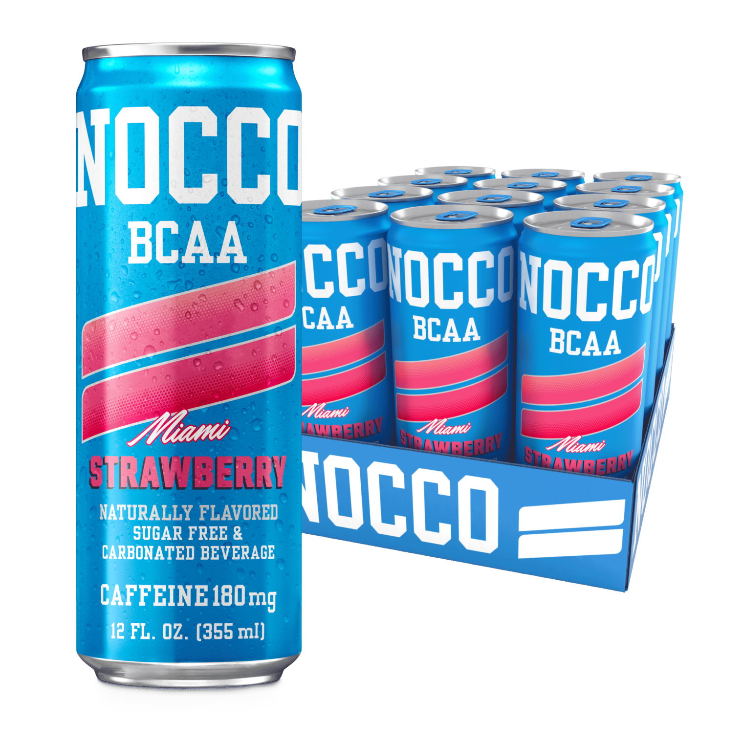
The packaging consists of a retail carton that holds multiple beverage cans. The carton is made of smooth, flat paperboard, featuring a colorful design that prominently displays the NOCCO branding. The exterior is printed with vibrant colors, primarily blue with pink accents, and includes product information such as flavor and caffeine content. The edges are clean and precise, indicating a well-constructed folding carton. The top of the carton is open, allowing for easy access to the cans inside.
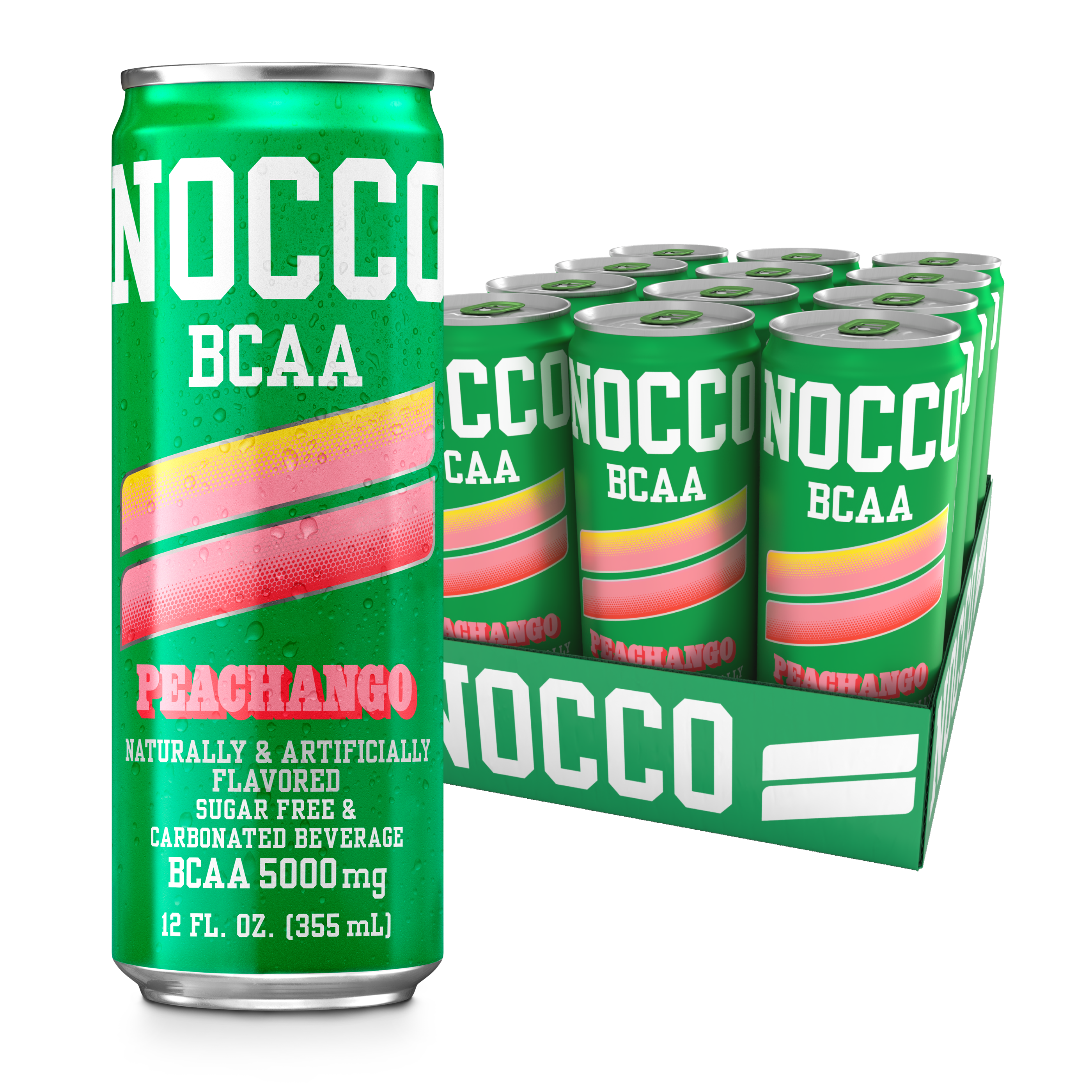
The packaging consists of a retail carton that holds multiple beverage cans. The carton has a smooth, flat construction without any fluted layers, indicating it is made from single-layer paperboard. The exterior features vibrant colors and graphics, prominently displaying the NOCCO branding. The carton is designed to hold 12 cans, with a top flap that is folded down to secure the contents. The overall form is rectangular, with clean edges and precise folds, typical of retail packaging for beverages.

The image displays a collection of beverage cans, each featuring a cylindrical shape typical of aluminum cans. The cans are adorned with vibrant colors and distinct graphics representing various flavors. Each can has a smooth surface finish with a glossy appearance, showcasing bright, bold colors and clear branding elements. The tops of the cans are standard can ends with pull tabs for easy opening.
About the Brand
NOCCO operates in the functional beverage segment, specializing in BCAA- and vitamin-enriched energy drinks for fitness enthusiasts. The brand employs direct-to-consumer distribution and uses packaging formats optimized for both retail and online channels.
With a focus on the performance beverage market, NOCCO prioritizes sugar-free formulations and clean ingredient labeling. Packaging is designed for visual impact, logistical efficiency, and to reinforce the brand's premium positioning among health-focused consumers. Frequent use of mixed and multi-pack formats caters to trial and repeat purchase behaviors, particularly in e-commerce environments.
Key Differentiator: NOCCO's packaging consistently integrates bold graphics and clear nutritional information, supporting its positioning as a performance-driven, health-oriented beverage brand.
Design System
Visual Style
Typography is bold and sans-serif, maximizing readability and modern appeal; the color palette relies on vibrant, high-contrast hues (blues, yellows, pinks, grays) to differentiate SKUs and attract attention. The overall aesthetic is energetic, clean, and sport-oriented.
Brand Identity
The NOCCO logo is consistently featured prominently on both cans and cartons, always paired with clear flavor and product descriptors. Iconography is minimal, focusing on essential nutritional information and product claims, supporting a transparent and professional brand image.
Packaging Design
Materials are chosen for recyclability and product integrity: aluminum cans and single-wall paperboard cartons. Structural designs are straightforward, prioritizing stackability, protection, and efficient retail presentation, with visual layouts that reinforce both flavor and brand recognition.
User Experience
Packaging is engineered for ease of opening, immediate recognition, and portability. The unboxing and usage journey emphasizes visual excitement, flavor variety, and quick access, supporting the brand’s fitness-centric, on-the-go lifestyle positioning.
Company Metrics
Business insights for NOCCO based on available data
Market Positioning
Brand Values & Focus
Key Competitors
Target Market: Fitness enthusiasts, athletes, and health-conscious consumers seeking sugar-free functional beverages in the European market.
Packaging Assessment
Overall Grade
Visual appeal and presentation quality
Packaging durability and protection
Eco-friendliness and recyclable materials
Cost efficiency and value for money
Packaging assessment for NOCCO based on industry standards and best practices
Frequently Asked Questions
What materials are primarily used in NOCCO's packaging?
NOCCO primarily utilizes aluminum cans for primary packaging due to their recyclability and product protection qualities, and single-layer paperboard cartons for secondary packaging, enhancing logistics and shelf presentation.
How does NOCCO's packaging support the brand's identity?
The packaging features high-impact colors, clear logo placement, and flavor differentiation, ensuring strong shelf visibility and reinforcing the brand's association with fitness and energy.
Is NOCCO's packaging designed with sustainability in mind?
While aluminum cans are widely recyclable and the paperboard cartons are also recyclable, there is limited evidence of advanced eco-design features such as reduced material usage or renewable sourcing in the current portfolio.
Discover other Food & Drink companies
Explore more companies in the food & drink industry and their packaging strategies
PrepMyMeal
Food & Drink
PrepMyMeal is a food production company specializing in high-protein meal delivery services. They offer a variety of natural, nutritious meals designed for fitness enthusiasts and those seeking convenience in meal preparation.
kerex - terre exotique
Food & Drink
Kerex - Terre Exotique specializes in the international trade of gourmet food and drink products, offering a unique selection of spices and culinary ingredients.
Terres de Café
Food & Drink
Terres de Café is a specialty coffee retailer based in Paris, France, known for its commitment to sustainability and high-quality coffee sourcing.