Neptune Elements packaging
Neptune Elements delivers premium seaweed-based products with a focus on health and sustainability. Their packaging strategy aligns with modern D2C food trends, utilizing distinctive branded formats that balance shelf presence, consumer engagement, and environmental responsibility.
Packaging Portfolio
Neptune Elements utilizes a diverse packaging portfolio comprising folding carton boxes, rigid selection boxes, and aluminum beverage cans. Paperboard cartons are used for shelf-stable seaweed and culinary products, providing print versatility and recyclability. Rigid boxes support premium or multi-product sets, enhancing perceived value and protection, while aluminum cans are reserved for infused beverage formats, offering robust product integrity and high recyclability. Across all formats, the packaging demonstrates a consistent emphasis on clean structural design and effective product protection.
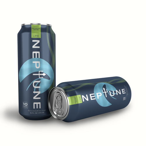
The packaging consists of two aluminum cans, both featuring a sleek, cylindrical shape typical of beverage containers. The cans are predominantly dark blue with a glossy finish, showcasing a vibrant design that includes a large, stylized logo and graphic elements. The top of the cans features a standard pull-tab opening, and the bottom shows a flat surface typical of beverage cans.
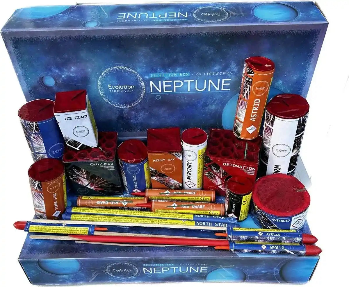
The packaging features a sturdy, thick construction typical of rigid boxes, with a premium appearance. The box is primarily rectangular, with a flat base and a lid that fits snugly over it. The exterior showcases a vibrant design with a cosmic theme, predominantly blue with circular patterns resembling planets. The box is adorned with colorful graphics and text, including the brand name 'NEPTUNE' prominently displayed on the front. The interior holds various fireworks, organized neatly in a structured layout.
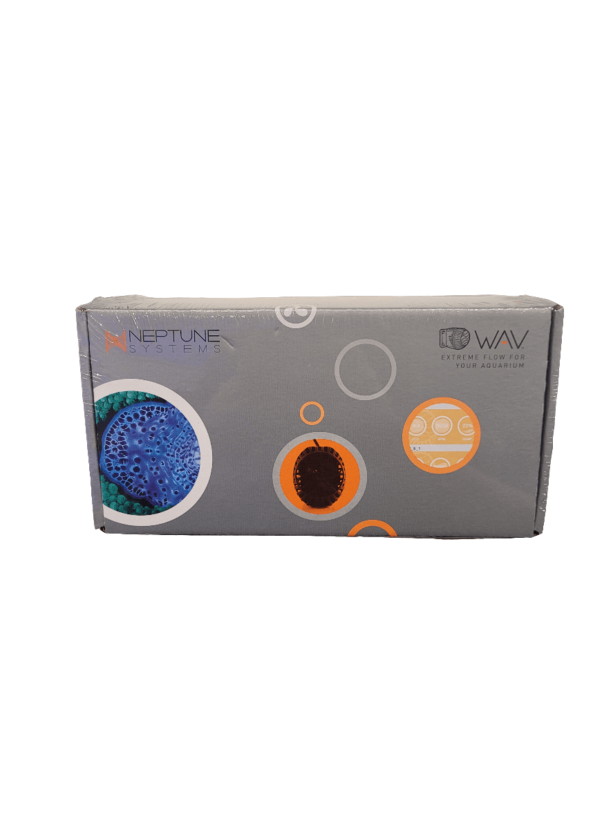
The packaging is a flat, rectangular box made from a single layer of paperboard. The surface is smooth and features a matte finish. The box has clean, precise edges and folds, indicative of a folding carton. The design includes colorful circular graphics and images, likely representing the product inside. The overall appearance is lightweight and suitable for retail display.
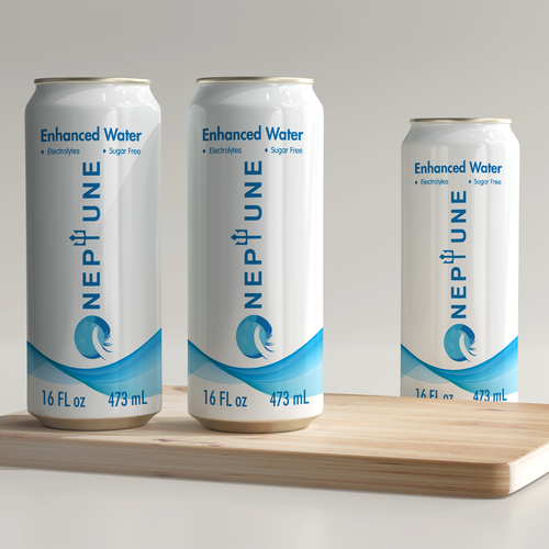
The packaging consists of three aluminum cans of enhanced water, each featuring a sleek, cylindrical shape. The cans are predominantly white with a glossy finish, showcasing a vibrant blue wave graphic that wraps around the lower part of each can. The text is printed in a bold, modern font, prominently displaying the brand name 'NEPTUNE' along with product details such as 'Enhanced Water', 'Electrolytes', and 'Sugar Free'. The cans are uniform in height and diameter, with clear labeling and no visible seams or imperfections.

The packaging is a folding carton made of single-layer paperboard, featuring a smooth, flat construction without any visible fluted layers. The box is predominantly orange with gray and white accents, showcasing a modern design. The edges are clean and precise, indicating a well-constructed fold. The surface has a glossy finish, enhancing the visual appeal. There are images of fish and bubbles printed on the sides, contributing to an aquatic theme.
About the Brand
Neptune Elements is a health-focused food and beverage company specializing in locally sourced seaweed products from Brittany. Their approach emphasizes quality assurance, eco-friendly sourcing, and educational outreach on seaweed nutrition.
Operating within the food and drink sector, Neptune Elements integrates sustainability into both sourcing and packaging, supporting local supply chains and reducing environmental impact. The packaging solutions deployed reflect a balance of product protection, retail visibility, and brand storytelling, with a consistent emphasis on clean design and material integrity.
Key Differentiator: Neptune Elements differentiates itself through its integration of local sourcing, high nutritional value, and a strong commitment to sustainable packaging and transparent supply chain practices.
Design System
Visual Style
The visual design leverages modern sans-serif typography, a palette dominated by oceanic blues, greens, and vibrant accent colors, and clean, minimalist layouts with prominent aquatic or cosmic motifs.
Brand Identity
Logo placement is consistent and prominent, leveraging aquatic iconography and bold logotypes. Visual consistency is achieved through recurring wave patterns, clear product labeling, and uniform use of brand colors.
Packaging Design
Material selection emphasizes recyclability (paperboard, aluminum) and structural efficiency, with folding cartons and rigid boxes engineered for both retail display and protective function. Design philosophy prioritizes minimal waste and visual clarity.
User Experience
Packaging is structured for intuitive opening, strong shelf presence, and a tactile, premium unboxing experience. Design choices support clear product communication and reinforce the brand’s sustainability and health-oriented positioning throughout the customer journey.
Company Metrics
Business insights for Neptune Elements based on available data
Market Positioning
Brand Values & Focus
Key Competitors
Target Market: Health-conscious consumers seeking sustainable, nutrient-rich food and beverage options, with a focus on eco-aware individuals in Western Europe.
Packaging Assessment
Overall Grade
Visual appeal and presentation quality
Packaging durability and protection
Eco-friendliness and recyclable materials
Cost efficiency and value for money
Packaging assessment for Neptune Elements based on industry standards and best practices
Frequently Asked Questions
What types of packaging formats does Neptune Elements use?
Neptune Elements employs a mix of carton boxes, rigid boxes, and aluminum cans, selected to suit product type and retail requirements while supporting brand consistency and logistical efficiency.
How does Neptune Elements address sustainability in packaging?
Their packaging strategy favors recyclable materials such as paperboard and aluminum, with an emphasis on minimizing environmental impact through sourcing and structural choices.
How does the packaging contribute to the customer experience?
The packaging is designed for strong shelf impact, clear branding, and a positive unboxing experience, enhancing perceived value and encouraging customer retention.
Discover other Food & Drink companies
Explore more companies in the food & drink industry and their packaging strategies
ruf lebensmittelwerk kg
Food & Drink
RUF Lebensmittelwerk KG is a German food production company specializing in a variety of baking mixes and drink products. Founded in 1920, the company is known for its high-quality ingredients and innovative food solutions.
Thés de la Pagode
Food & Drink
Thés de la Pagode is a French company specializing in organic teas and infusions, focusing on health and well-being. Established in 1987, they prioritize sustainable practices and high-quality ingredients sourced through fair trade.
kerex - terre exotique
Food & Drink
Kerex - Terre Exotique specializes in the international trade of gourmet food and drink products, offering a unique selection of spices and culinary ingredients.