Naturalia packaging
Naturalia is a leading French retailer specializing in organic foods, beverages, and wellness products. Their packaging strategy emphasizes recyclable materials and eco-friendly formats, reinforcing the brand’s commitment to sustainability within the organic sector.
Packaging Portfolio
Naturalia’s packaging portfolio is characterized by the use of recyclable paperboard cartons, molded pulp egg containers, and kraft paper retail bags. These structures demonstrate a preference for single-use, mono-material solutions optimized for both shelf display and transport. The branding is consistently applied through direct print and label integration, with a clear focus on minimizing plastic and maximizing recyclability. Packaging formats are tailored to product type, balancing protection, visibility, and eco-certifications, which supports both sustainability objectives and regulatory compliance in the food sector.
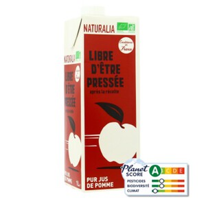
The packaging is a rectangular carton with a smooth, flat construction. It features a predominantly red exterior with white and green accents. The front displays an illustration of an apple and the product name 'LIBRE D'ÊTRE PRESSÉE' prominently. The carton has a clean, precise finish with sharp edges and folds, typical of retail packaging. The top has a pour spout for easy dispensing, and the overall appearance suggests it is designed for single-use.
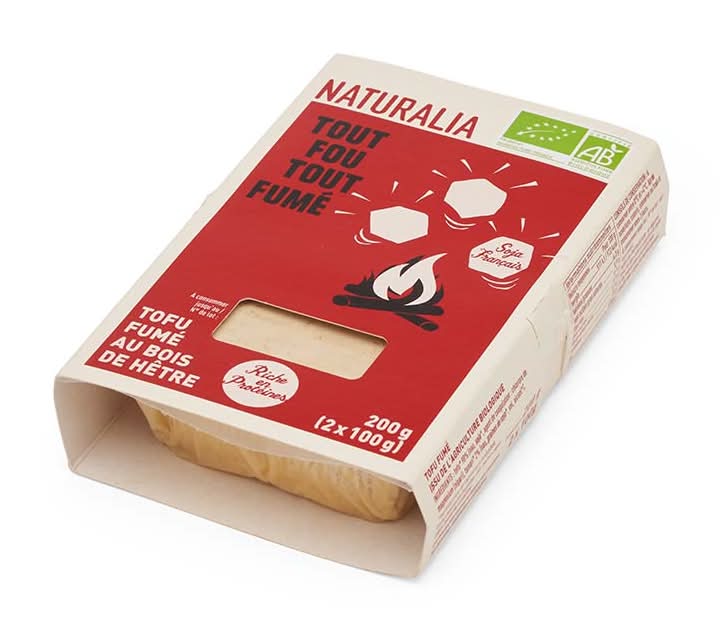
The packaging is a folding carton made of single-layer paperboard. It features a smooth, flat construction with clean edges and folds. The exterior is primarily a cream color with a vibrant red panel on the front displaying graphics and text. The carton has a rectangular shape with a cut-out window that allows visibility of the product inside. The design includes a stylized fire graphic and hexagonal icons, suggesting a focus on natural ingredients.

The packaging consists of a variety of items placed on a flat surface. The most prominent item is a brown paper bag with the word 'NATURALIA' printed in bold red letters at the top. The bag has a smooth, flat construction without visible fluted layers, indicating it is made from single-layer paperboard. Other items include a white container, a plastic bottle, and several food products in flexible packaging. The overall scene suggests a grocery shopping context.

The packaging is a standard egg carton made from molded pulp. It has a smooth, single-layer construction without any visible fluted layers. The carton is primarily gray with a matte finish, featuring a rectangular shape that holds six eggs. The top is flat with rounded edges, and the sides are slightly raised to accommodate the egg shapes. The carton has a printed label on the front, which includes product information and branding elements.
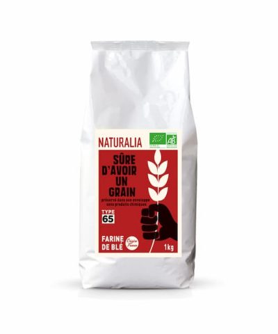
The packaging is a flat, white paper bag with a rectangular shape. It features a smooth surface without any visible fluted layers, indicating it is made from single-layer paperboard. The bag has a simple design with a front-facing graphic that includes a hand holding a wheat grain, along with text indicating the product type (flour) and weight (1kg). The edges are clean and precise, suggesting a well-constructed fold. The overall appearance is lightweight and suitable for retail display.
About the Brand
Naturalia operates over 100 stores in France and offers a diverse range of organic food, drink, and health items. The company’s packaging approach aligns with its ecological values, utilizing recyclable paper and molded pulp formats for both branding and logistics efficiency.
Founded in 1973, Naturalia has established a robust presence in the organic retail segment, with a focus on high-quality, health-conscious products. The brand’s packaging solutions are carefully selected for both environmental impact and product protection, reflecting consumer demand for sustainability in food retail. Packaging formats include retail cartons, paper bags, molded pulp egg cartons, and single-use beverage cartons, all with strong branding coherence.
Key Differentiator: Naturalia’s packaging strategy differentiates itself through consistent use of eco-friendly materials and prominent, easily recognizable branding across all formats.
Design System
Visual Style
Naturalia employs bold, sans-serif typography, with a palette dominated by red, white, and natural earth tones. The aesthetic is minimal yet impactful, supporting high shelf visibility and easy product identification.
Brand Identity
The logo is prominently featured on all packaging, with consistent use of iconography and high-contrast color schemes. Visual consistency is maintained through unified layout grids, logo placement, and certification marks.
Packaging Design
Material choices favor recyclable paperboard and molded pulp, with structures designed for efficient stacking and product protection. The design philosophy prioritizes sustainability, simplicity, and clear communication of organic credentials.
User Experience
The packaging design supports the customer journey by ensuring easy product recognition, clear labeling of organic and environmental certifications, and straightforward unboxing. The tactile quality of paper-based materials and the visual coherence of branding enhance consumer trust and reinforce Naturalia’s sustainability message.
Company Metrics
Business insights for Naturalia based on available data
Market Positioning
Brand Values & Focus
Key Competitors
Target Market: Health-conscious retail consumers in France seeking certified organic food, beverages, and wellness products, both in-store and online.
Packaging Assessment
Overall Grade
Visual appeal and presentation quality
Packaging durability and protection
Eco-friendliness and recyclable materials
Cost efficiency and value for money
Packaging assessment for Naturalia based on industry standards and best practices
Frequently Asked Questions
What materials does Naturalia use for its packaging?
Naturalia primarily uses recyclable paperboard, molded pulp for egg cartons, and single-layer paper bags. These materials are chosen for their environmental profile and suitability for organic products.
How does Naturalia ensure its packaging aligns with sustainability goals?
Naturalia’s packaging selection prioritizes recyclable and compostable materials, minimal plastic usage, and clear labeling for eco-certifications, supporting both logistics efficiency and sustainability targets.
Does Naturalia’s packaging reflect its brand identity?
Yes, Naturalia maintains consistent visual branding across all product lines, using bold logos, a unified color palette, and clear typography to reinforce brand recognition and consumer trust.
Discover other Food & Drink companies
Explore more companies in the food & drink industry and their packaging strategies
Teegschwendner GmbH
Food & Drink
Teegschwendner GmbH is a specialty tea company based in Germany, offering a wide selection of high-quality teas and tea-related accessories. They focus on providing unique tea experiences through carefully sourced and curated products.
PrepMyMeal
Food & Drink
PrepMyMeal is a food production company specializing in high-protein meal delivery services. They offer a variety of natural, nutritious meals designed for fitness enthusiasts and those seeking convenience in meal preparation.
kerex - terre exotique
Food & Drink
Kerex - Terre Exotique specializes in the international trade of gourmet food and drink products, offering a unique selection of spices and culinary ingredients.