Moose Coffee packaging
Moose Coffee specializes in gourmet food and beverage products, delivered direct-to-consumer via e-commerce. Their packaging strategy focuses on branded, visually engaging flexible pouches and cartons that reinforce product quality and enhance the customer experience.
Packaging Portfolio
Moose Coffee's packaging portfolio comprises primarily flexible stand-up pouches for items like coffee and pancake mix, enhanced by resealable features for freshness retention. Rigid carton boxes are used for mugs and curated bundles, providing structural protection and a premium retail display. The use of matte and gloss finishes, die-cut windows, and consistent brand iconography supports both visual appeal and product information clarity. Material selection prioritizes product safety and shelf-life but shows moderate emphasis on eco-friendly substrates.
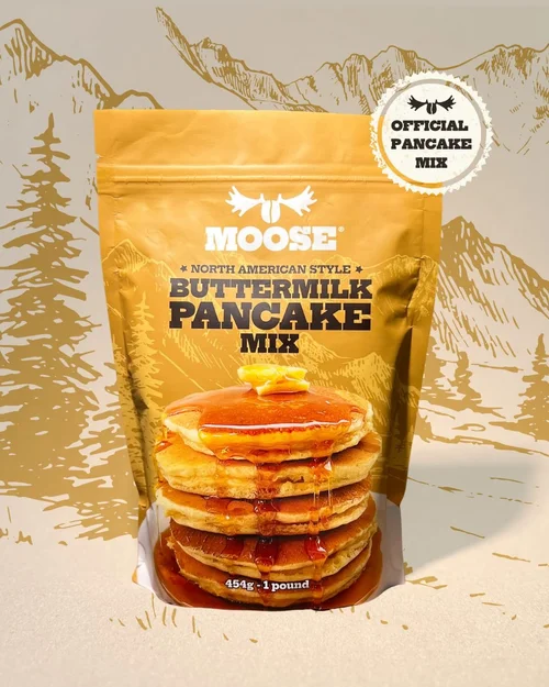
The packaging is a stand-up pouch made of flexible material, featuring a smooth surface with a matte finish. The front displays a large image of stacked pancakes drizzled with syrup, prominently showcasing the product. The top has a resealable zipper closure, and the sides are slightly curved, allowing it to stand upright. The overall color scheme is warm, with a dominant golden yellow background. The top right corner features a circular emblem stating 'OFFICIAL PANCAKE MIX'.
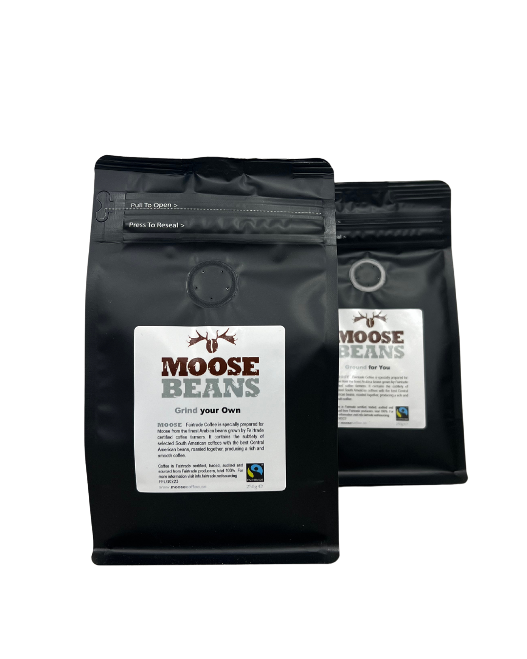
The packaging consists of a stand-up pouch made from a flexible material, likely a multi-layer laminate that includes a barrier to preserve freshness. The bag features a matte black finish with a glossy logo and text. The top has a resealable zipper and a tear notch for easy opening. The front displays the brand name 'MOOSE BEANS' prominently, along with product information and Fair Trade certification details. The back of the pouch includes additional product details and instructions.
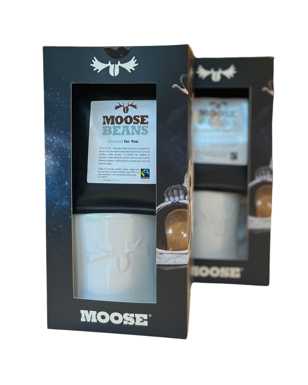
The packaging is a folding carton box made of smooth, flat paperboard. It features a sleek design with a glossy finish. The front has a cut-out window displaying the product inside, which is a white coffee mug. The box is predominantly black with a starry background, and the Moose Coffee logo is prominently displayed at the bottom. The top has a flap that folds down to secure the contents. The edges are clean and precise, indicating a high-quality construction.
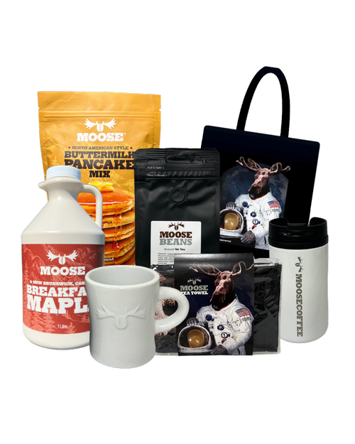
The packaging includes various items such as a pancake mix bag, coffee bags, a ceramic mug, and a travel mug, all presented in a visually appealing arrangement. The pancake mix bag is a stand-up pouch with a resealable top, while the coffee bags are flat and rectangular, showcasing a matte finish. The ceramic mug and travel mug have smooth surfaces with printed graphics. The overall presentation is colorful and engaging.
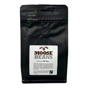
The packaging is a stand-up pouch made of a flexible material, likely a multi-layer film. It features a matte black exterior with a glossy finish on the logo and text. The top has a resealable zipper closure, and there is a tear notch for easy opening. The front displays a large label with the product name 'MOOSE BEANS' prominently featured in a bold, rustic font, accompanied by a graphic of a moose. The label also includes product information and Fair Trade certification details.
About the Brand
Moose Coffee is a UK-based online retailer offering specialty coffees, teas, and gourmet food items, with a focus on quality and distinctive flavors. Their packaging approach utilizes a mix of stand-up pouches, carton boxes, and retail cartons, all tailored to protect product integrity and reinforce brand perception.
The company leverages custom packaging formats aligned with their premium positioning, using resealable flexible pouches for freshness, and sturdy cartons for gift and bundle sets. Consistent branding, including logo presence and cohesive color palettes, ensures a uniform customer experience. Attention is paid to both shelf impact and functional protection, balancing aesthetic appeal with logistical demands.
Key Differentiator: Moose Coffee's unique value lies in their integration of brand-centric design with practical packaging formats that support freshness, presentation, and customer engagement for gourmet food and beverage products.
Design System
Visual Style
The design utilizes clean sans-serif typography, earthy and muted color palettes (blacks, browns, golds, and natural tones), and a rustic, outdoor-inspired aesthetic. Matte finishes dominate, with selective use of gloss for logo and key product information.
Brand Identity
Logo usage is prominent, with the Moose icon and 'Moose Coffee' wordmark consistently displayed on all packaging. Iconography and product imagery are harmonized across SKUs, supporting strong brand recognition and visual cohesion.
Packaging Design
Material choices include multilayer flexible laminates for pouches and coated paperboard for cartons. Structural designs emphasize resealability, rigidity for fragile items, and transparency (via windows) where appropriate. The philosophy balances durability, freshness, and aesthetic value.
User Experience
Design supports a seamless customer journey, from first visual engagement online to product unboxing at home. Packaging is engineered for intuitive opening, clear product identification, and a consistent brand experience, enhancing perceived value and encouraging repeat purchases.
Company Metrics
Business insights for Moose Coffee based on available data
Market Positioning
Brand Values & Focus
Key Competitors
Target Market: Gourmet food and beverage consumers in the UK and broader e-commerce markets, with a focus on individuals seeking premium, curated home dining and drinking experiences.
Packaging Assessment
Overall Grade
Visual appeal and presentation quality
Packaging durability and protection
Eco-friendliness and recyclable materials
Cost efficiency and value for money
Packaging assessment for Moose Coffee based on industry standards and best practices
Frequently Asked Questions
What types of packaging does Moose Coffee use?
Moose Coffee employs a combination of flexible stand-up pouches for coffee and pancake mixes, as well as high-quality carton boxes for mugs and bundled products, all featuring prominent branding and resealable closures where appropriate.
How does Moose Coffee ensure product safety during shipping?
Products are protected using multi-layer flexible materials and rigid carton structures, with resealable features and durable construction designed to withstand transit and maintain product integrity.
Is the packaging eco-friendly?
While Moose Coffee uses some recyclable materials, the majority of packaging appears to be standard flexible laminates and coated cartons. There is limited evidence of explicit sustainability claims or use of advanced eco-friendly substrates.
How does the packaging enhance the unboxing experience?
The packaging features consistent branding, visually appealing graphics, and structured layouts that deliver a premium unboxing experience, combining aesthetic impact with practical product information.
Discover other Food & Drink companies
Explore more companies in the food & drink industry and their packaging strategies
PrepMyMeal
Food & Drink
PrepMyMeal is a food production company specializing in high-protein meal delivery services. They offer a variety of natural, nutritious meals designed for fitness enthusiasts and those seeking convenience in meal preparation.
Teegschwendner GmbH
Food & Drink
Teegschwendner GmbH is a specialty tea company based in Germany, offering a wide selection of high-quality teas and tea-related accessories. They focus on providing unique tea experiences through carefully sourced and curated products.
kerex - terre exotique
Food & Drink
Kerex - Terre Exotique specializes in the international trade of gourmet food and drink products, offering a unique selection of spices and culinary ingredients.