Milupa packaging
Milupa delivers specialized nutritional products for infants and toddlers, emphasizing both product quality and parent-centric support. Their packaging strategy leverages robust branding, user-friendly formats, and stringent safety standards to ensure both consumer trust and regulatory compliance.
Packaging Portfolio
Milupa’s packaging portfolio comprises folding carton boxes, cylindrical paperboard containers, and resealable flexible pouches. Primary materials include single-layer coated paperboard for cartons and composite plastics for pouches, chosen for barrier protection and printability. Structural formats prioritize shelf stability, tamper resistance, and easy dispensing, while design elements—such as windows and ergonomic lids—support practical use by caregivers. Packaging consistently integrates nutritional labeling and child-oriented graphics, aligning with stringent EU food safety and marketing standards.
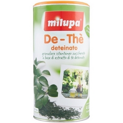
The packaging is a cylindrical container with a smooth, flat surface. It features a bright orange lid and a predominantly white body with green accents. The design includes images of tea leaves and a small depiction of a teapot, suggesting the product's use. The edges are clean and precise, indicating a well-constructed design.

The packaging is a cylindrical container with a smooth, flat construction, made from a single layer of paperboard. It features a colorful design with a predominantly red lid and a beige body adorned with green clovers and a heart motif. The edges are clean and precise, indicating a well-constructed folding carton. The surface has a matte finish, giving it a soft touch. The top of the container has a clear label indicating the brand name and product information, while the sides feature additional graphics and nutritional information.

The packaging is a folding carton made of single-layer paperboard, featuring a smooth, flat construction without fluted layers. It has a colorful design with a prominent heart shape at the top, indicating a child-friendly product. The front displays an illustration of a monkey and a glass of milk, appealing to children. The edges are clean and precise, and the overall appearance is lightweight yet sturdy.

The packaging is a stand-up pouch made from a composite material that includes a plastic layer for moisture barrier and a printed exterior. It has a resealable top, allowing for easy access and storage. The front features a large window displaying the product inside, along with vibrant graphics and text. The overall design is colorful and appealing, targeting parents of young children.

The packaging features a smooth, flat construction typical of folding cartons. It has a colorful design with a prominent heart shape and floral graphics. The edges are clean and precise, indicating a well-constructed box. The surface has a matte finish with vibrant colors, primarily in shades of blue, red, and white. The front displays the brand name 'Milupa' prominently along with product information and illustrations.

The packaging is a folding carton box made of single-layer paperboard. It features a smooth, flat construction with clean edges and folds. The exterior is predominantly white with colorful graphics and text. The box has a rectangular shape, designed for retail display, and includes various printed instructions and nutritional information on the sides.
About the Brand
Milupa, a German-based subsidiary of Danone, operates in the Food & Drink sector, focusing on high-quality baby and toddler nutrition. Their product portfolio spans infant formulas, cereals, and toddler milk, with a strong emphasis on safety, nutritional compliance, and parental guidance. Packaging is leveraged as a key interface for brand identity and regulatory information.
With a medium-sized operational footprint, Milupa utilizes packaging not only to protect sensitive nutritional products but also as a communication channel for parents, featuring clear nutritional data and vibrant, child-friendly graphics. The company adheres to strict EU food safety standards, and its packaging formats are selected to balance durability, shelf appeal, and user convenience. Community engagement and expert-backed resources are supported visually and structurally through packaging design.
Key Differentiator: Milupa distinguishes itself through a combination of expert-endorsed nutritional guidance, highly regulated packaging practices, and a cohesive brand experience designed for the early childhood segment.
Design System
Visual Style
Milupa employs rounded, approachable sans-serif typography and a color palette dominated by soft blues, reds, oranges, and whites. The aesthetic balances vibrancy with a gentle, family-friendly tone, using matte finishes and playful illustrations.
Brand Identity
Branding is reinforced through prominent logo placement, consistent use of the heart motif, and clear display of product names and taglines. Iconography is simple and intuitive, with high visual consistency across SKUs.
Packaging Design
Material selection emphasizes food safety and protection—primarily paperboard for rigidity and composite films for barrier properties. Structural designs focus on tamper evidence, resealability, and ease of handling, reflecting a pragmatic approach to infant nutrition packaging.
User Experience
Packaging is designed for intuitive use, with clear opening mechanisms, resealable features, and visible nutritional information, facilitating informed, stress-free feeding routines for parents. The visual and structural design reinforces trust and simplifies the customer journey from purchase to use.
Company Metrics
Business insights for Milupa based on available data
Market Positioning
Brand Values & Focus
Key Competitors
Target Market: Parents of infants and toddlers in Germany and the broader EU, with a focus on families seeking premium nutrition solutions and expert-backed guidance.
Packaging Assessment
Overall Grade
Visual appeal and presentation quality
Packaging durability and protection
Eco-friendliness and recyclable materials
Cost efficiency and value for money
Packaging assessment for Milupa based on industry standards and best practices
Frequently Asked Questions
What types of packaging does Milupa use for its products?
Milupa employs folding carton boxes, cylindrical paperboard containers, and flexible stand-up pouches. These formats are selected for durability, product protection, and ease of use for parents.
How does Milupa address sustainability in packaging?
Milupa utilizes recyclable paperboard and seeks to minimize material use without compromising product safety, though the reliance on composite materials in some flexible packaging presents ongoing sustainability challenges.
How does packaging contribute to Milupa's brand identity?
Packaging consistently features the Milupa logo, signature heart motif, and vibrant color schemes, ensuring immediate brand recognition and reinforcing trust among parents.
Who are the key decision makers for packaging at Milupa?
Supply chain and quality managers, such as the Supply Chain Planner and Quality Control Laboratory Manager, are primarily responsible for packaging procurement and compliance.
Discover other Food & Drink companies
Explore more companies in the food & drink industry and their packaging strategies
PrepMyMeal
Food & Drink
PrepMyMeal is a food production company specializing in high-protein meal delivery services. They offer a variety of natural, nutritious meals designed for fitness enthusiasts and those seeking convenience in meal preparation.
kerex - terre exotique
Food & Drink
Kerex - Terre Exotique specializes in the international trade of gourmet food and drink products, offering a unique selection of spices and culinary ingredients.
Terres de Café
Food & Drink
Terres de Café is a specialty coffee retailer based in Paris, France, known for its commitment to sustainability and high-quality coffee sourcing.