maorika packaging
Maorika specializes in premium Manuka honey and bee-based products, leveraging a direct-to-consumer model from their Hamburg base. Their packaging approach emphasizes sustainability and product integrity, utilizing glass jars and luxury rigid boxes designed to enhance both product protection and brand perception.
Packaging Portfolio
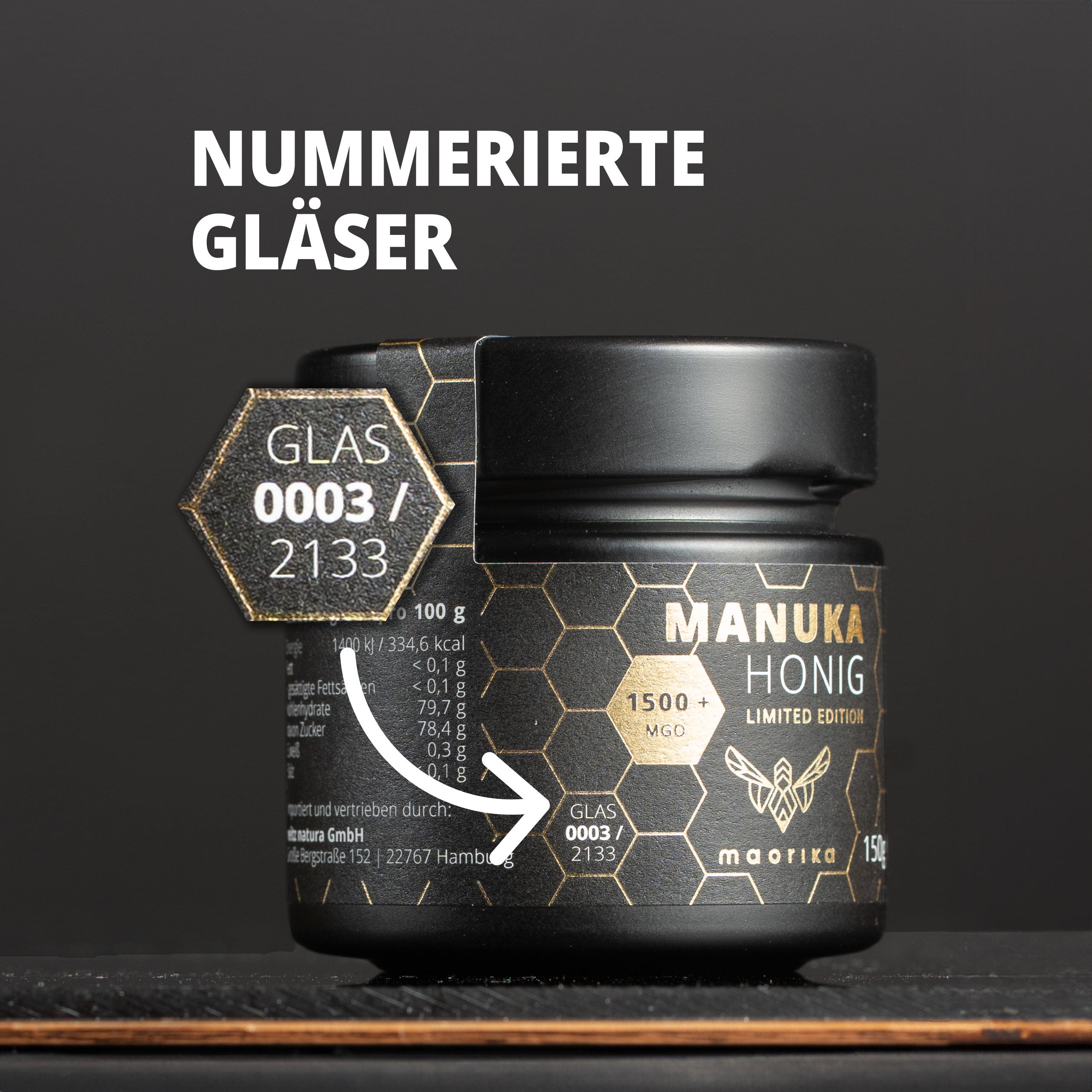
Maorika’s packaging portfolio features a combination of glass jars with metal lids, luxury rigid boxes, and folding carton secondary packaging. The primary use of glass offers superior product stability and a premium tactile experience, while rigid boxes with matte and gold finishes serve both as protective casing and as gift-ready presentation. Detailed labeling, QR codes, and unique numbering reinforce authenticity and traceability. All formats balance retail shelf impact with unboxing quality, and the material choices emphasize recyclability and premium product positioning.

The outer packaging is a folding carton made of smooth, flat paperboard. It features a predominantly black and white color scheme with a glossy finish. The carton has clean edges and precise folds, typical of retail packaging. The front displays a large logo and product information, while the sides contain additional details and certifications. The inner jar is a rigid container made of dark glass, with a screw-on lid, indicating a premium product.
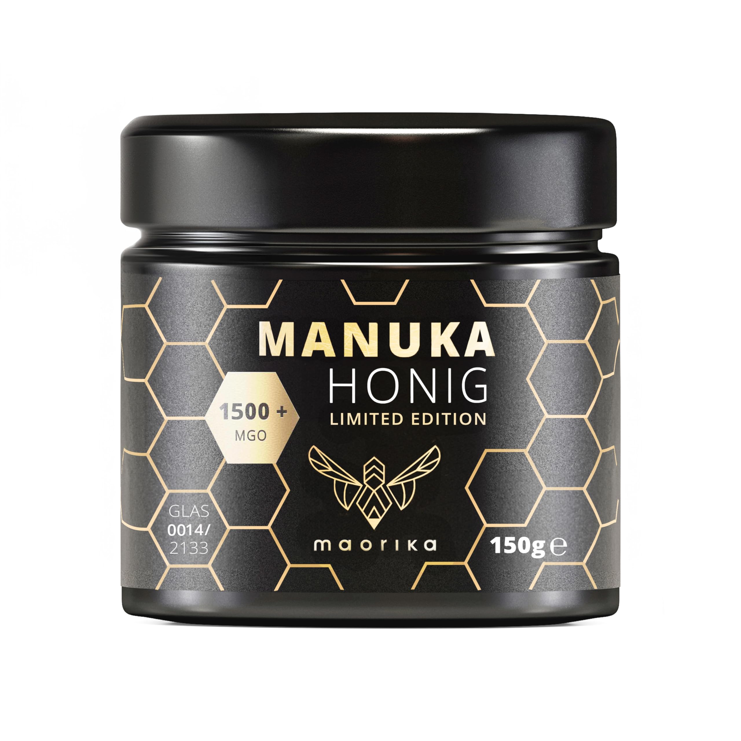
The packaging consists of a glass jar with a black lid. The jar has a cylindrical shape and is primarily black with gold accents. It features a hexagonal honeycomb pattern, which is indicative of honey packaging. The label includes product information, including the type of honey (Manuka), a limited edition note, and a MGO rating. The text is printed in a clean, modern font, with the brand name 'maorika' prominently displayed.
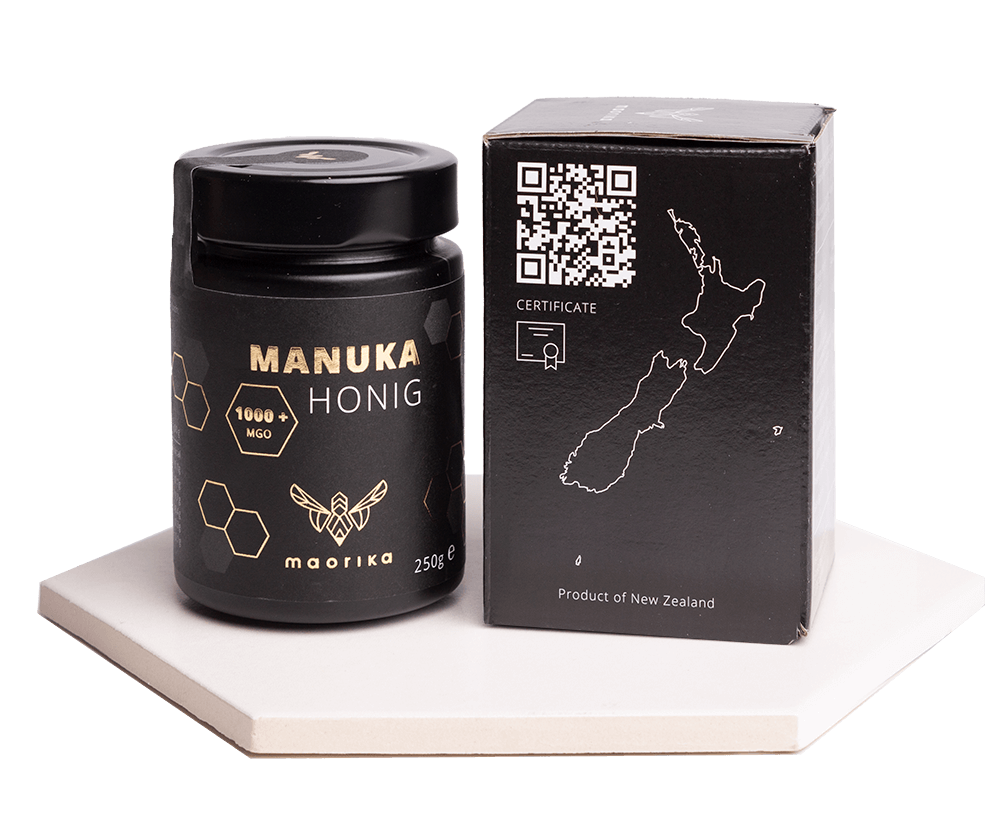
The packaging consists of a folding carton box designed to hold a jar of Manuka honey. The box features a smooth, flat construction with clean edges and folds. The exterior is predominantly black with gold accents, showcasing a modern and premium aesthetic. The front displays the product name 'MANUKA HONIG' in bold gold lettering, accompanied by a honeycomb graphic and the brand name 'maorika' in smaller font. The sides of the box include a QR code and a map of New Zealand, emphasizing the product's origin. The overall finish appears to be matte, giving it a sophisticated look.
The packaging consists of a small glass jar with a black lid. The jar is cylindrical in shape and features a textured surface with a matte finish. The lid is smooth and has a slight gloss. The jar is labeled with a gold and black design, showcasing a honeycomb pattern and product information. The label includes the product name 'MANUKA HONIG', a limited edition note, and a unique glass number. The overall appearance is elegant and premium.

The packaging is a black rigid box with a sturdy construction, featuring a lid that opens upwards. The interior is lined with a golden color, providing a premium look. The box is designed to hold a jar of Manuka honey, which is partially visible. The exterior has a smooth finish, while the interior has a contrasting glossy surface. The box has clean edges and a precise fold, indicative of high-quality craftsmanship.

The packaging is a luxury gift box with a sturdy construction, featuring thick walls and a premium appearance. The exterior is matte black, while the interior has a contrasting gold finish. The box has a hinged lid that opens to reveal a jar of Manuka honey, which is securely placed inside. The interior lid features a QR code and a message, adding a personal touch.
About the Brand
Maorika operates in the European natural health market, importing authentic Manuka honey and related bee products directly from New Zealand. Their packaging methodology is defined by a strong focus on eco-friendly materials—primarily glass and rigid board structures—paired with premium-grade printing and finishing to reinforce a luxury positioning. This approach is consistent across both food and skincare product lines.
The company’s compact operational size allows for agile quality assurance and close control over packaging sourcing. Maorika’s packaging integrates sustainability (glass over plastic), robust protection for sensitive contents, and a high-end unboxing experience, with QR codes and detailed product provenance elements. Their packaging also reflects a response to consumer demand for transparency and ethical sourcing in the food and wellness sector.
Key Differentiator: Distinctive use of luxury rigid boxes and glass containers, combined with traceability features (QR codes, certifications), positions Maorika as a premium, sustainability-focused brand within the Manuka honey segment.
Design System
Visual Style
The visual design employs modern sans-serif typography, a black and gold color palette, and minimalist layouts to convey luxury and purity. High-contrast accents and honeycomb motifs reinforce the natural product theme.
Brand Identity
Consistent logo placement, prominent use of the brand name 'maorika', and integration of New Zealand origin graphics and certification badges ensure cohesive identity across all packaging touchpoints.
Packaging Design
Material selection prioritizes glass and rigid board for both sustainability and protection. Structural designs focus on precise folds, sturdy construction, and layered unboxing sequences that enhance perceived value.
User Experience
Packaging is designed to support premium unboxing rituals, foster consumer trust through transparent labeling and QR-enabled traceability, and provide tactile cues that reinforce luxury and authenticity throughout the customer journey.
Company Metrics
Business insights for maorika based on available data
Market Positioning
Brand Values & Focus
Key Competitors
Target Market: Health-conscious consumers and premium food buyers across Europe seeking authentic Manuka honey and bee-related wellness products.
Packaging Assessment
Overall Grade
Visual appeal and presentation quality
Packaging durability and protection
Eco-friendliness and recyclable materials
Cost efficiency and value for money
Packaging assessment for maorika based on industry standards and best practices
Frequently Asked Questions
What types of packaging does Maorika use for its Manuka honey products?
Maorika utilizes glass jars with premium rigid or folding carton boxes, emphasizing product security, shelf appeal, and sustainability.
How does Maorika address packaging sustainability?
The company prioritizes recyclable glass and paperboard materials, minimizing plastic use and incorporating packaging elements that support a lower environmental impact.
How does Maorika ensure product authenticity and traceability in packaging?
Packaging frequently incorporates QR codes and certification markings, allowing consumers to verify product provenance and lab testing results.
Discover other Food & Drink companies
Explore more companies in the food & drink industry and their packaging strategies
Teegschwendner GmbH
Food & Drink
Teegschwendner GmbH is a specialty tea company based in Germany, offering a wide selection of high-quality teas and tea-related accessories. They focus on providing unique tea experiences through carefully sourced and curated products.
Thés de la Pagode
Food & Drink
Thés de la Pagode is a French company specializing in organic teas and infusions, focusing on health and well-being. Established in 1987, they prioritize sustainable practices and high-quality ingredients sourced through fair trade.
kerex - terre exotique
Food & Drink
Kerex - Terre Exotique specializes in the international trade of gourmet food and drink products, offering a unique selection of spices and culinary ingredients.