Maison Pariès packaging
Maison Pariès is a heritage French confectionery specializing in artisanal chocolates, pastries, and regional Basque delicacies. Their packaging strategy emphasizes premium materials, distinctive structures, and strong brand integration to enhance both product protection and consumer experience.
Packaging Portfolio
Maison Pariès employs a diverse packaging portfolio centered on folding carton boxes, rigid tin boxes, and specialty retail cartons with integrated handles and windows. The prevalent use of high-grade paperboard supports both structural integrity and premium tactile quality. Rigid metal boxes are designated for luxury chocolates, offering long-term reuse and enhanced shelf appeal. The incorporation of vibrant colors, playful illustrations, and custom die-cuts contribute to a branded, gift-oriented experience across all formats.
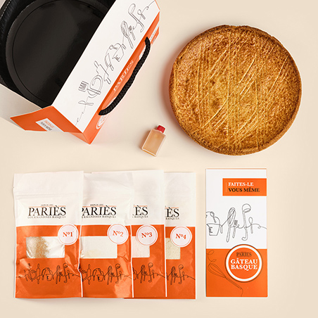
The packaging consists of a folding carton with a handle, made from a single layer of paperboard. The exterior features a colorful design with illustrations of utensils and a logo. The edges are clean and precise, and the carton is primarily white with orange accents. The handle is made from a sturdy rope material, providing ease of carrying. The packaging is designed to hold baking ingredients and includes a clear window to display the contents.
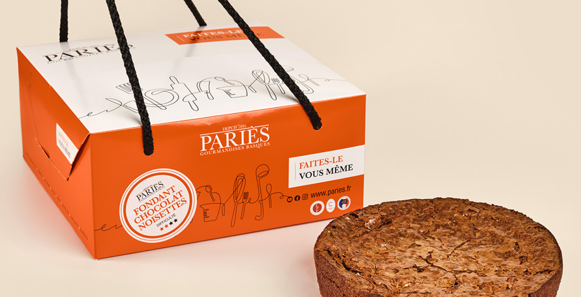
The packaging is a rectangular folding carton with a smooth, flat construction. It features a vibrant orange color with white graphics. The top has a handle made of black rope, providing easy carrying. The edges are clean and precise, indicative of high-quality manufacturing. The front displays the brand name prominently, along with product information in a clear font.
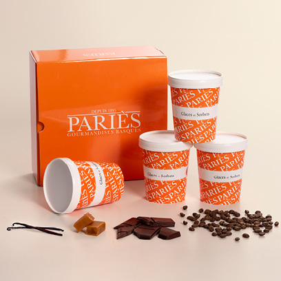
The packaging consists of a sturdy, flat construction with a smooth surface. The outer box is a vibrant orange color with a glossy finish, featuring the brand name 'PARIES' prominently displayed in white lettering. The box has clean, precise edges and folds, indicating high-quality paperboard material. Inside, there are three white cups, each with a simple design, likely made of paperboard, containing gourmet items such as chocolates and coffee beans. The overall appearance is appealing and well-organized.
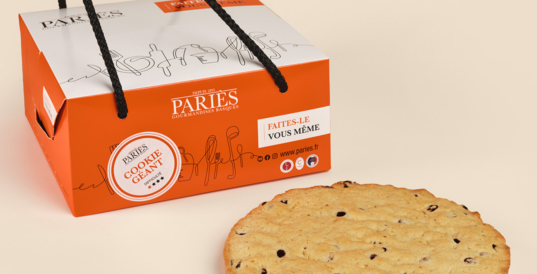
The packaging is a folding carton with a smooth, flat construction. It features a predominantly orange exterior with a white top, showcasing a clean design. The edges are precise and well-defined, indicating high-quality manufacturing. The box has a handle made of black string, allowing for easy carrying. The front displays the brand name 'PARIÈS' prominently, along with product information and a playful illustration that adds a personal touch.
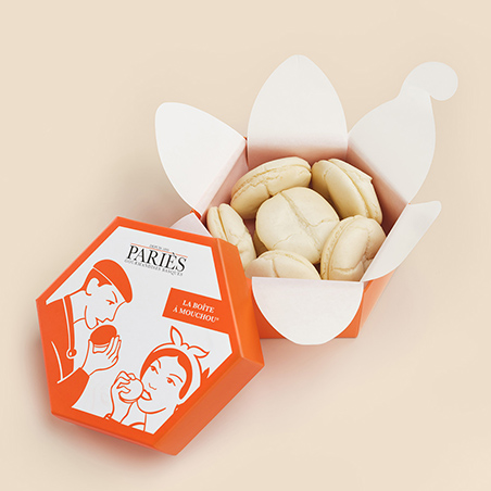
The packaging is a hexagonal folding carton made from single-layer paperboard. It features a smooth, flat construction with clean edges and folds. The exterior is a vibrant orange color, while the interior is white. The top of the box has a unique petal-like design that opens up to reveal the contents inside. The box is designed to hold macarons, with the pastries visible through the open top. The overall appearance is light and inviting, suitable for retail display.
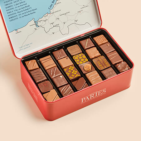
The packaging is a rectangular tin box with a hinged lid. The exterior is a vibrant red color with a smooth finish. The lid features a printed map design in a lighter color, along with the brand name 'PARIES' prominently displayed in white. The interior is divided into sections holding an assortment of chocolates, each piece neatly arranged. The box has a sturdy construction, indicative of high-quality materials.
About the Brand
Maison Pariès operates in the premium food and drink sector, producing traditional chocolates, pastries, and confections with a focus on Basque culinary heritage. Their packaging approach utilizes high-quality carton and rigid boxes, prioritizing visual impact, product protection, and brand storytelling.
The company leverages a mix of structural carton packaging and rigid gift boxes, often incorporating handles, windows, and custom illustrations. Maison Pariès consistently applies its vibrant color palette and logo across all packaging formats, reinforcing brand recognition and luxury positioning. This sophisticated approach supports both retail and e-commerce channels, aligning with consumer expectations for gifting and premium presentation.
Key Differentiator: Maison Pariès differentiates itself through the integration of traditional Basque aesthetics, exceptional packaging quality, and a cohesive brand narrative that elevates the unboxing experience.
Design System
Visual Style
Maison Pariès' packaging leverages modern sans-serif typography, a bold orange primary color paired with white and accent hues, and playful line illustrations. The overall aesthetic is contemporary yet rooted in Basque tradition.
Brand Identity
Branding is consistent with prominent logo placement ('PARIES'), uniform color applications, and recurring iconography such as product illustrations and heritage motifs. Visual coherence is maintained across all formats for strong shelf and digital presence.
Packaging Design
Materials include premium paperboard for carton structures and metal for rigid boxes. The design approach emphasizes clean lines, ergonomic handles, and protective inserts, optimizing both presentation and product safety.
User Experience
Packaging is designed to facilitate easy carrying, intuitive opening, and immediate brand recognition. The unboxing sequence is curated for emotional impact, reinforcing Maison Pariès' luxury positioning and supporting gifting behaviors.
Company Metrics
Business insights for Maison Pariès based on available data
Market Positioning
Brand Values & Focus
Key Competitors
Target Market: Maison Pariès targets gourmet consumers, gift buyers, and aficionados of artisanal French confectionery, both domestically and internationally, with a focus on premium retail and e-commerce channels.
Packaging Assessment
Overall Grade
Visual appeal and presentation quality
Packaging durability and protection
Eco-friendliness and recyclable materials
Cost efficiency and value for money
Packaging assessment for Maison Pariès based on industry standards and best practices
Frequently Asked Questions
What types of packaging does Maison Pariès use for its products?
Maison Pariès primarily uses high-quality folding carton boxes for pastries and confections, complemented by rigid metal boxes for luxury chocolate assortments. Packaging often features handles, custom shapes, and illustrative graphics to enhance usability and brand storytelling.
How does Maison Pariès ensure product protection during shipping?
The brand utilizes sturdy carton and rigid materials with precise structural engineering, such as reinforced edges and compartmentalization, to safeguard delicate items against transit-related damage.
Is sustainability considered in Maison Pariès' packaging strategy?
Maison Pariès demonstrates some commitment to sustainability through the use of recyclable paperboard materials and reusable rigid boxes, though further transparency on material sourcing and end-of-life recyclability could strengthen the eco-profile.
Discover other Food & Drink companies
Explore more companies in the food & drink industry and their packaging strategies
PrepMyMeal
Food & Drink
PrepMyMeal is a food production company specializing in high-protein meal delivery services. They offer a variety of natural, nutritious meals designed for fitness enthusiasts and those seeking convenience in meal preparation.
kerex - terre exotique
Food & Drink
Kerex - Terre Exotique specializes in the international trade of gourmet food and drink products, offering a unique selection of spices and culinary ingredients.
Terres de Café
Food & Drink
Terres de Café is a specialty coffee retailer based in Paris, France, known for its commitment to sustainability and high-quality coffee sourcing.