Ma Vie en Couleurs packaging
Ma Vie en Couleurs operates an interactive food and e-commerce platform, engaging consumers with branded snacks, recipes, and promotional content. Their packaging approach emphasizes vibrant retail cartons and flexible pouches, aligning with brand partners like Milka, LU, and Prince to ensure strong shelf appeal and consumer engagement.
Packaging Portfolio
Ma Vie en Couleurs’ packaging portfolio emphasizes single-layer paperboard cartons, flexible stand-up pouches with resealable closures, and cylindrical snack containers. The use of high-gloss finishes, vibrant color schemes, and prominent brand logos ensures strong retail differentiation. Packaging formats are chosen for their suitability to snacks and biscuits, prioritizing ease of use, freshness retention, and compliance with partner brand standards. Structural design frequently favors lightweight, cost-efficient materials, with a focus on visual merchandising.

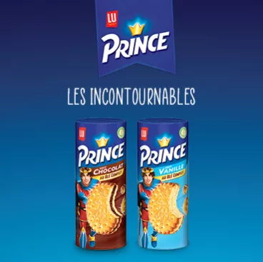
The packaging consists of two cylindrical containers, each featuring a colorful design. The left container is labeled 'Chocolat' and the right one 'Vanille', both showcasing a prominent image of the product. The containers have a smooth surface with a glossy finish, vibrant colors, and clear branding elements. The top of the packaging features a banner with the brand name 'Prince' in a bold font, along with a crown logo.

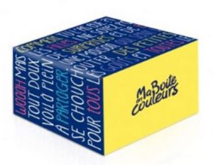
The packaging is a square-shaped box with a smooth, flat construction. It features a vibrant yellow base color with a multi-colored design that includes various text elements in bold fonts. The edges are clean and precise, indicative of a folding carton. The overall appearance is lightweight and suitable for retail display.

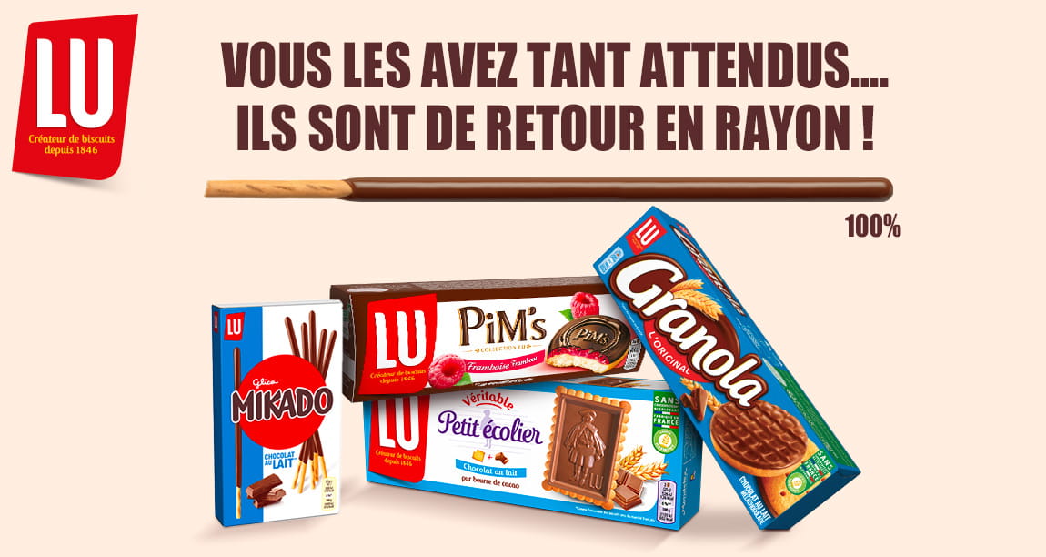
The image displays various retail cartons for snacks and biscuits. Each carton has a smooth, flat construction without visible fluted layers, indicating they are made of single-layer paperboard. The cartons are brightly colored, featuring a glossy finish with vibrant graphics and branding. The edges are clean and precise, typical of retail packaging. The products are arranged in a way that showcases their branding and product information.

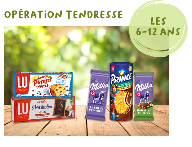
The image features several retail cartons, each with a smooth, flat construction typical of folding cartons. The boxes are brightly colored with appealing graphics aimed at children. The LU brand boxes are predominantly red and white, showcasing images of cookies and biscuits, while the Milka and Prince boxes are purple and blue, featuring chocolate products. Each box has clean edges and precise folds, indicating a well-constructed design suitable for retail display.

The packaging is a stand-up pouch made from a flexible material. It features a vibrant blue background with a glossy finish, showcasing images of chocolate-covered pretzels. The top of the pouch has a resealable zipper, allowing for easy access and storage. The front displays the product name 'Brezel Snax' in bold, white lettering, accompanied by a small logo of the brand 'Milka'. The overall shape is rectangular with a slight curve at the top, typical of snack bags.
About the Brand
Ma Vie en Couleurs is a Paris-based digital platform specializing in food products, recipe content, and interactive promotions. Their packaging strategy leverages established food brands, prioritizing retail-ready designs and strong visual differentiation.
The company's packaging portfolio features a diverse mix of flexible pouches, cylindrical containers, and folding cartons, primarily for snack foods and desserts. Packaging is tailored to maximize on-shelf visibility, often utilizing brand-aligned color schemes and graphics to engage a family-oriented consumer base. Integration of resealable features and multi-pack structures reflects a focus on both convenience and product freshness.
Key Differentiator: Ma Vie en Couleurs stands out for its integration of branded packaging from multiple major partners, emphasizing interactive consumer engagement through packaging design and digital content.
Design System
Visual Style
Typography is bold and legible, with playful sans-serif fonts tailored for family audiences. The color palette is dominated by bright, saturated hues—purples, blues, reds, and yellows—aligned with partner brand identities. Visuals are clean, approachable, and heavily product-focused.
Brand Identity
Logo usage is prominent, with consistent placement of partner and product logos. Iconography is minimal, centering on product imagery and simple, child-friendly graphics. Brand consistency is maintained via strict adherence to color codes and graphic standards across all packaging types.
Packaging Design
Material selection centers on recyclable folding cartons and flexible plastic pouches, with occasional use of rigid cylindrical containers. Structure prioritizes product protection, resealability, and efficient retail display. Design philosophy supports clear branding and consumer convenience.
User Experience
Packaging is structured to facilitate an intuitive customer journey—from shelf selection to home consumption. Resealable features and clear product visuals enhance usability, while branding and design elements foster emotional connection and repeat engagement.
Company Metrics
Business insights for Ma Vie en Couleurs based on available data
Market Positioning
Brand Values & Focus
Key Competitors
Target Market: French consumers interested in branded snack foods, family-oriented households, and online shoppers seeking culinary inspiration and value offers.
Packaging Assessment
Overall Grade
Visual appeal and presentation quality
Packaging durability and protection
Eco-friendliness and recyclable materials
Cost efficiency and value for money
Packaging assessment for Ma Vie en Couleurs based on industry standards and best practices
Frequently Asked Questions
What types of packaging does Ma Vie en Couleurs use for its food products?
Ma Vie en Couleurs primarily utilizes flexible pouches, cylindrical containers, and folding carton boxes, often co-branded with partner brands such as Milka and LU. These formats are selected for their strong retail presence and suitability for snack and dessert items.
How does Ma Vie en Couleurs ensure packaging aligns with partner brands?
Packaging is co-developed to reflect partner brand guidelines, using consistent color palettes, logos, and graphic styles. This approach ensures immediate brand recognition and a unified shelf appearance.
What sustainability practices are evident in Ma Vie en Couleurs’ packaging?
While the company uses recyclable paperboard for many cartons, the portfolio contains limited information on advanced eco-friendly materials or circular packaging initiatives.
Discover other Food & Drink companies
Explore more companies in the food & drink industry and their packaging strategies
PrepMyMeal
Food & Drink
PrepMyMeal is a food production company specializing in high-protein meal delivery services. They offer a variety of natural, nutritious meals designed for fitness enthusiasts and those seeking convenience in meal preparation.
Teegschwendner GmbH
Food & Drink
Teegschwendner GmbH is a specialty tea company based in Germany, offering a wide selection of high-quality teas and tea-related accessories. They focus on providing unique tea experiences through carefully sourced and curated products.
kerex - terre exotique
Food & Drink
Kerex - Terre Exotique specializes in the international trade of gourmet food and drink products, offering a unique selection of spices and culinary ingredients.