Luce Beauty packaging
Luce Beauty specializes in premium skincare and beauty products, leveraging personalized solutions for diverse skin concerns. The company employs sophisticated, branded packaging formats that emphasize both product protection and a luxurious customer experience.

Packaging Portfolio
Luce Beauty’s packaging portfolio prominently features rigid boxes for high-value devices, leveraging thick chipboard and book-style openings for structural integrity and a luxurious feel. Folding carton boxes, often with window cut-outs and custom inserts, are standard for creams, serums, and accessories. The use of matte and gloss finishes, combined with precise die-cutting, supports both shelf presence and product protection. Overall, the portfolio demonstrates a consistent focus on premium materials and tactile quality, with moderate adoption of eco-friendly practices.
The packaging is a rigid box with a sturdy construction, featuring a thick chipboard material. The box has a smooth, matte finish with a subtle sheen. The exterior is predominantly white with gold foil accents, including the brand name 'LUCE' and product details. The edges are clean and precise, indicating high-quality manufacturing. The box has a lift-off lid design, which adds to its premium appearance.

The packaging consists of a smooth, flat construction made from single-layer paperboard. The box features a clean, precise design with a matte finish. The front displays the product name 'LUCE 4T THERAPY WAND' in bold, modern typography, with a soft color palette of peach and cream. The box is rectangular with a top flap that folds down, and the edges are neatly finished. The overall form is lightweight and designed for retail display.

The packaging is a flat, rectangular folding carton with a smooth, single-layer paperboard construction. It features a clean, white exterior with a matte finish. The front displays a large cut-out window showcasing the product inside, which is a silky satin pillowcase. The edges are clean and precise, with well-defined folds. The top has a slight tuck tab closure, and the overall shape is rectangular, designed to hold the pillowcase securely while allowing visibility of the product.

The image displays a variety of cosmetic products packaged in smooth, flat carton boxes and containers. The boxes are predominantly white with clean edges and folds, indicative of folding cartons. The products are arranged aesthetically, showcasing their labels and branding. The overall presentation is neat and organized, with a light and airy feel due to the use of floral elements and soft colors.

The packaging features a sturdy, thick-walled construction typical of rigid boxes, with a premium feel. The exterior is predominantly white with a vibrant pink interior. The box opens like a book, revealing a pink insert that holds the product securely. The overall shape is rectangular, designed to accommodate the product and its accessories comfortably.
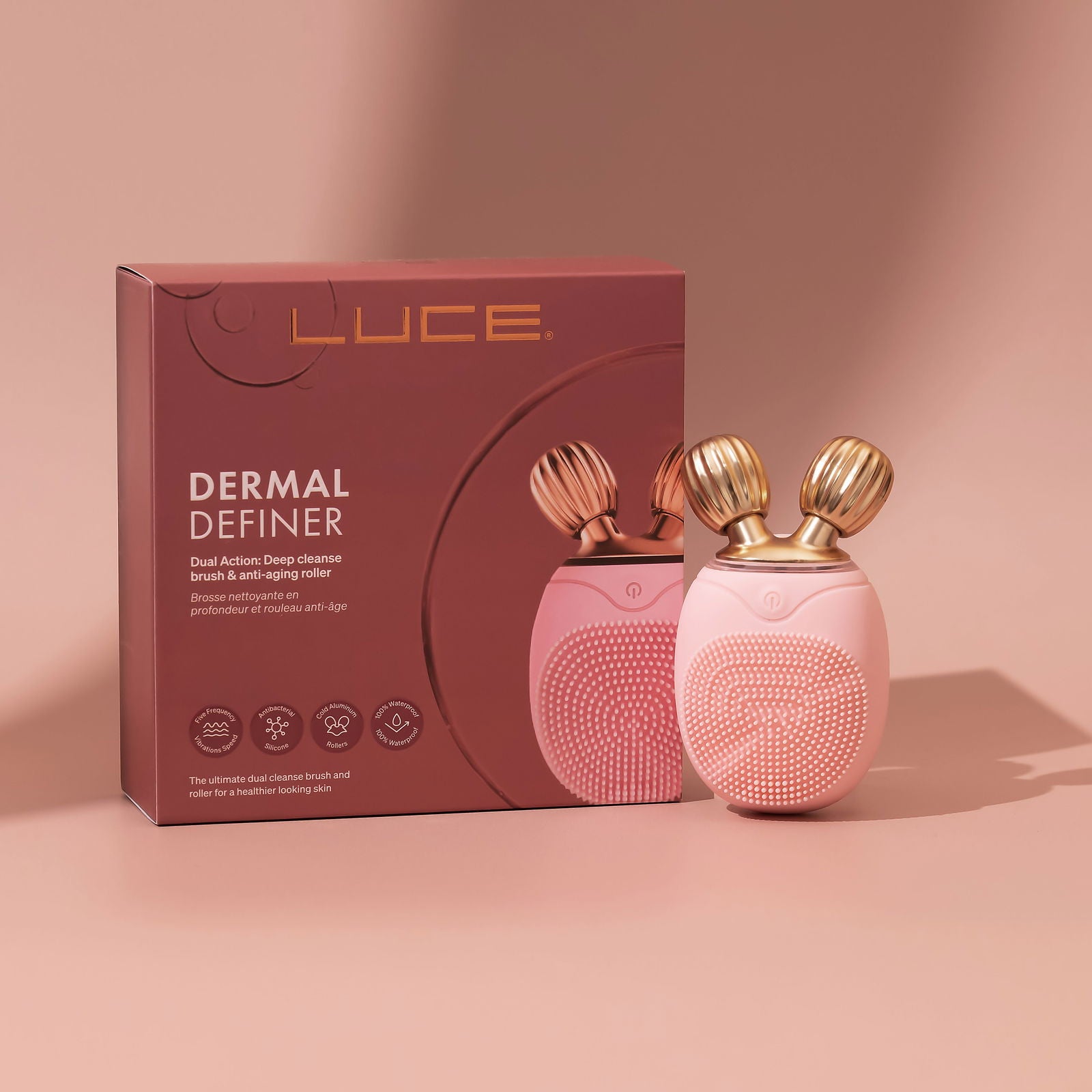
The packaging is a folding carton made of single-layer paperboard, featuring a smooth, flat construction. The box is predominantly a rich burgundy color with gold accents. The front displays an image of the product, a beauty device, along with its name 'DERMAL DEFINER' in a bold, modern font. The overall design is clean and precise, with sharp edges and folds. The box has a glossy finish, enhancing its visual appeal.
About the Brand
Luce Beauty operates in the beauty and skincare industry, focusing on D2C distribution of high-quality serums, creams, and beauty devices. Its packaging strategy is characterized by a blend of rigid and folding carton formats, with a clear emphasis on premium materials and visual appeal.
The brand’s packaging consistently features sturdy constructions such as rigid boxes for devices and luxury products, as well as folding cartons for creams and smaller items. Design elements incorporate minimalist color palettes, gold accents, and windowed cartons that showcase product contents. The structural approach prioritizes both aesthetics and product safety, aligning with expectations for premium beauty products. Visual coherence across the portfolio reinforces a strong, recognizable brand identity.
Key Differentiator: Luce Beauty differentiates itself through celebrity-endorsed branding, personalized product protocols, and a cohesive, high-end packaging system that enhances the perceived value of its offerings.
Design System
Visual Style
The visual design employs modern sans-serif typography, a core color palette of white, burgundy, gold, and peach, and minimalist layouts. The aesthetic is clean, elegant, and aligned with luxury beauty sector trends.
Brand Identity
Branding is reinforced through prominent logo placement, consistent use of the LUCE wordmark, and restrained iconography. Visual consistency is maintained across packaging types, ensuring strong shelf and digital recognition.
Packaging Design
Material choices include single-layer paperboard for folding cartons and thick rigid board for luxury boxes. Structural design emphasizes product security, unboxing theatre, and premium tactile experiences, with occasional use of window cut-outs to display product contents.
User Experience
Design supports the end-to-end customer journey by delivering a visually engaging and emotionally resonant unboxing, clear product information, and intuitive opening mechanics that reinforce the brand’s luxury positioning.
Company Metrics
Business insights for Luce Beauty based on available data
Market Positioning
Brand Values & Focus
Key Competitors
Target Market: Affluent, beauty-conscious consumers seeking high-quality skincare solutions with a focus on personalized routines and premium product experiences. Primary markets include Italy and broader European regions attracted to luxury beauty brands.
Packaging Assessment
Overall Grade
Visual appeal and presentation quality
Packaging durability and protection
Eco-friendliness and recyclable materials
Cost efficiency and value for money
Packaging assessment for Luce Beauty based on industry standards and best practices
Frequently Asked Questions
What types of packaging does Luce Beauty use for its products?
Luce Beauty utilizes a mix of rigid boxes for premium devices and luxury items, as well as folding cartons for skincare products and accessories. Packaging frequently features branded elements, gloss or matte finishes, and structural designs that protect contents while delivering a premium unboxing experience.
How sustainable is Luce Beauty's packaging approach?
While paperboard and rigid box constructions are generally recyclable, there is limited evidence of explicit sustainability initiatives or use of recycled materials. The focus remains on premium presentation and product safety, with moderate integration of eco-friendly practices.
How does Luce Beauty’s packaging support the brand’s market positioning?
Packaging reinforces Luce Beauty’s premium positioning through high-quality materials, elegant color palettes, and a consistent application of branding. This strategy is designed to elevate the unboxing experience and align with consumer expectations in the luxury beauty segment.
Discover other Beauty & Fitness companies
Explore more companies in the beauty & fitness industry and their packaging strategies
Pure Altitude
Beauty & Fitness
Pure Altitude specializes in high-quality beauty and skincare products that leverage the expertise of spa treatments to enhance daily routines. The brand offers a diverse range of products tailored for both facial and body care.
Owari
Beauty & Fitness
Owari specializes in 100% natural beauty and fitness products, designed to enhance health and wellness. The company proudly offers its products made in France, emphasizing quick delivery and customer support.
Big Moustache
Beauty & Fitness
Big Moustache specializes in shaving and grooming products tailored for men, providing a hassle-free subscription service for razor blades and skincare essentials.