Lilley's Cider packaging
Lilley's Cider is a UK-based premium cider producer specializing in a diverse portfolio of traditional and fruit-infused ciders. Their packaging strategy leverages custom-branded cartons and corrugated boxes, emphasizing both visual appeal and product protection for e-commerce and retail channels.
Packaging Portfolio
Lilley's Cider employs a combination of single-layer folding carton boxes and corrugated shipping containers for its cider products. Carton boxes are predominantly used for retail and gifting, featuring high-quality paperboard with glossy finishes and vivid graphics that reflect individual product identities. Corrugated boxes support larger-volume distribution, offering increased durability and protection during transit. Across all formats, the packaging integrates strong visual branding, including prominent logos, product names, and color schemes that facilitate differentiation and shelf impact. Material selection prioritizes recyclability and print quality, supporting both sustainability goals and marketing effectiveness.
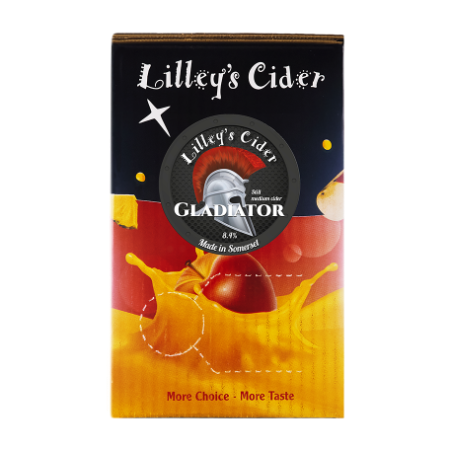
The packaging is a folding carton made of single-layer paperboard, featuring a smooth, flat construction. The exterior is predominantly black and orange, with a glossy finish that enhances visual appeal. The front displays a circular label with a silver cap design, indicating the product name 'GLADIATOR' and alcohol content. The edges are clean and precise, with well-defined folds. The overall shape is rectangular, designed to hold multiple cider bottles.
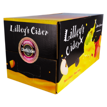
The packaging is a corrugated box with a visible fluted inner layer, characterized by its sturdy construction suitable for shipping. The box features a predominantly black exterior with vibrant graphics depicting various fruits associated with cider. The edges are slightly rounded, and the box has a tuck flap closure at the front.
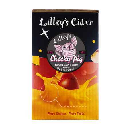
The packaging is a folding carton made of a single layer of paperboard. It features a smooth, flat construction with clean edges and precise folds. The exterior has a vibrant, colorful design with a glossy finish, showcasing images of apples and a pig, which aligns with the product branding. The top of the carton has a tuck flap closure, ensuring the contents are securely held inside.
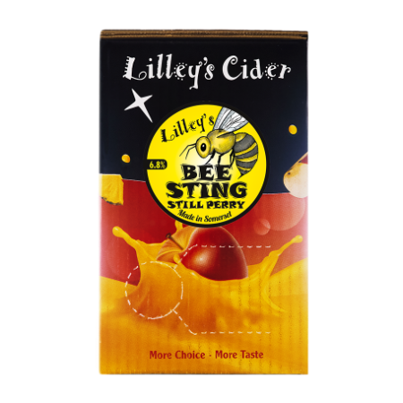
The packaging is a folding carton made of single-layer paperboard, featuring a smooth, flat construction without any visible fluted layers. The exterior is predominantly black with vibrant colors, including yellow and red, depicting images of apples and a bee. The edges are clean and precise, indicating a well-constructed box. The front displays a circular label with the product name 'BEE STING' prominently featured, alongside the brand name 'Lilley's Cider'. The overall appearance is eye-catching and designed for retail display.
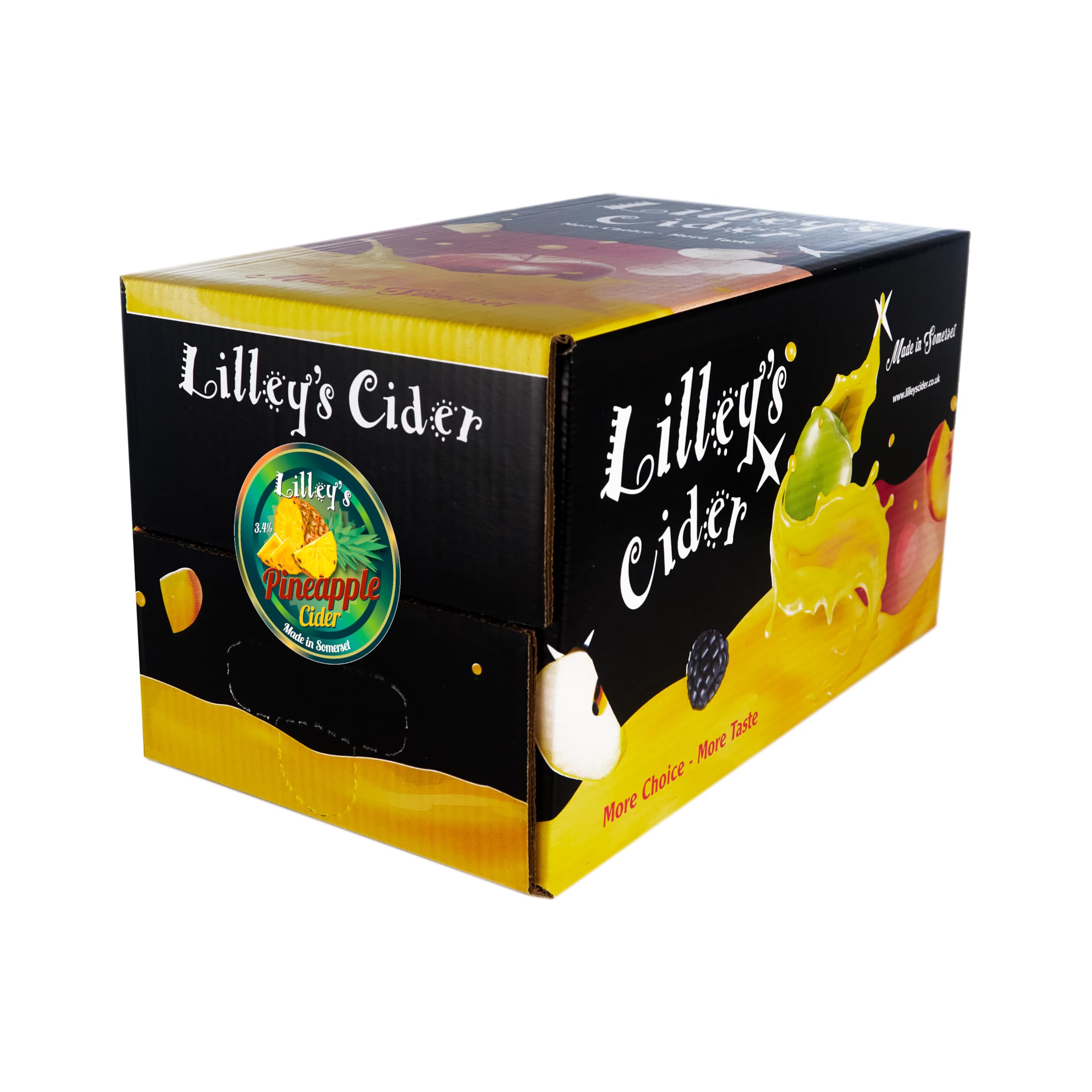
The packaging is a folding carton box made from a single layer of paperboard. It features a smooth, flat construction with clean edges and folds. The exterior is predominantly black with vibrant graphics depicting fruits, specifically a pineapple, and a colorful splash design. The box has a glossy finish that enhances the visual appeal. The front displays the brand name 'Lilley's Cider' prominently in white, with a circular logo featuring the product name and fruit imagery. The sides of the box have additional graphics and text, indicating product variety and marketing messages.
About the Brand
Lilley's Cider manufactures a wide range of alcoholic ciders, utilizing locally sourced apples and modern production techniques. The brand is recognized for its distinctive flavor profiles and commitment to delivering high-quality beverages directly to customers.
The company operates on a direct-to-consumer e-commerce model, enabling efficient distribution and customer engagement. Lilley's Cider's packaging approach integrates custom folding carton boxes and robust corrugated shipping containers, tailored for both retail display and logistical demands. Their visual design and messaging reinforce the brand's emphasis on tradition, quality, and sustainability, while supporting a diverse product mix that appeals to varying consumer palates.
Key Differentiator: Lilley's Cider distinguishes itself through unique flavor innovation, strong brand storytelling, and a packaging system that balances visual impact, sustainability, and shipping resilience.
Design System
Visual Style
The visual design utilizes bold, sans-serif typography and a vibrant color palette including black, orange, yellow, and various fruit-inspired hues. Aesthetic choices favor high contrast and playful illustrations, delivering strong shelf presence and product differentiation.
Brand Identity
Brand logos are consistently prominent, often placed within circular badges or featured alongside playful iconography such as fruit and animals. Visual consistency is maintained through recurring use of color schemes, logo placement, and thematic imagery across all product lines.
Packaging Design
Material choices focus on recyclable paperboard for folding cartons and corrugated fiberboard for shipping, with an emphasis on sturdy construction and surface print quality. Structural design is retail-oriented, utilizing clean folds, precise closures, and ergonomic sizing to optimize both presentation and protection.
User Experience
The packaging is designed for engaging unboxing, combining vibrant visuals and tactile finishes to enhance the emotional impact. Clear product information and secure closures support a positive customer experience, while design consistency reinforces brand recall throughout the purchase journey.
Company Metrics
Business insights for Lilley's Cider based on available data
Market Positioning
Brand Values & Focus
Key Competitors
Target Market: Adult cider consumers in the UK and select international markets, with a focus on both traditional cider drinkers and experimental consumers seeking unique flavors via e-commerce and retail channels.
Packaging Assessment
Overall Grade
Visual appeal and presentation quality
Packaging durability and protection
Eco-friendliness and recyclable materials
Cost efficiency and value for money
Packaging assessment for Lilley's Cider based on industry standards and best practices
Frequently Asked Questions
What types of packaging does Lilley's Cider use for their products?
Lilley's Cider utilizes custom-printed folding carton boxes for retail presentation and corrugated boxes for bulk shipping, both featuring strong brand elements and product differentiation.
How does Lilley's Cider address sustainability in its packaging?
The company incorporates recyclable paperboard and corrugated materials, aligning with stated commitments to environmentally friendly practices, though further details on renewable sourcing or reduced material use are not publicly disclosed.
What is the primary function of Lilley's Cider’s packaging strategy?
Their packaging is designed to enhance shelf appeal, protect products during transit, and reinforce brand recognition across both direct-to-consumer and retail channels.
Discover other Food & Drink companies
Explore more companies in the food & drink industry and their packaging strategies
PrepMyMeal
Food & Drink
PrepMyMeal is a food production company specializing in high-protein meal delivery services. They offer a variety of natural, nutritious meals designed for fitness enthusiasts and those seeking convenience in meal preparation.
kerex - terre exotique
Food & Drink
Kerex - Terre Exotique specializes in the international trade of gourmet food and drink products, offering a unique selection of spices and culinary ingredients.
ruf lebensmittelwerk kg
Food & Drink
RUF Lebensmittelwerk KG is a German food production company specializing in a variety of baking mixes and drink products. Founded in 1920, the company is known for its high-quality ingredients and innovative food solutions.