Laori Drinks packaging
Laori Drinks produces adult-oriented non-alcoholic beverages, utilizing a direct-to-consumer model with a strong emphasis on premium, modern packaging. Their packaging strategy leverages minimalist carton boxes and glass bottles to reinforce a sophisticated brand image and elevate the consumer experience.
Packaging Portfolio
Laori Drinks employs a packaging portfolio centered on single-layer paperboard carton boxes with matte or glossy finishes and clear glass bottles sealed with cork stoppers. The cartons are designed for both retail shelf appeal and e-commerce durability, featuring minimalistic graphics and precise structural folds. Packaging consistently uses neutral base colors with bold accent bands and clear typography, reinforcing the brand’s modern and sophisticated positioning. The material selection prioritizes product protection and display, though advanced sustainability features are currently limited to recyclable substrates.
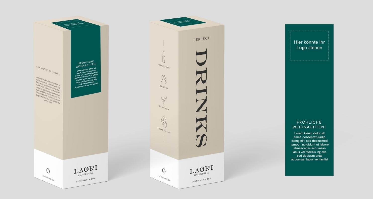
The packaging is a tall, rectangular folding carton with a smooth, flat construction. It features a light beige exterior with a matte finish. The front displays the word 'DRINKS' in large, bold black serif font, while the brand name 'LAORI' is positioned prominently at the bottom in a smaller font. The sides have minimal graphics, with simple icons representing product features. The top has a teal band with the text 'PERFECT' in white, creating a striking contrast. The edges are clean and precise, indicating high-quality manufacturing.
The packaging consists of a smooth, flat construction without fluted layers, indicative of a carton box. It features clean, precise edges and folds, with a glossy finish that enhances its visual appeal. The box is predominantly white with a subtle sheen, suggesting a premium quality. The design includes a prominent brand name and product information printed in a contrasting color, making it visually striking.
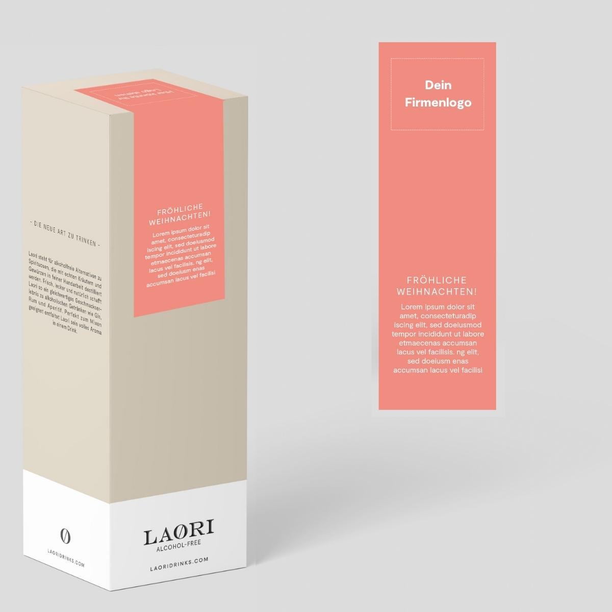
The packaging features a smooth, flat construction typical of folding cartons. It is primarily white with a pastel-colored panel that includes a logo and festive text. The edges are clean and precise, indicating a well-constructed design. The carton has a rectangular shape with a tall, slender profile, suitable for retail display.
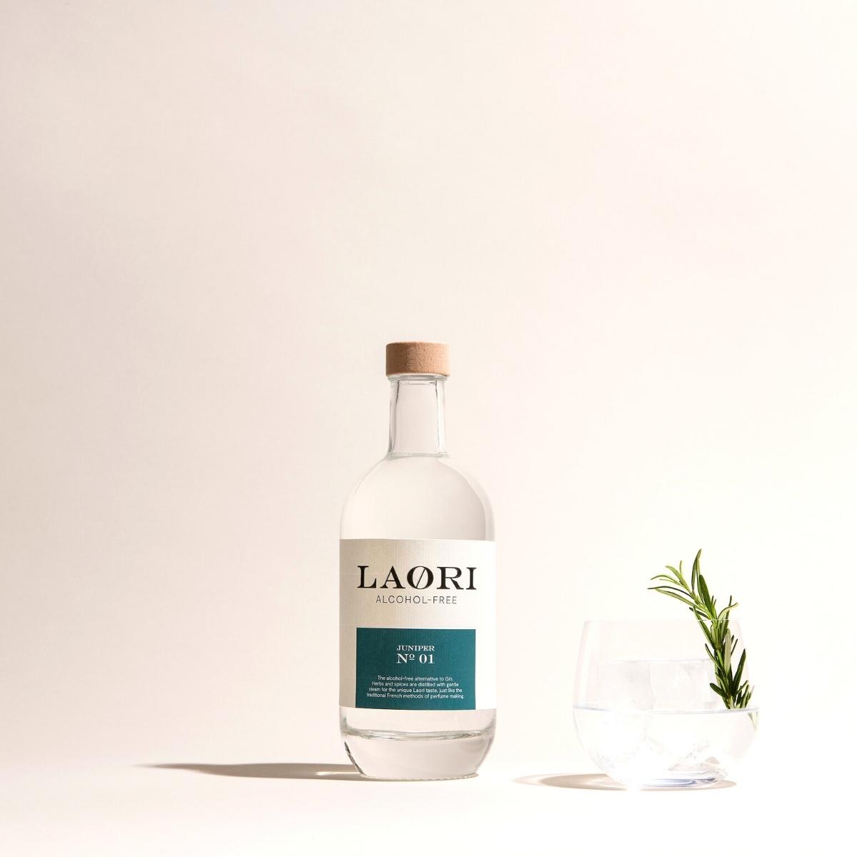
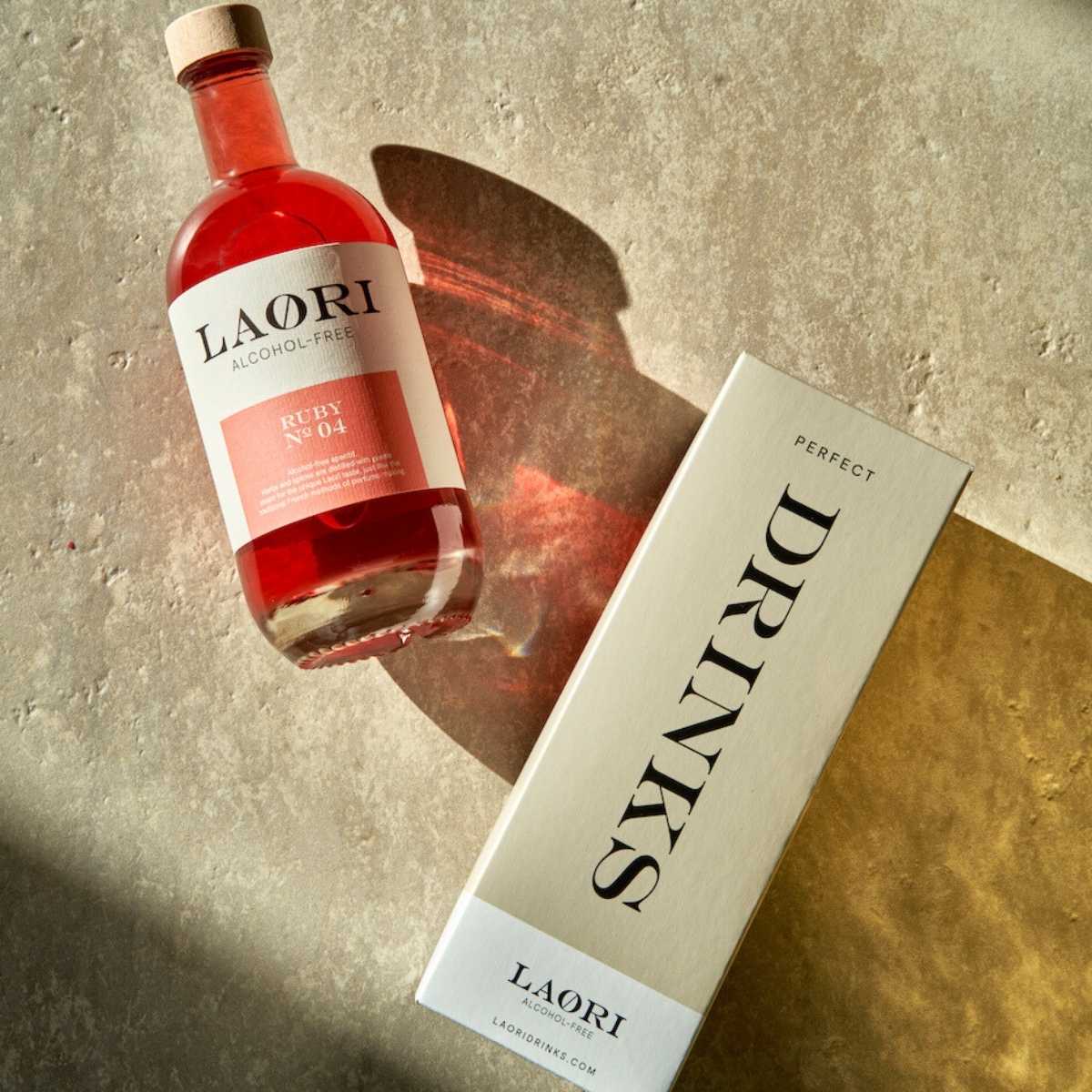
The image features a clear glass bottle with a cork stopper, containing a liquid. The bottle has a cylindrical shape with a slightly tapered neck. A label is affixed to the front of the bottle, displaying the brand name 'LAORI' prominently in a bold font. Below the brand name, 'ALCOHOL-FREE' is printed in smaller text, and 'N° 01' is featured at the bottom of the label. The label has a teal background with white text, creating a clean and modern aesthetic. The bottle is accompanied by a glass containing ice and a sprig of rosemary, suggesting a refreshing drink.
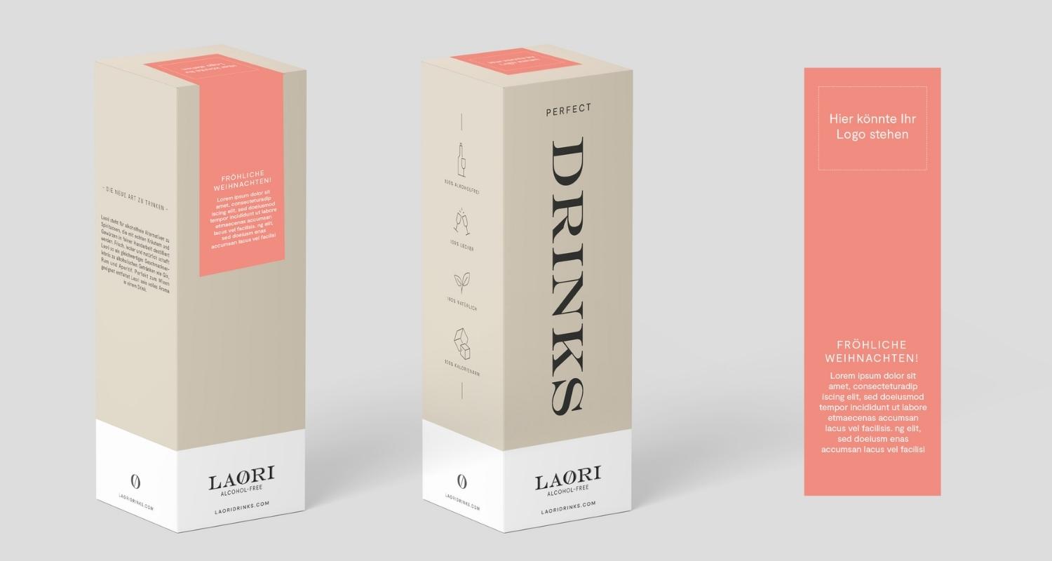
The packaging is a tall, rectangular carton with a smooth, flat construction. It features a beige exterior with a matte finish, providing a clean and modern appearance. The front panel prominently displays the word 'DRINKS' in large, bold black font, while the brand name 'LAORI' is located at the bottom in a smaller size. The top section has a coral-colored band that adds a pop of color and may contain additional branding or product information. The edges are clean and precise, with no visible fluted layers, indicating it is made from single-layer paperboard. The carton is designed for retail display, suggesting it is lightweight and easy to handle.
About the Brand
Laori Drinks is a Berlin-based company specializing in high-quality non-alcoholic beverages, targeting adults who seek sophisticated alternatives to traditional alcoholic drinks. Their packaging approach prioritizes modern aesthetics, consistent branding, and functional design to support both retail display and e-commerce fulfillment.
Founded in 2019, Laori Drinks addresses a growing consumer demand for adult-focused, alcohol-free options by delivering products that mimic the complexity and experience of classic spirits and aperitifs. The company's packaging solutions are carefully selected to protect product integrity during logistics while ensuring a memorable unboxing experience that aligns with the brand’s premium positioning. With a small team and strong online presence, Laori leverages packaging as a core element of its brand strategy.
Key Differentiator: Laori Drinks differentiates itself through minimalist, premium packaging that balances visual impact, structural protection, and consistent brand identity in the non-alcoholic beverage sector.
Design System
Visual Style
Modern, minimalist typography with bold sans-serif and serif fonts; color palette includes beige, white, black, coral, and teal accents. The overall aesthetic emphasizes clean lines, flat backgrounds, and strategic color blocking.
Brand Identity
Consistent use of the LAORI logo, large product descriptors, and accent color bands. Iconography is minimal and functional, with clear hierarchy and spacing to support legibility and shelf recognition.
Packaging Design
Carton boxes and glass bottles are the primary formats. Material choices focus on single-layer paperboard and clear glass for a premium feel, with a structural emphasis on clean, precise edges and straightforward opening mechanisms. Design philosophy favors a balance between visual impact and practical protection.
User Experience
Packaging is designed to create a strong first impression through visual simplicity and tactile quality, supporting a premium unboxing experience. The structure and labeling provide intuitive cues for use, while the overall design helps reinforce brand trust and product quality throughout the customer journey.
Company Metrics
Business insights for Laori Drinks based on available data
Market Positioning
Brand Values & Focus
Key Competitors
Target Market: Adults seeking premium, alcohol-free beverage alternatives; urban, health-conscious consumers; e-commerce and specialty retail shoppers in Tier I markets.
Packaging Assessment
Overall Grade
Visual appeal and presentation quality
Packaging durability and protection
Eco-friendliness and recyclable materials
Cost efficiency and value for money
Packaging assessment for Laori Drinks based on industry standards and best practices
Frequently Asked Questions
What types of packaging does Laori Drinks use for their products?
Laori Drinks primarily utilizes single-layer carton boxes with matte or glossy finishes and clear glass bottles sealed with cork stoppers. Their packaging emphasizes modern, minimalist design and is optimized for both retail and direct-to-consumer shipping.
How does Laori Drinks' packaging reinforce their brand identity?
The packaging features prominent brand elements such as the LAORI logo, bold typography, and a restrained color palette. Consistent use of these elements across cartons and bottles ensures strong brand recognition and a cohesive consumer experience.
Is sustainability considered in Laori Drinks’ packaging choices?
Laori Drinks uses recyclable materials such as glass and paperboard for most packaging components. However, there is limited public information on advanced sustainability measures like compostable materials or carbon-neutral production.
Discover other Food & Drink companies
Explore more companies in the food & drink industry and their packaging strategies
Terres de Café
Food & Drink
Terres de Café is a specialty coffee retailer based in Paris, France, known for its commitment to sustainability and high-quality coffee sourcing.
PrepMyMeal
Food & Drink
PrepMyMeal is a food production company specializing in high-protein meal delivery services. They offer a variety of natural, nutritious meals designed for fitness enthusiasts and those seeking convenience in meal preparation.
kerex - terre exotique
Food & Drink
Kerex - Terre Exotique specializes in the international trade of gourmet food and drink products, offering a unique selection of spices and culinary ingredients.