La Canopée packaging
La Canopée is an online beauty and skincare retailer specializing in nature-inspired formulations and a diverse catalog of creams, cleansers, and serums. Their packaging strategy centers on visually distinctive, brand-forward solutions designed to enhance both consumer experience and product protection.
Packaging Portfolio
La Canopée utilizes a multi-material packaging portfolio including rigid boxes for premium gift sets, single-layer paperboard cartons for individual skincare products, and flexible pouches with pump dispensers for liquid formulas. Each solution is engineered for both protective performance and retail visibility, with a focus on clean, precise construction and high-quality printing. The brand favors white bases with botanical illustrations and matte finishes, balancing tactile appeal with practical product protection. While the use of rigid and flexible formats enhances perceived value, it also introduces complexity in recycling and cost structures.

The packaging consists of a rigid box with a premium appearance, featuring a thick, sturdy construction. The box is primarily white with a decorative design on the front, showcasing a colorful illustration of a bird. The edges are clean and precise, indicating high-quality manufacturing. The box is designed to hold a set of cosmetic products, which are likely secured inside a fabric pouch.

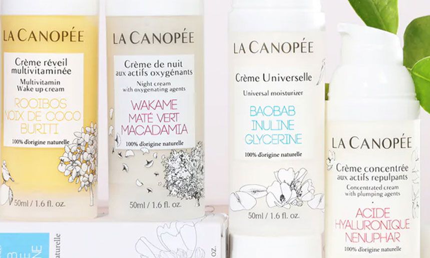
The packaging consists of several stand-up pouches made from a flexible material, likely a composite of plastic and possibly foil. Each pouch features a pump dispenser at the top, allowing for easy dispensing of the product inside. The pouches are designed to stand upright, showcasing their contents. The surface has a matte finish with floral graphics and product information printed on the front. The overall shape is rectangular with rounded edges, and the pouches are slightly transparent, allowing visibility of the product inside.

The packaging consists of a soft, padded pouch that holds multiple cosmetic products. It features a smooth, fabric-like exterior with a subtle texture. The front displays a large, colorful graphic of a squirrel, along with the brand name 'LA CANOPÉE' in bold letters. The overall shape is rectangular with rounded edges, and it appears to be designed for retail display. The interior is likely lined to protect the products.

The packaging consists of a smooth, flat construction with clean edges and folds, indicative of a folding carton. The box is predominantly white with a glossy finish, featuring vibrant red accents. The front displays product information in a clear, modern font, while the sides contain additional details about the product's benefits. The overall design is sleek and professional, suitable for retail display.
The packaging consists of smooth, flat construction without any visible fluted layers, indicating it is made from single-layer paperboard. The boxes are primarily white with colorful floral graphics and product information printed on them. Each box has clean, precise edges and folds, typical of retail packaging. The overall design is elegant and minimalistic, showcasing the product details prominently.

The packaging consists of a flat, smooth, single-layer paperboard box that houses cosmetic products. The box features a colorful design with a prominent logo and product information. The edges are clean and precise, indicative of high-quality folding carton construction. The overall appearance is light and retail-friendly, suitable for display on shelves.
About the Brand
La Canopée operates in the beauty and skincare sector, delivering products with a strong emphasis on natural ingredients and customer loyalty. The brand leverages a multi-format packaging portfolio that blends functional protection with high-impact branding.
The company’s approach combines rigid boxes, flexible pouches, and retail cartons, each tailored for specific product lines. Branding is integrated at every stage, ensuring visual consistency and reinforcing their natural, botanical ethos. Their packaging choices suggest a strategy focused on balancing shelf appeal, logistics safety, and the expectations of eco-conscious consumers in a competitive market.
Key Differentiator: Distinctive integration of natural-themed graphics and consistent brand visibility across a diverse range of packaging formats.
Design System
Visual Style
The visual approach employs modern sans-serif typography, a predominantly white background with botanical and fauna illustrations, and accent colors reflecting natural themes (greens, soft reds, and earthy tones). The style is clean, minimal, and accessible.
Brand Identity
Consistent use of the 'LA CANOPÉE' logo, prominent placement of product names, and integration of nature-inspired icons such as squirrels and birds. Branding is applied uniformly across all packaging formats, ensuring immediate recognition and coherence.
Packaging Design
Material choices prioritize high-quality paperboard for cartons, sturdy rigid boxes for sets, and flexible composite pouches for liquids. The structural design emphasizes durability, ease of use (such as pump dispensers), and shelf appeal, with a preference for clean edges and minimalistic forms.
User Experience
Packaging is designed to reinforce brand values at every touchpoint, from initial unboxing to daily use. The combination of tactile finishes, vivid graphics, and ergonomic formats aims to create a memorable and positive interaction that supports customer loyalty and repeat purchases.
Company Metrics
Business insights for La Canopée based on available data
Market Positioning
Brand Values & Focus
Key Competitors
Target Market: Eco-conscious beauty consumers seeking premium skincare solutions with an emphasis on natural ingredients and effective formulations.
Packaging Assessment
Overall Grade
Visual appeal and presentation quality
Packaging durability and protection
Eco-friendliness and recyclable materials
Cost efficiency and value for money
Packaging assessment for La Canopée based on industry standards and best practices
Frequently Asked Questions
What types of packaging does La Canopée use for its products?
La Canopée employs a combination of rigid boxes, flexible stand-up pouches with dispensers, and folding carton boxes. These packaging types are selected based on product protection, retail presentation, and branding requirements.
How does La Canopée’s packaging contribute to the customer experience?
The packaging is designed to deliver a visually appealing unboxing experience with vibrant graphics and tactile materials, aiming to reinforce the brand’s natural and premium positioning while ensuring product integrity.
Does La Canopée use sustainable packaging materials?
While their packaging includes recyclable paperboard and efforts towards eco-friendly materials, the use of composite flexible packaging and rigid boxes suggests a moderate level of sustainability. The brand’s focus on natural imagery aligns with growing consumer demand for environmentally responsible solutions.
Discover other Beauty & Fitness companies
Explore more companies in the beauty & fitness industry and their packaging strategies
Big Moustache
Beauty & Fitness
Big Moustache specializes in shaving and grooming products tailored for men, providing a hassle-free subscription service for razor blades and skincare essentials.
Institut Karité Paris
Beauty & Fitness
Institut Karité Paris specializes in luxury beauty products made with natural Shea Butter, offering a wide range of skincare and body care solutions. The brand combines Parisian heritage with a commitment to quality and creativity in its offerings.
Pure Altitude
Beauty & Fitness
Pure Altitude specializes in high-quality beauty and skincare products that leverage the expertise of spa treatments to enhance daily routines. The brand offers a diverse range of products tailored for both facial and body care.