Kloster Kitchen packaging
Kloster Kitchen specializes in health-focused beverages, leveraging traditional recipes and premium natural ingredients. Their packaging strategy centers on sustainability, visual simplicity, and functional carton-based formats tailored for both retail and direct-to-consumer channels.
Packaging Portfolio
Kloster Kitchen’s packaging portfolio is dominated by single-layer paperboard carton boxes and sturdy corrugated cardboard structures, optimized for both retail display and secure shipping. The use of kraft finishes and die-cut windows enhances product visibility and aligns with sustainability objectives. Packaging formats are tailored to accommodate multi-pack beverage shots, glass bottles, and seasonal offerings, leveraging modular inserts for product stability and shelf-ready presentation. Branding is consistently integrated across all formats, maintaining a unified and recognizable presence in the health beverage market.
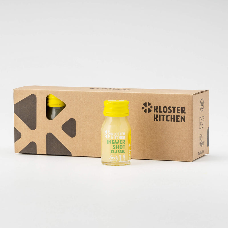
The packaging is a flat, rectangular carton box designed to hold multiple beverage shots. It features a smooth, single-layer paperboard construction with clean, precise edges and folds. The exterior is predominantly kraft brown, with a cut-out window on one side that allows visibility of the product inside. The box has a minimalistic design with a modern aesthetic.

The packaging is a flat, rectangular box made of single-layer paperboard. It features a smooth, kraft-colored exterior with a matte finish. The edges are clean and precise, indicating a well-constructed folding carton. The box has a printed design that includes a large black graphic element and the brand name 'KLOSTER KITCHEN' in a bold, modern font. The overall appearance is lightweight and suitable for retail display.

The packaging consists of a flat, smooth construction with clean edges and folds, made of single-layer paperboard. It is designed to hold three glass bottles securely, with cutouts for the bottles to fit snugly. The exterior features a kraft brown color, typical of paperboard, with a matte finish. The front side has a printed logo and product information, while the sides are plain.

The packaging is a folding carton box made of single-layer paperboard, featuring a smooth, flat construction without any visible fluted layers. The box is primarily kraft brown in color with a large heart graphic printed on one side. The edges are clean and precise, indicating a well-constructed fold. The box is designed to hold multiple small bottles and a glass, suggesting it is intended for retail display. There are no visible signs of wear or damage.
The packaging is a corrugated box with a sturdy construction, featuring visible fluted layers when viewed from the side. The box is primarily brown in color, typical of kraft cardboard, and shows signs of wear from handling. The interior is organized to hold multiple bottles securely, with a partition separating the items. The box has a clean, functional design with a top flap that folds down to close.

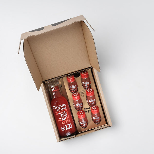
The packaging consists of a flat, smooth, single-layer paperboard box with clean edges and precise folds. The box is primarily brown with a kraft finish, featuring a simple, modern design. It contains several small glass bottles of juice shots arranged neatly, with a larger green bottle prominently displayed. The box has a cut-out window shape on the front, allowing visibility of the products inside. The overall appearance is clean and organized, suitable for retail display.
About the Brand
Kloster Kitchen operates at the intersection of traditional culinary wisdom and modern health trends, producing a range of ginger shots, smoothies, and dietary supplements. Their packaging approach is rooted in minimalism and sustainability, with a strong focus on brand visibility and consumer trust.
The company emphasizes clean design, recyclable carton materials, and user-friendly structures that facilitate both product protection and shelf appeal. Their packaging supports efficient logistics, reduces environmental impact, and enhances customer engagement through clear branding and organized presentation. Kloster Kitchen’s portfolio reflects the demands of health-conscious consumers seeking transparency and convenience.
Key Differentiator: The use of whole ginger pieces and natural, high-quality ingredients, combined with visually consistent, eco-conscious packaging, distinguishes Kloster Kitchen within the competitive health beverage segment.
Design System
Visual Style
The design system employs modern sans-serif typography, a neutral kraft brown palette complemented by minimal accent colors, and a restrained, uncluttered aesthetic. Visual hierarchy is established through bold product titles and simplified icons.
Brand Identity
Logo placement is prominent and consistent, with the Kloster Kitchen wordmark and emblem appearing on all packaging. Iconography is minimal, supporting a clean and transparent brand look. Design repetition across SKUs reinforces brand recognition.
Packaging Design
Material selection favors recyclable paperboard and corrugated cardboard, prioritizing sustainability and product protection. Structural designs use precision folds, window cut-outs, and modular partitions to balance visual appeal with logistical efficiency.
User Experience
Packaging is designed to facilitate an intuitive unboxing process, provide clear product information, and support both gifting occasions and daily use. The visible arrangement of products and transparent windows enhance consumer confidence and reinforce the brand’s health-driven narrative.
Company Metrics
Business insights for Kloster Kitchen based on available data
Market Positioning
Brand Values & Focus
Key Competitors
Target Market: Health-conscious consumers seeking premium, natural beverages and supplements, particularly within the D2C and specialty retail sectors in Germany and broader EU markets.
Packaging Assessment
Overall Grade
Visual appeal and presentation quality
Packaging durability and protection
Eco-friendliness and recyclable materials
Cost efficiency and value for money
Packaging assessment for Kloster Kitchen based on industry standards and best practices
Frequently Asked Questions
What materials does Kloster Kitchen use for its beverage packaging?
Kloster Kitchen primarily utilizes single-layer paperboard carton boxes and corrugated cardboard for both retail and shipping, focusing on recyclability and structural integrity.
How does the packaging design align with Kloster Kitchen’s brand values?
The packaging features minimalist graphics, kraft brown colorways, and prominent logo placement, reinforcing the brand’s emphasis on natural ingredients, quality, and sustainability.
Is Kloster Kitchen’s packaging optimized for shipping and retail presentation?
Yes, their packaging solutions are engineered for both logistics safety and visual appeal, with durable corrugated boxes for shipping and sleek, windowed cartons for retail display.
Discover other Food & Drink companies
Explore more companies in the food & drink industry and their packaging strategies
kerex - terre exotique
Food & Drink
Kerex - Terre Exotique specializes in the international trade of gourmet food and drink products, offering a unique selection of spices and culinary ingredients.
PrepMyMeal
Food & Drink
PrepMyMeal is a food production company specializing in high-protein meal delivery services. They offer a variety of natural, nutritious meals designed for fitness enthusiasts and those seeking convenience in meal preparation.
Terres de Café
Food & Drink
Terres de Café is a specialty coffee retailer based in Paris, France, known for its commitment to sustainability and high-quality coffee sourcing.