Just Spices packaging
Just Spices specializes in direct-to-consumer spice blends, leveraging vibrant, highly branded packaging to reinforce product quality and natural ingredient messaging. Their packaging approach prioritizes visual differentiation, retail readiness, and a consistent customer experience across their product lines.
Packaging Portfolio
Just Spices employs cylindrical metal cans and tubes for most spice blends, offering robust protection and stackability while maximizing shelf impact through vibrant, matte, or glossy printed labels. Folding carton boxes are used for gift sets and multi-pack assortments, utilizing rigid paperboard for structure and high-quality print finishes for branding. Packaging emphasizes single-material recyclability (metal and paperboard), but lacks clear evidence of advanced sustainable inputs like compostable films or post-consumer content. This portfolio balances branding, product protection, and e-commerce suitability, aligning with industry standards for premium food and beverage packaging.
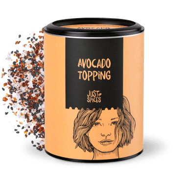
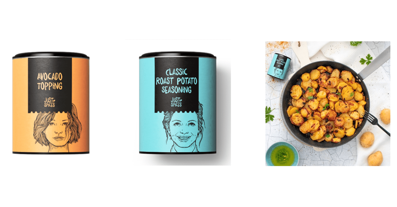
The packaging is a cylindrical metal container with a black lid and a label wrapped around its body. The label features an illustration of a woman with a textured hairstyle, and the product name 'AVOCADO TOPPING' is prominently displayed in bold font. The background color of the label is a warm orange, contrasting with the black text. The container appears to be designed for retail display, with a clean and modern aesthetic.

The packaging is a folding carton box, primarily made of smooth, flat paperboard. It features a bright yellow exterior with a glossy finish. The box opens from the top and contains multiple smaller packets of seasoning, each with distinct colors and illustrations. The interior is designed to hold these packets securely, with a clean and precise assembly. The edges are sharp and well-defined, typical of retail packaging.
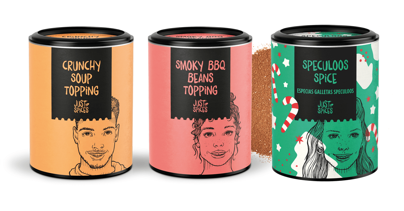
The packaging consists of three cylindrical containers, each with a distinct color scheme and design. The containers have a matte finish with vibrant colors: orange for 'Crunchy Soup Topping', pink for 'Smoky BBQ Beans', and green for 'Speculoos Spice'. Each container features illustrations of faces that correspond to the flavor, along with bold text indicating the product name. The lids are black and appear to have a smooth, possibly plastic finish. The overall design is playful and eye-catching, suitable for retail display.
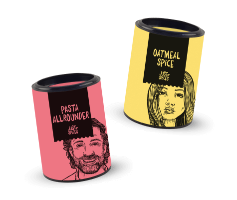
The packaging consists of cylindrical containers with a smooth surface and a glossy finish. Each container features a distinct color scheme, with one being pink and the other yellow. The containers have a black band around the top that likely serves as a lid. The graphics include illustrations of a man and a woman, along with product names and the brand name 'Just Spices'. The overall design is vibrant and eye-catching, suitable for retail display.
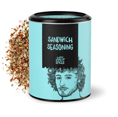
The packaging is a cylindrical container with a smooth surface and a metal lid. The container features a vibrant turquoise background with a black label prominently displaying the product name 'SANDWICH SEASONING' in bold white lettering. An illustration of a person with curly hair is also present on the label, adding a playful touch. The overall design is modern and eye-catching, suitable for retail display.
The packaging consists of cylindrical metal containers with a smooth surface finish. Each container features a colorful label with illustrations and product names. The lids are black and fit snugly on the top, providing a secure closure. The containers are designed for easy stacking and display.
About the Brand
Just Spices is a UK-based food and drink company focused on natural spice mixes and seasonings, offering a diverse range of blends for various cuisines through a direct-to-consumer model. Their packaging strategy deploys cylindrical containers and carton boxes, each designed for optimal shelf impact and clear brand recognition.
The company's packaging consistently utilizes cylindrical metal cans with matte or glossy finishes, paired with folding carton boxes for multipack offerings. Emphasis is placed on bold color blocking, illustrative portraiture, and clear typography to create a distinctive visual identity. Packaging formats support both product protection and brand storytelling, targeting health-conscious and culinary-engaged consumers. The packaging design also accommodates retail display and e-commerce fulfillment, balancing protection, unboxing experience, and sustainability messaging.
Key Differentiator: Distinctive illustrative branding combined with functional, retail-ready cylindrical containers sets Just Spices apart in a competitive spice market, supporting both strong shelf presence and a memorable unboxing experience.
Design System
Visual Style
Typography is bold, sans-serif, and highly legible; color palette includes saturated pastels and brights (pinks, yellows, turquoise, orange, green), with strong contrast for readability. Illustration-driven, modern, and playful aesthetic dominates.
Brand Identity
Logo is consistently applied in black or white for contrast, with large-format illustrative portraiture reinforcing brand personality. Iconography is minimal, focusing on hand-drawn faces and clear, product-specific identifiers. Visual consistency is maintained across SKUs through uniform label structures and color coding.
Packaging Design
Primary materials are recyclable metal (for cans/tubes) and coated paperboard (for cartons), chosen for barrier properties and print quality. Structural design is straightforward—cylinders for spices, rigid cartons for sets—prioritizing protection, ease of stacking, and efficient fulfillment.
User Experience
Design supports a positive customer journey by delivering high-impact unboxing, clear product navigation, and memorable branding. Packaging serves both as a functional container and as a storytelling tool, encouraging user engagement and repeat purchase through visual consistency and information clarity.
Company Metrics
Business insights for Just Spices based on available data
Market Positioning
Brand Values & Focus
Key Competitors
Target Market: Health-conscious consumers, home cooks, and culinary enthusiasts seeking natural ingredient blends and recipe inspiration within the UK and broader European e-commerce markets.
Packaging Assessment
Overall Grade
Visual appeal and presentation quality
Packaging durability and protection
Eco-friendliness and recyclable materials
Cost efficiency and value for money
Packaging assessment for Just Spices based on industry standards and best practices
Frequently Asked Questions
What types of packaging formats does Just Spices use?
Just Spices primarily utilizes cylindrical metal cans and tubes for individual spice blends, along with folding carton boxes for multipack sets. These formats enhance visual differentiation and provide durability during shipping.
How sustainable is Just Spices' packaging?
Just Spices’ packaging employs recyclable metals and paperboard, but there is limited public data on the use of post-consumer materials or carbon footprint reduction initiatives, placing them above industry average but with room for improvement.
Does the packaging design support retail and e-commerce equally?
Yes, the chosen packaging structures are robust and visually impactful for retail environments, while also ensuring secure product delivery and a positive unboxing experience in direct-to-consumer e-commerce channels.
Discover other Food & Drink companies
Explore more companies in the food & drink industry and their packaging strategies
Thés de la Pagode
Food & Drink
Thés de la Pagode is a French company specializing in organic teas and infusions, focusing on health and well-being. Established in 1987, they prioritize sustainable practices and high-quality ingredients sourced through fair trade.
Terres de Café
Food & Drink
Terres de Café is a specialty coffee retailer based in Paris, France, known for its commitment to sustainability and high-quality coffee sourcing.
kerex - terre exotique
Food & Drink
Kerex - Terre Exotique specializes in the international trade of gourmet food and drink products, offering a unique selection of spices and culinary ingredients.