JOD Cosmetics packaging
JOD Cosmetics delivers portable skincare and cosmetics with a focus on natural, sustainably sourced ingredients. Their packaging strategy emphasizes convenience, premium rigid containers, and bold, modern visuals tailored for eco-conscious and mobile consumers.
Packaging Portfolio
JOD Cosmetics employs a cohesive packaging strategy centered on rigid chipboard cylinders and carton stick containers, designed for both product safety and retail shelf impact. The use of thick, matte-finished materials ensures durability, while vibrant color schemes and bold typography enhance visual distinction. Packaging structures are optimized for portability and ease of use, supporting the brand’s focus on convenience and sustainability. The consistent application of recyclable materials and minimalist closures further reflects an intentional balance between premium presentation and environmental responsibility.
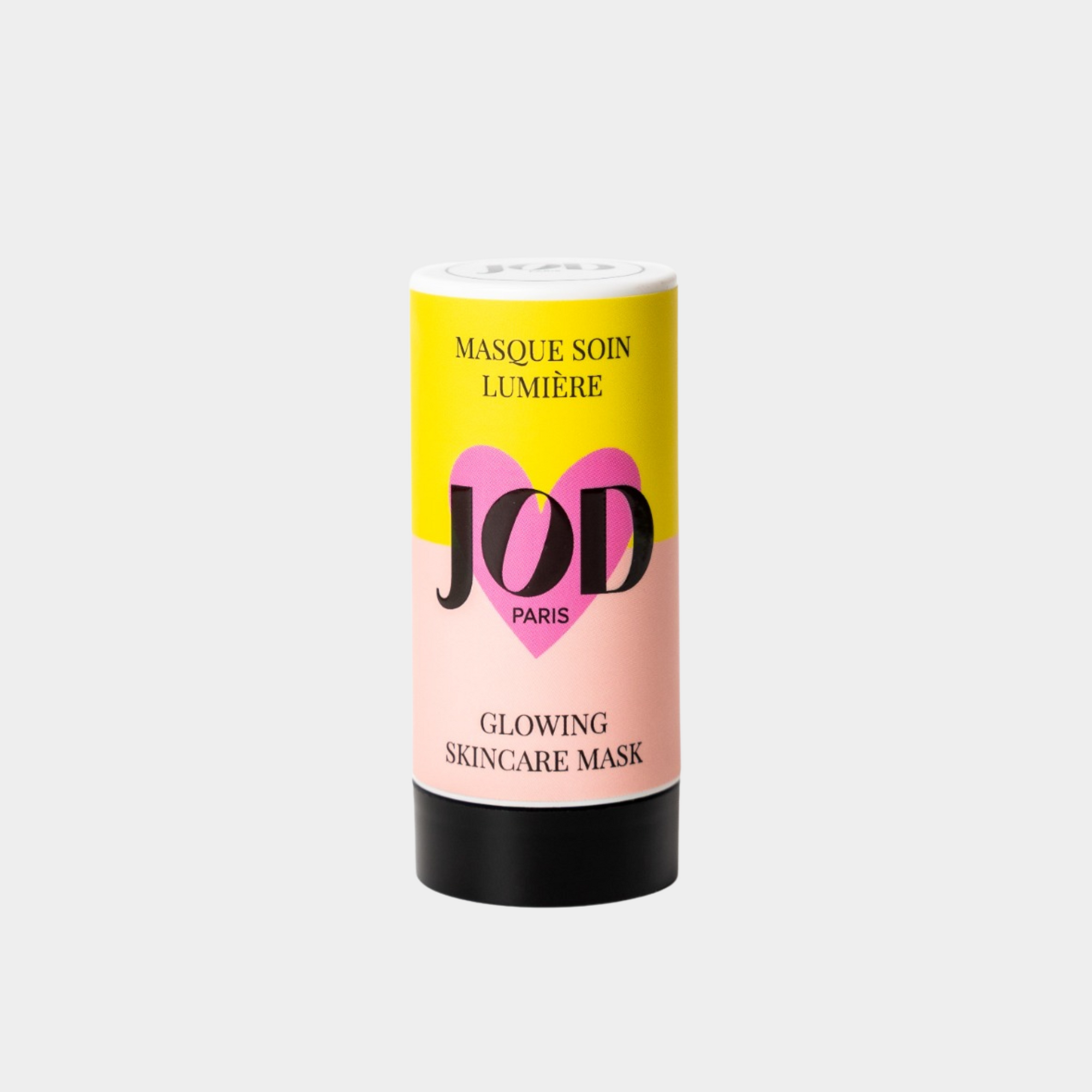
The packaging is a cylindrical container with a smooth surface, featuring a vibrant color scheme of yellow, pink, and black. The top has a white cap with the brand logo prominently displayed. The body of the container has a glossy finish, with the product name and description printed in bold, contrasting colors. The overall design is modern and appealing, typical for cosmetic products.

The packaging consists of cylindrical containers with a sturdy construction, made from thick chipboard. Each container has a smooth, matte finish and features a vibrant color scheme with distinct sections for branding. The tops are flat and have a circular design, while the body of the containers is adorned with bold graphics and product information. The overall design is sleek and modern, appealing to a cosmetic audience.
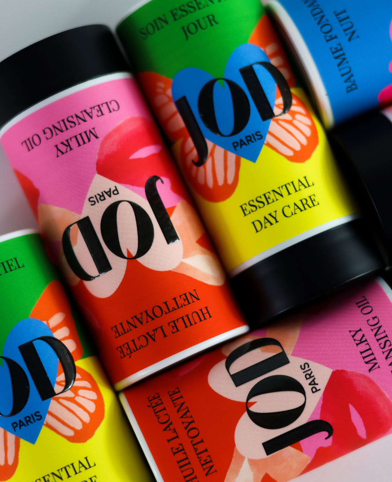
The packaging consists of cylindrical containers made from thick, sturdy chipboard. The containers have a premium appearance with vibrant colors and floral graphics. Each container features a smooth, matte finish, and the edges are clean and precise. The design includes a prominent brand logo and product information printed in bold fonts, creating a striking visual appeal.
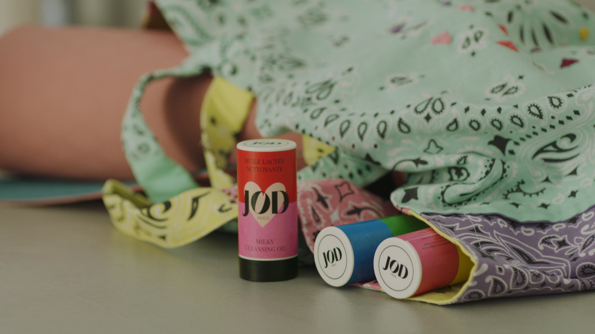
The packaging consists of small cylindrical containers with smooth, flat surfaces and clean edges. Each container has a colored cap and a white body, indicating a lightweight and retail-friendly design. The labels on the containers feature bold colors and a clear logo, making them visually appealing for cosmetic products.
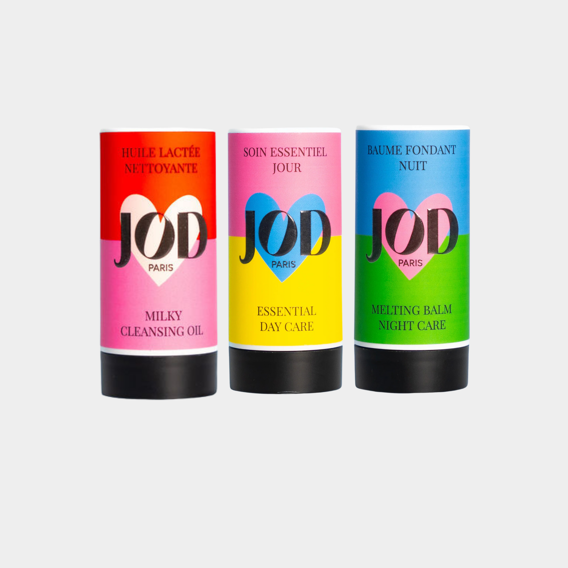
The packaging consists of three cylindrical containers, each with a distinct color scheme and design. The containers are made of a sturdy material, likely chipboard or a similar rigid material, providing a premium feel. Each container features a smooth surface with vibrant colors—pink, yellow, and blue—along with bold black text. The overall design is modern and appealing, aimed at cosmetic retail. The containers are capped, indicating a closure method that is likely twist-off or push-up, typical for stick packaging.
About the Brand
JOD Cosmetics specializes in direct-to-consumer skincare and beauty solutions, prioritizing innovative stick-format packaging designed for both at-home and on-the-go use. The brand leverages rigid cylindrical containers and vibrant color coding to reinforce their emphasis on practicality and brand recognition.
Founded in France, JOD Cosmetics operates with a small, agile team and targets modern consumers seeking effectiveness, sustainability, and ease of use. Their packaging portfolio demonstrates a consistent use of chipboard rigid boxes and carton-based cylindrical containers, supporting both product safety and visual differentiation in the competitive beauty segment. The strategy is further reinforced by a strong focus on natural, preservative-free formulations and the use of sustainably sourced raw materials.
Key Differentiator: JOD Cosmetics stands out through its exclusive use of stick-format packaging combined with waterless, preservative-free products, aligning innovative product delivery with environmentally conscious packaging choices.
Design System
Visual Style
Modern, minimalist typography with bold sans-serif fonts; a vibrant color palette including pink, yellow, and blue; and clean, uncluttered layouts that highlight product names and key brand elements.
Brand Identity
The JOD logo is prominently featured on all packaging, supported by strong product naming and consistent color coding. Iconography is minimal, ensuring the brand remains the central visual anchor. Visual consistency is maintained across all containers and marketing assets.
Packaging Design
Material selection favors thick chipboard and recyclable carton for rigidity and sustainability. Structural design is focused on cylindrical forms with snug-fitting caps, supporting both product safety and the stick-format application. The design philosophy emphasizes portability, product protection, and environmental responsibility.
User Experience
Packaging is engineered for intuitive, single-handed use and portability, aligning with the brand's on-the-go positioning. Visual cues and color coding aid product differentiation, while premium tactile finishes and unboxing aesthetics support a positive emotional brand experience.
Company Metrics
Business insights for JOD Cosmetics based on available data
Market Positioning
Brand Values & Focus
Key Competitors
Target Market: Eco-conscious, mobile consumers seeking effective, portable skincare and cosmetics with an emphasis on sustainability and convenience; primarily direct-to-consumer in the European beauty market.
Packaging Assessment
Overall Grade
Visual appeal and presentation quality
Packaging durability and protection
Eco-friendliness and recyclable materials
Cost efficiency and value for money
Packaging assessment for JOD Cosmetics based on industry standards and best practices
Frequently Asked Questions
What packaging formats does JOD Cosmetics primarily use?
JOD Cosmetics primarily utilizes rigid cylindrical boxes and stick-format containers made from chipboard and carton materials, designed for both durability and visual appeal.
How does JOD Cosmetics incorporate sustainability into its packaging?
The company emphasizes the use of recyclable chipboard, carton, and sustainably sourced materials, with a clear focus on minimizing environmental impact throughout its packaging portfolio.
Does the packaging design support product safety during shipping?
Yes, the rigid structure and snug-fitting caps of the cylindrical containers provide robust protection, reducing the risk of damage during logistics and handling.
Discover other Beauty & Fitness companies
Explore more companies in the beauty & fitness industry and their packaging strategies
Pure Altitude
Beauty & Fitness
Pure Altitude specializes in high-quality beauty and skincare products that leverage the expertise of spa treatments to enhance daily routines. The brand offers a diverse range of products tailored for both facial and body care.
Orris Paris
Beauty & Fitness
Orris Paris specializes in creating artisanal skincare products that combine potent botanical ingredients with modern cleansing rituals. The company emphasizes natural, holistic practices in its formulations.
Big Moustache
Beauty & Fitness
Big Moustache specializes in shaving and grooming products tailored for men, providing a hassle-free subscription service for razor blades and skincare essentials.