JM Posner Ltd packaging
JM Posner Ltd delivers specialized ingredients and appliances to the hospitality sector, utilizing a diverse range of packaging formats to support food safety and brand presence. Their packaging approach emphasizes functional design for professional use, with a focus on consistent branding and practical handling.
Packaging Portfolio
JM Posner Ltd’s packaging portfolio encompasses corrugated shipping boxes for bulk and fragile goods, as well as a variety of flexible stand-up pouches for liquid and dry ingredients. The use of multi-layer pouches with resealable closures optimizes product preservation and operational efficiency in professional kitchens. Packaging consistently integrates prominent branding, nutritional details, and product usage information, balancing regulatory compliance with visual appeal. The structural choices reflect a strong emphasis on logistics safety and food service practicality, with moderate integration of recyclable materials.
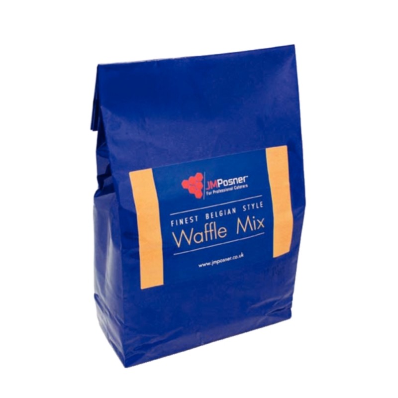
The packaging is a stand-up pouch made of a flexible material. It features a blue exterior with a matte finish and a rectangular shape that allows it to stand upright. The top of the pouch has a fold-over closure, and the bottom is gusseted to provide stability. The front displays a large label area with a white and orange design, prominently featuring the product name 'Waffle Mix' in bold lettering.

The packaging is a black flexible pouch designed for liquid storage, featuring a handle at the top for easy pouring. The front displays a large label with product information, including the product name, weight, and nutritional information. The overall shape is rectangular with a slight taper towards the bottom, allowing it to stand upright. The surface is smooth with a matte finish.

The packaging consists of a multi-layered pouch design, featuring a matte finish with a black top and a white body. The front displays vibrant images of waffles topped with fruits, emphasizing the product's appeal. The packaging has a resealable top, allowing for easy access and storage. The back includes nutritional information and preparation instructions, printed in a clear, legible font.

The packaging is a flexible pouch designed for liquid contents, featuring a handle for easy pouring. The front displays a large label with product information, including ingredients and nutritional facts. The overall shape is rectangular with a spout at the top for dispensing the liquid. The surface is predominantly black with glossy finish, and the design incorporates chocolate imagery that aligns with the product's contents.

The packaging is a flexible pouch designed for liquid contents, featuring a black exterior with a large, clear label on the front. The pouch has a handle at the top for easy pouring and a screw cap for dispensing the liquid. The overall shape is rectangular with a flat base, allowing it to stand upright. The label includes colorful graphics and product information, prominently displaying the product name and flavor.

The packaging is a corrugated box with a rectangular shape, primarily in a yellow and purple color scheme. The box features a prominent brand name 'Cadbury Flake 99' printed on the front, along with additional text indicating its use for ice cream and culinary purposes. The edges of the box are visible, showing the characteristic fluted layer of corrugated cardboard. The box appears to be well-constructed, suitable for shipping, with no visible signs of crushing or significant wear.
About the Brand
JM Posner Ltd operates within the food and drink industry, supplying crepe machines, waffle makers, and premium dessert ingredients to businesses. Their packaging strategy is tailored for B2B hospitality needs, prioritizing durability, clear labeling, and ease of use for professional kitchens.
Founded in 2009, JM Posner Ltd has established itself as a niche supplier to hospitality businesses, with a notable focus on quality and reliability in both its product range and packaging. The company leverages user-friendly, branded flexible pouches and corrugated shipping boxes designed to withstand commercial logistics environments and frequent handling. Product information, nutritional details, and brand elements are prominently integrated into package designs, enhancing traceability and regulatory compliance for the food service sector.
Key Differentiator: The brand’s unique value lies in its integration of functional, food service-ready packaging with strong visual branding, supporting efficient operations and reinforcing product quality perception.
Design System
Visual Style
Typography features bold, legible sans-serif fonts for clear communication, supported by a color palette dominated by black, white, blue, and accent colors matching product categories. Imagery is high-contrast and often food-focused, reinforcing product appeal.
Brand Identity
Branding utilizes the JM Posner logo and consistent iconography across all packaging formats. Visual consistency is maintained through standardized layouts, placement of the logo, and uniform use of typefaces. Product names and key information are always prominently displayed.
Packaging Design
Material choices favor corrugated cardboard for shipping and multi-layer flexible films for pouches, designed to withstand handling in commercial environments. The structural design emphasizes resealability, ease of pouring, and stability for stacking and storage.
User Experience
The packaging design facilitates a streamlined B2B purchasing journey with clear labeling, ergonomic handling features, and intuitive opening/dispensing systems. Visual hierarchy and consistent branding support rapid product identification and reinforce trust among professional buyers.
Company Metrics
Business insights for JM Posner Ltd based on available data
Market Positioning
Brand Values & Focus
Key Competitors
Target Market: B2B hospitality businesses including cafes, restaurants, and food service operators seeking specialized dessert equipment and ingredients.
Packaging Assessment
Overall Grade
Visual appeal and presentation quality
Packaging durability and protection
Eco-friendliness and recyclable materials
Cost efficiency and value for money
Packaging assessment for JM Posner Ltd based on industry standards and best practices
Frequently Asked Questions
What types of packaging does JM Posner Ltd use for its products?
JM Posner Ltd employs corrugated boxes for bulk shipping and a range of flexible pouches for liquid and dry ingredients, prioritizing durability, clear branding, and practicality for professional users.
How does JM Posner Ltd ensure product safety during transit?
Packaging structures such as corrugated shipping boxes and reinforced stand-up pouches are designed to protect contents from mechanical damage and contamination, supporting the demands of commercial distribution channels.
Is sustainability a factor in JM Posner Ltd’s packaging choices?
While sustainability considerations are present, the primary focus remains on functionality and food safety, with some use of recyclable materials but no evidence of advanced eco-design or compostability initiatives.
Discover other Food & Drink companies
Explore more companies in the food & drink industry and their packaging strategies
PrepMyMeal
Food & Drink
PrepMyMeal is a food production company specializing in high-protein meal delivery services. They offer a variety of natural, nutritious meals designed for fitness enthusiasts and those seeking convenience in meal preparation.
kerex - terre exotique
Food & Drink
Kerex - Terre Exotique specializes in the international trade of gourmet food and drink products, offering a unique selection of spices and culinary ingredients.
Terres de Café
Food & Drink
Terres de Café is a specialty coffee retailer based in Paris, France, known for its commitment to sustainability and high-quality coffee sourcing.