JING Tea packaging
JING Tea specializes in premium tea products with a focus on quality, heritage, and responsible sourcing. Their packaging strategy employs high-end materials and minimalist design to reinforce a luxury brand image while supporting product preservation and customer experience.
Packaging Portfolio
JING Tea’s packaging portfolio incorporates a mix of carton boxes, rigid gift boxes, flexible metallic pouches, and cylindrical tin canisters. Materials selection emphasizes paperboard and tin, optimized for both product protection and visual impact. Structural formats are tailored to product type—carton boxes for tea bags, rigid boxes for gifts, and airtight canisters for loose leaf teas—providing a balance between preservation, luxury presentation, and retail shelf appeal. The consistent use of matte finishes, gold accents, and minimalist labeling reinforces brand identity while supporting logistical efficiency and consumer engagement.
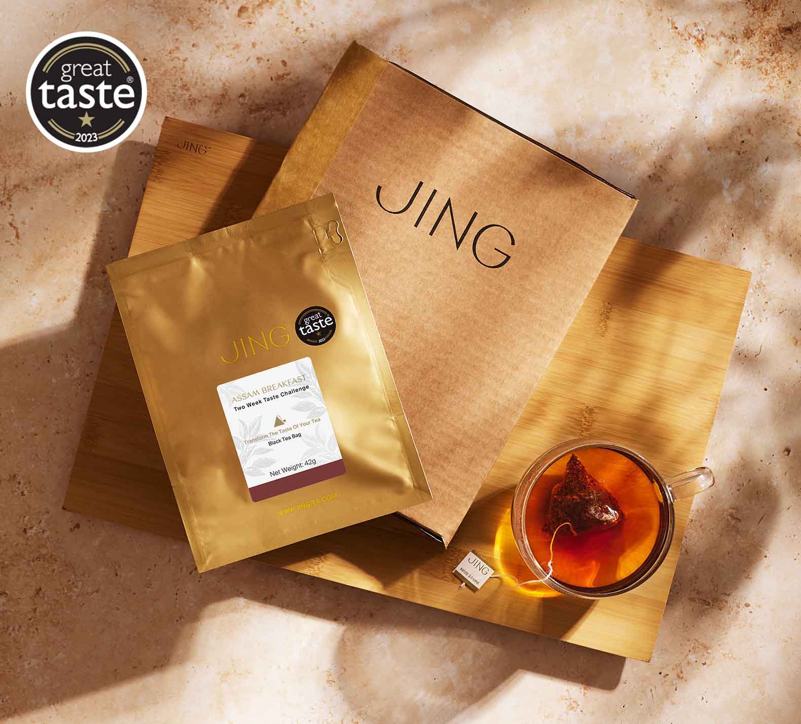
The image features a retail carton box and a flexible pouch. The carton box is brown with a smooth surface and clean edges, indicating it is made of single-layer paperboard. The pouch is gold with a glossy finish, suggesting a laminated surface. The carton has a simple design with the word 'JING' prominently displayed, while the pouch includes product information and a label.
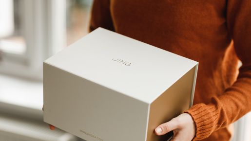
The packaging is a sturdy, thick-walled box with a premium appearance. It features a smooth, matte finish in a light color, likely cream or off-white. The box has clean, precise edges and a minimalist design, with the word 'JING' prominently displayed on the top in a simple, elegant font. The overall shape is rectangular, with a slightly larger base and a lid that fits snugly over it.
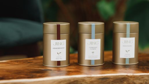
The packaging consists of three cylindrical tin canisters, each with a metallic gold finish. The canisters have a smooth surface with a glossy appearance. Each canister features a colored band around the top, with one in burgundy, one in light blue, and one in light green. The front of each canister has a white label with the brand name 'JING' prominently displayed, along with product names and descriptions. The lids are flat and fit snugly, indicating a secure closure.
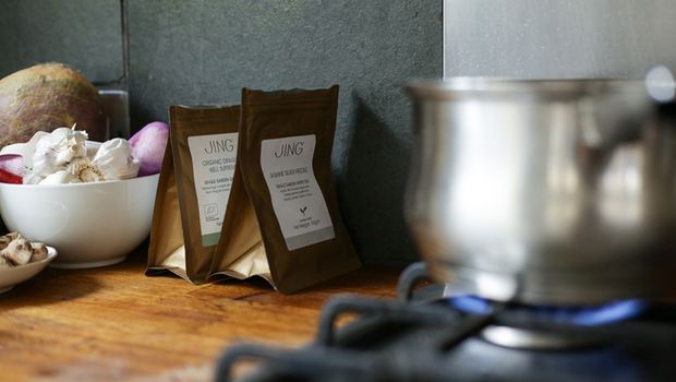
The packaging consists of two small pouches made of a flexible material, likely a type of paper or plastic with a metallic finish. Each pouch has a flat bottom allowing it to stand upright. The pouches are sealed at the top with a fold-over flap. The surface appears smooth with a matte finish, and the color is predominantly gold. The front of the pouches features a white label with product information and branding elements.
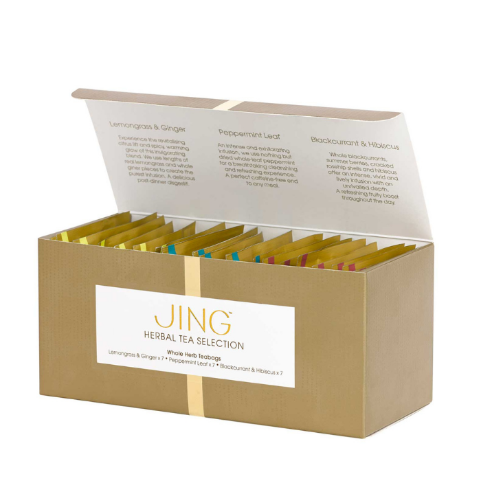
The packaging is a rectangular folding carton made of smooth, single-layer paperboard. It features a clean, flat construction with precise edges and folds. The exterior is a matte gold color with a glossy white label on the front. The label includes the brand name 'JING' in a bold, modern font, along with the product description 'HERBAL TEA SELECTION'. The top flap is slightly raised, indicating an opening mechanism. Inside, there are compartments for individual tea bags, organized neatly.
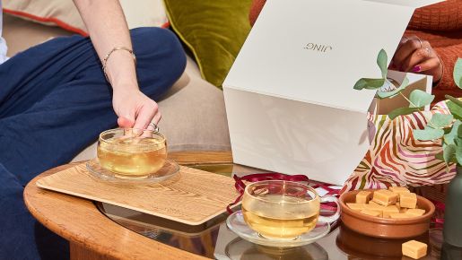
The packaging is a sturdy, thick-walled box with a premium appearance. It features a clean, white exterior with a smooth finish. The box is likely designed for gifting, indicated by its elegant design and high-quality construction. The lid appears to be a separate piece that fits over the base, providing a secure closure.
About the Brand
JING Tea is a direct-to-consumer brand delivering curated loose leaf teas, tea bags, and teaware, all sourced from renowned gardens across Asia. Their packaging approach prioritizes premium aesthetics and structural integrity, with formats ranging from rigid gift boxes to gold-finished tin canisters. This enables a consistent brand experience that aligns with their positioning in the high-end tea segment.
The company's packaging selection is informed by both product protection requirements and the desire to provide a refined unboxing experience. Carton boxes, rigid boxes, and metallic canisters are used to maintain freshness, support logistics, and enhance giftability. The use of minimalist design and a restrained color palette ensures strong brand recognition and visual coherence across all product lines.
Key Differentiator: JING Tea differentiates itself through its single garden origin sourcing, consistently premium packaging materials, and an emphasis on storytelling through design that connects consumers to the heritage of tea.
Design System
Visual Style
The visual design style features clean, sans-serif typography, a refined color palette dominated by gold, white, cream, and subtle accent hues, and a minimalist, uncluttered layout. The aesthetic approach communicates luxury and sophistication.
Brand Identity
Brand identity is built around the prominent use of the 'JING' wordmark, restrained iconography, and a focus on visual consistency across all packaging types. Logos and naming are centrally placed, supporting instant brand recognition.
Packaging Design
Material choices favor sturdy paperboard, thick-walled rigid boxes, and metallic tins for both durability and sensory appeal. The structural design philosophy emphasizes protection, premium feel, and giftability, with modularity for efficient transport and display.
User Experience
Design choices enhance the customer journey by providing a visually striking and tactile unboxing experience, clear product information, and easy access. Packaging reinforces the brand’s storytelling by connecting visual cues to tea heritage and quality.
Company Metrics
Business insights for JING Tea based on available data
Market Positioning
Brand Values & Focus
Key Competitors
Target Market: Affluent consumers, tea connoisseurs, gift buyers, and hospitality clients seeking premium, authentic tea experiences with an emphasis on quality and responsible sourcing.
Packaging Assessment
Overall Grade
Visual appeal and presentation quality
Packaging durability and protection
Eco-friendliness and recyclable materials
Cost efficiency and value for money
Packaging assessment for JING Tea based on industry standards and best practices
Frequently Asked Questions
What materials are most commonly used in JING Tea’s packaging?
JING Tea primarily utilizes paperboard for cartons, rigid cardboard for gift boxes, and metallic tins for tea canisters. Flexible pouches with metallic finishes are also used for select products, supporting both product preservation and premium presentation.
How does JING Tea address sustainability in its packaging?
The brand incorporates recyclable paperboard and reusable tin canisters, and references responsible sourcing practices. However, the presence of metallic finishes and laminates suggests a mixed approach to environmental impact, with room for increased use of fully recyclable or compostable solutions.
What is the role of packaging in JING Tea’s branding?
Packaging serves as a primary touchpoint for brand storytelling, emphasizing minimalism, luxury, and cultural heritage through design consistency, color schemes, and material choices that align with the company’s premium positioning.
Discover other Food & Drink companies
Explore more companies in the food & drink industry and their packaging strategies
PrepMyMeal
Food & Drink
PrepMyMeal is a food production company specializing in high-protein meal delivery services. They offer a variety of natural, nutritious meals designed for fitness enthusiasts and those seeking convenience in meal preparation.
Thés de la Pagode
Food & Drink
Thés de la Pagode is a French company specializing in organic teas and infusions, focusing on health and well-being. Established in 1987, they prioritize sustainable practices and high-quality ingredients sourced through fair trade.
Teegschwendner GmbH
Food & Drink
Teegschwendner GmbH is a specialty tea company based in Germany, offering a wide selection of high-quality teas and tea-related accessories. They focus on providing unique tea experiences through carefully sourced and curated products.