Jägermeister Bulgaria packaging
Jägermeister Bulgaria operates as a direct-to-consumer platform for herbal liqueur and branded merchandise, leveraging visually distinctive packaging to reinforce brand identity and drive promotional engagement. Their packaging utilizes high-impact branding, structured formats, and premium finishes to deliver a cohesive unboxing experience aligned with the brand’s image.
Packaging Portfolio
Jägermeister Bulgaria’s packaging portfolio centers on folding carton boxes and rigid gift boxes, engineered for both individual bottles and multi-product promotional sets. Primary materials include single-layer paperboard with glossy finishes for visual appeal and rigid board for gift sets with glassware. Packaging structures are designed for snug fit and presentation, often featuring die-cut windows, branded handles, and premium printing techniques. Emphasis is placed on strong brand visuals, precise structural integrity, and the ability to support both retail logistics and experiential marketing needs.
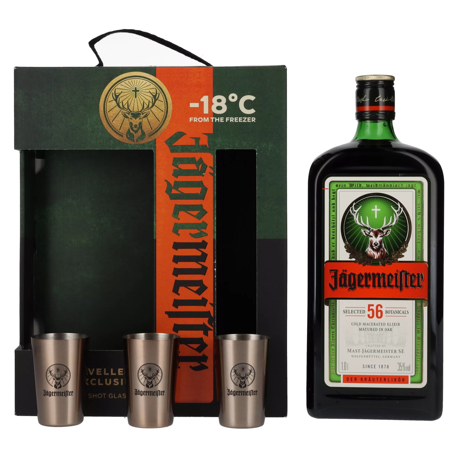
The packaging consists of a sturdy, thick-walled box designed to hold a bottle of Jägermeister and accompanying shot glasses. The box features a cut-out window displaying the bottle and glasses, with a black exterior and vibrant green and red accents. The front has a prominent logo and product name, while the sides are adorned with additional branding elements.
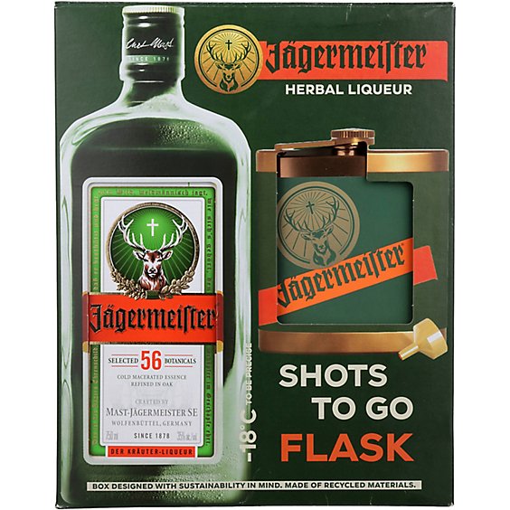
The packaging is a folding carton designed to hold a flask and a bottle of Jägermeister. It features a smooth, flat construction without any visible fluted layers, indicating it is made from single-layer paperboard. The box is predominantly green with a glossy finish, showcasing vibrant graphics. The front displays the Jägermeister logo prominently, along with images of the flask and product information. The edges are cleanly folded, and the box has a rectangular shape with a top flap closure.

The packaging features a smooth, flat construction typical of folding cartons. It has a rectangular shape with clean edges and folds. The exterior is predominantly white with green botanical illustrations, and the Jägermeister logo prominently displayed on the front. The carton has a glossy finish, enhancing the visual appeal. The design includes a large central label with product information and promotional text.
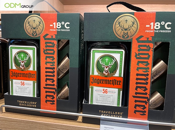
The packaging consists of a folding carton designed to hold multiple bottles of Jägermeister. It features a smooth, flat construction without fluted layers, indicative of paperboard. The exterior is predominantly black with vibrant green and red accents, showcasing the Jägermeister logo and a prominent image of a deer with antlers. The edges are clean and precise, with a glossy finish that enhances the visual appeal. The carton has a rectangular shape, designed to fit the bottles snugly, and includes cut-out handles for easy carrying.

The packaging is a folding carton made of single-layer paperboard, featuring a smooth, flat construction with clean edges and folds. It is predominantly white with intricate green graphics depicting botanical elements, along with a prominent logo and product information. The carton has a slightly glossy finish, enhancing the visual appeal and providing a premium look.
About the Brand
Jägermeister Bulgaria specializes in direct-to-consumer sales of herbal liqueur and branded merchandise, emphasizing experiential marketing through curated promotional packaging. Their packaging approach is characterized by the use of robust carton and rigid box solutions, designed to enhance both product security and brand perception.
The brand consistently aligns its packaging with its visual identity, employing signature colorways and prominent logo placement. Jägermeister Bulgaria’s focus on limited editions, promotional bundles, and gift sets is reflected in the structural diversity of their packaging, which ranges from folding cartons to rigid displays for value-added merchandise. These strategic packaging choices serve both logistical and marketing objectives, supporting the company’s community-driven campaigns and responsible consumption messaging.
Key Differentiator: Strong integration of branded packaging with promotional campaigns, delivering a unified brand experience across direct-to-consumer channels.
Design System
Visual Style
Bold typography, predominantly sans-serif fonts for clarity and impact; a color palette anchored in black, green, and orange-red, reflecting the brand’s heritage; glossy and high-contrast finishes with botanical graphic elements for added visual interest.
Brand Identity
Consistent use of the Jägermeister logo, deer emblem, and brand name across all packaging; iconography and graphic motifs are botanically inspired and reinforce product heritage; layout and color schemes remain uniform across product tiers and special editions.
Packaging Design
Paperboard and rigid board materials are selected for their protective qualities and print performance; structures prioritize product visibility (e.g., windows), ease of carrying (cut-out handles), and premium tactile finishes; design philosophy centers on enhancing perceived value and supporting promotional activities.
User Experience
Packaging is crafted to maximize emotional impact during unboxing, with visual cues and tactile finishes reinforcing brand recognition. Structural elements such as secure closures and ergonomic handles support both transport safety and user convenience, while design consistency builds trust and strengthens community engagement.
Company Metrics
Business insights for Jägermeister Bulgaria based on available data
Market Positioning
Brand Values & Focus
Key Competitors
Target Market: Young adult consumers and brand enthusiasts in Bulgaria seeking premium herbal liqueur and branded merchandise, with a focus on experiential gifting and lifestyle products.
Packaging Assessment
Overall Grade
Visual appeal and presentation quality
Packaging durability and protection
Eco-friendliness and recyclable materials
Cost efficiency and value for money
Packaging assessment for Jägermeister Bulgaria based on industry standards and best practices
Frequently Asked Questions
What types of packaging does Jägermeister Bulgaria primarily use?
Jägermeister Bulgaria primarily utilizes folding carton boxes and rigid boxes, optimized for both retail and promotional gift sets. These packaging formats are designed to ensure product protection, visual impact, and alignment with the brand's marketing objectives.
How does the packaging reflect the Jägermeister brand?
Packaging features high brand relevance through consistent use of the Jägermeister logo, color schemes, and visual motifs, reinforcing brand recognition and customer engagement.
Is sustainability a focus in Jägermeister Bulgaria’s packaging?
While standard carton and paperboard solutions are used, there is limited evidence of advanced sustainable practices beyond basic recyclability. The use of paper-based materials provides moderate eco-friendliness, but further improvements could be made in sourcing and material innovation.
Discover other Food & Drink companies
Explore more companies in the food & drink industry and their packaging strategies
ruf lebensmittelwerk kg
Food & Drink
RUF Lebensmittelwerk KG is a German food production company specializing in a variety of baking mixes and drink products. Founded in 1920, the company is known for its high-quality ingredients and innovative food solutions.
Thés de la Pagode
Food & Drink
Thés de la Pagode is a French company specializing in organic teas and infusions, focusing on health and well-being. Established in 1987, they prioritize sustainable practices and high-quality ingredients sourced through fair trade.
kerex - terre exotique
Food & Drink
Kerex - Terre Exotique specializes in the international trade of gourmet food and drink products, offering a unique selection of spices and culinary ingredients.