jane iredale (iredale cosmetics) packaging
jane iredale (iredale cosmetics) develops mineral-based cosmetics and skincare, emphasizing clean beauty and skin health. Their packaging strategy utilizes sleek carton and rigid box formats, focusing on visual clarity, retail readiness, and an elevated consumer experience.
Packaging Portfolio
jane iredale’s packaging leverages a combination of rigid boxes, compacts, and folding carton boxes for primary and secondary containment. Materials include matte-finished paperboard for cartons and clear, embossed plastics for product display and consumer interaction. The structural design prioritizes product protection, precise fit, and shelf presence, while premium finishes and metallic detailing enhance perceived value. Packaging is engineered for both retail display and direct-to-consumer shipment, balancing branding, protection, and environmental considerations.

The packaging consists of individual cosmetic bottles stacked vertically. Each bottle has a square base and a cylindrical body, topped with a flat, white cap. The bottles are made of clear plastic, allowing the product inside to be visible. The surface of the bottles is smooth with a glossy finish, and they feature embossed branding on the side. The overall appearance is sleek and modern, suitable for retail display.

The packaging consists of three cylindrical containers made of clear plastic with a smooth surface. Each container has a screw-on lid and is designed to hold loose mineral powder. The containers are transparent, allowing the product inside to be visible, and feature embossed text on the sides indicating the product name and details.
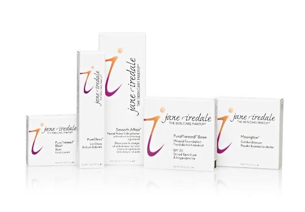
The packaging consists of several folding cartons made of smooth, single-layer paperboard. Each box features clean, precise edges and folds, with a predominantly white exterior. The surface has a matte finish, providing a soft texture. The boxes are adorned with colorful graphics and text, including the brand name and product information. The overall shape is rectangular, designed for retail display.
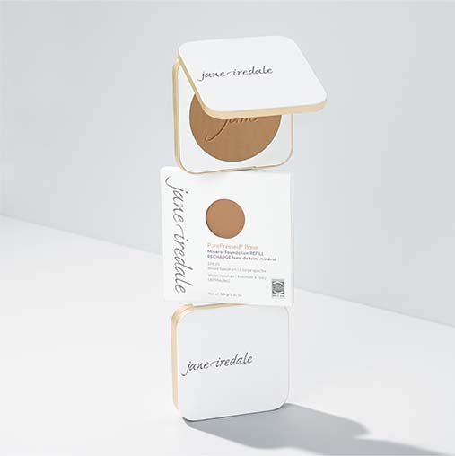
The packaging consists of a smooth, flat construction with clean edges and folds. The outer layer is primarily white paperboard with a matte finish, featuring a subtle gold trim around the edges. The design is minimalistic, showcasing the brand name 'jane iredale' in an elegant font. The inner compact is circular and fits snugly within the carton, indicating a well-thought-out design for retail display. The packaging is lightweight and designed for easy handling.

The packaging is a compact case with a sleek, rectangular shape. It features a sturdy construction with a smooth, metallic finish on the lid. The interior holds three cosmetic shades, arranged in a row, with a clean and organized layout. The exterior has a glossy surface that reflects light, enhancing its premium appearance.
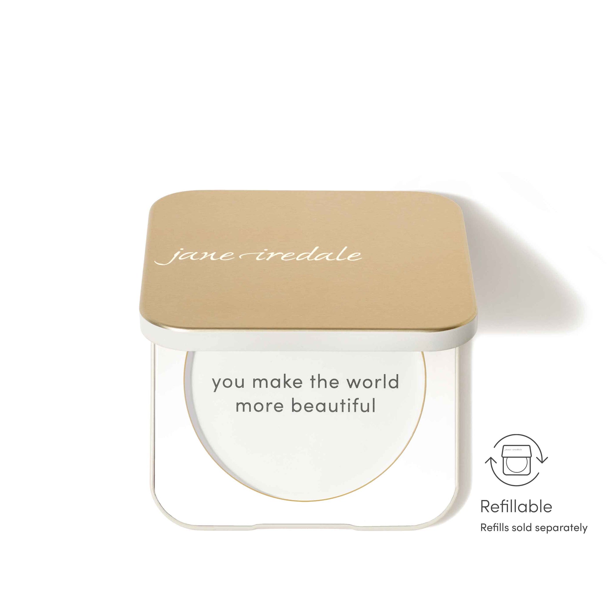
The packaging features a square compact design with a thick, sturdy base and a lid that is slightly raised. The lid is a light tan color with a matte finish, while the base is white and has a transparent window to view the product inside. The overall appearance is sleek and modern, indicative of high-quality cosmetic packaging.
About the Brand
jane iredale is a beauty brand specializing in mineral makeup and skincare products, known for its commitment to clean formulations and skin-friendly ingredients. Its packaging approach centers on high-quality materials and precision-engineered structures to support both brand positioning and product protection.
The company’s packaging portfolio features a mix of carton boxes and rigid containers, each designed with brand consistency and practical user experience in mind. Utilizing matte-finish paperboard, clear plastics, and metallic accents, jane iredale ensures both shelf appeal and robust product security. Visual and tactile cues are leveraged to reinforce the brand’s clean, elegant aesthetic and to optimize retail display, while the use of recyclable materials aligns with evolving sustainability standards in beauty packaging.
Key Differentiator: jane iredale uniquely integrates minimalist design, strong brand visuals, and eco-conscious material selection in its packaging, setting it apart within the mineral cosmetics segment.
Design System
Visual Style
Clean, sans-serif typography; a muted, elegant color palette centered on white, gold, and soft neutrals; matte and glossy surface finishes for tactile interest; minimalist aesthetic with restrained graphic elements.
Brand Identity
Consistent use of the 'jane iredale' logo, clear product naming, and subtle iconography. Visual alignment across packaging types maintains strong brand recognition and a unified shelf presence.
Packaging Design
Preference for recyclable paperboard and clear plastics; sturdy and precisely engineered structures; focus on retail and D2C functionality. Use of compact forms for portability and product protection, aligned with industry standards for premium cosmetics.
User Experience
Design elements support a premium unboxing experience through tactile finishes, intuitive opening mechanisms, and visible branding. Packaging is structured for easy handling, retail display, and clear product information, enhancing consumer trust and satisfaction.
Company Metrics
Business insights for jane iredale (iredale cosmetics) based on available data
Market Positioning
Brand Values & Focus
Key Competitors
Target Market: Health-conscious consumers seeking premium mineral cosmetics and skincare, primarily in the North American direct-to-consumer (D2C) segment.
Packaging Assessment
Overall Grade
Visual appeal and presentation quality
Packaging durability and protection
Eco-friendliness and recyclable materials
Cost efficiency and value for money
Packaging assessment for jane iredale (iredale cosmetics) based on industry standards and best practices
Frequently Asked Questions
How does jane iredale incorporate sustainability into its packaging?
jane iredale utilizes recyclable materials such as paperboard for cartons and clear plastic components for product visibility, with a focus on minimizing environmental impact while maintaining product protection and presentation quality.
What types of packaging formats does jane iredale use for its products?
The brand employs a combination of carton boxes for external retail packaging and rigid boxes or compacts for primary cosmetic containment, ensuring both retail appeal and product durability.
How does the packaging design support the jane iredale brand identity?
Packaging consistently features the jane iredale logo, elegant typography, and a modern color palette, reinforcing brand recognition and conveying the brand’s commitment to clean beauty.
Discover other Beauty & Fitness companies
Explore more companies in the beauty & fitness industry and their packaging strategies
Owari
Beauty & Fitness
Owari specializes in 100% natural beauty and fitness products, designed to enhance health and wellness. The company proudly offers its products made in France, emphasizing quick delivery and customer support.
Pure Altitude
Beauty & Fitness
Pure Altitude specializes in high-quality beauty and skincare products that leverage the expertise of spa treatments to enhance daily routines. The brand offers a diverse range of products tailored for both facial and body care.
Big Moustache
Beauty & Fitness
Big Moustache specializes in shaving and grooming products tailored for men, providing a hassle-free subscription service for razor blades and skincare essentials.