Itsuki Shop packaging
Itsuki Shop operates a direct-to-consumer e-commerce platform, with a focus on premium products including specialty tea and wellness items. Their packaging approach emphasizes branded carton boxes and flexible pouches, leveraging visually distinct and culturally resonant designs to enhance product presentation.
Packaging Portfolio
Itsuki Shop’s packaging utilizes a combination of flexible stand-up pouches and custom-printed carton boxes, primarily composed of single-layer paperboard and laminated materials. Stand-up pouches for matcha products feature resealable closures and premium graphic illustrations, enhancing both product freshness and shelf presence. Carton boxes employ glossy finishes and vibrant green or cream color palettes, with precise structural folds to ensure retail suitability and brand consistency. The packaging formats are optimized for both e-commerce and in-store display, reflecting a balance of visual appeal and functional protection.
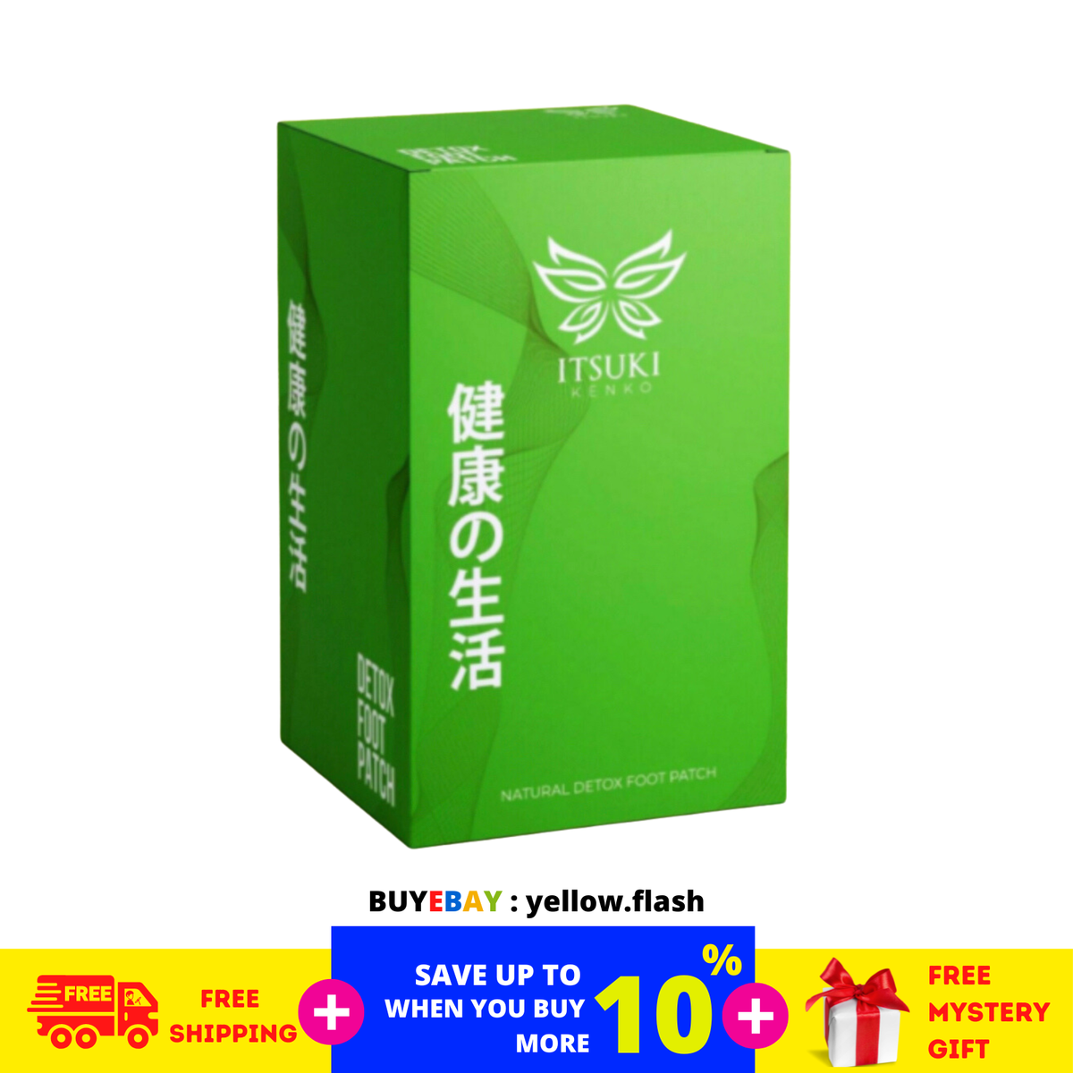
The packaging is a folding carton with a smooth, flat construction. It features clean edges and precise folds, indicative of a single-layer paperboard design. The box is predominantly green with a glossy finish, showcasing a vibrant and eye-catching appearance. The front displays a logo and product name in white, with additional text in Japanese, suggesting a focus on health and wellness. The overall design is sleek and modern, suitable for retail display.

The packaging is a flat, folded carton made of smooth, single-layer paperboard. It features a clean, minimalist design with precise edges and folds. The exterior is a soft cream color, giving it an elegant appearance. The front displays the brand name 'ITSUKI' prominently, along with product information about premium green tea and matcha. The overall design is simple yet sophisticated, aligning with premium product aesthetics.

The packaging consists of a series of green retail cartons with a smooth, flat construction. Each box has clean edges and precise folds, indicating a single-layer paperboard material. The boxes are uniformly colored in a vibrant green with a glossy finish, enhancing their visual appeal. The front of each carton features a logo and product information in white text, with additional graphics that may include images or patterns related to the product. The overall shape is rectangular, with a standard height and width suitable for retail display.
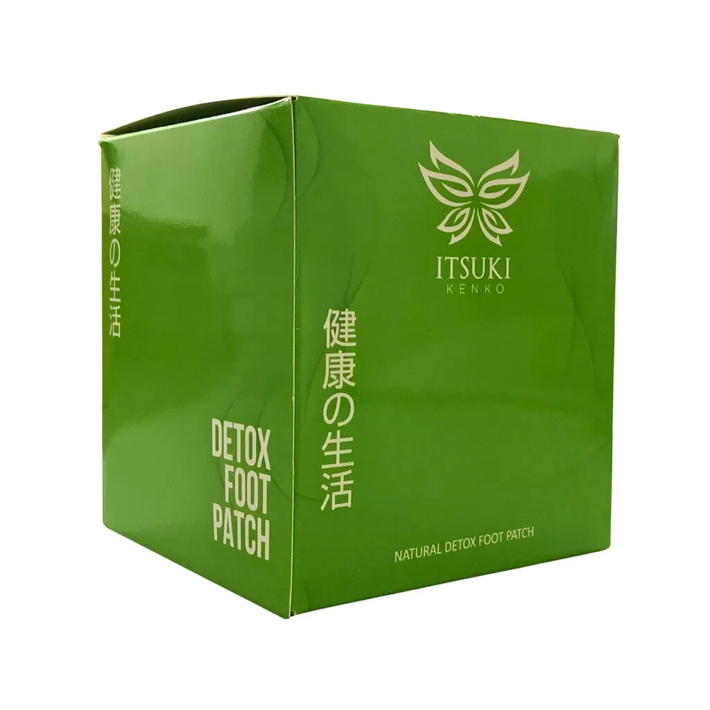
The packaging is a square-shaped retail carton with smooth, flat construction. It features clean edges and precise folds, indicative of a single-layer paperboard design. The exterior is a vibrant green color with a glossy finish, giving it a polished appearance. The front displays a logo and product name in white and gold, while the sides include additional text and graphics in both English and Japanese.

The packaging is a stand-up pouch made from a flexible material. It features a smooth, flat construction with a resealable top. The front displays an elegant illustration of a woman in traditional attire, accompanied by the brand name 'ITSUKI' prominently placed in a stylish font. The overall color scheme is light, with a white background and subtle accents that enhance its premium appeal.
About the Brand
Itsuki Shop is an online retailer targeting a broad consumer base, with an emerging product lineup that currently centers on premium matcha, green tea, and wellness goods. The packaging strategy is built around custom-designed flexible pouches and paperboard cartons that reflect both product quality and cultural heritage.
Despite limited public information due to a password-protected website, observable packaging assets reveal a consistent brand identity anchored in Japanese aesthetics and premium positioning. The use of visually cohesive elements—such as traditional illustrations, Japanese typography, and a distinct green palette—supports both shelf appeal and consumer recognition. Packaging choices suggest a focus on retail-ready formats and a blend of visual storytelling with functional protection.
Key Differentiator: Itsuki Shop’s unique value lies in its integration of culturally authentic design and premium packaging formats, setting it apart in the e-commerce tea and wellness segment.
Design System
Visual Style
Typography leans on clean, sans-serif fonts paired with stylized Japanese scripts. The color palette is dominated by greens, creams, whites, and accents of gold or red, evoking both modern and traditional Japanese aesthetics. Overall, the aesthetic is minimalist with premium cues.
Brand Identity
Consistent use of the ITSUKI logo, traditional iconography (e.g., illustrations of women in kimono), and bilingual labeling reinforce brand recognition. Brand name placement is prominent, and visual consistency is maintained across all packaging formats.
Packaging Design
Material selection emphasizes paperboard for structural rigidity and flexible laminates for product freshness. Structural design prioritizes clean folds, resealable features, and lightweight construction to optimize both consumer experience and logistics.
User Experience
The design system supports the customer journey by delivering an elevated unboxing experience, clear product information, and easy-open features. The aesthetic coherence across formats reinforces perceived value and encourages repeat engagement.
Company Metrics
Business insights for Itsuki Shop based on available data
Market Positioning
Brand Values & Focus
Key Competitors
Target Market: Digitally engaged consumers in Germany and the EU seeking premium tea, matcha, and wellness products with authentic Japanese branding.
Packaging Assessment
Overall Grade
Visual appeal and presentation quality
Packaging durability and protection
Eco-friendliness and recyclable materials
Cost efficiency and value for money
Packaging assessment for Itsuki Shop based on industry standards and best practices
Frequently Asked Questions
What types of packaging does Itsuki Shop use?
Itsuki Shop employs a mix of flexible stand-up pouches for matcha and tea products, alongside custom-printed carton boxes for retail display and wellness items. The packaging is characterized by premium paperboard, resealable features, and strong visual branding.
How sustainable are Itsuki Shop’s packaging solutions?
While the use of paperboard cartons suggests a moderate focus on recyclability, the presence of glossy coatings and flexible plastics may limit overall sustainability. There is currently no public information on eco-certifications or recycled content.
What is the primary focus of Itsuki Shop’s packaging design?
The primary focus is on visual storytelling, premium positioning, and cultural resonance, achieved through traditional Japanese motifs, bold color schemes, and cohesive brand identity across all formats.
Discover other Food & Drink companies
Explore more companies in the food & drink industry and their packaging strategies
Teegschwendner GmbH
Food & Drink
Teegschwendner GmbH is a specialty tea company based in Germany, offering a wide selection of high-quality teas and tea-related accessories. They focus on providing unique tea experiences through carefully sourced and curated products.
PrepMyMeal
Food & Drink
PrepMyMeal is a food production company specializing in high-protein meal delivery services. They offer a variety of natural, nutritious meals designed for fitness enthusiasts and those seeking convenience in meal preparation.
kerex - terre exotique
Food & Drink
Kerex - Terre Exotique specializes in the international trade of gourmet food and drink products, offering a unique selection of spices and culinary ingredients.