Horlicks packaging
Horlicks operates within the nutritional beverage sector, providing malt-based drinks designed for various age groups. Their packaging strategy emphasizes brand consistency, functional container formats, and impactful visual presentation to reinforce product trust and shelf presence.
Packaging Portfolio
Horlicks employs a dual-format packaging approach, primarily using cylindrical rigid plastic containers and single-layer carton boxes. The containers feature high-visibility blue and orange color schemes, with matte or glossy finishes, and are designed for product protection and convenient dispensing. Carton packaging offers lightweight, stackable solutions suitable for retail environments. All packaging prominently displays the Horlicks logo, product variant, and nutritional data, maintaining regulatory compliance and brand consistency. Structural choices prioritize product integrity, tamper evidence, and extended shelf life, while design elements focus on consumer appeal and rapid brand recognition.

The packaging is a cylindrical plastic container with a bright orange lid and a predominantly blue body. The container features a smooth surface without any visible fluted layers, indicating it is not corrugated. The design includes a stylized image of a cup with a splash of the product, along with text that highlights key nutritional benefits. The overall appearance is vibrant and eye-catching, aimed at attracting consumers.

The packaging is a cylindrical container with a smooth surface, primarily made of a rigid material. It features a vibrant blue color scheme with a gradient effect, transitioning from light blue at the top to darker blue at the bottom. The front showcases a large, prominent logo of 'Horlicks' in a bold font, accompanied by the product description 'Malty Goodness beverage mix just add milk'. The design includes illustrations of a serene landscape with people walking, enhancing the product's appeal. The container has a sealed top and a wide mouth for easy access to the contents.

The packaging consists of two cylindrical containers made of smooth, single-layer paperboard. Each container features a vibrant blue and purple color scheme with illustrations of a house and people, conveying a sense of warmth and comfort. The top and bottom of the containers are flat, and the edges are cleanly folded, indicating precise construction. The surface has a matte finish, enhancing the visual appeal and providing a soft touch.
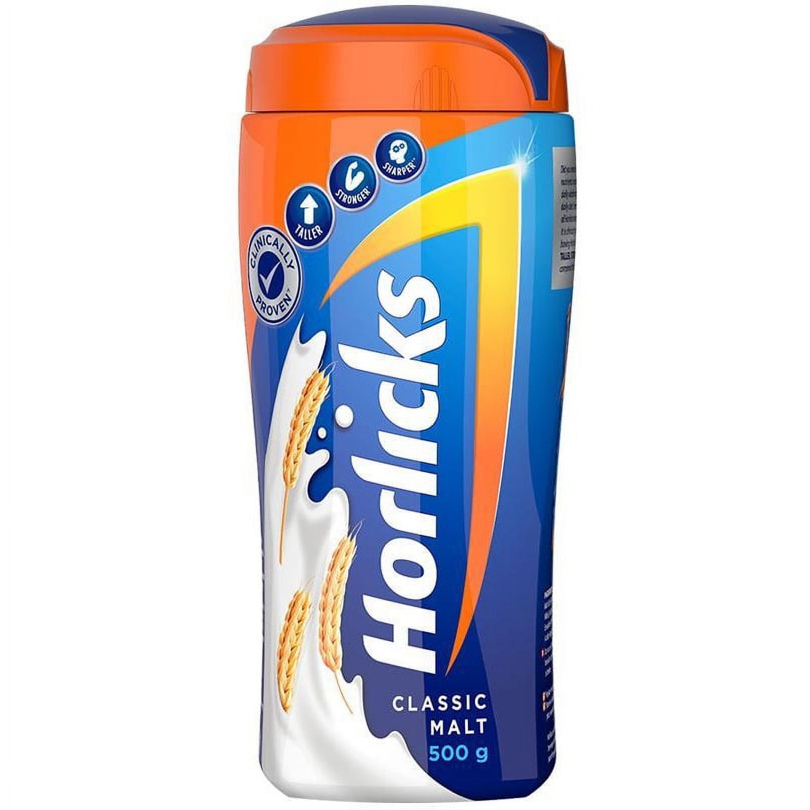
The packaging is a tall, cylindrical plastic container with a screw-on lid. The container features a smooth surface with a glossy finish, primarily in blue and orange colors. The front displays the product name 'Horlicks' prominently, along with a graphic of wheat and the product weight (500 g). The design includes a white wave graphic that adds visual interest.

The packaging is a cylindrical plastic container with a smooth surface and a bright orange lid. The container is predominantly blue with vibrant orange and white graphics. It features a large logo of 'Horlicks' prominently displayed on the front, along with product information such as weight (2 kg) and nutritional highlights. The design is modern and eye-catching, aimed at attracting consumer attention.

The packaging is a cylindrical carton with a smooth, flat construction. It features a glossy finish with vibrant colors. The top and bottom are sealed, and the sides are printed with graphics and text. The design includes a prominent image of a mug with a hot beverage and a scenic background. The edges are clean and precise, with no visible fluted layers.
About the Brand
Horlicks is a leading nutritional beverage brand in India, focused on delivering malt-based drinks fortified with essential vitamins and minerals. The company serves children, adults, and seniors, adapting its product and packaging strategies to segmented consumer needs.
The brand leverages a robust direct-to-consumer model to maximize control over product experience and customer engagement. Packaging is a critical element in Horlicks’ value proposition, combining rigid plastic containers and carton boxes with high-impact graphics and clear product information. This approach supports both brand recognition and practical considerations such as shelf stability and ease of use.
Key Differentiator: Notably, Horlicks integrates personalized services and digital marketing with their packaging, using visual cues and nutritional messaging to build consumer trust and reinforce their position as a heritage health brand.
Design System
Visual Style
Sans-serif typography with bold weights, a saturated blue and orange color palette, and dynamic illustrative graphics create a modern, approachable aesthetic. High contrast elements are used for product and nutritional claims.
Brand Identity
The Horlicks logo is consistently emphasized, with strict adherence to brand colors and graphic standards. Nutritional icons and clear, large-font labels support both branding and regulatory requirements, while all packs maintain coherence across product lines.
Packaging Design
Material choices favor rigid, impact-resistant plastics for primary containers and single-layer carton board for secondary packaging. Structural design emphasizes cylindrical forms for ergonomic handling and efficient storage. Tamper-evident closures and wide mouths are common for usability.
User Experience
Packaging design supports a seamless user journey, from strong shelf impact and easy identification to clear opening mechanisms and informative labeling, enhancing both trust and convenience throughout the consumer experience.
Company Metrics
Business insights for Horlicks based on available data
Market Positioning
Brand Values & Focus
Key Competitors
Target Market: Health-conscious consumers in India across children, adults, and elderly demographics seeking fortified nutritional beverages.
Packaging Assessment
Overall Grade
Visual appeal and presentation quality
Packaging durability and protection
Eco-friendliness and recyclable materials
Cost efficiency and value for money
Packaging assessment for Horlicks based on industry standards and best practices
Frequently Asked Questions
What types of packaging does Horlicks primarily use?
Horlicks predominantly utilizes cylindrical rigid plastic containers and carton boxes, featuring high-gloss or matte finishes, vibrant brand colors, and clear labeling for nutritional information and product variants.
How does Horlicks address sustainability in its packaging?
While the primary use of rigid plastics raises environmental considerations, some packaging components may be recyclable; however, the overall sustainability profile is intermediate and could be enhanced by a shift toward more eco-friendly materials and reduced plastic content.
What is the focus of Horlicks’ packaging design?
The design emphasizes strong brand visibility, consumer trust, and functional usability, with consistent color schemes, logo prominence, and informative graphics that support both marketing and regulatory requirements.
Discover other Food & Drink companies
Explore more companies in the food & drink industry and their packaging strategies
Thés de la Pagode
Food & Drink
Thés de la Pagode is a French company specializing in organic teas and infusions, focusing on health and well-being. Established in 1987, they prioritize sustainable practices and high-quality ingredients sourced through fair trade.
PrepMyMeal
Food & Drink
PrepMyMeal is a food production company specializing in high-protein meal delivery services. They offer a variety of natural, nutritious meals designed for fitness enthusiasts and those seeking convenience in meal preparation.
ruf lebensmittelwerk kg
Food & Drink
RUF Lebensmittelwerk KG is a German food production company specializing in a variety of baking mixes and drink products. Founded in 1920, the company is known for its high-quality ingredients and innovative food solutions.