Horace packaging
Horace is a Paris-based men's grooming brand specializing in skincare, fragrances, and body care, with an emphasis on natural ingredients and a direct-to-consumer approach. Their packaging strategy leverages minimalist, branded formats to reinforce a modern, accessible brand image while supporting logistics and retail requirements.
Packaging Portfolio
Horace utilizes a multi-format packaging system comprising folding carton boxes for retail, rigid boxes for premium and gift sets, corrugated cardboard for shipping, flexible cosmetic tubes for skincare, and branded retail paper bags. Material selection emphasizes matte finishes and deep blue colorways for brand consistency, with structural choices balancing product protection and presentation. Carton and corrugated solutions incorporate recyclable paperboard, while cosmetic tubes and rigid boxes reflect a blend of functionality and visual appeal. The inclusion of branded interior touchpoints, such as slogans and thank-you notes, enhances the customer experience across physical and e-commerce channels.

The packaging consists of a sturdy, thick-walled box that is rectangular in shape. The exterior is a deep navy blue with a matte finish, providing a premium appearance. The box is adorned with the brand name 'HORACE' prominently displayed in white, elegant typography. The box has clean, precise edges and a luxurious feel, indicative of high-quality construction.
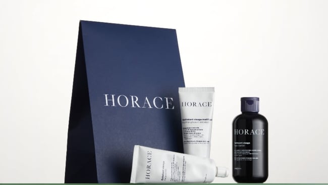
The packaging is a retail shopping bag made from thick paper. It features a solid navy blue exterior with a matte finish. The bag has a structured design with a flat bottom, allowing it to stand upright. The top edge is folded over and secured, giving it a clean appearance. The handles are made from the same material as the bag, providing a sturdy grip.
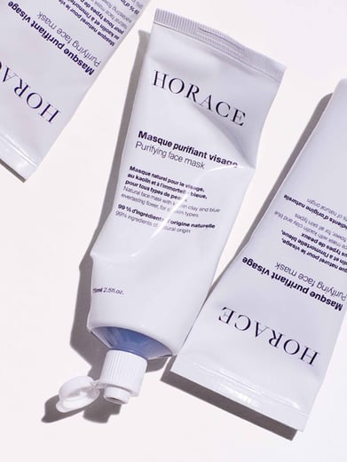
The packaging consists of a flexible tube with a smooth surface, primarily white in color with a glossy finish. The tube is cylindrical with a rounded cap at one end, which is likely a flip-top or screw-on closure. The design features a prominent brand name 'HORACE' in bold, uppercase letters, along with product information and instructions printed in a smaller font. The overall appearance is sleek and modern, suitable for cosmetic products.

The packaging consists of a corrugated box with a visible fluted inner layer, indicating its sturdy construction. The box is primarily brown in color, typical of kraft cardboard, and shows signs of wear from handling. The flaps are folded down and secured, likely with shipping tape. Inside, there is crumpled kraft paper used as cushioning for the product, which is a bottle of perfume. A thank-you note is also included, adding a personal touch.
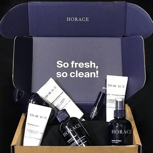
The packaging is a folding carton box with a smooth, flat construction. The exterior is primarily dark blue with a matte finish, featuring a large white printed logo 'HORACE' on the lid and a slogan 'So fresh, so clean!' printed in bold white letters inside the box. The box has clean, precise edges and folds, typical of retail packaging. The interior is designed to hold multiple products securely.
About the Brand
Horace delivers men's grooming solutions with a focus on quality, simplicity, and accessibility, utilizing a D2C model to serve customers both online and in physical retail. The company employs a cohesive packaging system designed to enhance brand recall and ensure product integrity throughout the supply chain.
Founded in 2016 and headquartered in Paris, Horace operates within the premium accessible segment of the beauty and fitness industry, targeting men seeking straightforward skincare solutions. The brand's packaging approach blends high-impact visual identity with practical considerations for e-commerce fulfillment, retail display, and customer experience. Consistency across structural formats, brand elements, and color palettes reinforces Horace’s modern and approachable ethos.
Key Differentiator: Horace distinguishes itself through a unified, minimalist packaging design system that aligns closely with its French heritage, D2C model, and commitment to quality ingredients, resulting in strong brand recognition and a streamlined unboxing experience.
Design System
Visual Style
Horace’s visual design relies on a minimalist, modern aesthetic featuring sans-serif typography, a deep navy blue and white color palette, and matte finishes. Layouts are uncluttered with a focus on negative space.
Brand Identity
Brand identity is reinforced through consistent use of the 'HORACE' logotype in uppercase, prominent logo placement, and uniform iconography across product and packaging. Visual consistency is maintained through strict adherence to color and typographic guidelines.
Packaging Design
Material choices prioritize paper-based substrates for outer packaging (carton, corrugated), with rigid boxes for premium positioning and flexible tubes for product functionality. Structural designs are clean, with precise folds and closures, reflecting a philosophy of understated elegance and reliability.
User Experience
The packaging system is engineered to enhance the customer journey through clear labeling, secure product protection, and branded messaging. The unboxing process is designed for emotional impact and ease of use, supporting both first-time and repeat purchase experiences.
Company Metrics
Business insights for Horace based on available data
Market Positioning
Brand Values & Focus
Key Competitors
Target Market: Urban, quality-conscious men seeking premium yet approachable grooming solutions in France and broader European markets.
Packaging Assessment
Overall Grade
Visual appeal and presentation quality
Packaging durability and protection
Eco-friendliness and recyclable materials
Cost efficiency and value for money
Packaging assessment for Horace based on industry standards and best practices
Frequently Asked Questions
What types of packaging formats does Horace use for its products?
Horace employs a range of packaging formats including folding carton boxes, rigid boxes, cosmetic tubes, retail shopping bags, and corrugated shipping boxes. Each format is selected to balance product protection, brand visibility, and user experience.
How does Horace address sustainability in its packaging?
Horace demonstrates moderate sustainability by using recyclable materials such as kraft corrugated boxes and paper-based retail bags. However, the presence of rigid boxes and plastic tubes indicates room for further optimization toward eco-friendly alternatives.
How does the packaging support Horace’s direct-to-consumer model?
Packaging structures are engineered for e-commerce efficiency, emphasizing protection during transit, compactness for shipping, and branded presentation for enhanced customer engagement upon delivery.
Discover other Beauty & Fitness companies
Explore more companies in the beauty & fitness industry and their packaging strategies
Cultiv Cosmetique
Beauty & Fitness
Cultiv Cosmetique is a French skincare brand that provides organic and eco-friendly beauty products inspired by nature. They focus on effective skincare solutions for various skin concerns.
Big Moustache
Beauty & Fitness
Big Moustache specializes in shaving and grooming products tailored for men, providing a hassle-free subscription service for razor blades and skincare essentials.
Pure Altitude
Beauty & Fitness
Pure Altitude specializes in high-quality beauty and skincare products that leverage the expertise of spa treatments to enhance daily routines. The brand offers a diverse range of products tailored for both facial and body care.