Hayman's Gin packaging
Hayman's Gin is a heritage London-based distillery specializing in artisanal gin production and direct-to-consumer sales. Their packaging strategy leverages premium rigid and carton box formats with consistent brand cues, focusing on both visual appeal and product protection.
Packaging Portfolio
Hayman's Gin employs a packaging portfolio centered on high-grade rigid boxes for premium gifting and multi-bottle sets, as well as custom-printed folding carton boxes for retail and direct shipping. The use of thick-walled chipboard and paperboard provides structural integrity, while decorative finishes, custom inserts, and die-cut windows enhance presentation and secure the product during transit. Color palettes and patterns are consistently aligned with brand guidelines, supporting both shelf impact and unboxing satisfaction. Packaging is purpose-designed for both product protection and elevated consumer experience, particularly in D2C and gifting contexts.
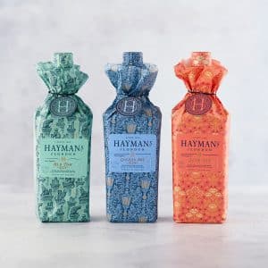
The packaging consists of three distinct folding cartons, each with a tall, slender shape, designed to hold bottles of gin. The cartons are made from a single layer of paperboard, featuring smooth, flat surfaces without any visible fluted layers. Each carton has a decorative wrap that includes vibrant colors and intricate patterns, contributing to an eye-catching retail appearance. The tops of the cartons are gathered and tied, creating a unique closure that adds to the aesthetic appeal.
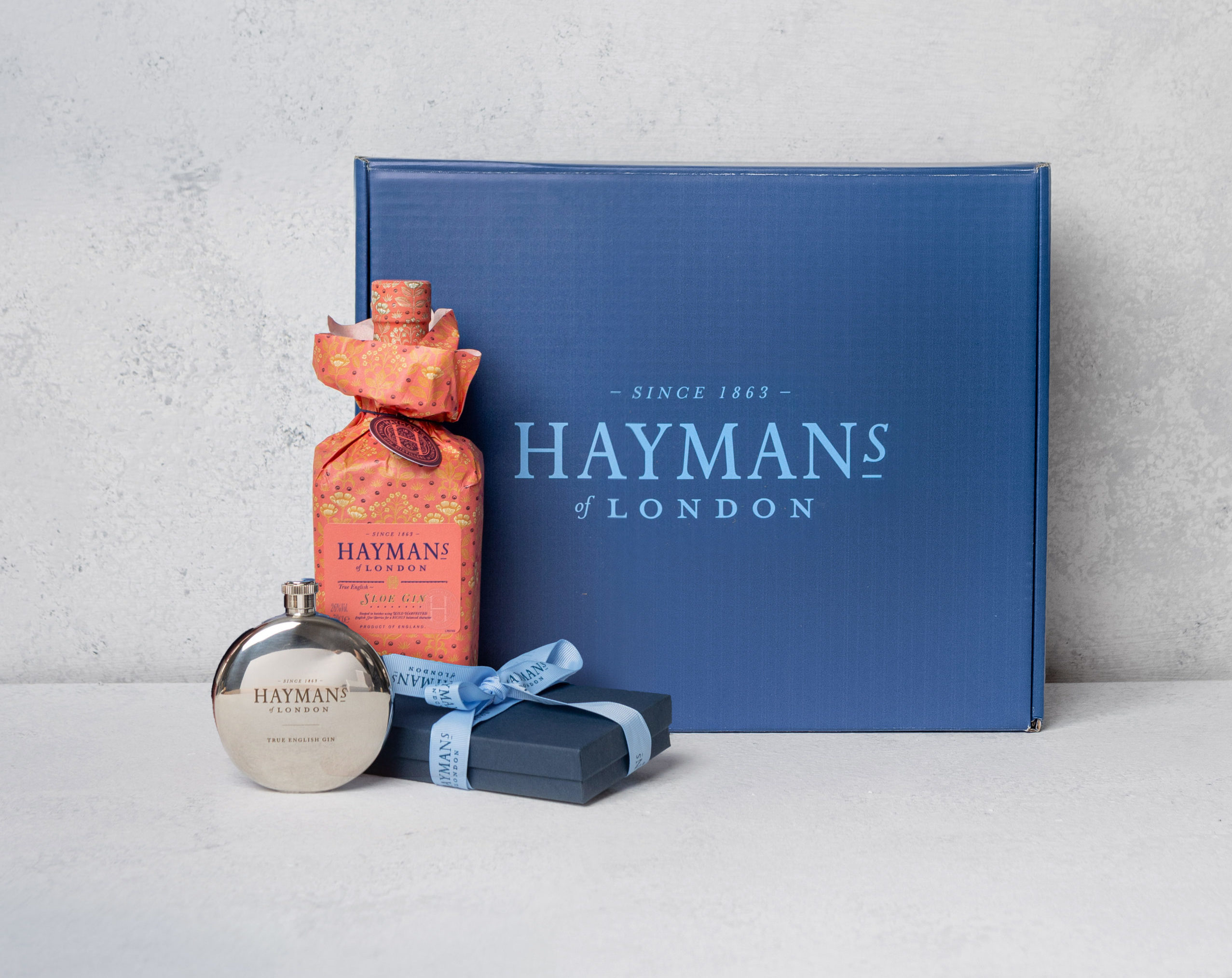
The packaging is a sturdy, thick-walled box with a premium appearance. It features a smooth, matte finish in a deep navy blue color. The box is adorned with a large, white logo that reads 'HAYMAN'S of LONDON' prominently on the front. The edges are clean and precise, indicating high-quality construction. The interior includes a decorative filler or insert to hold the contents securely.
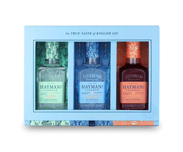
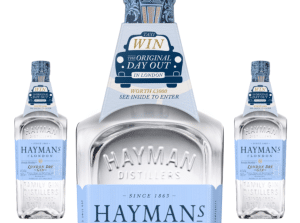
The packaging is a rigid box designed to hold three bottles of gin. It features a sturdy construction with thick walls, likely made from chipboard. The exterior is adorned with a colorful design, showcasing illustrations that reflect the brand's heritage. The box has a window cutout that allows visibility of the bottles inside. The edges are clean and well-defined, indicating high-quality manufacturing. The box is predominantly light blue with contrasting colors for each bottle section.
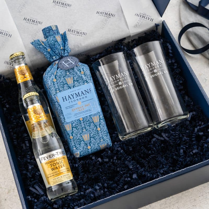
The packaging is a rigid box with a sturdy construction, featuring a deep blue exterior. The box has a lid that opens to reveal a decorative interior with a printed design. Inside, there are two clear glasses and a bottle of gin, all cushioned with black shredded paper. The exterior has a smooth finish, while the interior is printed with a pattern that complements the brand's aesthetic.
The packaging features a smooth, flat construction typical of folding cartons. It is predominantly white with a glossy finish, showcasing a clean and precise design. The edges are well-defined, and the folds are sharp, indicating high-quality manufacturing. The front displays a prominent logo and promotional graphics, while the sides are likely printed with additional product information.
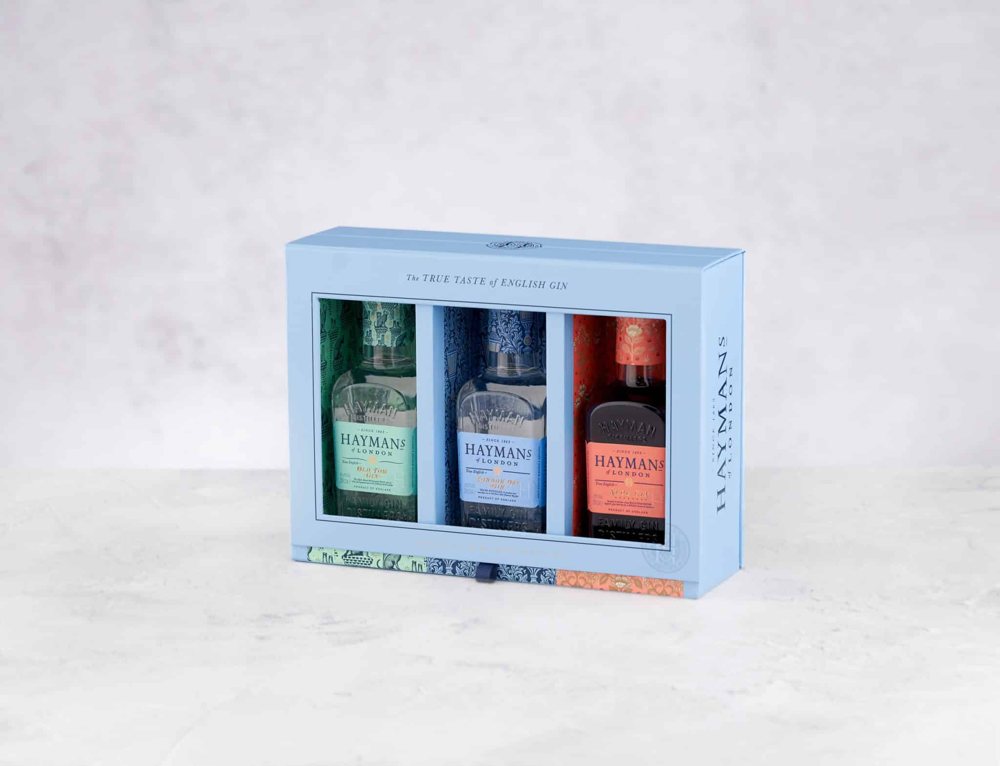
The packaging is a rigid box featuring a premium construction with thick walls. It has a decorative outer layer with a smooth finish, likely made of high-quality paperboard. The box is designed to hold three bottles of gin, with a clear window section allowing visibility of the products inside. The colors are pastel blue with vibrant accents, and the overall design includes intricate patterns and branding elements.
About the Brand
Hayman's Gin, established in 1863, is a family-run distillery recognized for its traditional gin craftsmanship and strong commitment to quality. The brand utilizes packaging as a strategic tool to reinforce its premium positioning and heritage narrative.
Operating as a B Corp certified business, Hayman's Gin integrates sustainability and responsible practices into its operations. Packaging plays a key role in customer experience, with a focus on gifting and direct-to-consumer logistics. Their portfolio includes a variety of rigid gift boxes and folding cartons, each designed to meet stringent protection, presentation, and brand consistency requirements.
Key Differentiator: The combination of historic legacy, B Corp sustainability standards, and a visually cohesive, luxury packaging system distinguishes Hayman's Gin within the premium spirits market.
Design System
Visual Style
The visual design style utilizes serif and sans-serif typography, a predominantly navy and pastel blue color palette with vibrant accent hues, and intricate pattern work reflecting heritage cues. Matte and glossy finishes are selectively applied to enhance tactile and visual appeal.
Brand Identity
Logo usage is prominent and standardized across all packaging, with the 'HAYMAN'S of LONDON' mark and supporting iconography. Visual consistency is ensured through repeating color schemes, pattern motifs, and clear hierarchy of information.
Packaging Design
Material choices favor rigid chipboard and recyclable paperboard for structural boxes and cartons. The structural philosophy emphasizes durability, premium presentation, and ease of product access, with consideration for both retail display and safe shipment.
User Experience
Packaging design is tailored to support a memorable customer journey—beginning with visual shelf appeal, progressing through tactile unboxing rituals, and culminating in reinforced brand perception. Inserts, windows, and unique closures contribute to both protection and aesthetic impact, optimizing the gifting and direct-to-consumer experience.
Company Metrics
Business insights for Hayman's Gin based on available data
Market Positioning
Brand Values & Focus
Key Competitors
Target Market: Premium spirits consumers, gifting market, and environmentally conscious gin enthusiasts seeking high-quality, heritage-driven products.
Packaging Assessment
Overall Grade
Visual appeal and presentation quality
Packaging durability and protection
Eco-friendliness and recyclable materials
Cost efficiency and value for money
Packaging assessment for Hayman's Gin based on industry standards and best practices
Frequently Asked Questions
What types of packaging formats does Hayman's Gin primarily use?
Hayman's Gin primarily utilizes rigid boxes for premium gifting occasions and folding carton boxes for retail and direct shipment, with both formats featuring custom inserts and high-impact printed designs.
How does Hayman's Gin address sustainability in its packaging?
As a B Corp certified company, Hayman's Gin demonstrates a commitment to sustainability by selecting recyclable paperboard materials and designing packaging with reusability and minimal environmental impact in mind.
What role does packaging play in Hayman's Gin's direct-to-consumer model?
Packaging is critical to the brand’s D2C strategy, ensuring safe logistics, enhancing the unboxing experience, and reinforcing brand perception through premium tactile and visual cues.
Discover other Food & Drink companies
Explore more companies in the food & drink industry and their packaging strategies
Terres de Café
Food & Drink
Terres de Café is a specialty coffee retailer based in Paris, France, known for its commitment to sustainability and high-quality coffee sourcing.
kerex - terre exotique
Food & Drink
Kerex - Terre Exotique specializes in the international trade of gourmet food and drink products, offering a unique selection of spices and culinary ingredients.
PrepMyMeal
Food & Drink
PrepMyMeal is a food production company specializing in high-protein meal delivery services. They offer a variety of natural, nutritious meals designed for fitness enthusiasts and those seeking convenience in meal preparation.