Hannoversche Kaffeemanufaktur packaging
Hannoversche Kaffeemanufaktur is a specialty coffee roastery based in Germany, serving both B2C and B2B markets. Their packaging approach emphasizes sustainable materials, clear branding, and consistent design to enhance product presentation and customer perception.
Packaging Portfolio
Hannoversche Kaffeemanufaktur utilizes a combination of single-layer paperboard carton boxes and flexible, resealable coffee bags for its product range. The carton boxes are constructed with precise folding and matte or glossy finishes, optimized for retail presentation and brand storytelling. Flexible coffee bags offer resealability and product freshness, employing barrier materials suitable for specialty coffee. Both formats feature consistent branding elements, including logos, product-specific color schemes, and organic certification marks, supporting a unified and eco-oriented brand image.
The packaging consists of three individual coffee bags, each with a distinct design. The bags are made from a flexible material that allows for a lightweight and compact form. Each bag features a smooth surface with a matte finish, and they are primarily rectangular in shape. The bags have a top fold and a resealable closure, which is common for coffee packaging. The overall design is clean and modern, with vibrant colors and clear branding.
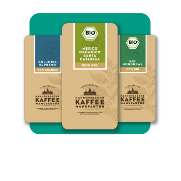
The packaging consists of three individual boxes arranged closely together, each with a smooth, flat construction. The boxes are made of a single-layer paperboard, featuring clean edges and precise folds. The exterior is predominantly kraft brown, with printed graphics in various colors. Each box has a distinct design, showcasing product names and branding elements prominently. The overall appearance is lightweight and retail-friendly, suitable for display.
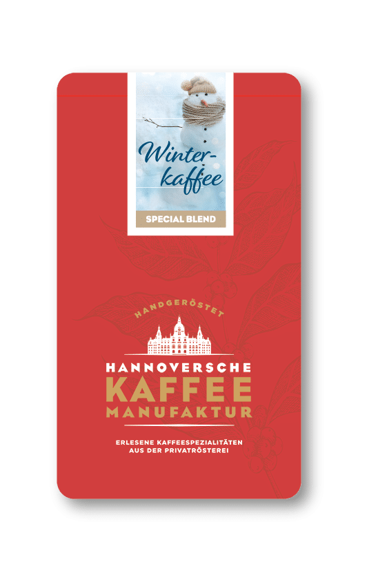
The packaging is a flat, rectangular box made of single-layer paperboard. It features a smooth, flat construction without any visible fluted layers, indicating it is a carton box. The exterior is predominantly red with a glossy finish, showcasing a winter-themed design with a snowman and the text 'Winter-kaffee Special Blend' prominently displayed. The edges are clean and precise, and the overall appearance is lightweight and retail-friendly.
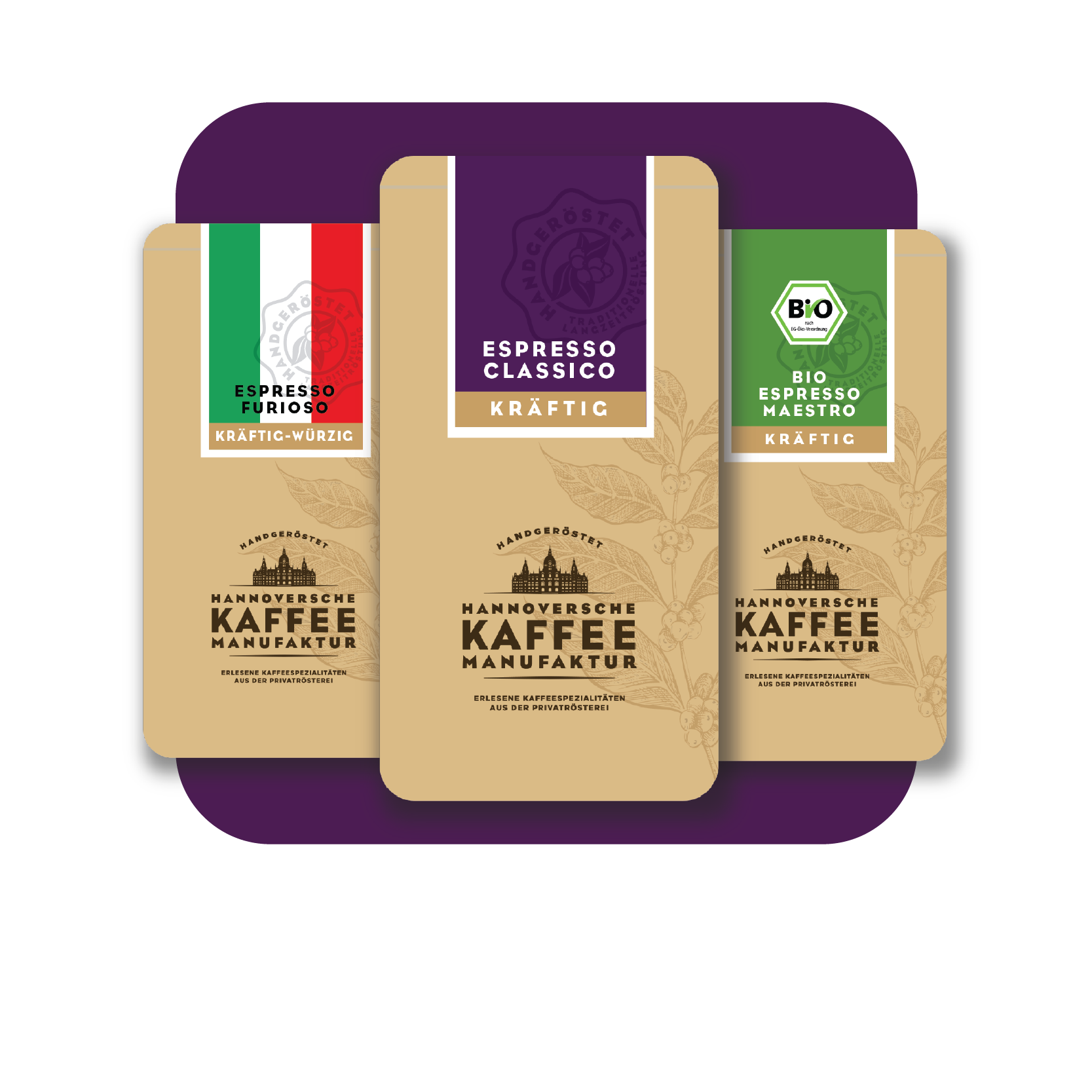
The packaging consists of a series of flat, rectangular boxes with a smooth, single-layer paperboard construction. The boxes feature clean, precise edges and folds, indicative of a folding carton design. The surface has a matte finish with a combination of earthy tones and vibrant colors, prominently displaying product names and branding elements. Each box has a consistent layout, with a central logo and product information clearly visible.
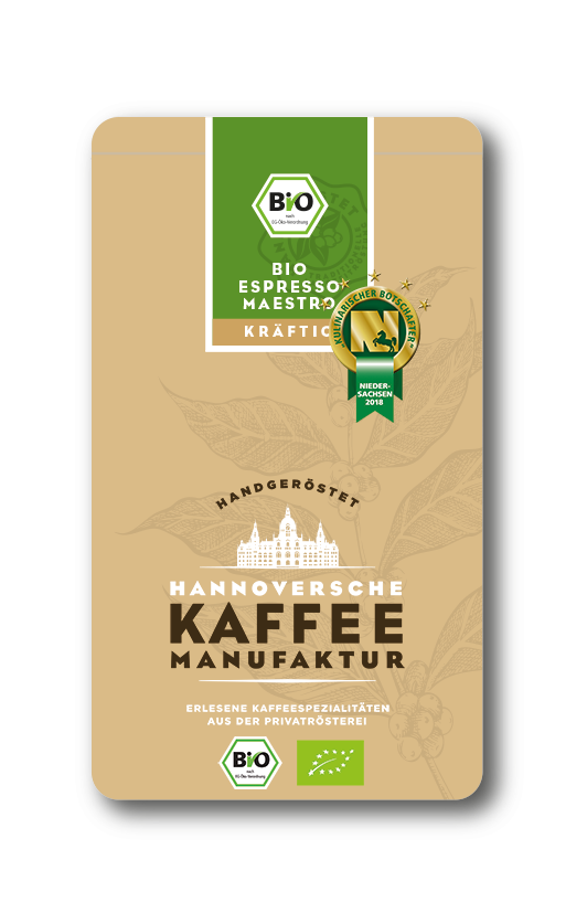
The packaging is a flat, rectangular box made from single-layer paperboard. It features a smooth, matte finish with a light brown background. The front displays a prominent logo and product name in white and dark brown fonts, with additional graphics including a green certification logo. The edges are clean and precise, indicating a well-constructed folding carton. There are no visible fluted layers, confirming it is not corrugated. The design includes decorative elements such as coffee plant illustrations.

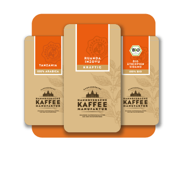
The packaging is a rectangular, smooth, flat construction made from single-layer paperboard. It features clean edges and folds, with a kraft brown exterior. The front displays a colorful label indicating the product name and blend, while the sides have printed text describing the product. The overall appearance is lightweight and designed for retail display.
About the Brand
Hannoversche Kaffeemanufaktur specializes in premium, small-batch roasted coffees sourced directly from origin and distributed through both retail and business channels. The company's packaging strategy centers on leveraging carton boxes and flexible bags to deliver quality, freshness, and a strong, consistent brand identity.
Founded in 2012, the company emphasizes quality assurance through direct sourcing and traditional roasting techniques. Packaging choices include matte-finished paperboard cartons and resealable flexible bags, both of which provide effective retail display and product protection. The brand integrates eco-friendly certifications and organic labels, reflecting a commitment to sustainability and consumer transparency.
Key Differentiator: Direct sourcing, traditional roasting, and an emphasis on eco-certified packaging differentiate Hannoversche Kaffeemanufaktur within the premium coffee segment.
Design System
Visual Style
Typography is clean and modern, with emphasis on legibility for product information. The color palette leverages earthy tones—browns, greens, and muted hues—contrasted by occasional vibrant accents for seasonal or specialty blends. The overall aesthetic is minimalist, prioritizing clarity and natural imagery.
Brand Identity
Logo usage is prominent and consistent, appearing on all packaging formats alongside product names and certification icons. Iconography reinforces organic and Fairtrade positioning, while visual elements are applied with uniform spacing and hierarchy to ensure brand recognition.
Packaging Design
Material choices focus on recyclable paperboard and flexible packaging with barrier properties, aligning with sustainability goals. Structural design emphasizes lightweight, retail-friendly forms with sturdy edges and resealable closures for freshness. The philosophy blends visual appeal with functional protection.
User Experience
Packaging is designed to provide a tactile and visually engaging unboxing, supporting customer engagement from purchase to consumption. Clear labeling and intuitive opening mechanisms enhance usability, while storytelling elements on the packs reinforce the premium, artisanal brand experience.
Company Metrics
Business insights for Hannoversche Kaffeemanufaktur based on available data
Market Positioning
Brand Values & Focus
Key Competitors
Target Market: Environmentally conscious specialty coffee consumers, local businesses, and corporate clients seeking premium coffee solutions in Germany and surrounding regions.
Packaging Assessment
Overall Grade
Visual appeal and presentation quality
Packaging durability and protection
Eco-friendliness and recyclable materials
Cost efficiency and value for money
Packaging assessment for Hannoversche Kaffeemanufaktur based on industry standards and best practices
Frequently Asked Questions
What types of packaging does Hannoversche Kaffeemanufaktur primarily use?
The company primarily uses single-layer paperboard carton boxes for retail and specialty blends, as well as flexible, resealable coffee bags for product freshness and convenience.
How does the packaging support sustainability initiatives?
Packaging incorporates recyclable materials, organic certification labels, and minimalistic designs to reduce environmental impact and communicate responsible sourcing.
What is the visual approach of Hannoversche Kaffeemanufaktur packaging?
The packaging features consistent branding, earthy color palettes, and clear typography, with a focus on product information and visual cues for organic and specialty status.
How does the packaging contribute to the overall customer experience?
Packaging is designed for both shelf impact and an engaging unboxing experience, supporting product storytelling and reinforcing the brand’s artisanal positioning.
Discover other Food & Drink companies
Explore more companies in the food & drink industry and their packaging strategies
Teegschwendner GmbH
Food & Drink
Teegschwendner GmbH is a specialty tea company based in Germany, offering a wide selection of high-quality teas and tea-related accessories. They focus on providing unique tea experiences through carefully sourced and curated products.
PrepMyMeal
Food & Drink
PrepMyMeal is a food production company specializing in high-protein meal delivery services. They offer a variety of natural, nutritious meals designed for fitness enthusiasts and those seeking convenience in meal preparation.
Thés de la Pagode
Food & Drink
Thés de la Pagode is a French company specializing in organic teas and infusions, focusing on health and well-being. Established in 1987, they prioritize sustainable practices and high-quality ingredients sourced through fair trade.