Guru Granola packaging
Guru Granola specializes in Ayurvedic-inspired granola blends, utilizing flexible stand-up pouch packaging to deliver a natural, health-focused brand experience. Their packaging approach emphasizes resealability, transparency, and a rustic visual identity that aligns with wellness-driven consumer expectations.
Packaging Portfolio
Guru Granola's packaging portfolio is built around flexible stand-up pouches constructed from kraft-laminated films paired with clear plastic windows, providing a balance of visual transparency and product protection. The use of resealable zip-lock closures enhances consumer convenience and supports portion control, while the natural aesthetic—emphasizing earthy tones and minimalistic graphics—reinforces brand authenticity. Twine details and clean typography further differentiate the packaging, making it both functionally robust and visually aligned with health-centric consumer values.

The packaging consists of three stand-up pouches, each featuring a clear front panel that allows visibility of the granola inside. The pouches are filled with granola and are slightly crumpled at the top, indicating they have been opened or handled. Each pouch has a resealable zipper at the top, which is a common feature for maintaining freshness. The overall shape is rectangular with a flat bottom, allowing them to stand upright on shelves.
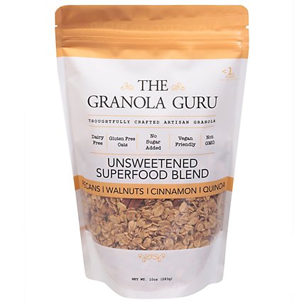
The packaging is a stand-up pouch made of a flexible material, likely a multi-layer film. The front features a clear window that allows visibility of the granola inside, with a white background and orange accents at the top. The text is printed in a mix of bold and regular fonts, prominently displaying the product name and key attributes. The edges are sealed, and the top has a resealable zipper for convenience.

The packaging is a stand-up pouch made from a flexible material, designed to hold granola. It features a resealable top, allowing for easy access and storage. The front of the pouch displays the product name prominently, along with images of the ingredients. The overall design is clean and modern, with a clear window showing the granola inside.
The packaging consists of three stand-up pouches, each containing granola. The pouches are made from a flexible material that allows them to stand upright. Each pouch features a clear window at the front, showcasing the granola inside. The top of the pouches is sealed with a zip-lock closure, allowing for easy opening and resealing. The overall shape is rectangular with rounded edges, providing a modern and appealing look.
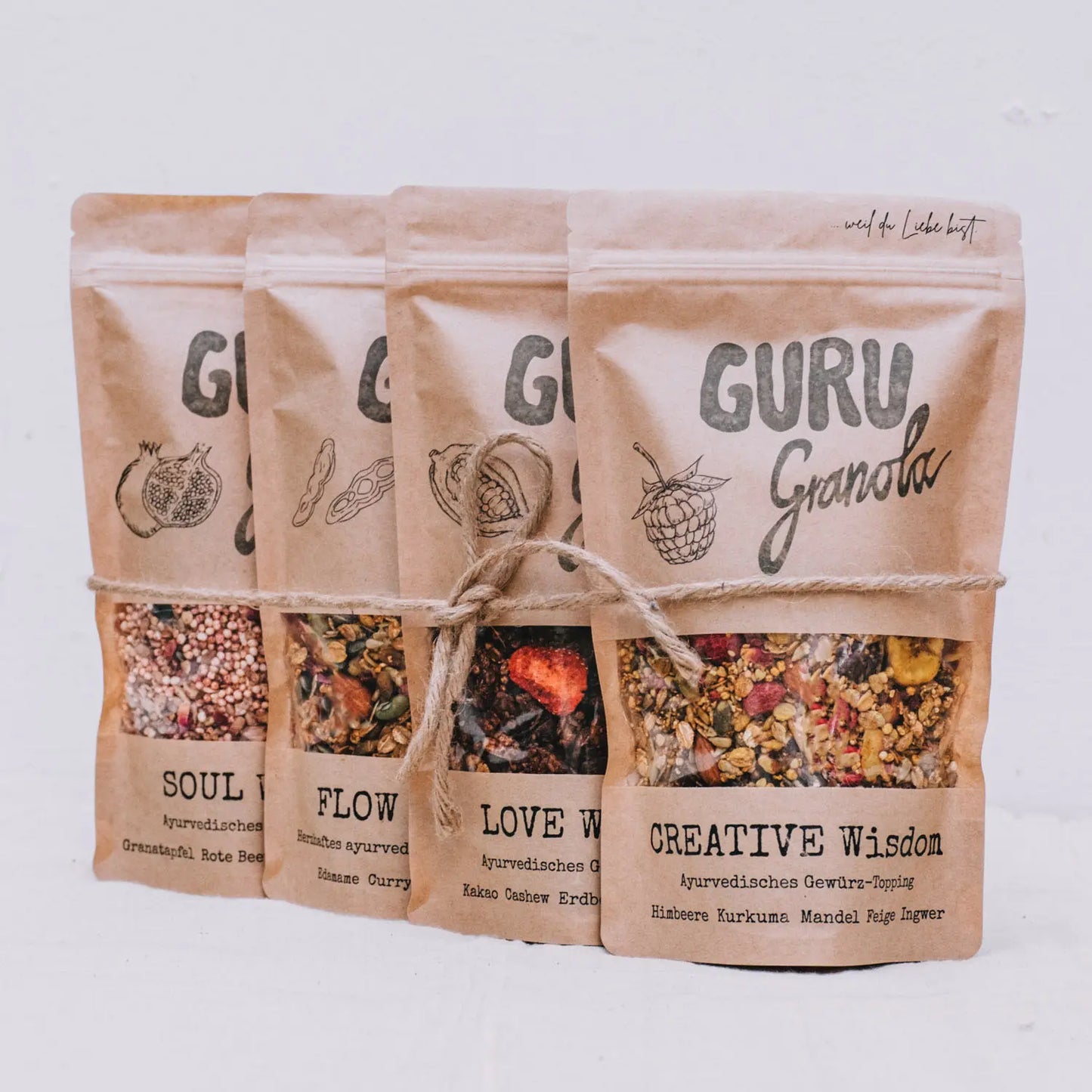
The packaging consists of multiple stand-up pouches made from a flexible material that allows them to stand upright. Each pouch features a kraft paper exterior with a clear plastic window at the front, showcasing the granola contents. The pouches are sealed at the top with a zip-lock closure, making them resealable. The design includes a rustic aesthetic with a natural look, complemented by twine wrapped around the base of the pouches.

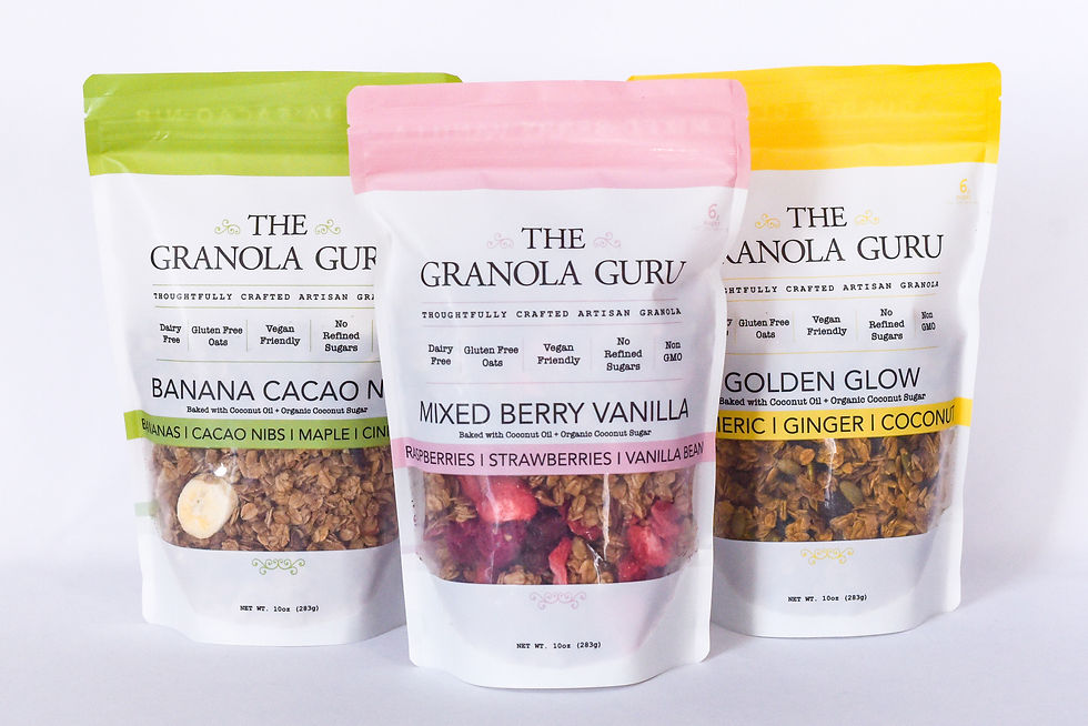
The packaging consists of three stand-up pouches, each featuring a clear front window that displays the granola inside. The pouches have a resealable zipper at the top. Each pouch has a different color scheme: one is white with a pink top, another is white with a yellow top, and the last is white with a green top. The front of each pouch prominently displays the product name and flavor in bold, colorful fonts, with additional details about the ingredients listed below. The overall appearance is clean and modern, appealing to health-conscious consumers.
About the Brand
Guru Granola operates in the health-oriented food segment, producing granola and snack products with a strong emphasis on sustainability and wellness. The company leverages direct-to-consumer distribution and integrates eco-conscious packaging strategies into their supply chain.
Based in Cologne, Germany, Guru Granola adopts Ayurvedic principles in product formulation and communicates a holistic, health-centered brand ethos across all touchpoints. The packaging strategy incorporates natural visual cues and functional resealable solutions, appealing to consumers prioritizing both nutrition and environmental responsibility. The brand also extends its philosophy through wellness retreats and courses, reinforcing its commitment to lifestyle alignment.
Key Differentiator: Guru Granola's unique positioning derives from its integration of Ayurvedic wellness principles with sustainable packaging and a transparent, approachable visual identity.
Design System
Visual Style
Typography centers on clean, sans-serif fonts with a preference for bold type for product names and lighter weights for descriptions. The color palette leverages earth tones—kraft brown, white, muted greens, and soft accent colors—creating a rustic yet modern aesthetic.
Brand Identity
Logo usage is consistent, with the 'GURU' or 'Granola Guru' logotype placed prominently at the top of each pouch. Iconography is minimal, focusing on ingredient visuals and clear flavor callouts. Visual consistency is maintained through unified labeling, recurring color schemes, and strategic placement of windows and brand marks.
Packaging Design
Material choices favor kraft paper laminates and clear multi-layer films for both sustainability and barrier protection. The structural design emphasizes upright shelf presence, resealability, and product visibility, adhering to principles of functional minimalism and user convenience.
User Experience
Packaging is designed to facilitate quick product identification, ease of opening and resealing, and transparent communication of nutritional benefits. The unboxing journey is enhanced by tactile materials and clear visual hierarchies, supporting a premium yet approachable brand experience.
Company Metrics
Business insights for Guru Granola based on available data
Market Positioning
Brand Values & Focus
Key Competitors
Target Market: Health-conscious consumers seeking natural, sustainably packaged food products, with a particular focus on those interested in Ayurvedic nutrition and lifestyle.
Packaging Assessment
Overall Grade
Visual appeal and presentation quality
Packaging durability and protection
Eco-friendliness and recyclable materials
Cost efficiency and value for money
Packaging assessment for Guru Granola based on industry standards and best practices
Frequently Asked Questions
What type of packaging does Guru Granola use for its products?
Guru Granola utilizes flexible, resealable stand-up pouches, often with kraft paper exteriors and clear plastic windows for product visibility. This approach balances shelf appeal, product protection, and sustainability.
How does Guru Granola address sustainability in its packaging?
The brand emphasizes the use of recyclable materials and minimalistic structures, reducing environmental impact while ensuring product freshness and quality. Kraft paper exteriors and clear windows support both eco-consciousness and transparency.
Is Guru Granola's packaging designed with logistics and shipping safety in mind?
Yes, the stand-up pouch format with resealable zippers provides a secure, protective barrier against moisture and external contaminants, supporting safe transit and extended shelf life.
Discover other Food & Drink companies
Explore more companies in the food & drink industry and their packaging strategies
Teegschwendner GmbH
Food & Drink
Teegschwendner GmbH is a specialty tea company based in Germany, offering a wide selection of high-quality teas and tea-related accessories. They focus on providing unique tea experiences through carefully sourced and curated products.
kerex - terre exotique
Food & Drink
Kerex - Terre Exotique specializes in the international trade of gourmet food and drink products, offering a unique selection of spices and culinary ingredients.
PrepMyMeal
Food & Drink
PrepMyMeal is a food production company specializing in high-protein meal delivery services. They offer a variety of natural, nutritious meals designed for fitness enthusiasts and those seeking convenience in meal preparation.