Glamot packaging
Glamot specializes in distributing professional beauty and wellness products through a robust e-commerce platform, utilizing highly branded, retail-ready packaging formats. Their packaging approach combines premium materials with visual transparency and targeted structural solutions for a differentiated consumer experience.
Packaging Portfolio
Glamot’s packaging portfolio is dominated by rigid boxes and carton boxes engineered for presentation and product safety. Materials include matte-finished paperboard, transparent plastics for product visibility, and reinforced edges for durability during transit. Structural designs often feature clear windows and multi-compartment layouts to showcase sets or bundled products, enhancing shelf appeal and unboxing satisfaction. Branding is consistently integrated across all packaging, with high visibility of logos, product names, and curated color palettes tailored to beauty sector norms.
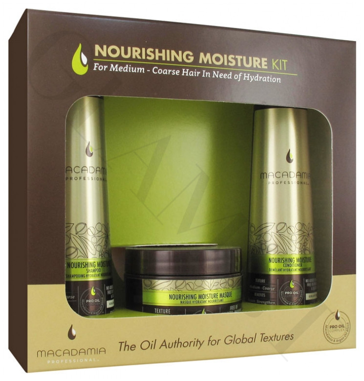
The packaging is a rectangular rigid box with a clear plastic window on the front, allowing visibility of the products inside. The box features a matte finish with a combination of green and gold colors, creating a luxurious appearance. The edges are clean and well-defined, with a sturdy construction that suggests durability. The front displays the product name and branding prominently, while the sides have additional information about the products included.
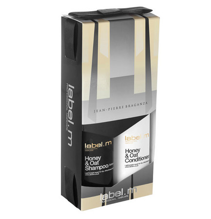
The packaging is a retail carton box designed to hold two bottles of shampoo and conditioner. It features a smooth, flat construction with clean edges and folds. The box is predominantly black with gold accents, showcasing a modern and elegant design. The front has a transparent window that allows visibility of the products inside. The overall shape is rectangular, with a sturdy base and a top that folds over to secure the contents.
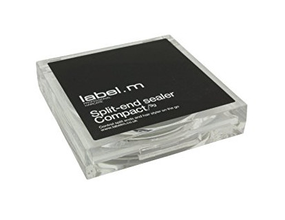
The packaging is a square, rigid box with a transparent plastic exterior. The top features a black label with white text, indicating the product name 'Split-end sealer Compact' and the brand 'label.m'. The box has clean, sharp edges and a sturdy construction, suggesting premium quality. The overall appearance is sleek and modern, suitable for retail display.

The image showcases a variety of cosmetic products, primarily in cylindrical and rectangular packaging. The cylindrical bottles are made of dark-colored plastic with a matte finish, featuring pump dispensers. The rectangular boxes are made of smooth paperboard with clean edges and folds, displaying vibrant graphics and product information. The overall arrangement is visually appealing, with a focus on the brand's logo and product names.
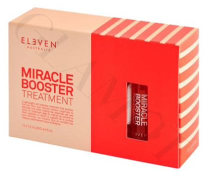
The packaging is a flat, rectangular carton box made of single-layer paperboard. It features a smooth surface with clean edges and folds. The box is predominantly a soft peach color with a contrasting white stripe design on one side. The front displays the product name 'MIRACLE BOOSTER TREATMENT' in bold, red font, which is prominent and easy to read. The overall construction appears lightweight yet sturdy, suitable for retail display.
About the Brand
Glamot is an online retailer within the beauty and fitness sector, delivering salon-grade hair, skin, and cosmetic products across multiple markets. The company employs a customer-centric packaging strategy, emphasizing protective, visually appealing formats that reinforce both brand identity and product quality.
Operating as a B2C e-commerce business, Glamot leverages a mix of rigid boxes and custom carton solutions tailored for cosmetics and professional beauty tools. Their packaging portfolio emphasizes premium presentation, with frequent use of matte finishes, transparent windows, and cohesive color schemes to signal product quality and brand consistency. The company integrates branding elements across packaging assets, supporting both retail visibility and post-purchase brand recall.
Key Differentiator: Glamot’s unique approach lies in its integration of luxury-inspired, retail-grade packaging with strong visual branding and a focus on the unboxing experience, positioning it at the intersection of professional and consumer beauty markets.
Design System
Visual Style
Typography is modern and legible, frequently using bold sans-serif fonts for product names and clean, minimalist layouts. The color palette leverages premium hues such as gold, black, green, and peach, providing a luxurious yet approachable aesthetic. Matte finishes and selective gloss accents are common.
Brand Identity
Logo placement is prominent on all packaging, accompanied by consistent use of brand colors and product-specific iconography. Visual consistency is maintained through uniform typefaces and clear hierarchy of information across formats.
Packaging Design
Material choices prioritize paperboard and rigid plastics for structure and display, with transparent windows enhancing product visibility. Structural design emphasizes durability, clean folds, and retail shelf-readiness. Packaging often supports multi-product arrangements for bundled offerings.
User Experience
The design system enhances the customer journey by creating anticipation through visually appealing packaging and clear branding. Unboxing is engineered to deliver an emotional impact, with easy-access structures and protective features that minimize damage while reinforcing a premium brand experience.
Company Metrics
Business insights for Glamot based on available data
Market Positioning
Brand Values & Focus
Key Competitors
Target Market: End consumers and professional stylists seeking salon-quality beauty products with a premium retail experience, spanning multiple European countries.
Packaging Assessment
Overall Grade
Visual appeal and presentation quality
Packaging durability and protection
Eco-friendliness and recyclable materials
Cost efficiency and value for money
Packaging assessment for Glamot based on industry standards and best practices
Frequently Asked Questions
What types of packaging formats does Glamot use?
Glamot primarily utilizes rigid boxes and carton boxes with features such as transparent windows, matte finishes, and structural reinforcements, optimized for retail and e-commerce distribution.
How does Glamot address sustainability in its packaging?
While visually premium, Glamot's packaging relies heavily on paperboard and recyclable plastics; however, comprehensive sustainability practices such as the use of post-consumer materials or minimalistic design are not overtly documented.
What is the primary focus of Glamot’s packaging design?
The primary focus is on brand visibility, product protection, and delivering a high-impact unboxing experience aligned with beauty retail expectations.
Discover other Beauty & Fitness companies
Explore more companies in the beauty & fitness industry and their packaging strategies
Owari
Beauty & Fitness
Owari specializes in 100% natural beauty and fitness products, designed to enhance health and wellness. The company proudly offers its products made in France, emphasizing quick delivery and customer support.
Pure Altitude
Beauty & Fitness
Pure Altitude specializes in high-quality beauty and skincare products that leverage the expertise of spa treatments to enhance daily routines. The brand offers a diverse range of products tailored for both facial and body care.
Big Moustache
Beauty & Fitness
Big Moustache specializes in shaving and grooming products tailored for men, providing a hassle-free subscription service for razor blades and skincare essentials.