fruchtbar - jufico gmbh packaging
Fruchtbar - jufico gmbh specializes in organic food and beverage products for families and children, leveraging playful and functional packaging to enhance product appeal and usability. Their packaging strategy integrates child-friendly graphics, sustainable materials, and convenience-driven formats, supporting both brand positioning and consumer experience.
Packaging Portfolio
Fruchtbar employs a portfolio of single-layer paperboard cartons and flexible multi-layer pouches, optimized for lightweight durability and retail display. Carton boxes are used for snack bars and multi-packs, featuring clean folds, glossy finishes, and transparent windows for product visibility. Flexible pouches incorporate resealable features and spouts, supporting portion control and on-the-go consumption. All packaging integrates vibrant, child-friendly graphics and clear organic certification labeling, balancing shelf impact with sustainability objectives.
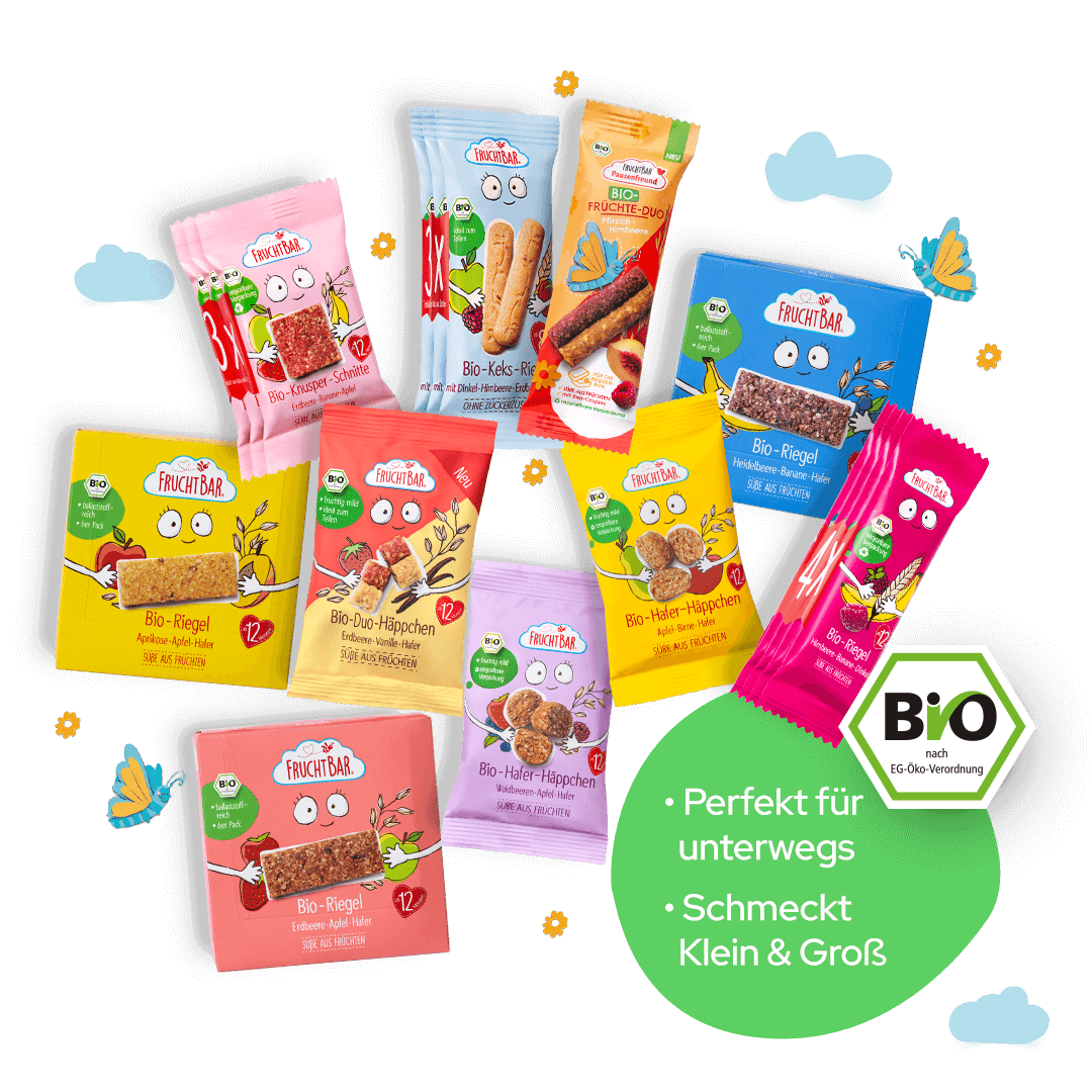
The image features a variety of small, colorful retail cartons used for packaging snacks. Each carton has a smooth, flat construction without visible fluted layers, indicating they are made from single-layer paperboard. The cartons are predominantly bright colors, including pink, yellow, and green, with playful graphics and illustrations of the products inside. The edges are clean and precise, and the cartons are designed for retail display, likely featuring a glossy finish.
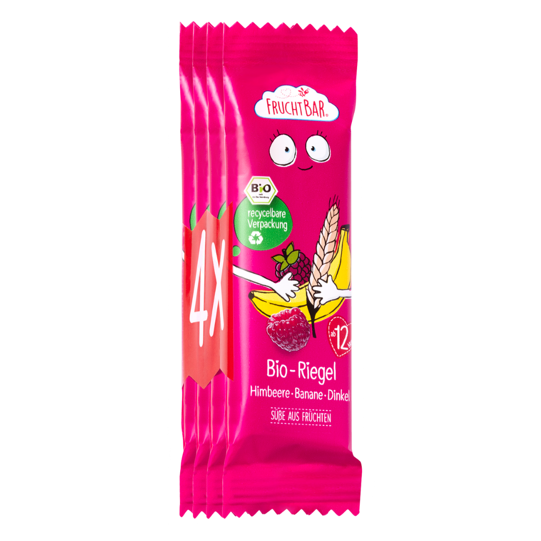
The packaging consists of a multi-pack of snack bars, featuring a vibrant pink exterior with playful graphics. The front displays images of bananas and raspberries, along with the product name 'Bio-Riegel' prominently featured. The packaging is sealed at the top and bottom, with a clear indication of the number of bars (4x) included. The overall design is colorful and appealing, aimed at attracting consumers looking for organic snacks.
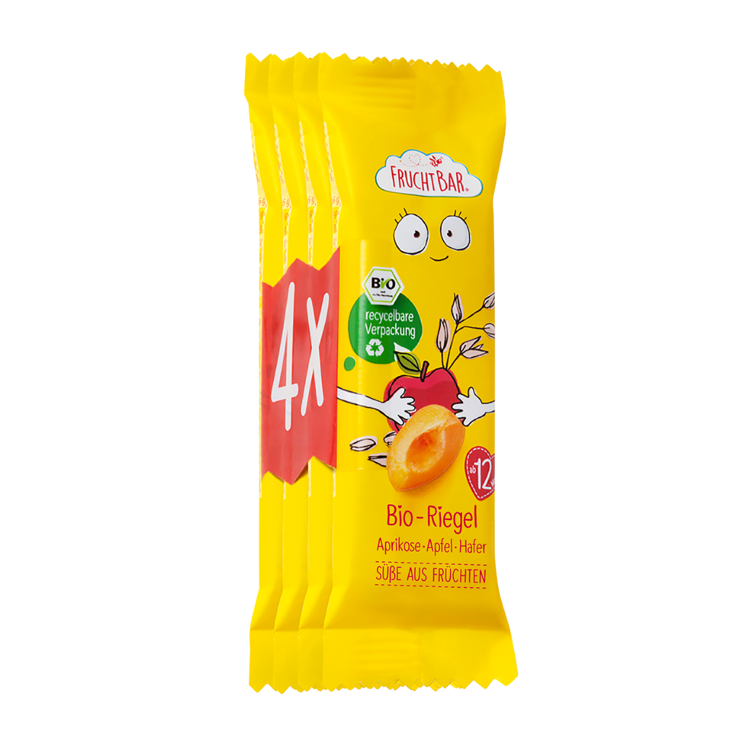
The packaging consists of a multi-pack of snack bars, featuring a bright yellow exterior with playful graphics. The front displays a cartoon character with large eyes and a smiling face, alongside images of apricots and apples. The packaging is sealed at the top and bottom, with a clear view of the individual bars. The overall design is colorful and appealing, aimed at attracting consumers, particularly children.

The packaging is a flat, rectangular box made from a single layer of paperboard, featuring a smooth surface with clean edges and precise folds. The box is predominantly pink with colorful illustrations of strawberries and a cartoon character, enhancing its appeal. The front displays the product name 'Bio-Riegel' prominently, along with flavor details and a certification logo.

The image features two types of packaging: a flexible pouch and a retail carton. The flexible pouch is made of a soft, flexible material, likely a multi-layer film, with a resealable top and a spout for easy dispensing. The pouch is colorful, showcasing fruit images and vibrant colors. The retail carton is a flat, rectangular box made of paperboard, featuring a smooth surface with a glossy finish. It has a clear, printed design with images of pasta and various ingredients, along with nutritional information and branding elements.
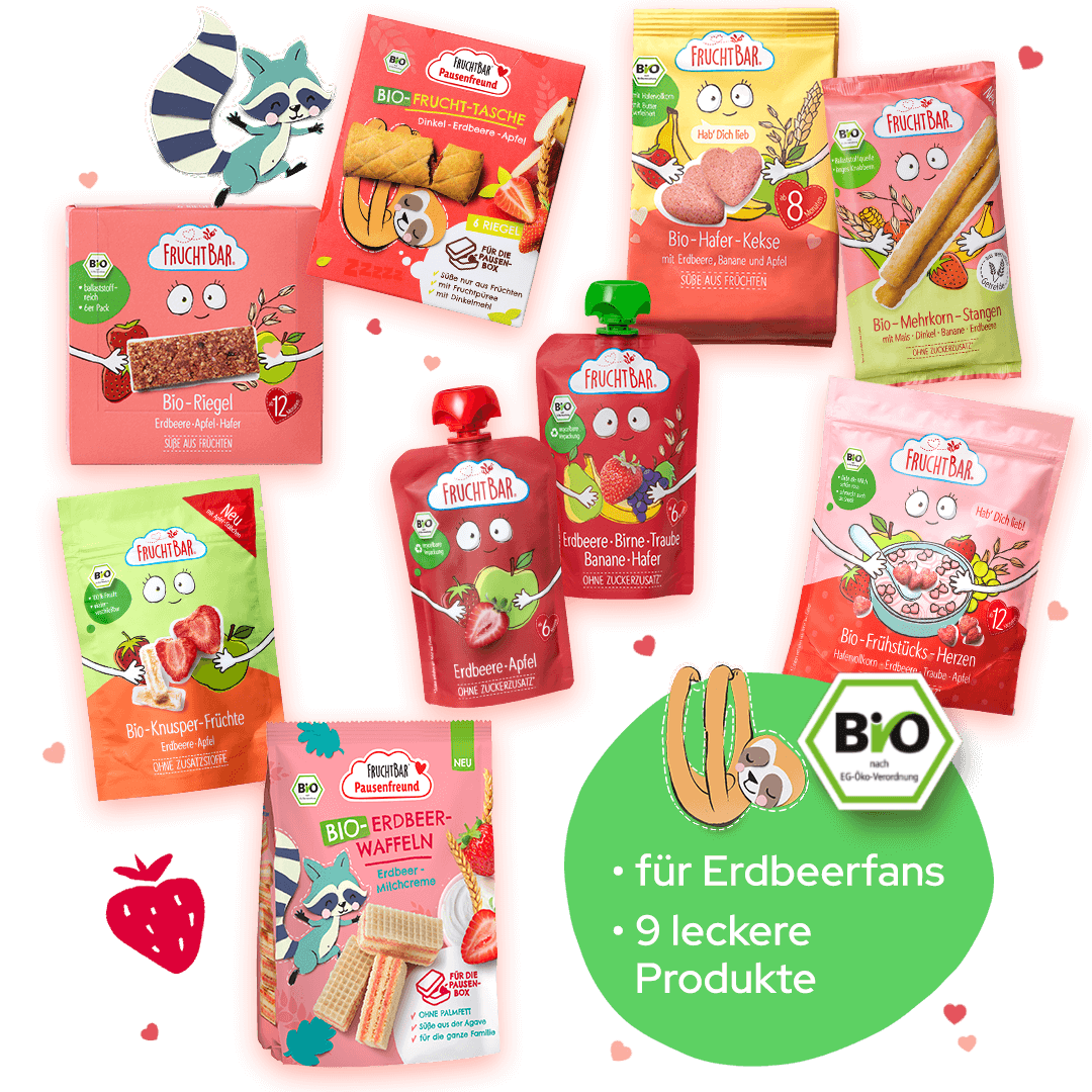
The image features various retail food packaging items, primarily composed of single-layer paperboard. The packages are brightly colored, predominantly in shades of pink and green, with clear, smooth surfaces. Each package has a clean, flat construction with precise edges and folds, indicative of folding cartons. The products are designed for easy visibility and appeal, showcasing images of the contents on the front. Some packages have transparent windows to display the product inside.
About the Brand
Fruchtbar - jufico gmbh is a German company focused on producing organic and natural food products for children and families, emphasizing health, convenience, and sustainability. Their approach to packaging is closely aligned with their core values, featuring bright, playful designs and functional structures tailored for easy use by children and parents.
Operating from Krailling, Bavaria, Fruchtbar's portfolio includes organic snacks, beverages, and family-oriented solutions, all presented in packaging formats such as single-layer paperboard cartons and flexible pouches. The company’s packaging consistently features eco-labels and child-centric branding, balancing shelf impact with environmental considerations. Their direct-to-consumer business model further prioritizes packaging durability for e-commerce logistics.
Key Differentiator: Fruchtbar stands out for its integration of playful, child-centered design with a high commitment to organic certification and sustainable packaging materials.
Design System
Visual Style
Typography relies on rounded, approachable sans-serif fonts that improve readability for both children and adults. The color palette is dominated by bright hues—pinks, yellows, greens—paired with high-contrast illustrations of fruits and playful mascots, establishing a cheerful yet natural aesthetic.
Brand Identity
Logo usage is prominent and consistent, with the 'FRUCHTBAR' wordmark and associated icons appearing on all primary and secondary packaging surfaces. Iconography includes organic certification badges and simple fruit illustrations, maintaining visual cohesion across formats.
Packaging Design
Material selection prioritizes recyclable paperboard for cartons and flexible films for pouches, with structural designs engineered for easy handling, resealability, and product protection. Structural clarity and minimal complexity facilitate efficient packing and consumer access.
User Experience
The packaging design supports the family customer journey through intuitive opening mechanisms, clear labeling, and emotional engagement via playful graphics. Emphasis on resealability and portion control aligns with parental convenience and reinforces the brand’s health and sustainability promises.
Company Metrics
Business insights for fruchtbar - jufico gmbh based on available data
Market Positioning
Brand Values & Focus
Key Competitors
Target Market: Health-conscious families and parents seeking organic, convenient, and environmentally responsible food and beverage options for children across Germany and broader European markets.
Packaging Assessment
Overall Grade
Visual appeal and presentation quality
Packaging durability and protection
Eco-friendliness and recyclable materials
Cost efficiency and value for money
Packaging assessment for fruchtbar - jufico gmbh based on industry standards and best practices
Frequently Asked Questions
What types of packaging does Fruchtbar - jufico gmbh use for its products?
Fruchtbar - jufico gmbh primarily utilizes single-layer paperboard cartons and flexible multi-layer pouches, both designed for visual appeal and practicality. Packaging formats are tailored to optimize protection, resealability, and ease of use for children and families.
How sustainable is Fruchtbar's packaging approach?
Fruchtbar demonstrates a strong focus on sustainability, using recyclable materials and clearly displaying organic certifications. However, the presence of multi-layer flexible packaging may limit recyclability in some markets, presenting ongoing opportunities for further improvement.
How does Fruchtbar's packaging support its brand identity?
The packaging features vivid colors, playful illustrations, and prominent organic certification logos, reinforcing the brand’s focus on health, child-friendliness, and environmental responsibility. Consistent design elements foster strong shelf recognition and emotional engagement with families.
Discover other Food & Drink companies
Explore more companies in the food & drink industry and their packaging strategies
PrepMyMeal
Food & Drink
PrepMyMeal is a food production company specializing in high-protein meal delivery services. They offer a variety of natural, nutritious meals designed for fitness enthusiasts and those seeking convenience in meal preparation.
kerex - terre exotique
Food & Drink
Kerex - Terre Exotique specializes in the international trade of gourmet food and drink products, offering a unique selection of spices and culinary ingredients.
Terres de Café
Food & Drink
Terres de Café is a specialty coffee retailer based in Paris, France, known for its commitment to sustainability and high-quality coffee sourcing.