for.me - ex fabiancosmetics packaging
for.me is a Paris-based beauty and cosmetics brand specializing in vegan, cruelty-free products distributed via a D2C e-commerce model. Their packaging emphasizes modern minimalism, leveraging high-quality carton and rigid box formats to reinforce brand identity and deliver a curated unboxing experience.
Packaging Portfolio
for.me employs a portfolio dominated by single-layer carton packaging with matte finishes and rigid box formats for select premium products. The use of recyclable paperboard aligns with industry sustainability trends, while structural choices such as tuck-tab closures and fold-over flaps support product security during transit. The minimalist, color-coordinated aesthetic enhances shelf appeal and brand recognition, and the integration of product information and branding elements is consistent across all formats.
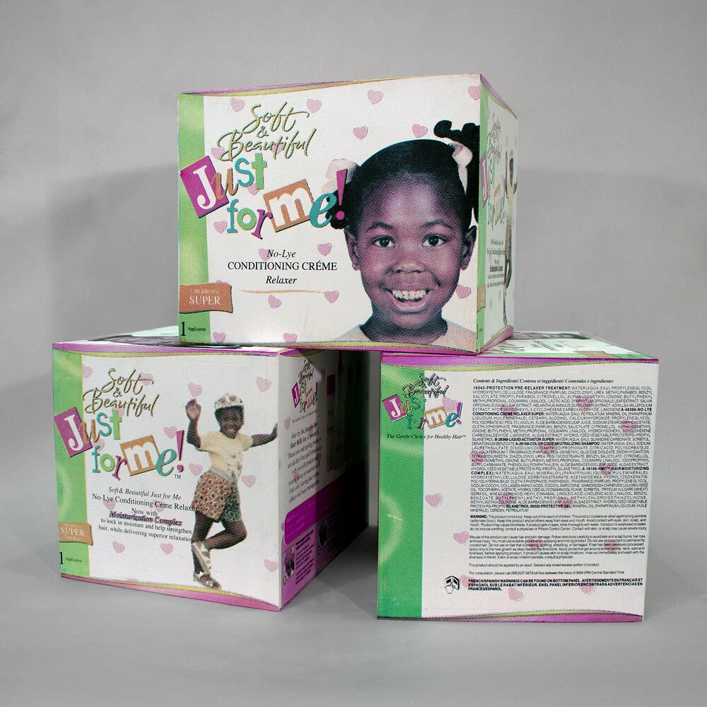
The packaging is a folding carton made of single-layer paperboard. It features a smooth, flat construction with clean edges and folds. The exterior is predominantly white with colorful graphics and images. The box has a square shape and is designed to stand upright. The front displays a large image of a young girl, along with the product name 'Just for Me!' in playful, bold fonts. The sides contain additional product information and instructions, printed in smaller text.

The packaging is a rectangular folding carton made from a single layer of paperboard. It features a smooth, flat construction with clean edges and folds. The exterior is a muted mauve color with a matte finish, providing a soft and elegant appearance. The top flap is slightly larger than the side flaps, allowing for a secure closure. The bottom is sealed with a tuck tab. The carton has printed text on one side, detailing the product ingredients and distribution information, in a clear, legible font.

The packaging consists of a sturdy, rectangular box with a smooth, matte finish. The box is light gray, featuring embossed text that reads 'Meadow' on the front. Inside, there is a clear glass perfume bottle with a round, gray cap. The bottle has a minimalist design, showcasing the product inside while maintaining an elegant appearance.

The packaging is a flat, smooth, single-layer paperboard carton with a clean, rectangular shape. It features a fold-over flap at the top for closure. The exterior is a solid black color with a matte finish, giving it a sleek appearance. The front displays the text 'BIG SECRET BOX' in bold, white font, centrally aligned, while the brand name 'For.me' is positioned at the bottom in smaller text. The edges are clean with precise folds, indicating a well-constructed carton.

The packaging is a folding carton made of single-layer paperboard, featuring a smooth, flat construction without any visible fluted layers. The box is predominantly white with colorful graphics and text. The edges are clean and precise, indicating a well-constructed retail package. It displays vibrant colors including blue, green, and orange, with a glossy finish that enhances the visual appeal. The front of the box features an image of a smiling child, which is likely part of the branding, along with product information and usage instructions.

The packaging is a folding carton made from a single layer of paperboard. It features a smooth, flat construction with clean edges and folds. The exterior is primarily white with sections of yellow and purple, indicating a colorful design. The carton has a matte finish, giving it a soft texture. The packaging is designed to hold a deodorant product, with a top flap that folds down to close the box securely.
About the Brand
for.me operates in the European beauty sector, selling makeup and cosmetic products directly to consumers through an online platform. The brand prioritizes customer satisfaction, rapid delivery, and ethical standards, with packaging designed to reflect both premium quality and contemporary aesthetics.
The company’s packaging approach favors single-layer carton boxes and rigid boxes with matte finishes, integrating clear brand identifiers and minimalistic design. With a small, agile team and a niche market focus, for.me leverages packaging as a key touchpoint in their customer journey, balancing branding, protection, and sustainability in line with EU regulations.
Key Differentiator: Distinctive minimalist packaging, rapid fulfillment, and a strong commitment to vegan and cruelty-free standards set for.me apart in the competitive beauty e-commerce landscape.
Design System
Visual Style
Typography is clean and sans-serif, with bold, centrally aligned product names. The color palette features muted tones (black, mauve, pale blue, white) with occasional vibrant accents. Matte finishes dominate, contributing to a modern, understated aesthetic.
Brand Identity
Brand name and product lines are displayed prominently, often replacing traditional logos for a text-first approach. Iconography is minimal or absent, and all packaging maintains strict visual consistency with high alignment to the core brand palette and design language.
Packaging Design
Material choices prioritize recyclable paperboard and rigid box structures, with emphasis on flat, smooth surfaces and clean folds. Structural design favors simplicity and ease of assembly while ensuring product protection.
User Experience
Packaging is engineered for a seamless, visually impactful unboxing process, supporting emotional engagement and reinforcing the brand’s premium positioning. Clear labeling and accessible closures enhance ease of use and customer satisfaction throughout the product journey.
Company Metrics
Business insights for for.me - ex fabiancosmetics based on available data
Market Positioning
Brand Values & Focus
Key Competitors
Target Market: European Union consumers seeking vegan, cruelty-free beauty and cosmetic products, with a focus on digitally native shoppers valuing ethical sourcing and premium presentation.
Packaging Assessment
Overall Grade
Visual appeal and presentation quality
Packaging durability and protection
Eco-friendliness and recyclable materials
Cost efficiency and value for money
Packaging assessment for for.me - ex fabiancosmetics based on industry standards and best practices
Frequently Asked Questions
What types of packaging does for.me typically use?
for.me mainly utilizes single-layer paperboard carton boxes and rigid boxes with matte finishes for both primary and secondary packaging, focusing on structural integrity and brand presentation.
How does for.me address sustainability in its packaging?
The brand uses recyclable paperboard materials and streamlined designs that align with EU environmental standards, though further improvements in material sourcing and end-of-life solutions could enhance their sustainability profile.
Does for.me use custom branding on its packaging?
Yes, for.me’s packaging consistently features the brand name and product information, with a high degree of visual consistency and minimalist design elements.
Discover other Beauty & Fitness companies
Explore more companies in the beauty & fitness industry and their packaging strategies
Orris Paris
Beauty & Fitness
Orris Paris specializes in creating artisanal skincare products that combine potent botanical ingredients with modern cleansing rituals. The company emphasizes natural, holistic practices in its formulations.
Big Moustache
Beauty & Fitness
Big Moustache specializes in shaving and grooming products tailored for men, providing a hassle-free subscription service for razor blades and skincare essentials.
Pure Altitude
Beauty & Fitness
Pure Altitude specializes in high-quality beauty and skincare products that leverage the expertise of spa treatments to enhance daily routines. The brand offers a diverse range of products tailored for both facial and body care.