Flor de Sal d’Es Trenc packaging
Flor de Sal d’Es Trenc specializes in premium, hand-harvested sea salt products from Mallorca, leveraging a direct-to-consumer model. Their packaging approach prioritizes eco-friendly materials and premium presentation, aligning with their emphasis on sustainability and artisanal quality.
Packaging Portfolio
Flor de Sal d’Es Trenc’s packaging portfolio comprises flexible stand-up pouches (kraft composite, resealable), rigid ceramic jars with cork lids, and cylindrical metal cans with high-gloss finishes. Material selection emphasizes recyclability and tactile quality, supporting both food safety and premium positioning. Structural design choices—such as the use of airtight closures and robust chipboard—enhance product preservation and shelf appeal. The portfolio is calibrated for D2C logistics, balancing protection, brand presentation, and environmental considerations.

The packaging is a cylindrical container with a smooth, white exterior. The top features a cork lid that fits snugly, providing a natural and rustic appearance. The container has a glossy finish, giving it a premium look. The base is sturdy and thick, indicative of high-quality chipboard construction. The overall form is cylindrical, with clean edges and a seamless appearance.

The packaging is a cylindrical container made of metal with a smooth surface. The container features a prominent label wrapped around its body, displaying a bright yellow circular logo in the center. The label includes text in a clear font, providing product information and branding details. The overall design is clean and modern, with a white background and radiating lines that add a dynamic visual element.
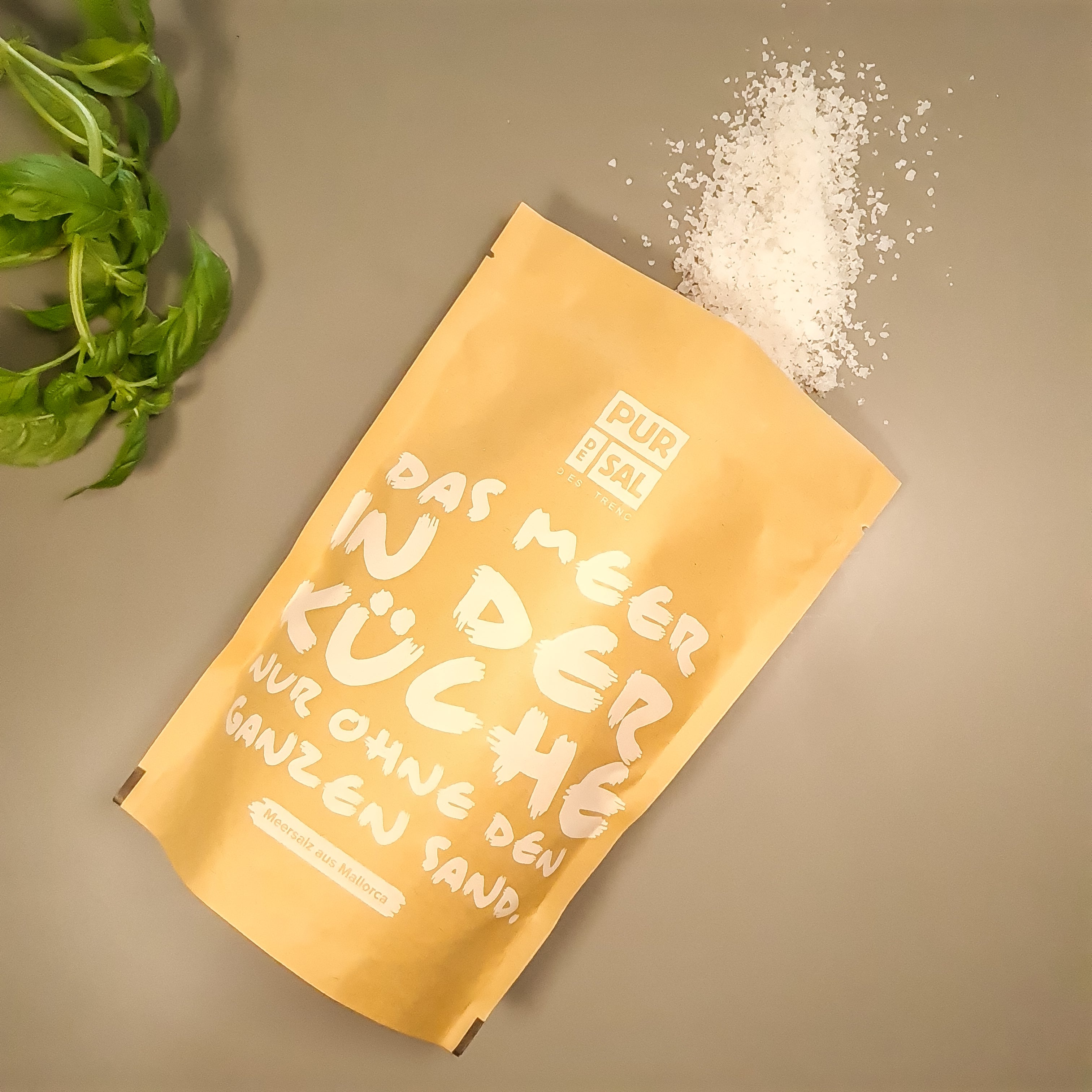
The packaging is a stand-up pouch made from a flexible material, likely a composite of plastic and paper. The front features a matte finish with a light brown kraft color, while the back may have a clear window or additional information. The top has a resealable zipper closure, allowing for easy access and storage. The pouch is filled with white salt, which is visible at the top, indicating its contents.
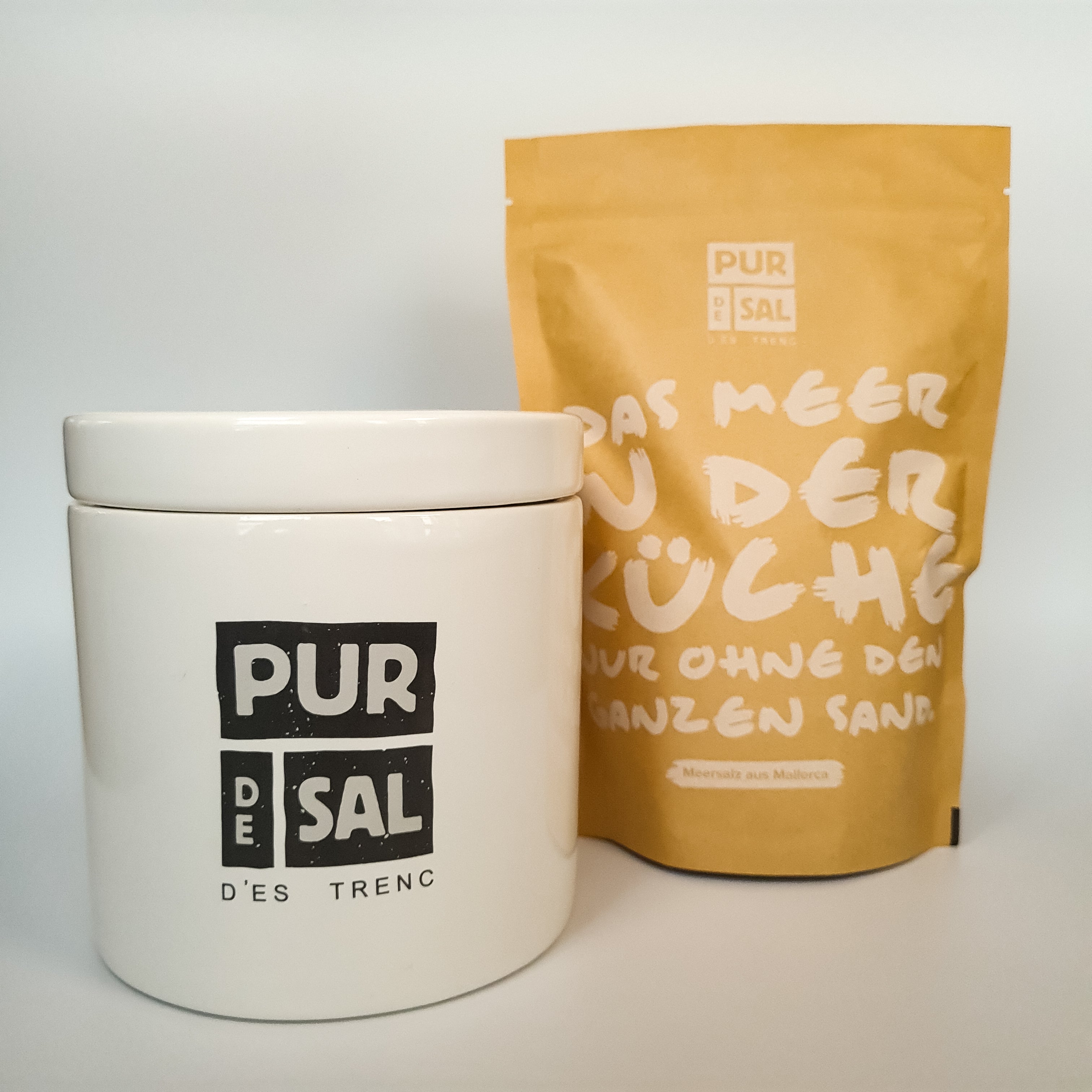
The image features two distinct packaging types: a ceramic jar and a flexible food pouch. The ceramic jar is white with a smooth, glossy finish and a simple design, while the food pouch is made of a flexible material with a matte finish and a vibrant yellow color. The pouch has a resealable top and printed graphics, including text in a bold font.

The packaging is a cylindrical metal can with a smooth surface and a glossy finish. The can is predominantly white with a subtle radial pattern radiating from the center. The top features a blue circular label with the text 'FLOR DE SAL D'ES TRENC' in a clean, modern font, indicating the product's name and origin. The overall design is minimalistic and elegant, emphasizing the product's premium quality.
About the Brand
Flor de Sal d’Es Trenc operates in the gourmet food sector, focusing on high-quality sea salt and related products. The brand is distinguished by its use of sustainable harvesting and production processes, integrating these values into its packaging strategy.
Packaging at Flor de Sal d’Es Trenc is designed to communicate both premium quality and environmental responsibility. The company utilizes a mix of flexible stand-up pouches, rigid ceramic jars, and cylindrical metal cans, each tailored to product type and consumer expectations. This multi-format approach supports product differentiation and brand storytelling, particularly for limited editions and gift sets.
Key Differentiator: The integration of sustainable materials and artisanal, visually consistent packaging structures tailored for D2C distribution distinguishes Flor de Sal d’Es Trenc within the gourmet salt market.
Design System
Visual Style
Typography centers on clean, sans-serif fonts with bold weights for product names and minimalist layouts. The color palette is dominated by natural earth tones—kraft brown, crisp whites, sea blues, and Mediterranean yellows—reinforcing the connection to the Mallorcan landscape and sustainability ethos.
Brand Identity
Consistent logo usage appears across all formats, with brand marks featured prominently on both primary and secondary packaging. Iconography is minimal, focusing on logotypes and subtle patterns. Visual consistency is maintained through repeated use of color, circular motifs, and straightforward, uncluttered graphics.
Packaging Design
Material choices prioritize recyclable and renewable substrates: kraft paper laminates, chipboard, natural cork, and metal. Structural design focuses on practical, robust containers that support product integrity and premium unboxing. The philosophy merges functional protection with tactile, artisanal cues appropriate for high-end food gifting.
User Experience
Packaging solutions are designed to create a memorable unboxing experience, with tactile materials and elegant presentation enhancing consumer perception of quality. Easy-open resealable features and reusable ceramic containers support product longevity and encourage brand interaction post-purchase.
Company Metrics
Business insights for Flor de Sal d’Es Trenc based on available data
Market Positioning
Brand Values & Focus
Key Competitors
Target Market: Culinary enthusiasts, gourmet food consumers, and environmentally conscious buyers across Europe, with a focus on the premium segment.
Packaging Assessment
Overall Grade
Visual appeal and presentation quality
Packaging durability and protection
Eco-friendliness and recyclable materials
Cost efficiency and value for money
Packaging assessment for Flor de Sal d’Es Trenc based on industry standards and best practices
Frequently Asked Questions
What types of packaging does Flor de Sal d’Es Trenc use for their products?
Flor de Sal d’Es Trenc employs flexible stand-up pouches, rigid ceramic jars with cork lids, and cylindrical metal cans. These formats are selected to optimize product preservation, premium presentation, and sustainability, with a strong emphasis on recyclable and natural materials.
How does Flor de Sal d’Es Trenc ensure packaging sustainability?
The brand integrates eco-friendly materials such as kraft paper, recyclable metals, and natural cork, and favors minimalistic designs to reduce unnecessary packaging waste.
Is the packaging suitable for gift and limited edition products?
Yes, the use of ceramics and premium rigid containers is specifically designed to enhance the perceived value for gift sets and limited edition offerings, supporting the brand’s positioning in the gourmet sector.
Discover other Food & Drink companies
Explore more companies in the food & drink industry and their packaging strategies
PrepMyMeal
Food & Drink
PrepMyMeal is a food production company specializing in high-protein meal delivery services. They offer a variety of natural, nutritious meals designed for fitness enthusiasts and those seeking convenience in meal preparation.
kerex - terre exotique
Food & Drink
Kerex - Terre Exotique specializes in the international trade of gourmet food and drink products, offering a unique selection of spices and culinary ingredients.
Terres de Café
Food & Drink
Terres de Café is a specialty coffee retailer based in Paris, France, known for its commitment to sustainability and high-quality coffee sourcing.