Fanola packaging
Fanola specializes in innovative hair care products for both consumers and professional salons, leveraging visually impactful and brand-consistent packaging. Their approach integrates premium retail cartons and sample sachets to reinforce brand identity and enhance the unboxing experience.
Packaging Portfolio
Fanola’s packaging portfolio is comprised primarily of folding carton boxes with smooth, glossy finishes, optimized for retail display and visual differentiation through color-coding. The use of dual-compartment sachets enables efficient sampling and targeted promotions, while all primary retail cartons feature precise construction and clean typography. Structural choices prioritize lightweight, non-fluted paperboard for cost efficiency and ease of handling, while premium finishes elevate shelf presence and support the brand's professional positioning.
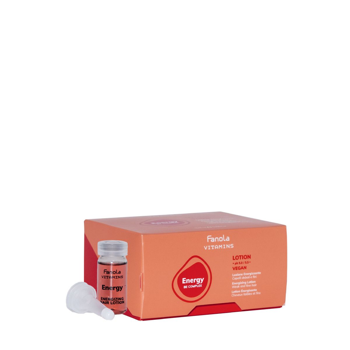
The packaging is a folding carton with a smooth, flat construction, featuring clean edges and folds. It has a vibrant color scheme primarily in orange with white and red accents. The front displays a clear product name and description, while the sides have additional product information. The carton is lightweight and designed for retail display.

The packaging consists of several retail cartons for hair care products, featuring a smooth, flat construction without fluted layers. The boxes are predominantly a rich red color with glossy finishes, showcasing clean edges and precise folds. Each box is designed to hold specific products like shampoo, conditioner, and styling treatments, with a consistent branding theme across all items. The overall appearance is sleek and modern, appealing to a beauty-conscious audience.
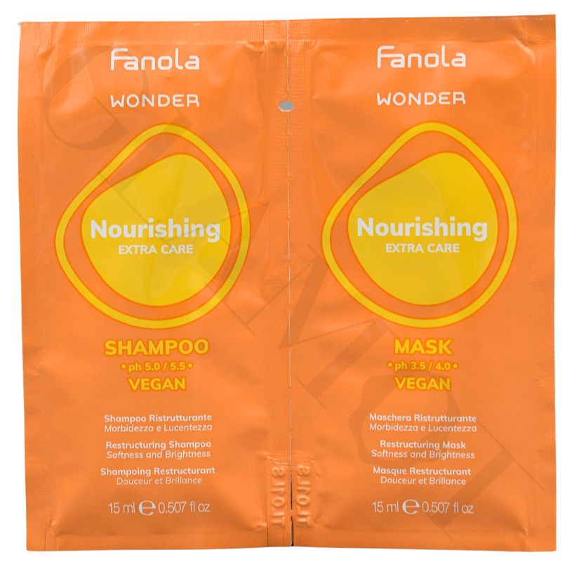
The packaging consists of a flat, dual-compartment sachet that holds two products: a shampoo and a mask. The sachet is made from a thin, flexible material that is typically used for single-use samples. The front features a vibrant orange background with a prominent yellow oval shape that contains the product names. The text is printed in white and black, providing contrast and clarity. The overall design is simple yet eye-catching, aimed at attracting attention in a retail setting.
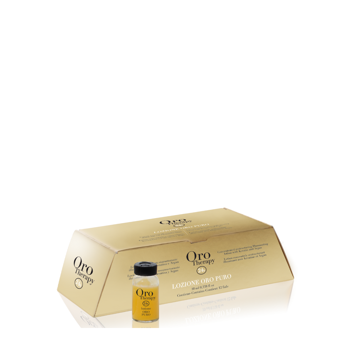
The packaging is a folding carton with a smooth, flat construction. It features a gold exterior with a glossy finish, giving it a premium appearance. The edges are clean and precise, and the carton is designed to hold a small bottle of product, likely a cosmetic or hair treatment. The front displays the brand name 'Oro Therapy' prominently, along with product information in a contrasting color. The overall shape is rectangular with a slightly tapered design, suggesting a well-structured assembly.
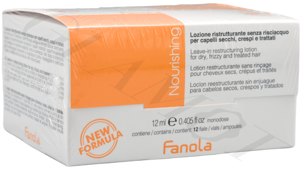
The packaging is a folding carton made of smooth, flat paperboard. It features a clean, precise construction with sharp edges and folds. The box is predominantly white with an orange top section, indicating a color-coded design for product differentiation. The surface is likely coated for a glossy finish, enhancing visual appeal. The front displays the product name 'Nourishing' prominently, along with the brand name 'Fanola'. The back includes product information in multiple languages, printed in a clear, legible font.
About the Brand
Fanola is an established player in the beauty industry, delivering specialized hair care solutions with a focus on color protection, nourishment, and professional styling. The brand's packaging strategy emphasizes strong visual branding, premium material selection, and differentiated formats for retail and sample distribution.
With a medium-sized operation and a robust online presence, Fanola combines product innovation with packaging choices that align closely with their premium positioning. Their cartons utilize glossy finishes and signature color palettes for shelf impact, while dual-compartment sachets facilitate sampling and user trial. Packaging design consistently reflects brand values and supports both B2C and salon-focused distribution channels.
Key Differentiator: Fanola distinguishes itself with visually cohesive, color-coded packaging systems and high-quality finishes that reinforce its identity as a premium, professional-grade hair care brand.
Design System
Visual Style
Fanola employs clean, sans-serif typography with high legibility, combined with a vibrant color palette dominated by orange, gold, white, and red. Glossy and metallic finishes are used to convey product segmentation and premium cues.
Brand Identity
The Fanola logo is consistently applied across all packaging, often paired with product-specific iconography and clear product names. Visual consistency is maintained through strict adherence to color schemes, logo placement, and uniform graphic layouts.
Packaging Design
Material selection centers on smooth, coated paperboard for cartons and flexible film for sachets. The structural philosophy emphasizes lightweight, compact shapes with precise folds for retail cartons and functional, dual-compartment formats for samples.
User Experience
Design choices enhance the customer journey by offering visually appealing, easy-to-open packaging that clearly communicates product benefits. Color coding and prominent labeling support quick identification, while tactile finishes contribute to a premium unboxing experience.
Company Metrics
Business insights for Fanola based on available data
Market Positioning
Brand Values & Focus
Key Competitors
Target Market: Individual consumers seeking premium hair care solutions and professional salons requiring branded, high-quality products.
Packaging Assessment
Overall Grade
Visual appeal and presentation quality
Packaging durability and protection
Eco-friendliness and recyclable materials
Cost efficiency and value for money
Packaging assessment for Fanola based on industry standards and best practices
Frequently Asked Questions
What types of packaging does Fanola use for their hair care products?
Fanola primarily utilizes folding carton boxes with glossy finishes for retail products and flexible dual-compartment sachets for sampling. These materials are selected for visual impact, product protection, and ease of display.
How does Fanola’s packaging contribute to brand recognition?
The packaging consistently features the Fanola logo, signature color schemes, and prominent product names, enhancing brand visibility and consumer recall at point of sale.
Does Fanola integrate sustainability into its packaging?
Fanola’s packaging strategy largely relies on recyclable paperboard cartons and flexible sachets, though the overall sustainability profile is moderate due to the use of coated and glossy finishes.
Discover other Beauty & Fitness companies
Explore more companies in the beauty & fitness industry and their packaging strategies
Pure Altitude
Beauty & Fitness
Pure Altitude specializes in high-quality beauty and skincare products that leverage the expertise of spa treatments to enhance daily routines. The brand offers a diverse range of products tailored for both facial and body care.
Orris Paris
Beauty & Fitness
Orris Paris specializes in creating artisanal skincare products that combine potent botanical ingredients with modern cleansing rituals. The company emphasizes natural, holistic practices in its formulations.
Big Moustache
Beauty & Fitness
Big Moustache specializes in shaving and grooming products tailored for men, providing a hassle-free subscription service for razor blades and skincare essentials.