English Tea Shop packaging
English Tea Shop specializes in premium organic teas, emphasizing ethical sourcing and community-driven practices. Their packaging strategy centers on vibrant, brand-consistent carton and rigid boxes, designed to enhance shelf presence and reflect their sustainability commitments.
Packaging Portfolio
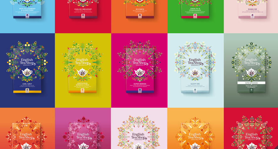
English Tea Shop’s packaging portfolio consists predominantly of single-layer paperboard carton boxes for retail teas, enhanced by specialized rigid boxes for gift sets and seasonal collections. The cartons feature high-quality offset printing, glossy finishes, and intricate floral graphics, supporting visual differentiation on shelves. Rigid box formats, such as hexagonal advent calendars, leverage thicker board and premium finishes to reinforce the brand’s premium positioning. The packaging selection emphasizes recyclability and the use of responsibly sourced materials, aligning with the company’s organic and Fairtrade commitments.
The packaging is a folding carton made of smooth, single-layer paperboard. It features a vibrant green exterior adorned with colorful floral and leaf designs, indicative of a natural and organic product. The edges are clean and precise, with a glossy finish that enhances the visual appeal. The box has a tuck flap closure at the top, allowing for easy opening and resealing. The dimensions suggest a rectangular shape, suitable for containing multiple tea bags.
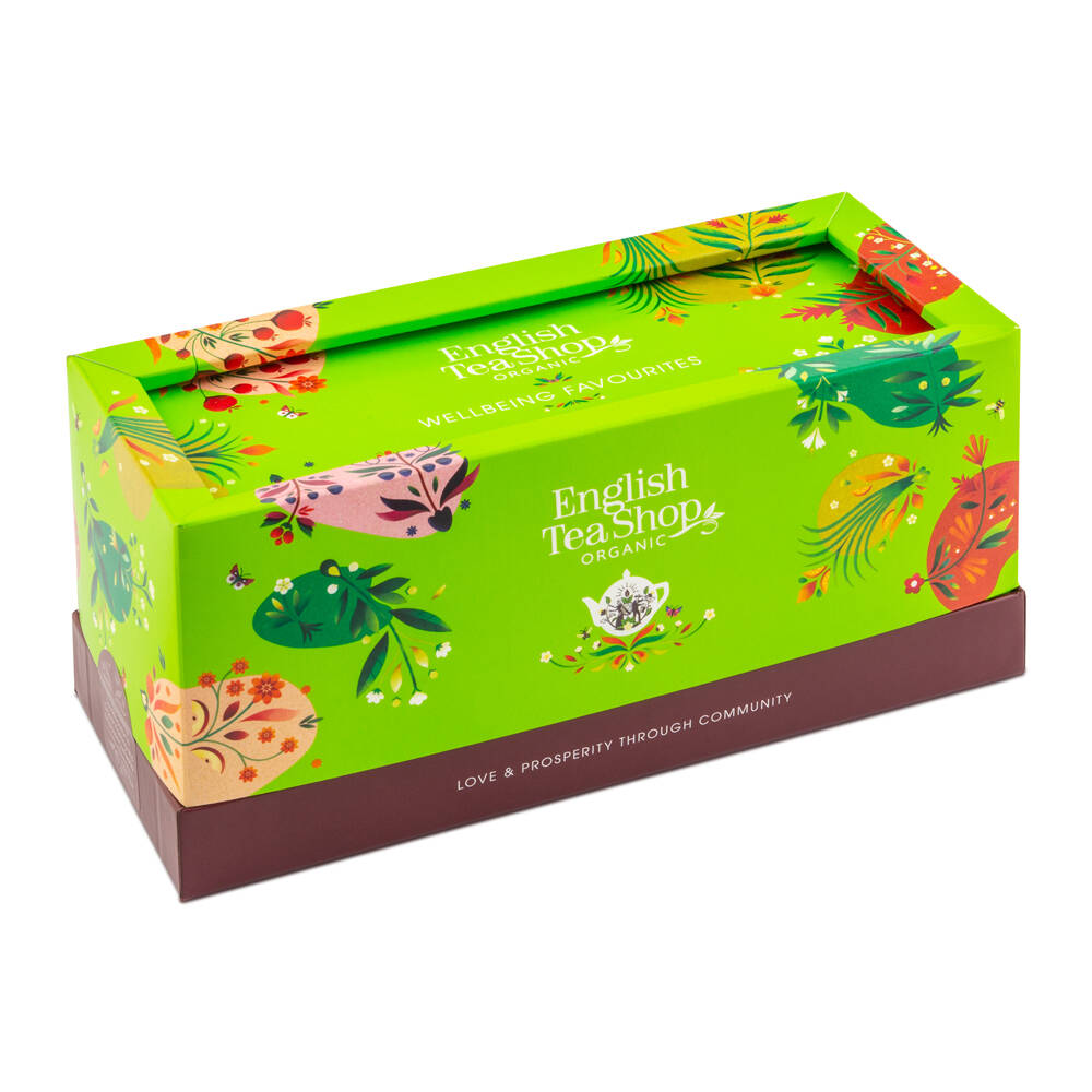
The packaging is a flat, smooth, single-layer paperboard box with a colorful design. The box features a variety of floral and whimsical illustrations in vibrant colors, including red, green, and yellow. The edges are clean and precise, with a glossy finish that enhances the visual appeal. The top flap is slightly raised, indicating a tuck closure. The overall shape is rectangular, designed to hold tea products.
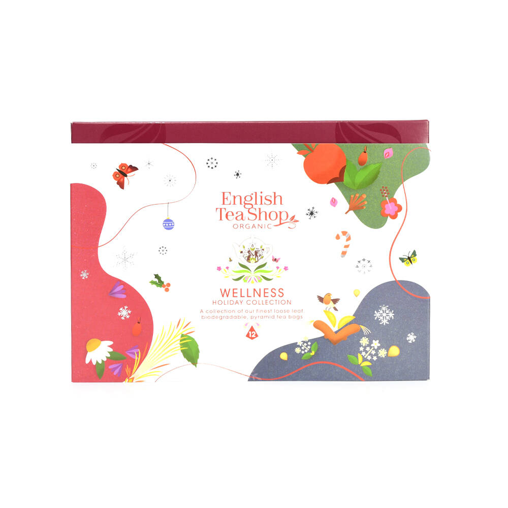
The packaging consists of a series of colorful, flat, single-layer paperboard boxes designed for retail display. Each box features a smooth, flat construction without any visible fluted layers, indicative of carton boxes. The edges are clean and precise, and the boxes are adorned with vibrant graphics and floral designs. The overall appearance is light and appealing, suitable for retail environments.
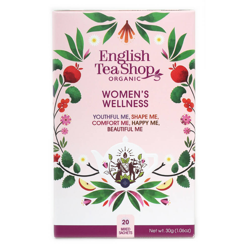
The packaging is a flat, rectangular box made from a single layer of paperboard. It features a smooth, glossy finish with vibrant colors and intricate floral graphics. The box is predominantly pink with green and red accents, showcasing a nature-inspired design. The edges are clean and precise, indicating a well-constructed folding carton. The front displays the product name 'Women's Wellness' prominently, along with the brand name 'English Tea Shop' in a stylized font.
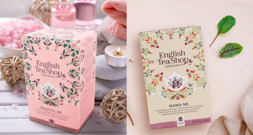
The packaging consists of two distinct folding cartons, both made of smooth, flat paperboard. The first carton is a soft pink color with floral graphics and the brand name prominently displayed. The second carton is a cream color with similar floral design elements and product information. Both cartons have clean edges and precise folds, indicative of high-quality construction. They are designed for retail display, likely containing tea products.
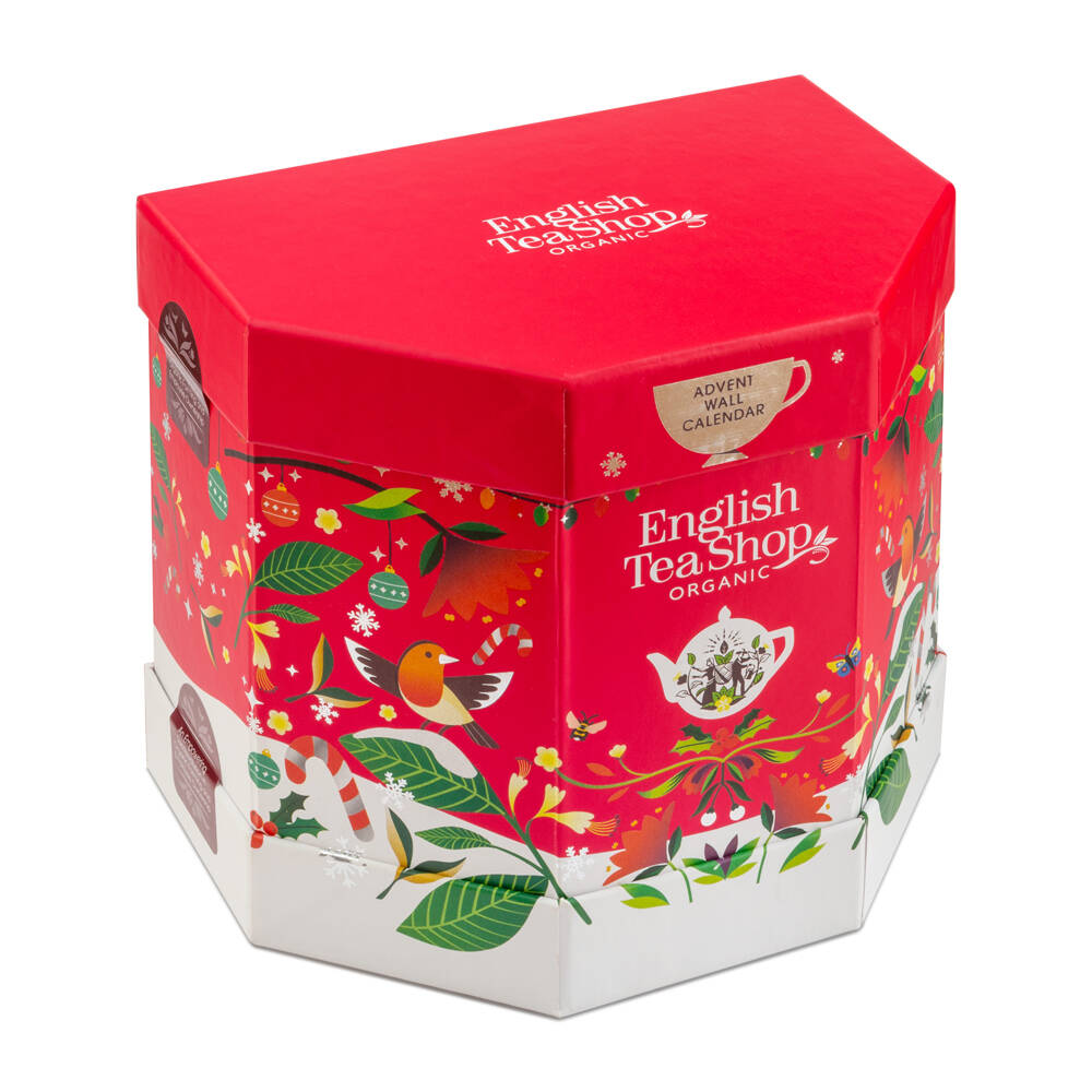
The packaging is a hexagonal rigid box with a thick, sturdy construction. The exterior features a vibrant red lid adorned with festive graphics, including illustrations of birds, leaves, and teapots. The base of the box is white with additional colorful designs, creating a visually appealing contrast. The edges are cleanly cut, and the box has a premium feel, indicative of high-quality materials.
About the Brand
English Tea Shop operates within the Food & Drink industry, focusing on the direct-to-consumer distribution of organic, Fairtrade teas. The brand's packaging approach is rooted in sustainability and brand storytelling, utilizing visually distinctive carton and rigid box formats.
The company’s packaging integrates high-quality printed paperboard cartons with custom graphics and structural innovations, supporting both product protection and retail appeal. Emphasis is placed on eco-friendly materials, with a clear alignment between packaging aesthetics and the brand’s organic, community-driven philosophy. Their use of rigid gift boxes for specialty and seasonal collections further enhances the premium perception and supports gifting occasions.
Key Differentiator: English Tea Shop distinguishes itself through a combination of Fairtrade sourcing, strong community engagement, and packaging that consistently reinforces its sustainability and wellness positioning.
Design System
Visual Style
Typography emphasizes elegant serif and sans-serif combinations, paired with a vibrant, nature-inspired color palette (pinks, greens, reds, and creams). The aesthetic is detailed and floral, reinforcing organic and wellness cues.
Brand Identity
Logo placement is prominent on all packaging, supported by consistent use of floral iconography and certification labels (e.g., organic, Fairtrade). Visual consistency is maintained through recurring motifs, color harmonies, and structured layouts.
Packaging Design
Materials are primarily FSC-certified paperboard and rigid board, chosen for recyclability and strength. Structural designs favor folding cartons for efficiency and rigid formats for high-value products, balancing protection and presentation.
User Experience
Packaging is designed to maximize shelf impact and create a memorable, emotionally resonant unboxing. Clear product names, certification badges, and easy-open closures enhance usability, while cohesive design language builds trust and brand loyalty throughout the customer journey.
Company Metrics
Business insights for English Tea Shop based on available data
Market Positioning
Brand Values & Focus
Key Competitors
Target Market: Ethically minded, health-conscious consumers seeking organic and Fairtrade teas in the UK and international markets.
Packaging Assessment
Overall Grade
Visual appeal and presentation quality
Packaging durability and protection
Eco-friendliness and recyclable materials
Cost efficiency and value for money
Packaging assessment for English Tea Shop based on industry standards and best practices
Frequently Asked Questions
What types of packaging does English Tea Shop use?
English Tea Shop primarily utilizes printed carton boxes for everyday retail tea products and rigid boxes for premium and seasonal gift sets, emphasizing structural integrity and strong brand visuals.
How does their packaging support sustainability?
The packaging portfolio leverages recyclable paperboard and focuses on reducing environmental impact through the use of organic, responsibly sourced materials and minimal plastic.
Is the packaging designed for retail or direct-to-consumer sales?
The packaging is optimized for both retail display and e-commerce, ensuring durability, shelf appeal, and a positive unboxing experience.
What is the impact of their packaging on the customer experience?
The visually rich graphics and consistent branding contribute to a memorable unboxing experience, reinforcing product quality and ethical values.
Discover other Food & Drink companies
Explore more companies in the food & drink industry and their packaging strategies
PrepMyMeal
Food & Drink
PrepMyMeal is a food production company specializing in high-protein meal delivery services. They offer a variety of natural, nutritious meals designed for fitness enthusiasts and those seeking convenience in meal preparation.
ruf lebensmittelwerk kg
Food & Drink
RUF Lebensmittelwerk KG is a German food production company specializing in a variety of baking mixes and drink products. Founded in 1920, the company is known for its high-quality ingredients and innovative food solutions.
kerex - terre exotique
Food & Drink
Kerex - Terre Exotique specializes in the international trade of gourmet food and drink products, offering a unique selection of spices and culinary ingredients.