Dr. Spiller packaging
Dr. Spiller specializes in premium skincare and beauty products, utilizing a packaging approach that emphasizes brand consistency, visual appeal, and product protection. The brand leverages retail-oriented carton boxes with distinctive graphics to align with their focus on quality and customer experience.
Packaging Portfolio
Dr. Spiller’s packaging portfolio is dominated by folding carton boxes constructed from single-layer, high-quality paperboard. These structures are engineered for both product stability and retail aesthetics, frequently featuring gloss or matte finishes and precise, machine-cut edges. Design elements include bold color gradients, elegant typography, and thematic graphics that reinforce product segmentation and brand identity. The packaging solutions accommodate a variety of formats, such as individual product cartons, ampoule sleeves, and multi-box sets, ensuring versatility across their skincare range while maintaining consistent shelf appeal and logistical efficiency.

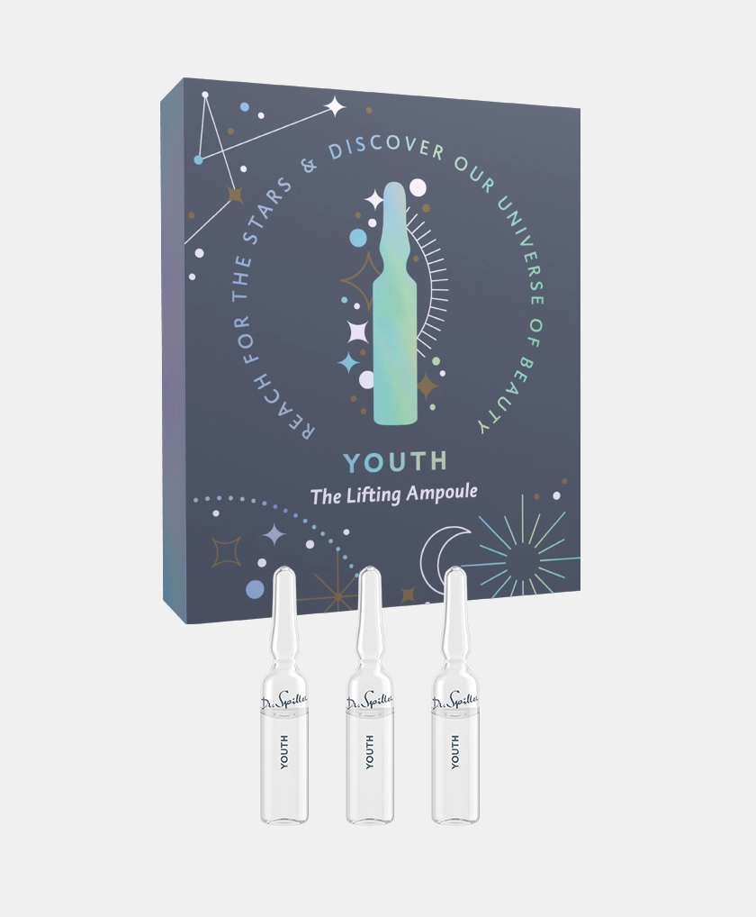
The packaging is a folding carton designed to hold three glass ampoules. It features a smooth, flat construction without visible fluted layers, indicative of single-layer paperboard. The exterior is printed with a dark blue background adorned with colorful celestial graphics, including stars and a bottle silhouette. The edges are clean and precise, with a glossy finish enhancing the visual appeal. The front displays the product name 'YOUTH' prominently, along with the tagline 'The Lifting Ampoule'.

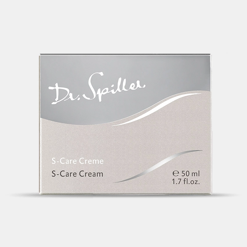
The packaging is a flat, rectangular box made of smooth, single-layer paperboard. It features clean, precise edges and folds, typical of retail packaging. The exterior is predominantly white with a glossy finish, enhancing its visual appeal. The front displays the product name 'S-Care Creme' and 'S-Care Cream' in elegant, flowing typography, suggesting a premium product. The overall design is minimalistic, with a subtle wave graphic that adds a touch of sophistication.

The packaging is a folding carton with a smooth, flat construction. It features a vibrant teal background with floral and abstract designs. The edges are clean and precise, indicative of high-quality paperboard. The front displays the product name 'my calm spirit' prominently, along with the product details. The overall appearance is lightweight yet sturdy, suitable for retail display.

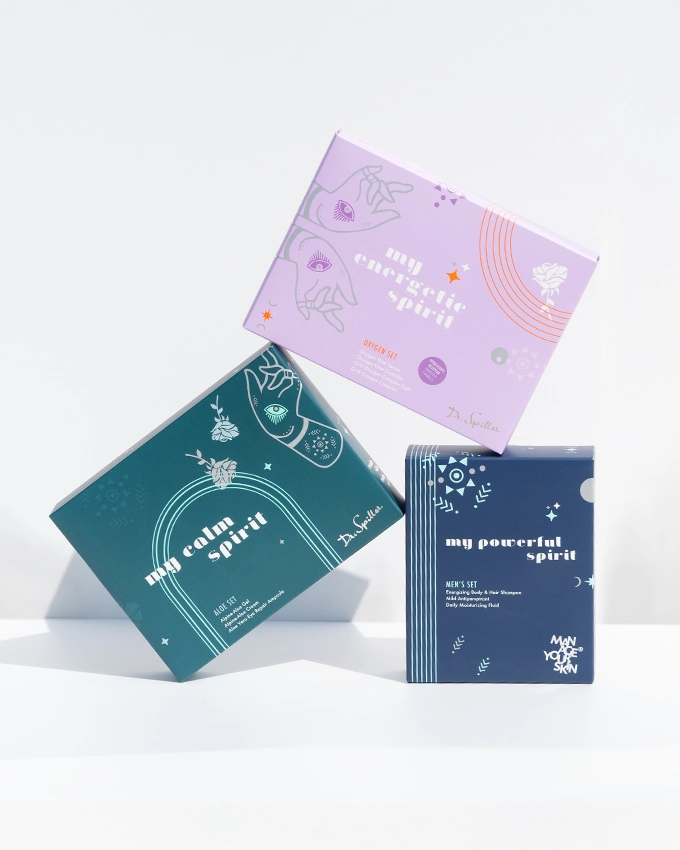
The packaging consists of three folding cartons stacked on top of each other. Each box features a smooth, flat construction without any visible fluted layers, indicating that they are made from single-layer paperboard. The boxes are predominantly colored in shades of teal, purple, and navy blue, with various graphic elements and text printed on the surfaces. The edges and folds are clean and precise, characteristic of retail packaging. The design includes illustrations of hands and floral motifs, adding a decorative touch. The overall appearance is lightweight and suitable for retail display.

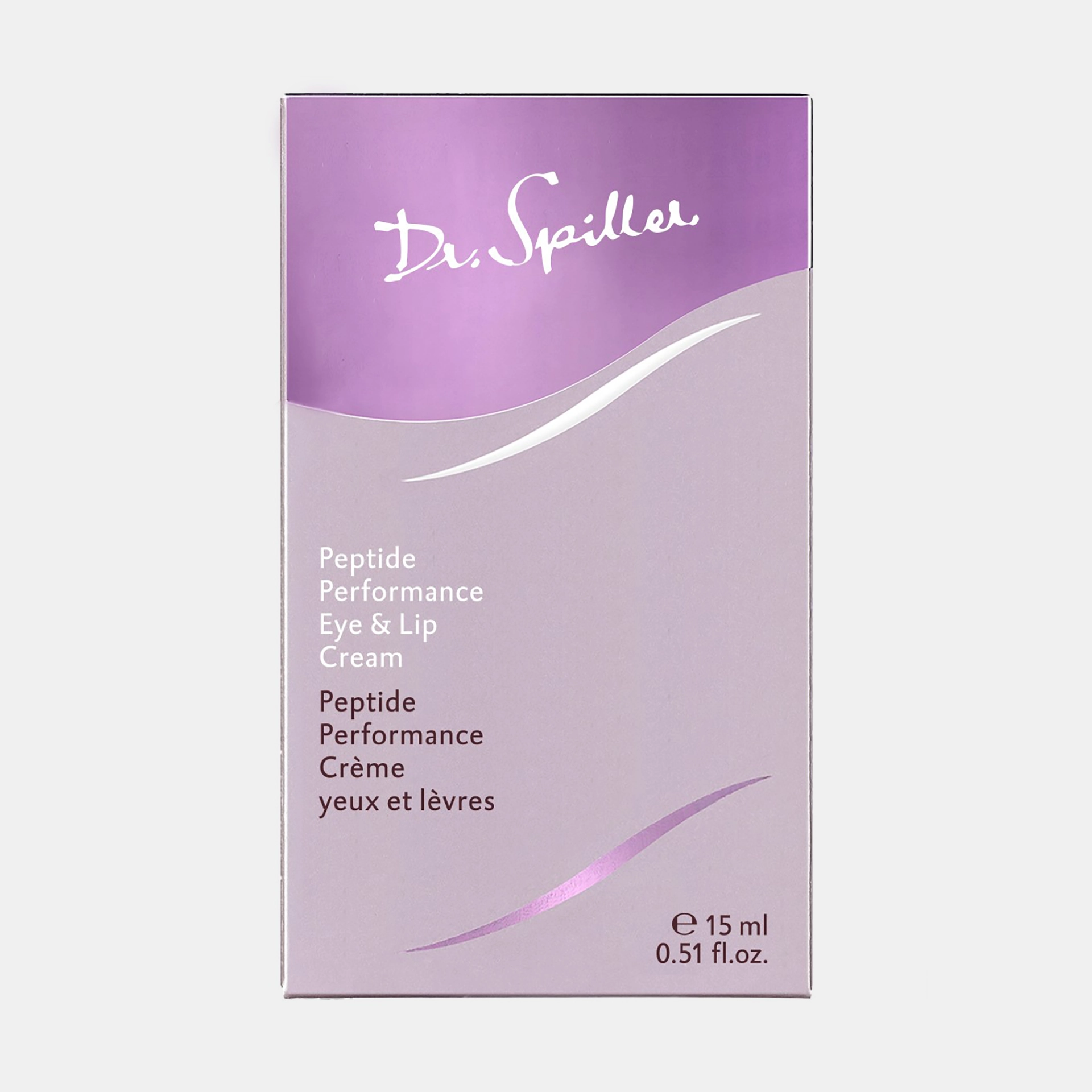
The packaging is a smooth, flat folding carton made of single-layer paperboard. It features a clean, precise construction with sharp edges and folds. The exterior has a glossy finish with a light purple gradient and white text. The front displays the product name prominently, with additional product information on the sides. The overall shape is rectangular, designed to hold a small cosmetic product.
About the Brand
Dr. Spiller offers a comprehensive range of skincare solutions, spanning facial care, body care, and men’s grooming. The company’s packaging strategy centers on folding carton boxes—engineered for retail display and product security—featuring high-quality paperboard and refined graphic treatments. This data-driven packaging approach supports the brand’s premium positioning within the Beauty & Fitness sector.
Packaging structures are predominantly single-layer, smooth paperboard cartons with precise folds and edges, designed to house both individual products and curated sets. Dr. Spiller’s portfolio showcases a mix of gloss and matte finishes, aligned with a modern, calming aesthetic and strong brand presence. Strategic use of color, typography, and iconography ensures each SKU delivers a cohesive unboxing experience while maintaining logistical efficiency and protective properties. The company’s ongoing commitment to sustainability is reflected in responsible material sourcing and recyclable designs.
Key Differentiator: Dr. Spiller distinguishes itself through consistent, visually compelling packaging that supports both premium brand perception and practical retail requirements, reinforced by a strong sustainability ethos.
Design System
Visual Style
Dr. Spiller’s visual style leverages modern, calming color palettes—such as teal, purple, white, and navy blue—paired with clean, sans-serif and elegant script typography. The graphics incorporate floral, abstract, and celestial motifs to communicate both product benefits and a sense of tranquility.
Brand Identity
Logo usage is prominent on all primary packaging surfaces, with consistent placement and scale. Iconography is minimal but present, supporting product differentiation. Visual consistency is maintained through unified color schemes, typography, and design language across all SKUs.
Packaging Design
Material selection prioritizes smooth, single-layer recyclable paperboard for lightweight, durable construction. Structural design is focused on precise folding, clean edges, and optimal protection for fragile items like ampoules, reflecting a balance between retail display needs and shipping security.
User Experience
The packaging is structured to enhance the customer journey from initial unboxing through product use, offering clear product information, tactile finishes, and visually engaging graphics. This approach supports brand storytelling, reinforces premium positioning, and aims to maximize perceived product value at every touchpoint.
Company Metrics
Business insights for Dr. Spiller based on available data
Market Positioning
Brand Values & Focus
Key Competitors
Target Market: Premium and mid-market skincare consumers in Germany and broader European markets, including both men and women seeking high-quality, effective, and visually appealing beauty products.
Packaging Assessment
Overall Grade
Visual appeal and presentation quality
Packaging durability and protection
Eco-friendliness and recyclable materials
Cost efficiency and value for money
Packaging assessment for Dr. Spiller based on industry standards and best practices
Frequently Asked Questions
What types of packaging materials does Dr. Spiller use for their skincare products?
Dr. Spiller primarily utilizes smooth, single-layer paperboard folding cartons for retail packaging, focusing on lightweight yet sturdy materials that support both product protection and visual branding.
How does Dr. Spiller’s packaging contribute to sustainability?
The brand incorporates recyclable paperboard and emphasizes responsible material sourcing to minimize environmental impact, though specific details on recycled content percentages are not publicly disclosed.
What is the visual style of Dr. Spiller’s packaging?
The packaging employs a contemporary design with calming color palettes, elegant typography, and a mix of graphical motifs, ensuring strong shelf presence and brand recognition.
How does Dr. Spiller’s packaging support the customer experience?
Packaging is designed for a premium unboxing experience, using high-quality materials, clean construction, and visually engaging graphics to enhance perceived value and reinforce brand loyalty.
Discover other Beauty & Fitness companies
Explore more companies in the beauty & fitness industry and their packaging strategies
Big Moustache
Beauty & Fitness
Big Moustache specializes in shaving and grooming products tailored for men, providing a hassle-free subscription service for razor blades and skincare essentials.
Orris Paris
Beauty & Fitness
Orris Paris specializes in creating artisanal skincare products that combine potent botanical ingredients with modern cleansing rituals. The company emphasizes natural, holistic practices in its formulations.
Pure Altitude
Beauty & Fitness
Pure Altitude specializes in high-quality beauty and skincare products that leverage the expertise of spa treatments to enhance daily routines. The brand offers a diverse range of products tailored for both facial and body care.