Dovo packaging
Dovo is a leading retailer in the beauty and grooming sector, specializing in shaving, personal care, and hygiene products. Their packaging strategy is characterized by high-visibility branding and standardized carton box solutions designed for both retail display and e-commerce fulfillment.
Packaging Portfolio
Dovo’s packaging portfolio is centered on folding carton boxes constructed from single-layer paperboard, selected for its balance of durability and recyclability. The structural formats include tuck closures, clean fold lines, and precise die-cuts, supporting both retail shelf presence and secure shipping. The packaging consistently integrates matte and glossy finishes, differentiated color schemes, and multi-language product information, reflecting a strategy focused on brand visibility and user information at the point of sale.
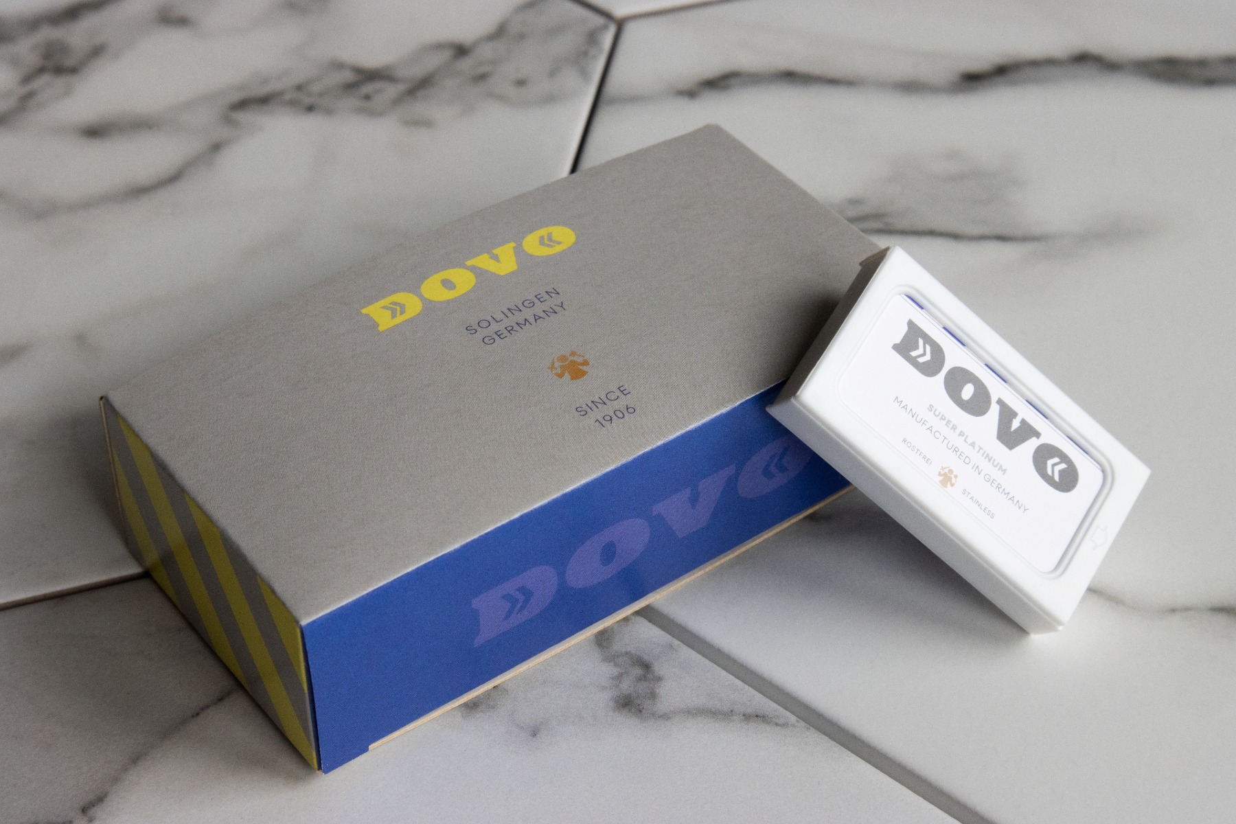
The packaging consists of a flat, smooth, single-layer paperboard structure with clean edges and folds. The primary color is a light gray with a blue section at the bottom featuring a bold yellow stripe. The top has the brand name 'DOVO' prominently displayed in a large, stylized font. The overall appearance is neat and retail-friendly, suitable for display.
The packaging is a flat, rectangular folding carton made of single-layer paperboard. It features a smooth surface with clean edges and folds, indicative of a retail packaging style. The exterior is primarily a light gray color with bold yellow lettering for the brand name 'DOVO' prominently displayed on the front. The text is clear and legible, with additional information about the product's application and effects printed in smaller fonts on the back. The overall design is simple yet effective for retail display.

The packaging is a folding carton made of smooth, single-layer paperboard. It features a predominantly white exterior with colorful graphics, including red and blue elements. The edges are clean and precise, indicating a well-constructed box. The front displays a logo and product information, while the sides have additional branding and graphics.
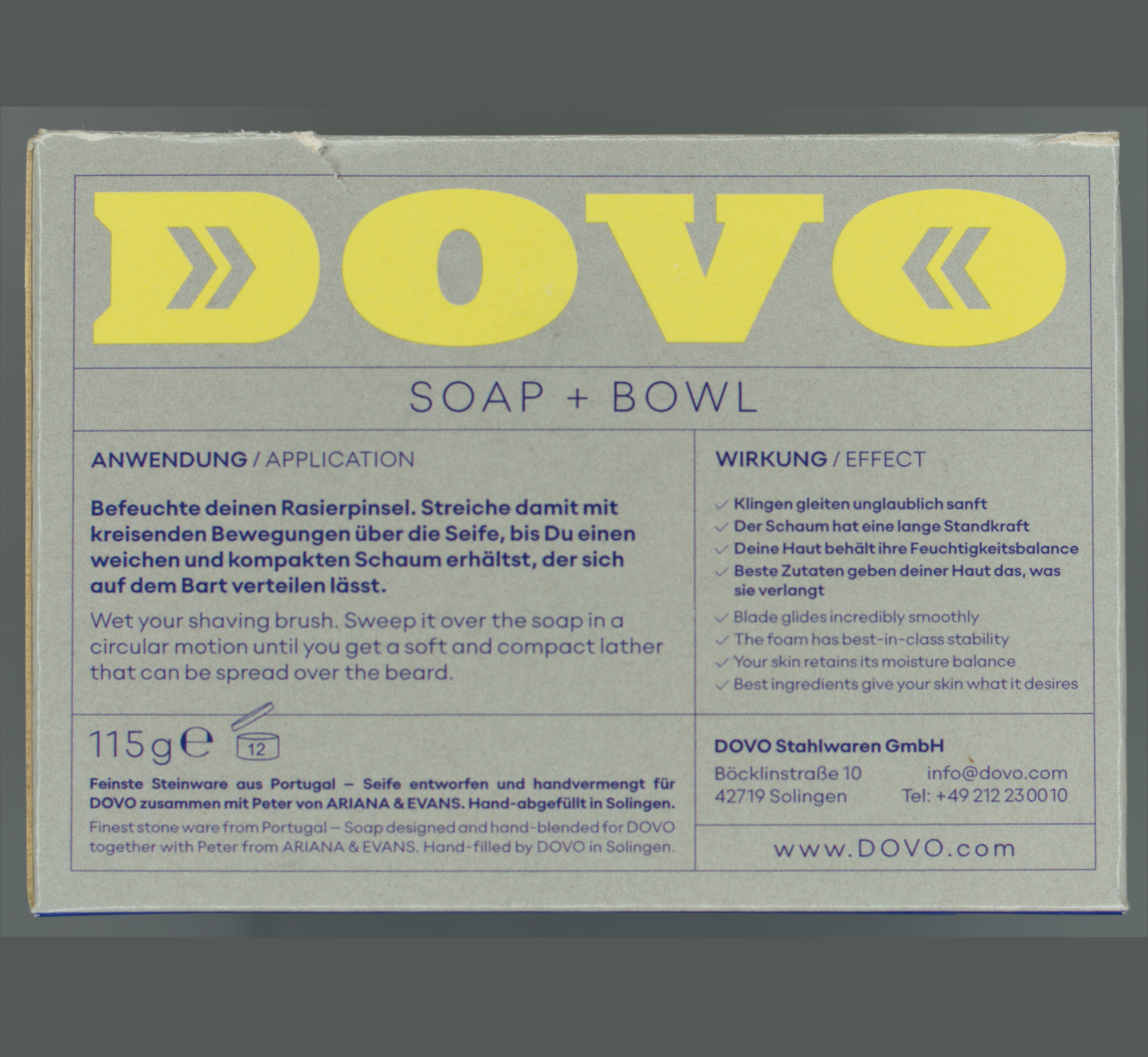
The packaging is a folding carton made of single-layer paperboard. It features a smooth, flat construction with clean edges and folds. The exterior is primarily a light beige color with a matte finish, while the interior is white. The top flap is slightly raised, indicating a tuck closure. The front displays the brand name 'DOVO' prominently in black, with additional text and a logo in yellow, suggesting a premium product. The overall design is simple yet elegant, aligning with typical retail packaging for cosmetics or grooming products.

The packaging is a flat, single-layer paperboard carton with a smooth, clean construction. It features a rectangular shape with precise edges and folds. The front displays a vibrant color scheme with a combination of red, blue, and white, showcasing the brand and product information prominently. The surface has a glossy finish, enhancing the visual appeal.
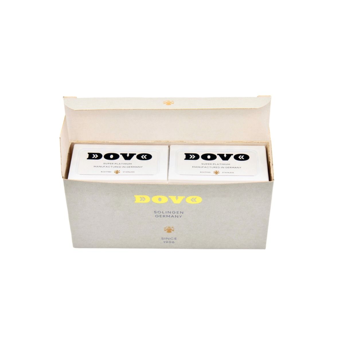
The packaging consists of a smooth, flat construction made from single-layer paperboard. The exterior is a light gray color with a matte finish, featuring clean edges and precise folds. The box has a rectangular shape, designed to hold a smaller inner product box. The inner box is white with a glossy finish, showcasing a contrasting black logo and text. The overall appearance is lightweight and retail-friendly.
About the Brand
Dovo operates within the Beauty & Fitness industry, offering a broad range of grooming and personal care products through a B2C e-commerce platform. The company utilizes packaging that emphasizes brand recognition and presentation, leveraging consistent design cues to reinforce its premium positioning.
Dovo’s packaging primarily employs single-layer paperboard carton boxes with a focus on clean construction, precise folds, and prominent brand elements. Their solutions are tailored for both retail shelf appeal and secure shipping, supporting the company’s online-first business model. The visual identity is reinforced through cohesive color schemes and legacy cues, such as references to Solingen, Germany, and the company’s founding date.
Key Differentiator: Dovo’s packaging strategy is distinguished by its consistent and heritage-driven branding, combined with the ability to balance retail aesthetics and e-commerce logistics requirements.
Design System
Visual Style
Dovo utilizes a restrained and classic visual style featuring sans-serif typography, a palette of neutrals (beige, gray, white) with accent colors such as blue, red, and yellow for product differentiation. The aesthetic emphasizes clarity, legibility, and a premium retail presence.
Brand Identity
Brand identity is anchored by prominent logo placement, consistent use of the 'DOVO' brand name, and heritage markers like 'Solingen Germany' and 'Since 1906.' Iconography is minimal, focusing on strong wordmarks and clear product designation to ensure visual consistency across SKUs.
Packaging Design
The design philosophy prioritizes recyclable paperboard materials and folding carton constructions. Boxes are engineered for rigidity and protection, with precise folds and tuck closures. The focus is on cost-effective manufacturing and ease of stacking for logistics, while maintaining a premium brand image.
User Experience
Packaging design supports the customer journey by delivering a visually cohesive unboxing experience, clear product information, and easy-open structures. The brand’s heritage elements and tactile finishes contribute to emotional engagement and perceived value, reinforcing customer loyalty and trust.
Company Metrics
Business insights for Dovo based on available data
Market Positioning
Brand Values & Focus
Key Competitors
Target Market: Dovo targets consumers seeking premium grooming and personal care products, with a focus on quality-conscious customers in the beauty and hygiene sector across European and global markets.
Packaging Assessment
Overall Grade
Visual appeal and presentation quality
Packaging durability and protection
Eco-friendliness and recyclable materials
Cost efficiency and value for money
Packaging assessment for Dovo based on industry standards and best practices
Frequently Asked Questions
What types of packaging materials does Dovo primarily use?
Dovo predominantly uses single-layer paperboard carton boxes for its product packaging, focusing on lightweight, recyclable materials suitable for both retail and e-commerce channels.
How does Dovo’s packaging reinforce its brand identity?
Dovo’s packaging consistently features the brand logo, company name, and heritage details like 'Solingen Germany' and 'Since 1906,' ensuring strong visual recognition and brand continuity across product lines.
How does Dovo address sustainability in its packaging?
Dovo’s use of paperboard materials aligns with recyclable packaging practices, though there is limited evidence of advanced eco-initiatives such as post-consumer recycled content or certified sustainable sourcing.
Discover other Beauty & Fitness companies
Explore more companies in the beauty & fitness industry and their packaging strategies
Institut Karité Paris
Beauty & Fitness
Institut Karité Paris specializes in luxury beauty products made with natural Shea Butter, offering a wide range of skincare and body care solutions. The brand combines Parisian heritage with a commitment to quality and creativity in its offerings.
Pure Altitude
Beauty & Fitness
Pure Altitude specializes in high-quality beauty and skincare products that leverage the expertise of spa treatments to enhance daily routines. The brand offers a diverse range of products tailored for both facial and body care.
Big Moustache
Beauty & Fitness
Big Moustache specializes in shaving and grooming products tailored for men, providing a hassle-free subscription service for razor blades and skincare essentials.