Dewar's packaging
Dewar's, a leading D2C whisky brand, utilizes premium rigid box packaging to reinforce its heritage and elevate the consumer experience. Their packaging emphasizes material quality, structural integrity, and strong brand presentation across its whisky and merchandise offerings.
Packaging Portfolio
Dewar's employs high-grade rigid box packaging across its whisky portfolio, utilizing thick chipboard for structural integrity and premium finishes such as metallic foils, embossing, and custom inserts to secure bottles. Many boxes feature window cut-outs for product visibility and magnetic closures or hinged lids for enhanced usability. The consistent use of luxury materials and multi-bottle gift sets demonstrates a focus on both protection and presentation, supporting a premium retail and gifting experience.

The packaging is a rigid box designed to hold a main bottle of Dewar's 15-year-old Scotch whisky alongside two smaller bottles. The box features a sturdy construction with thick chipboard walls, providing a premium feel. The exterior is adorned with a glossy gold finish, enhancing its luxury appearance. The front has a cut-out window that showcases the main bottle and the two miniatures, allowing visibility of the product inside. The overall shape is rectangular, with a flat base and a lid that opens from the top.

The packaging consists of a tall, rectangular rigid box that houses a whiskey bottle. The box is made of thick chipboard with a luxurious appearance, featuring a gold exterior finish. The surface is smooth with embossed details, giving it a premium feel. The box has a lid that opens from the top, and the interior is designed to snugly hold the bottle in place. The exterior has intricate patterns and text, enhancing its visual appeal.
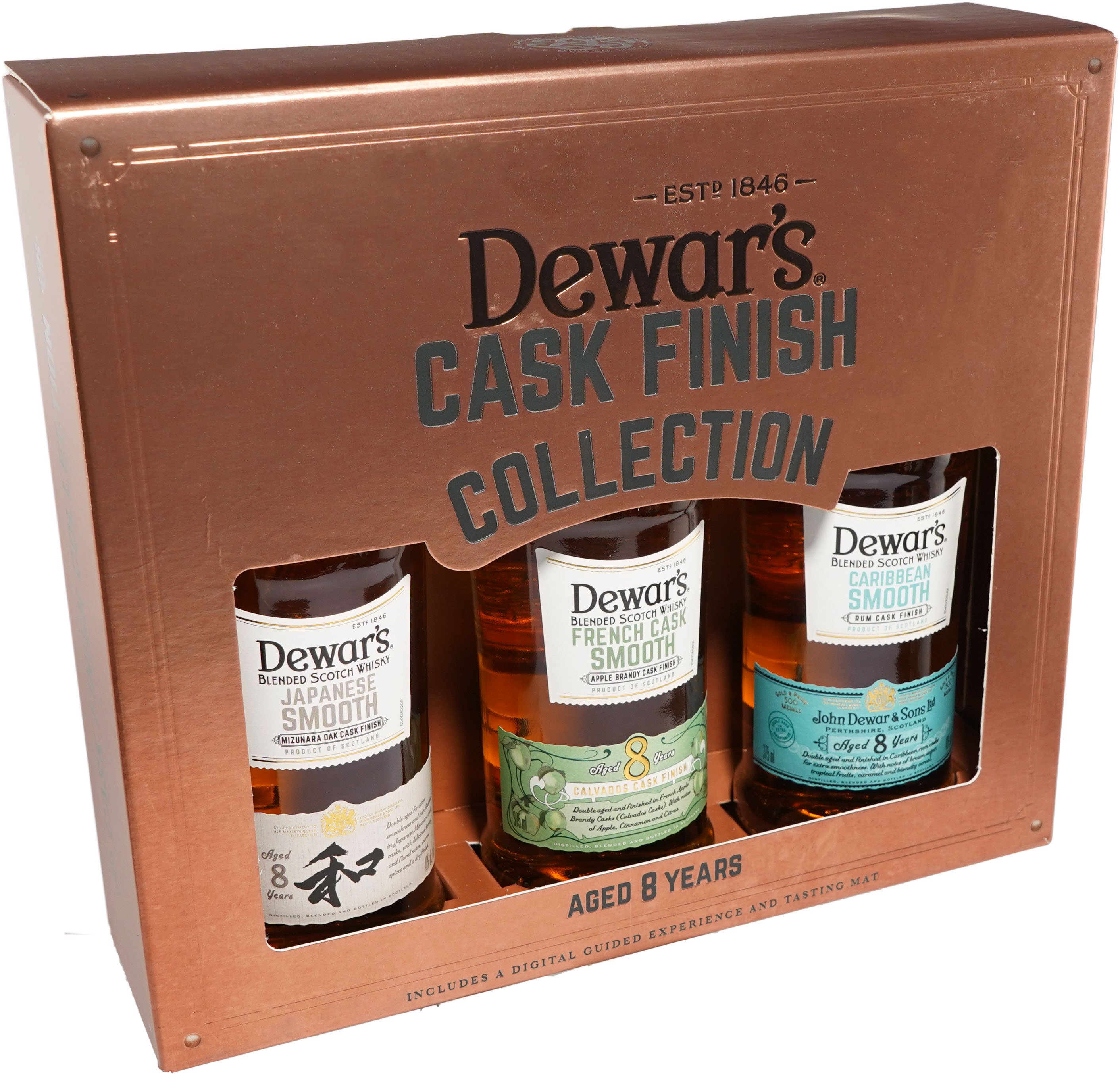
The packaging is a luxury rigid box featuring a sturdy construction with thick chipboard walls. The exterior has a metallic copper finish, providing a premium appearance. The box contains three bottles of Dewar's whisky, each displayed in a windowed section. The front has a cut-out area for visibility, showcasing the bottles inside. The edges are clean and precise, with a smooth surface that reflects light. The box has a flat top and bottom, with a hinged lid that opens to reveal the contents.
The packaging is a rigid box designed to hold a whiskey bottle securely. It features a thick chipboard construction with a premium feel. The box is predominantly white with a clean, elegant design. The front has a cut-out window that showcases the whiskey bottle inside, allowing visibility of the product. The edges are smooth and well-defined, indicating high-quality manufacturing. The top flap has a small tab for easy opening, while the base is solid and sturdy, ensuring durability.

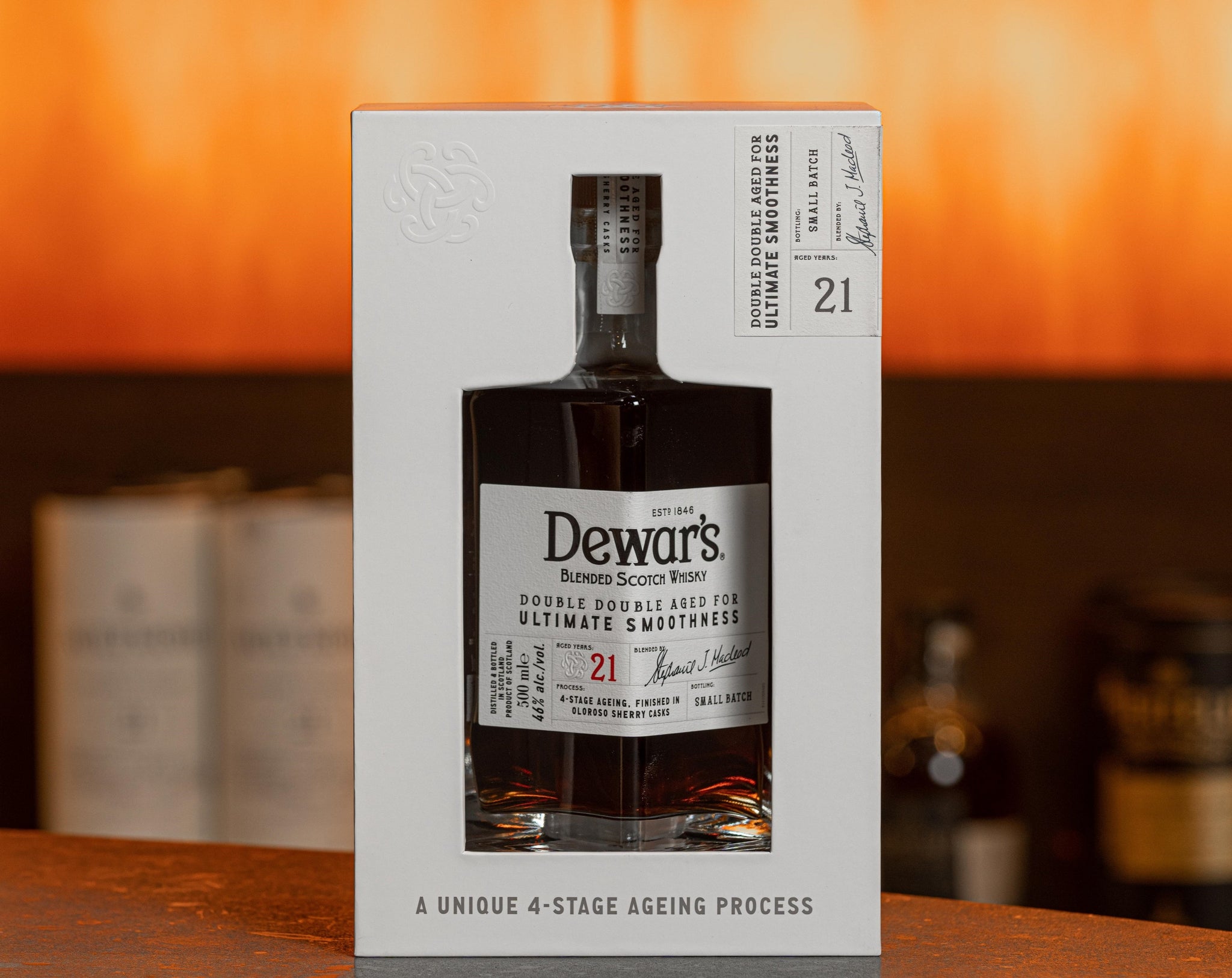
The packaging is a high-quality rigid box with a sturdy construction, featuring a thick chipboard material. The exterior is finished in a deep navy blue with a smooth texture, giving it a premium appearance. The box has a magnetic closure, allowing it to open and close seamlessly. Inside, it holds a bottle of Dewar's whisky, secured with a custom insert that fits the bottle snugly. The front of the box displays elegant gold foil lettering and intricate designs, enhancing its luxury appeal.
About the Brand
Dewar's operates as a prominent e-commerce whisky retailer, specializing in blended Scotch whiskies and branded merchandise. The company consistently employs luxury rigid box packaging, integrating custom inserts and premium finishes to ensure product protection and reinforce a premium brand position.
With a focus on age-statement and limited-edition whiskies, Dewar's packaging strategy leverages structural rigidity, windowed displays, and high-impact visual branding to optimize both shelf presence and the end-user unboxing experience. Their packaging solutions are designed to balance luxury appeal with functional protection, reflecting the brand's long-standing heritage and commitment to quality.
Key Differentiator: Dewar's distinct use of luxury rigid boxes with custom inserts and prominent heritage branding differentiates its packaging from standard spirits packaging, creating a heightened unboxing experience and reinforcing product authenticity.
Design System
Visual Style
Dewar's visual design incorporates serif and script typography, deep navy and gold color palettes, and minimalist layouts punctuated by intricate detailing. The palette leans toward metallics and rich neutrals to emphasize luxury.
Brand Identity
Branding is consistently applied with prominent logo placement, use of age statements, and heritage cues such as 'John Dewar & Sons Ltd.' Iconography is restrained, focusing on authenticity and craftsmanship. Visual consistency is maintained across all packaging formats.
Packaging Design
Material selection prioritizes thick chipboard for rigidity and premium tactile feel, with frequent use of gold foil, embossed details, and die-cut windows. Structural design emphasizes secure bottle fit, protection during handling, and display value.
User Experience
Packaging is structured to support an elevated customer journey, from first visual impact through tactile unboxing. Features such as magnetic closures, custom inserts, and visible product windows enhance usability, reinforce brand heritage, and create positive emotional engagement during the unboxing process.
Company Metrics
Business insights for Dewar's based on available data
Market Positioning
Brand Values & Focus
Key Competitors
Target Market: Adult whisky enthusiasts and collectors, with a focus on premium segment consumers seeking a high-quality, branded experience.
Packaging Assessment
Overall Grade
Visual appeal and presentation quality
Packaging durability and protection
Eco-friendliness and recyclable materials
Cost efficiency and value for money
Packaging assessment for Dewar's based on industry standards and best practices
Frequently Asked Questions
What types of packaging does Dewar's primarily use for its whisky products?
Dewar's predominantly utilizes rigid boxes made from thick chipboard, often featuring custom inserts, cut-out windows, and premium finishes such as gold foiling and embossing to protect and showcase its whisky bottles.
How does Dewar's packaging contribute to the customer experience?
Dewar's packaging is engineered to provide a visually engaging and tactile unboxing experience, with luxury materials, precise fit, and detailed branding elements that reinforce the brand’s premium positioning and heritage.
Is sustainability considered in Dewar's packaging strategy?
While Dewar's packaging emphasizes durability and luxury, the use of rigid chipboard materials suggests a moderate level of recyclability, but there is limited evidence of advanced sustainability initiatives such as the use of post-consumer recycled content or explicit eco-certifications.
Discover other Food & Drink companies
Explore more companies in the food & drink industry and their packaging strategies
PrepMyMeal
Food & Drink
PrepMyMeal is a food production company specializing in high-protein meal delivery services. They offer a variety of natural, nutritious meals designed for fitness enthusiasts and those seeking convenience in meal preparation.
kerex - terre exotique
Food & Drink
Kerex - Terre Exotique specializes in the international trade of gourmet food and drink products, offering a unique selection of spices and culinary ingredients.
Terres de Café
Food & Drink
Terres de Café is a specialty coffee retailer based in Paris, France, known for its commitment to sustainability and high-quality coffee sourcing.