Deborah Milano packaging
Deborah Milano specializes in beauty and personal care products, employing visually striking and brand-centric packaging strategies to reinforce its market positioning. Their packaging leverages custom rigid and carton box formats to deliver both retail impact and product protection.
Packaging Portfolio
Deborah Milano’s packaging portfolio consists mainly of rigid boxes and folding cartons engineered for cosmetic and personal care products. These solutions utilize coated paperboard and rigid substrates, often featuring gloss or matte finishes, clear windows for product visibility, and custom inserts for secure product placement. The packaging is structurally optimized for both retail display and e-commerce shipping, reflecting a data-driven balance between retail aesthetics and functional performance. Design elements such as geometric patterns and bold color blocking are leveraged for strong shelf presence and brand differentiation.
The packaging is a folding carton designed to hold cosmetic products. It features a smooth, flat construction with clean, precise edges and folds. The exterior has a glossy finish, showcasing vibrant colors and geometric patterns. The front displays a clear window that allows visibility of the products inside, enhancing the retail appeal. The carton is designed for easy shelf display.
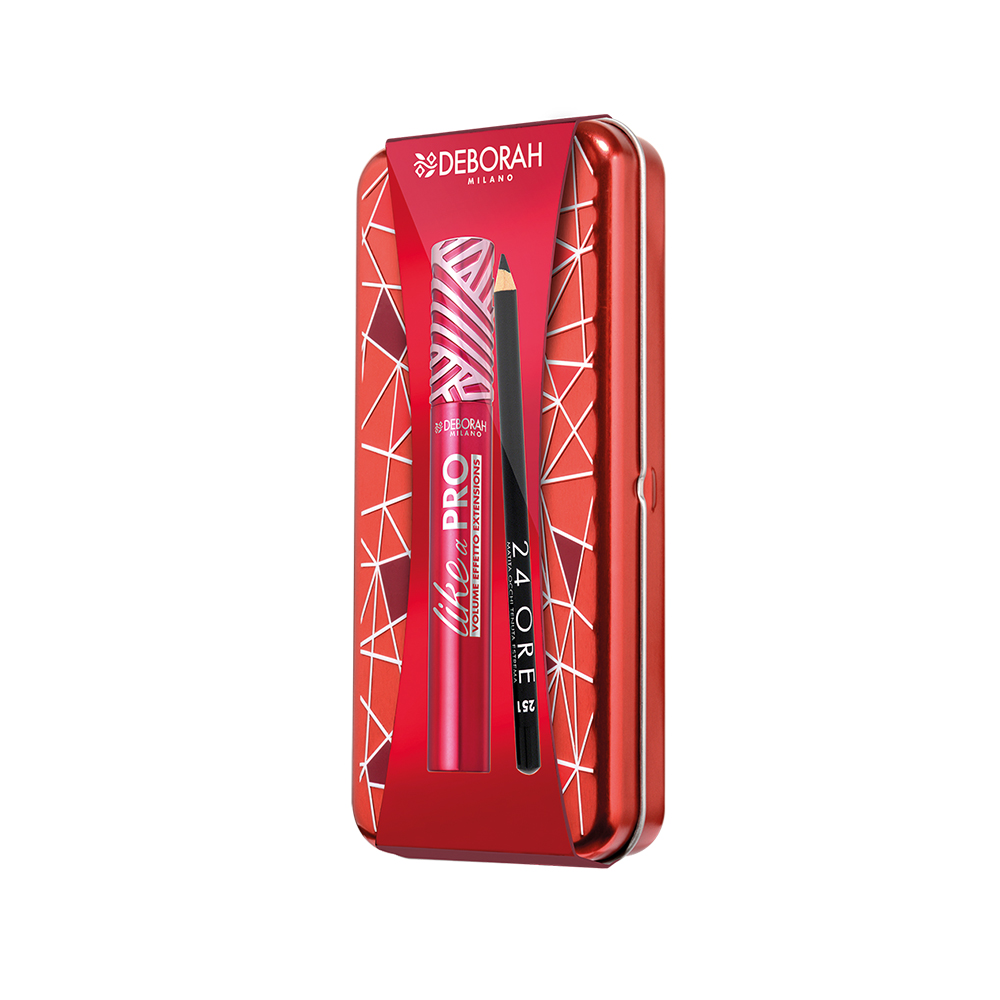
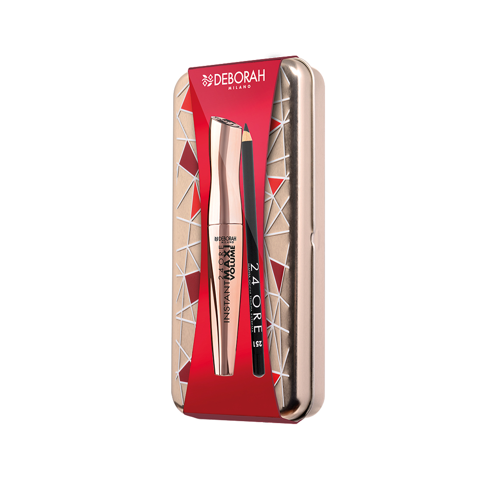
The packaging is a rigid box with a sturdy construction, featuring a metallic red exterior with a geometric design. The box has a smooth surface finish, likely coated for a glossy appearance. The dimensions appear compact, suitable for holding cosmetic items. The box is designed with a hinged lid, allowing for easy access to the contents inside. The interior is likely fitted to securely hold the products, which include a lip product and a pencil.
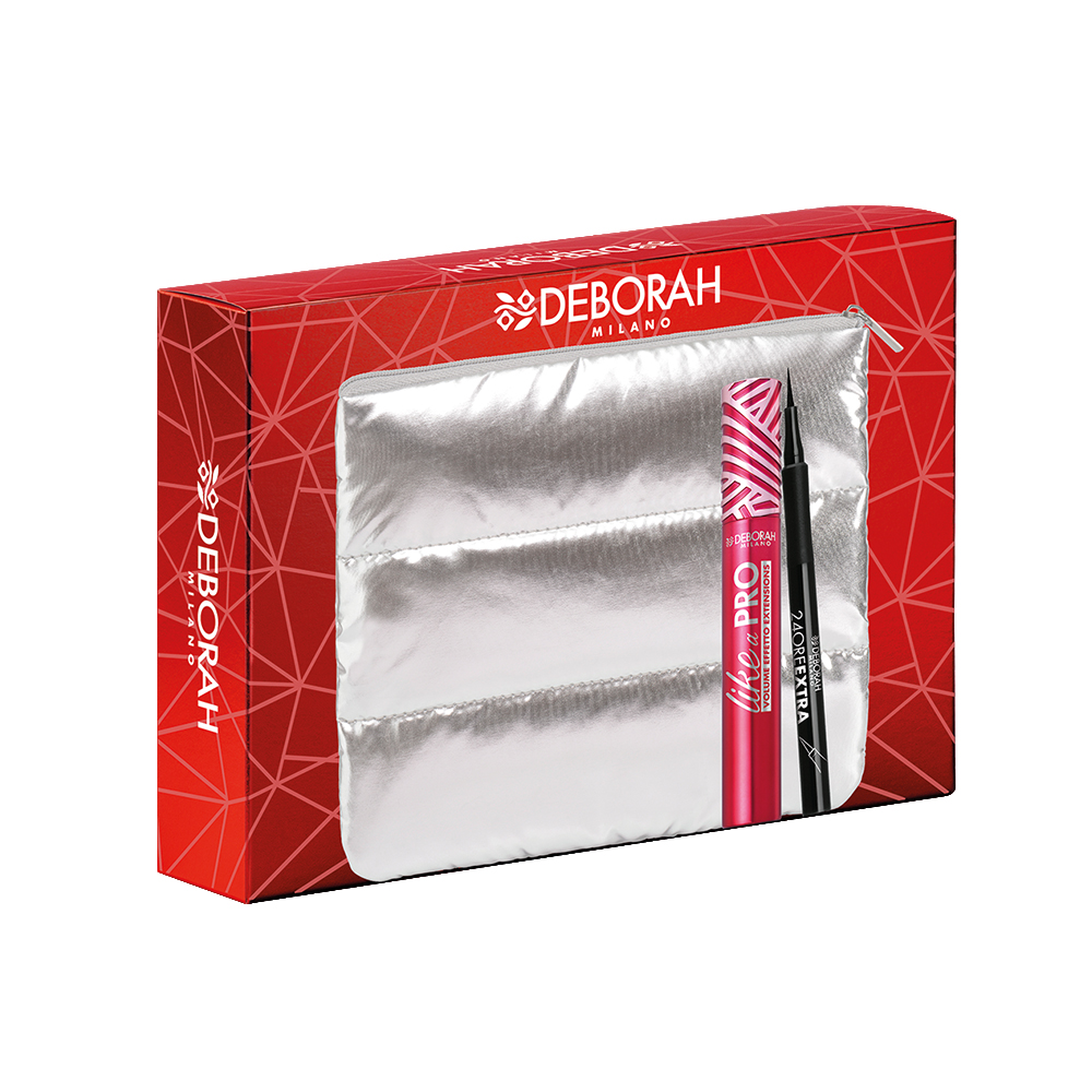
The packaging is a folding carton with a smooth, flat construction. It features a vibrant red exterior with a geometric pattern and a glossy finish. The front displays the brand name 'DEBORAH' prominently in white, along with the product names in contrasting colors. The carton is designed to hold two cosmetic items securely inside, with a clear plastic insert visible through a window on the front. The edges are cleanly folded, and the overall shape is rectangular with a slight depth to accommodate the products.
The packaging is a flat, rectangular box with smooth edges and a clean construction. It features a predominantly red exterior with geometric patterns, and a window cut-out showcasing the product inside. The box has a glossy finish, enhancing its visual appeal. The front displays product information and branding elements prominently.
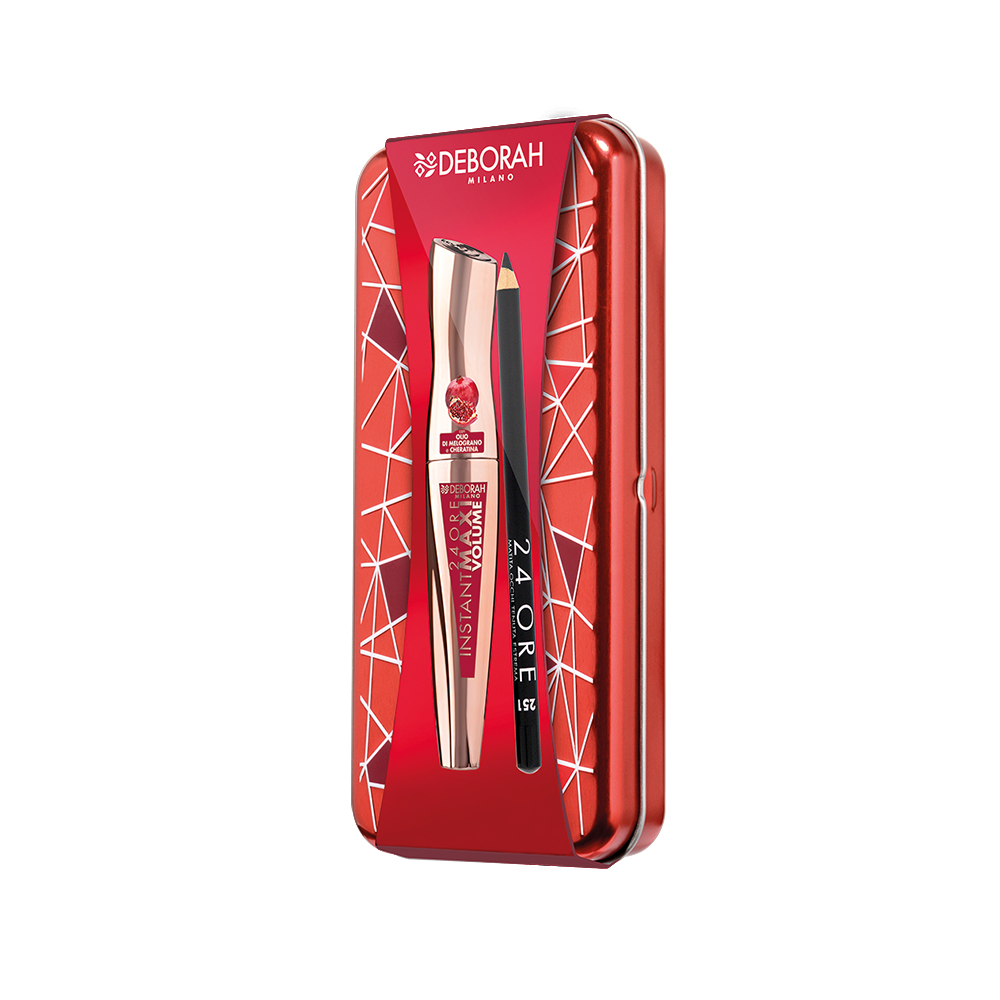
The packaging is a rigid box with a sturdy construction, featuring a high-quality finish. It has a metallic red exterior with a geometric pattern in white, giving it a premium appearance. The box is designed to hold cosmetic products, specifically a lip product and a pencil. The front showcases a clear plastic window that allows visibility of the products inside, enhancing its appeal. The edges are clean and precise, indicating a well-constructed design.
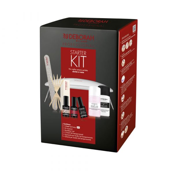
The packaging is a rectangular folding carton made of single-layer paperboard. It features a smooth, flat construction with clean, precise edges and folds. The exterior is predominantly black with bold red accents, showcasing product information and branding elements. The surface has a matte finish, giving it a professional appearance. The front displays images of the contents, including nail products and tools, with clear labeling.
About the Brand
Deborah Milano operates within the beauty and cosmetics sector, targeting consumers seeking high-quality, stylish products for face, body, and personal care. The company leverages a direct-to-consumer business model and places a strong emphasis on packaging as a key element of its brand experience.
With a streamlined organizational structure and a robust e-commerce presence, Deborah Milano focuses on delivering products that are both visually appealing and secure in transit. The brand's packaging portfolio is characterized by the use of rigid and folding carton boxes, often featuring glossy finishes, bold geometric patterns, and prominent branding. This approach not only enhances shelf presence but also supports their digital marketing initiatives and influencer collaborations.
Key Differentiator: Deborah Milano’s unique integration of high-impact visual design with functional packaging structures distinguishes its products in a saturated beauty market, supporting strong brand recognition and consumer engagement.
Design System
Visual Style
Typography emphasizes bold, sans-serif fonts for legibility and impact, combined with a color palette dominated by reds, blacks, and whites. Visuals employ geometric patterns and high-gloss or matte surfaces to create a modern, premium look.
Brand Identity
Consistent use of the Deborah Milano logo, clear product naming, and uniform iconography reinforce brand recognition. Visual elements are applied consistently across product lines, supporting a cohesive brand experience.
Packaging Design
Material selection prioritizes coated paperboard and rigid box structures, optimizing for both product protection and premium presentation. Structural design includes window cut-outs and internal inserts, reflecting a strategy focused on product visibility and unboxing appeal.
User Experience
The packaging is engineered to enhance the customer journey, from initial visual impact to secure, intuitive unboxing. Emphasis is placed on tactile quality, easy access to products, and clear communication of product benefits through on-pack graphics and labeling.
Company Metrics
Business insights for Deborah Milano based on available data
Market Positioning
Brand Values & Focus
Key Competitors
Target Market: Digitally engaged beauty consumers seeking high-quality, visually appealing cosmetic and personal care products, with a focus on European markets.
Packaging Assessment
Overall Grade
Visual appeal and presentation quality
Packaging durability and protection
Eco-friendliness and recyclable materials
Cost efficiency and value for money
Packaging assessment for Deborah Milano based on industry standards and best practices
Frequently Asked Questions
What types of packaging does Deborah Milano use for its products?
Deborah Milano primarily utilizes rigid boxes and folding carton packaging, featuring glossy or matte finishes, clear display windows, and custom inserts for product security. These formats are tailored for cosmetic products, balancing visual appeal with protection.
How does Deborah Milano ensure brand consistency across its packaging?
The brand maintains consistency through the use of a defined color palette (predominantly reds and blacks), geometric patterns, and clear brand logo placement. This cohesive approach reinforces brand identity on both individual products and across product ranges.
What sustainability practices are evident in Deborah Milano's packaging?
While the packaging features recyclable paperboard components, the use of glossy finishes and plastic windows may impact overall recyclability. The brand demonstrates partial sustainability efforts but could further improve by increasing the use of eco-friendly materials.
Discover other Beauty & Fitness companies
Explore more companies in the beauty & fitness industry and their packaging strategies
Pure Altitude
Beauty & Fitness
Pure Altitude specializes in high-quality beauty and skincare products that leverage the expertise of spa treatments to enhance daily routines. The brand offers a diverse range of products tailored for both facial and body care.
Institut Karité Paris
Beauty & Fitness
Institut Karité Paris specializes in luxury beauty products made with natural Shea Butter, offering a wide range of skincare and body care solutions. The brand combines Parisian heritage with a commitment to quality and creativity in its offerings.
Big Moustache
Beauty & Fitness
Big Moustache specializes in shaving and grooming products tailored for men, providing a hassle-free subscription service for razor blades and skincare essentials.