Dear Barber packaging
Dear Barber is a UK-based men's grooming brand specializing in premium hair, beard, and shaving products. The company's packaging strategy centers on visually distinctive, brand-consistent solutions that reinforce a luxury positioning within the beauty and fitness market.
Packaging Portfolio
Dear Barber's packaging portfolio is characterized by a combination of rigid gift boxes, folding carton boxes, and kraft paper bags. Rigid boxes utilize thick chipboard with magnetic closures and premium matte finishes, supporting both durability and a high-end unboxing experience for fragrances and gift sets. Carton boxes are constructed from quality paperboard with detailed print finishes and brand-consistent color schemes, balancing shelf presence and cost efficiency. The use of recyclable materials is evident, though luxury elements such as wood grain textures and magnetic closures may impact recyclability. Packaging formats are tailored to both retail and e-commerce requirements, prioritizing secure product containment and visual impact.

The image features a variety of packaging elements, including several retail cartons and a paper bag. The cartons are made of smooth, flat paperboard with clean edges and folds, showcasing a combination of black and gold colors with intricate designs. The paper bag is made of kraft paper, featuring a simple yet bold logo and text on the front. The overall presentation is stylish and aligns with grooming products.

The packaging features a sturdy construction with thick chipboard walls, providing a premium feel. It has a dark exterior with a wood-like texture, complemented by a smooth, contrasting inner lining. The box opens from the top, revealing a compartment that securely holds a glass bottle. The edges are cleanly cut, and the overall form is rectangular with a slight depth to accommodate the product.
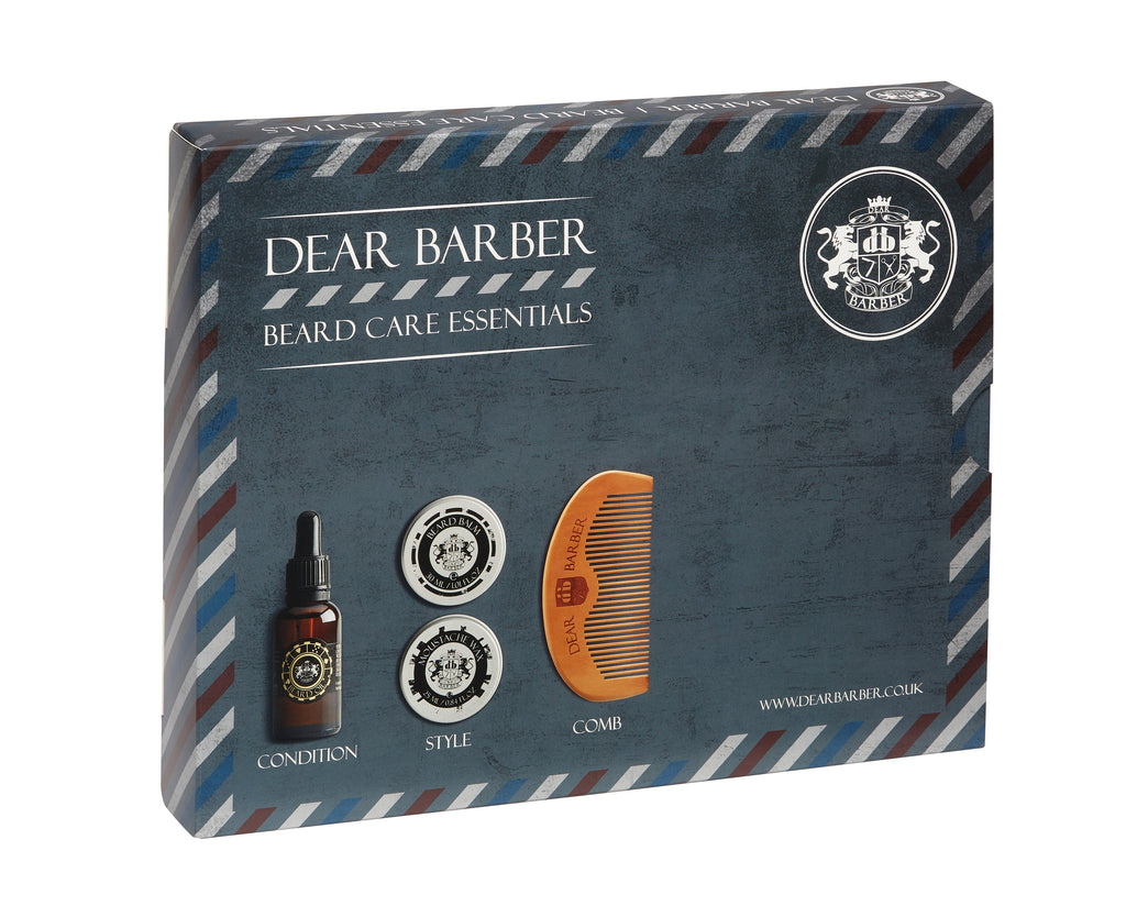
The packaging is a flat, rectangular folding carton made of single-layer paperboard. It features a smooth surface with clean, precise edges and folds. The exterior is predominantly dark blue with a textured appearance, complemented by stripes in red and white along the edges. The front displays the brand name 'DEAR BARBER' prominently in a bold, white font, along with product descriptors. The overall design has a modern and masculine aesthetic, suitable for grooming products.

The packaging features a sturdy, thick chipboard construction with a premium finish. The outer layer is black with a matte texture, while the interior showcases a contrasting design. The box has a magnetic closure that allows for easy access to the product inside. The overall shape is rectangular, designed to hold a bottle securely in place.
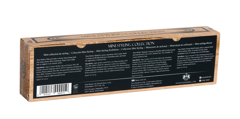
The packaging is a rectangular, flat carton box made from a single layer of paperboard. It features a smooth surface with clean edges and folds. The exterior has a matte black finish with a wood grain design printed along the top edge. The front displays product information in white text, including the product name and collection details. The back includes additional product descriptions and instructions in a smaller font. The overall appearance is sleek and professional, suitable for retail display.
About the Brand
Dear Barber operates in the men's grooming sector, offering a curated portfolio of hair care, beard care, and shaving essentials. Their packaging approach leverages premium materials and structured formats to convey quality and support the brand's upscale image.
With a direct-to-consumer model and a small, agile team, Dear Barber emphasizes British-made products and ethical standards, including cruelty-free practices. Their packaging is designed to balance shelf appeal with protective functionality, reflecting both tradition and contemporary design sensibilities. This strategy is underpinned by collaboration with barbers and a focus on customer experience throughout the purchasing journey.
Key Differentiator: Dear Barber differentiates itself through its integration of barber expertise into both product development and packaging design, ensuring a cohesive and credible presentation aligned with the expectations of a discerning male audience.
Design System
Visual Style
Typography emphasizes bold, sans-serif fonts paired with classic serif accents. The color palette includes matte black, gold, dark blue, and wood-grain effects, establishing a masculine and sophisticated aesthetic. Visual design is clean, with high contrast and minimal clutter.
Brand Identity
Consistent application of the Dear Barber logo on all packaging, often accompanied by product names and taglines. Iconography is restrained, focusing on heritage cues and modern barber motifs. Visual consistency is maintained across all SKUs through cohesive use of color, logo placement, and finish.
Packaging Design
Material selection favors rigid chipboard and high-quality paperboard for cartons, with a preference for matte finishes and tactile textures. Structural designs prioritize secure closures, product protection, and retail shelf appeal, with a clear focus on luxury cues and efficient use of space.
User Experience
Packaging is designed to deliver a premium unboxing experience, with attention to tactile feedback and presentation sequencing (e.g., magnetic closures, compartmentalized interiors). The design supports the customer journey by reinforcing the brand's luxury positioning at every touchpoint, from online purchase to in-home use.
Company Metrics
Business insights for Dear Barber based on available data
Market Positioning
Brand Values & Focus
Key Competitors
Target Market: Style-conscious male consumers in the UK and international markets seeking high-quality, barber-approved grooming solutions with an emphasis on premium presentation and ethical standards.
Packaging Assessment
Overall Grade
Visual appeal and presentation quality
Packaging durability and protection
Eco-friendliness and recyclable materials
Cost efficiency and value for money
Packaging assessment for Dear Barber based on industry standards and best practices
Frequently Asked Questions
What types of packaging does Dear Barber use for its grooming products?
Dear Barber employs a mix of rigid boxes, retail carton boxes, and kraft paper bags. These formats utilize premium chipboard and paperboard materials, matte finishes, and detailed brand graphics to reinforce the premium positioning and ensure product protection during transit.
How does Dear Barber address sustainability in its packaging strategy?
While the brand emphasizes ethical practices and British manufacturing, packaging sustainability is implemented through the use of recyclable carton and paper-based materials. However, the use of luxury finishes and rigid structures may limit the overall recyclability and environmental impact.
Discover other Beauty & Fitness companies
Explore more companies in the beauty & fitness industry and their packaging strategies
Pure Altitude
Beauty & Fitness
Pure Altitude specializes in high-quality beauty and skincare products that leverage the expertise of spa treatments to enhance daily routines. The brand offers a diverse range of products tailored for both facial and body care.
Institut Karité Paris
Beauty & Fitness
Institut Karité Paris specializes in luxury beauty products made with natural Shea Butter, offering a wide range of skincare and body care solutions. The brand combines Parisian heritage with a commitment to quality and creativity in its offerings.
Big Moustache
Beauty & Fitness
Big Moustache specializes in shaving and grooming products tailored for men, providing a hassle-free subscription service for razor blades and skincare essentials.