Dammann Frères packaging
Dammann Frères specializes in premium teas and infusions, utilizing sophisticated packaging solutions that reflect their long-standing heritage. The company emphasizes high-quality materials and refined structural formats to reinforce its premium brand positioning.
Packaging Portfolio
Dammann Frères employs a packaging portfolio dominated by rigid boxes and luxury wooden formats, utilizing thick chipboard, polished wood, and high-gloss cartons. These materials offer strong protection and support a premium unboxing moment, with compartmentalized interiors for precise product arrangement. Packaging consistently features embossed logos, matte or gloss finishes, and color palettes aligned with brand identity. This approach is optimized for both retail shelf impact and gifting scenarios, balancing presentation with durability.
The packaging is a rectangular box made of thick chipboard with a premium wooden finish. It features a hinged lid with a gold clasp, providing a luxurious appearance. The interior is neatly organized with compartments for individual tea sachets, each wrapped in colorful foil packaging. The box is designed to be sturdy and visually appealing, suitable for gifting.

The packaging is a sturdy, rectangular box with a premium appearance. It features a thick chipboard construction that provides exceptional durability. The exterior is covered in a matte finish, with a light brown color that gives it an elegant look. The box has a pull-out drawer mechanism, indicated by a black ribbon pull. Inside, it contains compartments for various tea sachets, arranged neatly in a grid format. The overall design is clean and sophisticated, with a focus on showcasing the product.

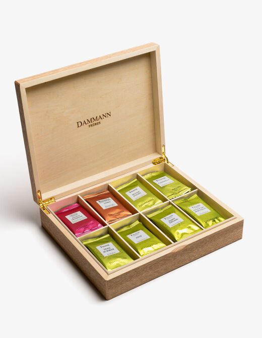
The packaging is a rectangular wooden box with a smooth, polished surface. It features a hinged lid that opens to reveal neatly arranged compartments holding individual tea sachets. The interior is lined with a soft material, enhancing the premium feel. The exterior showcases a natural wood finish, with the brand name elegantly engraved on the inside of the lid.
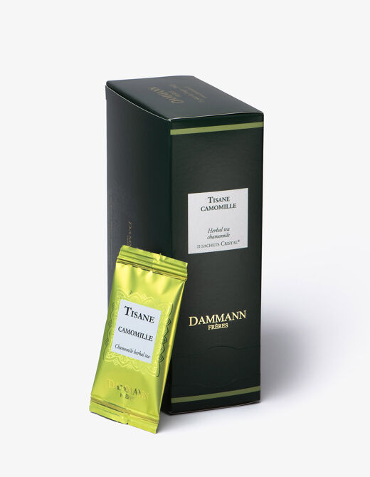
The packaging features a tall, rectangular shape with smooth, flat surfaces. It is predominantly dark green with a glossy finish, showcasing a clean and elegant design. The front displays a central white label with the product name 'TISANE CAMOMILLE' in a decorative font, along with the brand name 'DAMMANN FRÈRES'. The edges are well-defined, and the folds are precise, indicating high-quality construction. A small, bright green tea sachet is placed next to the carton, contrasting with the packaging's color scheme.
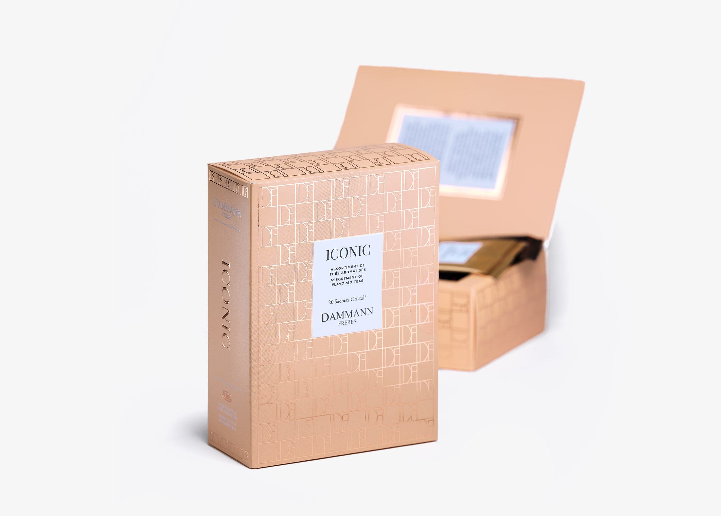
The packaging is a folding carton with a smooth, flat construction. It features a light peach color with a subtle embossed pattern. The edges are clean and precise, indicating a high-quality finish. The front displays the word 'ICONIC' prominently, along with product details in a contrasting white label. The interior is visible through a cut-out window, showcasing the contents inside.
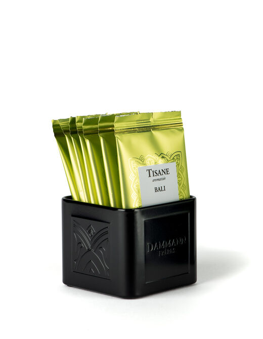
The packaging consists of a sturdy, square-shaped box made from thick chipboard, featuring a matte black finish. The box has a premium appearance with a textured surface and embossed branding on the front. Inside, it holds several tea sachets, each individually wrapped in a glossy green foil with a white label. The box has clean edges and a solid construction, suggesting durability and a luxury feel.
About the Brand
Dammann Frères is a French tea company with deep historical roots, offering a wide range of teas, infusions, and accessories. Their packaging approach is characterized by the use of rigid boxes, luxury cartons, and display formats designed for both protection and visual impact.
The brand combines traditional French craftsmanship with contemporary design, focusing on both the preservation and presentation of tea products. Their packaging strategy integrates durable chipboard, wood, and high-quality printed cartons to ensure product safety and deliver a premium unboxing experience. Distinctive visual cues such as embossed logos and elegant finishes are used consistently across product lines, supporting both retail and gifting segments.
Key Differentiator: Dammann Frères stands out for its integration of luxury packaging formats and minimalist design, enhancing both product protection and brand storytelling within the premium tea market.
Design System
Visual Style
The visual design employs serif and modern sans-serif typography, an elegant color palette including matte blacks, natural woods, deep greens, and light neutrals, and a minimalist aesthetic emphasizing clean lines and subtle textures.
Brand Identity
Logo usage is prominent and consistent, with the Dammann Frères name and emblem embossed or engraved on key panels. Iconography is minimal, ensuring the brand remains the visual focal point. Visual consistency is maintained through recurring use of signature colors and type treatments.
Packaging Design
Material selection favors rigid chipboard, polished woods, and premium folding cartons to ensure both durability and tactile appeal. Structural philosophy prioritizes compartmentalization, secure closures, and gift-ready presentation, supporting both functional protection and experiential value.
User Experience
Packaging is designed to enhance the customer journey, from first visual contact to unboxing. Features such as pull drawers, hinged lids, and interior organization contribute to a memorable experience, reinforcing the premium positioning and supporting brand loyalty.
Company Metrics
Business insights for Dammann Frères based on available data
Market Positioning
Brand Values & Focus
Key Competitors
Target Market: Premium tea consumers, gifting segment, and specialty food retail customers with a preference for high-quality, artisanal products.
Packaging Assessment
Overall Grade
Visual appeal and presentation quality
Packaging durability and protection
Eco-friendliness and recyclable materials
Cost efficiency and value for money
Packaging assessment for Dammann Frères based on industry standards and best practices
Frequently Asked Questions
What types of packaging does Dammann Frères use for their tea products?
Dammann Frères primarily utilizes rigid boxes, luxury wooden boxes, and high-quality folding cartons, with formats tailored to both retail display and gift presentation. These structures provide both durability and a premium visual experience.
How does Dammann Frères ensure the safety of their products during shipping?
The company employs thick chipboard and robust wooden structures in its packaging, prioritizing product compartmentalization and secure closures to minimize transit damage and maintain product integrity.
What sustainability practices are reflected in Dammann Frères’ packaging?
While Dammann Frères uses durable and reusable materials such as wood and chipboard, the overall sustainability is moderate, with limited public data on recyclable content or eco-certifications. There is a focus on reusability and long service life, particularly in gift and display boxes.
Discover other Food & Drink companies
Explore more companies in the food & drink industry and their packaging strategies
Terres de Café
Food & Drink
Terres de Café is a specialty coffee retailer based in Paris, France, known for its commitment to sustainability and high-quality coffee sourcing.
PrepMyMeal
Food & Drink
PrepMyMeal is a food production company specializing in high-protein meal delivery services. They offer a variety of natural, nutritious meals designed for fitness enthusiasts and those seeking convenience in meal preparation.
Thés de la Pagode
Food & Drink
Thés de la Pagode is a French company specializing in organic teas and infusions, focusing on health and well-being. Established in 1987, they prioritize sustainable practices and high-quality ingredients sourced through fair trade.