Cut by Fred packaging
Cut by Fred is a French beauty brand specializing in vegan hair care products, with a clear focus on sustainability and inclusive solutions for various hair types. Their packaging strategy emphasizes flexible, eco-friendly materials and a visually bold, modern design to reinforce brand values and optimize customer engagement.
Packaging Portfolio
Cut by Fred's packaging portfolio is characterized by the use of flexible multilayer pouches with spouts, kraft-based stand-up bags, and branded, reusable fabric drawstring pouches. The majority of packaging structures prioritize ease of dispensing, resealability, and upright shelf presence. Material choices reflect a strong preference for lightweight, recyclable, and refillable components, aimed at minimizing environmental impact and facilitating sustainable consumption. The visual identity is consistently reinforced through bold color blocking, geometric motifs, and clear, high-contrast typography across all primary and secondary packaging formats.

The packaging is a fabric drawstring pouch featuring a colorful geometric design. The pouch has a soft texture and is made from a lightweight fabric material. It is closed at the top with a drawstring mechanism, allowing for easy opening and closing. The design includes abstract shapes in blue, green, and orange against a light background, with the brand name 'CUT BY FRED' prominently displayed in bold black letters at the bottom.

The image features multiple flexible pouches and a bottle. The pouches are made of a smooth, glossy material, likely a type of plastic or laminated film, with a vibrant pink and white design. Each pouch has a spout for dispensing the product, and the overall shape is rectangular with rounded edges. The bottle is a small glass or plastic container with a round base and a yellow cap, featuring a similar color scheme and branding.

The image features a variety of cosmetic products with distinct packaging. The containers include bottles, jars, and pouches, primarily made of plastic and flexible materials. The packaging displays a modern aesthetic with bold colors and geometric shapes, often using a mix of matte and glossy finishes. The products are arranged in a flat lay style, showcasing their unique designs and labels.

The packaging is a flexible pouch made of a smooth, shiny material. It features a spout at the top for dispensing the product. The design includes a prominent pink and white color scheme with bold black text. The overall shape is a slightly curved rectangle, tapering towards the bottom, which allows it to stand upright when filled.
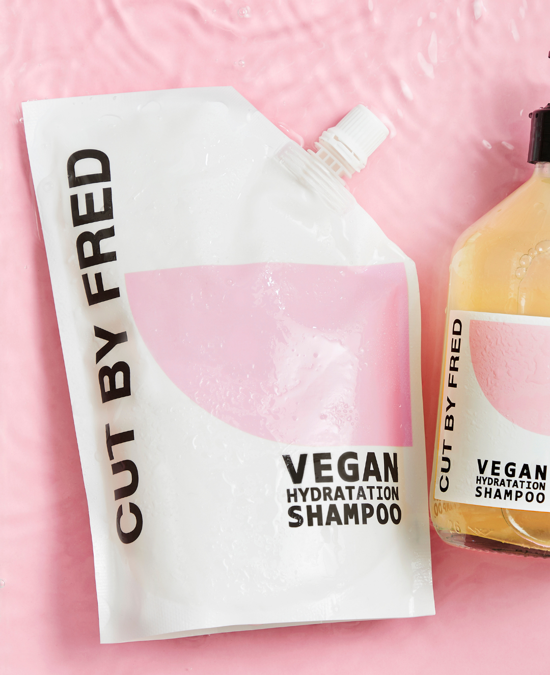
The packaging is a flexible pouch with a smooth surface and a matte finish. It features a resealable cap at the top and is designed to stand upright. The front of the pouch has a large, pink circular graphic that occupies a significant portion of the surface, with the product name 'VEGAN HYDRATION SHAMPOO' prominently displayed in bold black font. The overall design is modern and minimalistic, with a clean layout.
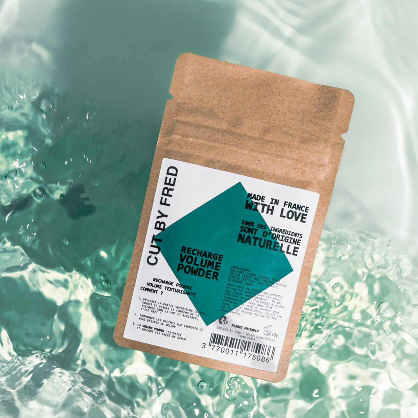
The packaging is a stand-up pouch made of a flexible material with a kraft paper exterior. It has a flat bottom that allows it to stand upright. The front features a large teal diamond graphic along with product information. The top is sealed with a heat seal, and there is a tear notch for easy opening.
About the Brand
Cut by Fred delivers a curated range of hair care products designed for diverse hair needs, integrating sustainability as a core tenet in both product formulation and packaging. The brand leverages flexible pouches, kraft paper stand-up bags, and fabric drawstring pouches, all featuring consistent brand elements and bold visual design.
Operating as a direct-to-consumer brand, Cut by Fred aligns its packaging approach with eco-conscious consumer values by prioritizing recyclable and refillable packaging formats. Their product presentation utilizes modern, minimalist graphics, and color-forward aesthetics to enhance shelf impact while supporting environmental responsibility. The packaging portfolio demonstrates an ongoing commitment to reducing material waste and improving user experience at every step of the unboxing process.
Key Differentiator: Cut by Fred stands out for its integration of vegan product formulations with sustainable, refill-focused packaging, and personalized customer journeys supported by diagnostic tools and a robust loyalty program.
Design System
Visual Style
The brand uses modern, sans-serif typography paired with bold, saturated colors such as pink, teal, and yellow, set against white or kraft backgrounds. The overall aesthetic is minimalist yet vibrant, enhancing on-shelf visibility and digital presence.
Brand Identity
Logo and brand name are prominently featured on all packaging in high-contrast layouts. Iconography is minimal, with an emphasis on geometric shapes and consistent visual elements to ensure recognition and coherence across the portfolio.
Packaging Design
Material selection focuses on flexible plastics and kraft paper to support refill and recyclability initiatives. Structural design emphasizes ergonomic shapes, resealable spouts, and stand-up formats, optimizing both user convenience and logistics efficiency.
User Experience
Packaging is designed to streamline the customer journey, from intuitive dispensing and resealing to visually engaging unboxing moments. The design supports a seamless brand experience both online and offline, reinforcing Cut by Fred's positioning as a premium, sustainable hair care provider.
Company Metrics
Business insights for Cut by Fred based on available data
Market Positioning
Brand Values & Focus
Key Competitors
Target Market: Eco-conscious consumers seeking premium, vegan hair care solutions with an emphasis on sustainability and inclusive product offerings.
Packaging Assessment
Overall Grade
Visual appeal and presentation quality
Packaging durability and protection
Eco-friendliness and recyclable materials
Cost efficiency and value for money
Packaging assessment for Cut by Fred based on industry standards and best practices
Frequently Asked Questions
What types of packaging does Cut by Fred use?
Cut by Fred primarily utilizes flexible pouches with spouts, kraft paper stand-up bags, and branded fabric drawstring pouches. These formats support both product safety and sustainability, with a strong emphasis on refillability and material reduction.
How does Cut by Fred address sustainability in packaging?
The brand adopts eco-friendly materials, including recyclable pouches and reusable fabric bags, and offers refill options to minimize single-use packaging waste, all aligned with their sustainability-driven brand ethos.
How does packaging design contribute to Cut by Fred's brand experience?
Distinctive, bold color schemes and clear typography create high visual recognition, while thoughtful structural choices like resealable pouches and stand-up formats enhance ease of use and reinforce a premium unboxing experience.
Discover other Beauty & Fitness companies
Explore more companies in the beauty & fitness industry and their packaging strategies
Big Moustache
Beauty & Fitness
Big Moustache specializes in shaving and grooming products tailored for men, providing a hassle-free subscription service for razor blades and skincare essentials.
Pure Altitude
Beauty & Fitness
Pure Altitude specializes in high-quality beauty and skincare products that leverage the expertise of spa treatments to enhance daily routines. The brand offers a diverse range of products tailored for both facial and body care.
Institut Karité Paris
Beauty & Fitness
Institut Karité Paris specializes in luxury beauty products made with natural Shea Butter, offering a wide range of skincare and body care solutions. The brand combines Parisian heritage with a commitment to quality and creativity in its offerings.