Christophe Robin packaging
Christophe Robin specializes in luxury hair care products, leveraging a direct-to-consumer model with a strong focus on premium packaging. The brand employs high-end carton and rigid box formats to deliver both product protection and a sophisticated unboxing experience.
Packaging Portfolio
Christophe Robin’s packaging portfolio comprises rigid chipboard boxes for gift sets, premium folding cartons for individual retail products, and robust cosmetic jars for treatments and scrubs. Structural elements focus on durability and shelf presence, while visual elements include clean typography, vibrant color accents, and ingredient illustrations. The portfolio displays consistent branding, with prominent logo use and a preference for tactile and glossy finishes that enhance perceived value. Packaging formats are chosen to optimize both consumer experience and product protection during transit.
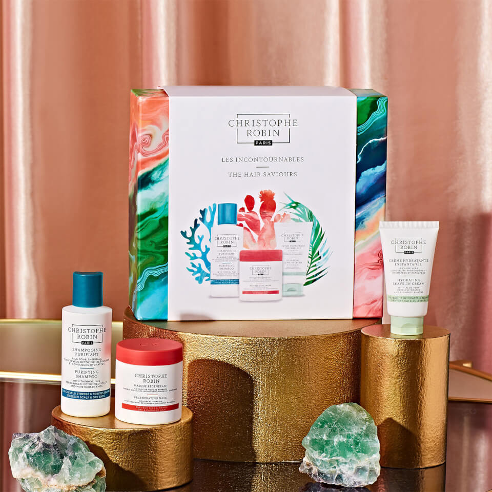
The packaging is a square rigid box with a premium appearance. It features a thick chipboard construction, providing a sturdy and luxurious feel. The exterior is adorned with a vibrant, colorful design that includes swirling patterns in shades of pink, green, and blue, reminiscent of marbled effects. The box has clean, precise edges and a smooth finish, contributing to its upscale look. The top of the box is decorated with the brand name 'CHRISTOPHE ROBIN' prominently displayed, along with the product line name 'LES INCONTOURNABLES' and 'THE HAIR SAVIOURS'. The box is designed to house multiple products, indicating a gift set.
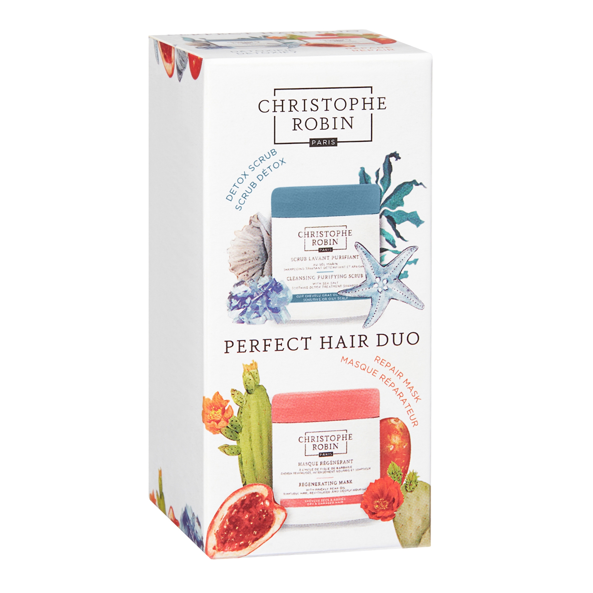
The packaging is a folding carton made of smooth, single-layer paperboard. It features a rectangular shape with clean, precise edges and folds. The exterior is predominantly white with colorful graphics depicting various ingredients and product images. The box has a glossy finish, enhancing its visual appeal. The front displays the brand name prominently at the top, with product names and descriptions below. The sides have additional graphics and information about the products included.

The packaging consists of a cylindrical jar with a thick, sturdy construction, indicative of premium quality. The jar features a smooth surface with a matte finish, and the lid is a contrasting color that adds to its aesthetic appeal. The overall design is sleek and modern, suitable for cosmetic products.
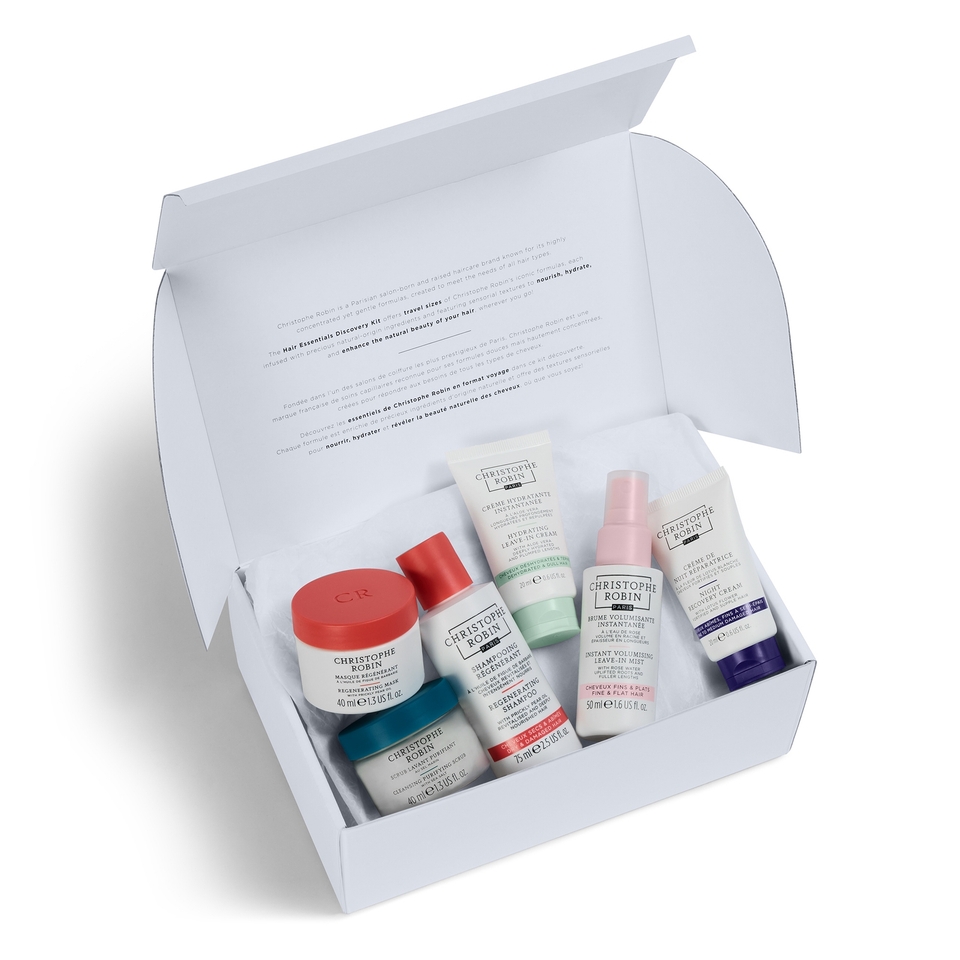
The packaging is a white folding carton with a smooth, flat construction. It has a clean design with precise edges and folds, typical of retail packaging. The interior is lined with a soft material, possibly tissue paper, to protect the products inside. The box opens from the top and has a flap closure.

The packaging consists of several rigid boxes designed for retail display, featuring vibrant colors and a premium appearance. Each box has a thick, sturdy construction with a decorative exterior that showcases a luxurious feel. The boxes are arranged in a visually appealing manner, with some containing products visible through cut-out windows. The overall design is colorful and eye-catching, aimed at attracting consumer attention.
About the Brand
Christophe Robin is a Paris-based luxury hair care company known for its commitment to natural ingredients and tailored hair solutions. The brand actively integrates packaging as a core component of its premium positioning, utilizing visually impactful and structurally robust solutions for its diverse product lineup.
The company's packaging strategy is characterized by a mix of rigid boxes, folding cartons, and cosmetic jars, frequently featuring vibrant graphics, clean layouts, and tactile finishes. These elements reinforce the brand’s upscale image while ensuring product safety and shelf appeal. Through consistency in branding and material quality, Christophe Robin’s packaging not only supports logistics and retail requirements but also enhances the sensory experience for consumers.
Key Differentiator: The integration of luxury-grade materials and consistent, brand-forward design principles distinguishes Christophe Robin’s packaging in the beauty sector, focusing equally on consumer experience and product protection.
Design System
Visual Style
Typography centers on modern, sans-serif fonts for clarity and elegance. The color palette favors clean whites, muted neutrals, and occasional vibrant hues—especially pinks, greens, and blues—to denote product lines or seasonal editions. The overall aesthetic is modern, minimal, and sophisticated, supporting luxury positioning.
Brand Identity
Logo usage is prominent, typically placed at the center or top of each package. Visual consistency is maintained through repeated use of brand colors, uniform font treatments, and carefully placed product names and descriptors. Iconography is minimal, focusing on ingredient illustrations or line demarcations.
Packaging Design
Material selection prioritizes sturdy chipboard and quality paperboard for structure, with a preference for recyclable substrates where possible. Structural design emphasizes clean lines, secure closures, and protection for delicate cosmetic formulations. Luxury cues are reinforced through tactile finishes such as matte coatings and soft-touch laminates.
User Experience
Packaging is engineered for a premium unboxing experience, with layered reveals, soft interior linings, and attention to tactile and visual detail. Design choices support both online and retail customer journeys by delivering immediate brand recognition and a sense of indulgence upon opening, while maintaining practical ease of use.
Company Metrics
Business insights for Christophe Robin based on available data
Market Positioning
Brand Values & Focus
Key Competitors
Target Market: Affluent consumers seeking premium, natural hair care solutions with an emphasis on product efficacy and experience; includes beauty enthusiasts and professionals worldwide.
Packaging Assessment
Overall Grade
Visual appeal and presentation quality
Packaging durability and protection
Eco-friendliness and recyclable materials
Cost efficiency and value for money
Packaging assessment for Christophe Robin based on industry standards and best practices
Frequently Asked Questions
What packaging materials does Christophe Robin typically use?
Christophe Robin primarily uses rigid chipboard boxes, premium folding cartons, and high-quality cosmetic jars, emphasizing both structural integrity and luxury presentation.
How does Christophe Robin’s packaging reflect its brand values?
The packaging consistently features minimalist yet vibrant designs, prominent logo placement, and tactile finishes, reinforcing the brand's commitment to quality, luxury, and natural beauty.
Is sustainability a focus in Christophe Robin’s packaging?
While the brand utilizes recyclable paperboard and seeks eco-friendly options, its primary focus is on premium materials and presentation, with moderate but evolving attention to sustainability.
Discover other Beauty & Fitness companies
Explore more companies in the beauty & fitness industry and their packaging strategies
Orris Paris
Beauty & Fitness
Orris Paris specializes in creating artisanal skincare products that combine potent botanical ingredients with modern cleansing rituals. The company emphasizes natural, holistic practices in its formulations.
Big Moustache
Beauty & Fitness
Big Moustache specializes in shaving and grooming products tailored for men, providing a hassle-free subscription service for razor blades and skincare essentials.
Pure Altitude
Beauty & Fitness
Pure Altitude specializes in high-quality beauty and skincare products that leverage the expertise of spa treatments to enhance daily routines. The brand offers a diverse range of products tailored for both facial and body care.