CAPTN Coffee packaging
CAPTN Coffee specializes in premium brewing equipment and sustainable coffee subscription services, with a business model centered on flexibility and customer-centric offerings. Their packaging approach leverages minimalist, eco-conscious materials, reflecting both brand values and industry trends in specialty coffee retail.
Packaging Portfolio
CAPTN Coffee's packaging portfolio comprises flexible kraft paper pouches, stand-up coffee bags with resealable closures, and minimalist folding carton boxes for accessories. The material selection prioritizes recyclability and a natural, matte finish, aligning with current specialty coffee market trends. Labeling utilizes monochrome palettes and clear typography for product differentiation, while the structural design supports both shelf display and efficient direct-to-consumer logistics. Overall, the portfolio demonstrates a commitment to balancing brand identity, sustainability, and practical shipping needs.
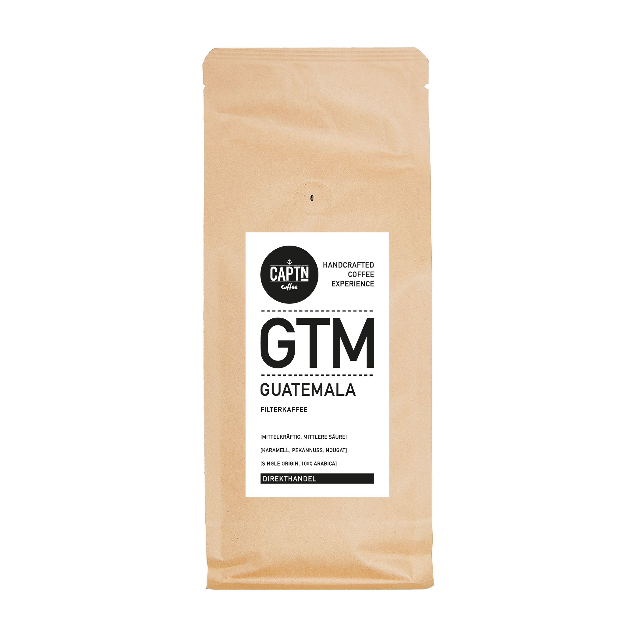
The packaging is a flat, stand-up pouch made from a kraft paper material with a smooth surface. It features a white label on the front with black text, including the brand name 'CAPTN Coffee' and product details such as 'GTM' and 'FILTERKAFFEE'. The edges of the pouch are cleanly sealed, and the top appears to have a resealable closure. The overall design is minimalistic with a focus on the brand name and product information.

The packaging is a flat, stand-up pouch made of kraft paper with a smooth surface. It features a rectangular shape with a sealed bottom and a resealable top. The front displays a large white label with black text, indicating the product name and details. The overall appearance is clean and minimalistic, with no visible fluted layers, indicating it is not corrugated. The bag has a matte finish, contributing to a natural look.
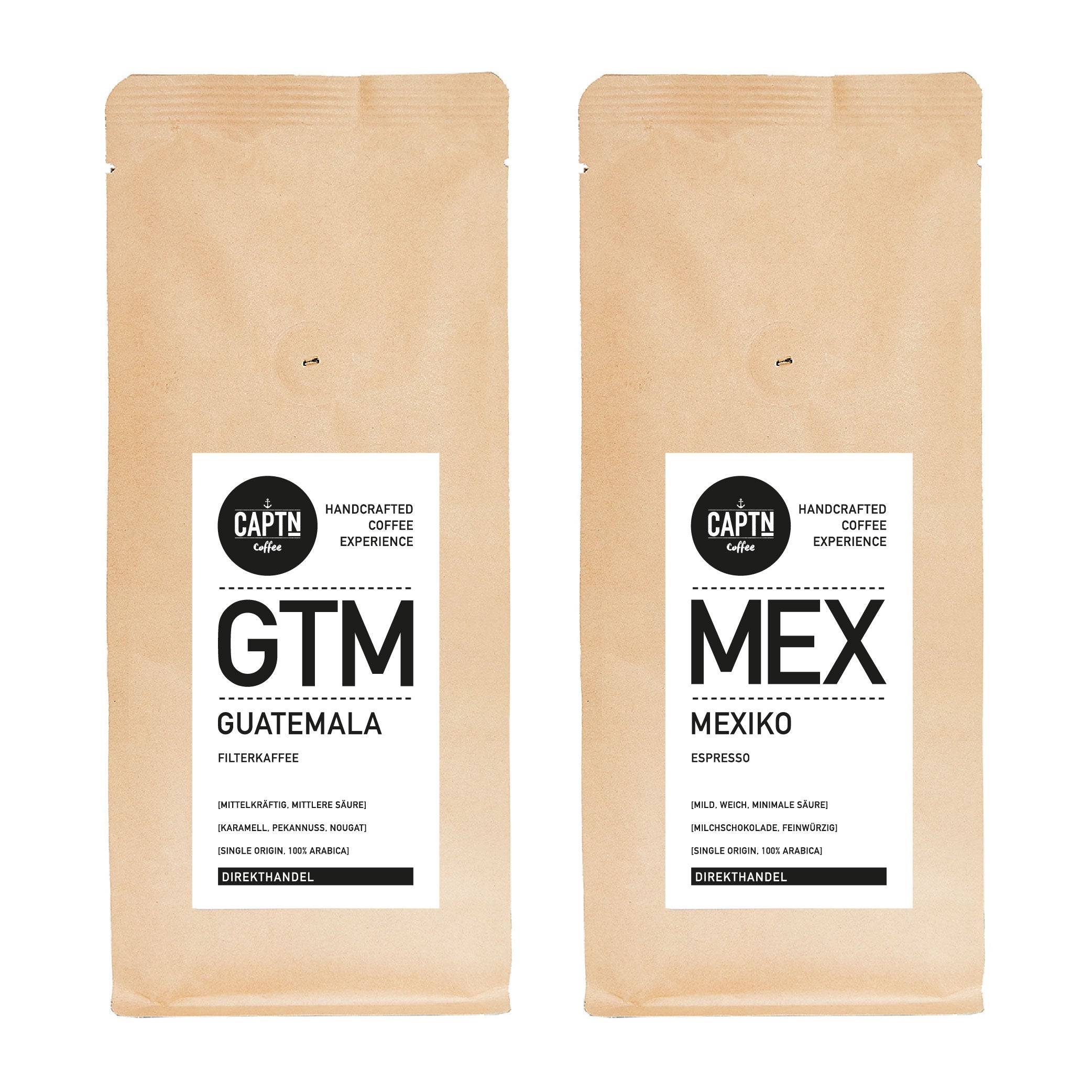
The packaging consists of two flat, rectangular bags made from a flexible material, likely a type of paper or plastic laminate. Each bag features a matte finish with a natural kraft color. The bags have a clean, smooth surface with no visible flutes or layers, indicating a single-layer construction. The edges are neatly sealed, and the bags appear to have a top opening that is likely sealed with a heat seal or fold-over closure. The front of each bag displays bold black text and graphics, with a minimalist design aesthetic.
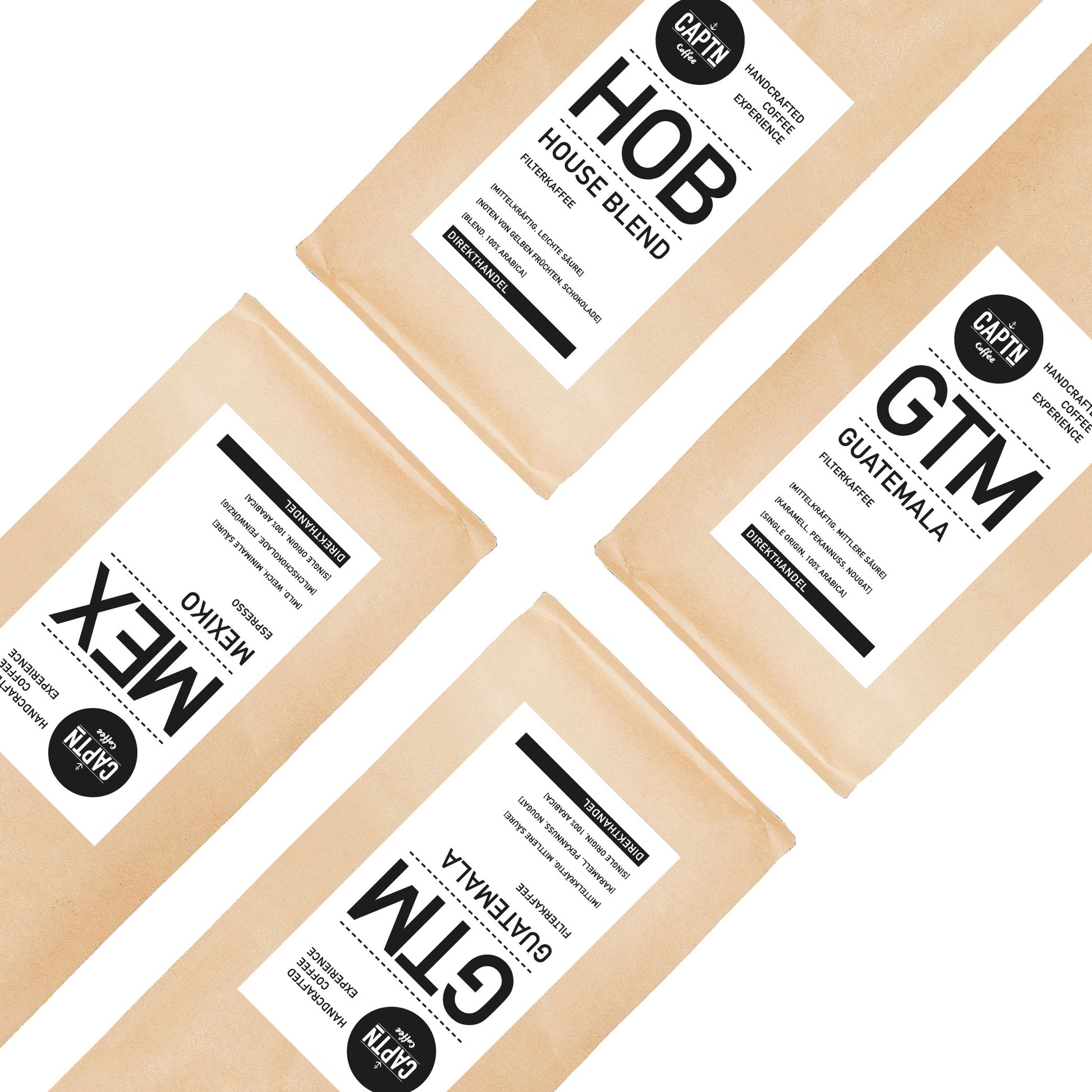
The packaging consists of flat, rectangular bags made from a smooth, lightweight paper material. The bags are primarily kraft brown in color with a matte finish. Each bag features a white label with black text that includes the brand name 'CAPTN' prominently displayed at the top. Below the brand name, there are product identifiers such as 'HOB', 'GTM', and 'MEX', indicating different coffee blends. The labels are cleanly cut with sharp edges and are applied uniformly across the bags. There are no visible flaps or structural elements typical of boxes; instead, the bags have a simple, straightforward design.
The packaging consists of flat, rectangular bags made from a flexible material, likely a combination of paper and plastic. Each bag has a matte finish with a kraft brown exterior, giving it a natural, organic appearance. The bags have a clean, simple design with a white label that includes product information and branding elements. The edges of the bags are smooth, and they appear to be sealed at the top, likely with a heat seal or adhesive. The bags are designed to stand upright, indicating a gusseted bottom.
About the Brand
CAPTN Coffee, based in Hamburg, Germany, operates in the food and drink sector, focusing on specialty coffee equipment and subscription-based product delivery. The brand is recognized for integrating sustainability and flexibility into both product offerings and packaging strategies.
Founded in 2021, CAPTN Coffee serves both individual consumers and B2B clients, offering a diverse range of coffee machines, grinders, and brewing accessories. The company’s packaging solutions are designed to reinforce their sustainable positioning, utilizing recyclable kraft paper materials and minimalist labeling to reduce environmental footprint and visual clutter. Their subscription model demands packaging that balances logistics efficiency, protection, and aesthetic appeal for repeat direct-to-consumer shipments.
Key Differentiator: CAPTN Coffee stands out through its combination of flexible equipment rental, sustainable subscription packaging, and a cohesive minimalist brand identity tailored for the specialty coffee market.
Design System
Visual Style
Typography centers on bold, sans-serif fonts with high legibility; the color palette is dominated by kraft browns, white labels, and black text, resulting in a clean, natural, and minimalist aesthetic.
Brand Identity
Consistent logo placement and product identifiers on all primary packaging, with restrained use of iconography and a focus on visual simplicity, ensuring strong shelf presence and easy brand recognition.
Packaging Design
Material choices favor recyclable kraft paper and lightweight carton, with a structural philosophy emphasizing flat, stand-up pouches and straightforward folding boxes for optimal protection and minimal waste.
User Experience
The packaging is designed to facilitate a seamless unboxing experience, with resealable features and clear labeling that support both functional convenience and an eco-conscious, premium brand touchpoint throughout the customer journey.
Company Metrics
Business insights for CAPTN Coffee based on available data
Market Positioning
Brand Values & Focus
Key Competitors
Target Market: Specialty coffee consumers, home baristas, small offices, and businesses seeking premium brewing solutions and sustainable coffee subscriptions in Germany and international markets.
Packaging Assessment
Overall Grade
Visual appeal and presentation quality
Packaging durability and protection
Eco-friendliness and recyclable materials
Cost efficiency and value for money
Packaging assessment for CAPTN Coffee based on industry standards and best practices
Frequently Asked Questions
What materials are used in CAPTN Coffee's packaging?
CAPTN Coffee predominantly utilizes flexible kraft paper pouches and folding carton boxes, emphasizing recyclability and a natural aesthetic in alignment with sustainability objectives.
How does CAPTN Coffee address sustainability in its packaging?
Sustainability is addressed through the use of recyclable kraft paper, minimalistic labeling, and avoidance of excess materials, supporting both eco-conscious branding and reduced environmental impact.
What is the visual design style of CAPTN Coffee’s packaging?
The visual design is characterized by a minimalist approach, featuring matte kraft materials, monochrome labeling, and clear, legible typography to enhance brand recognition and shelf presence.
Discover other Food & Drink companies
Explore more companies in the food & drink industry and their packaging strategies
kerex - terre exotique
Food & Drink
Kerex - Terre Exotique specializes in the international trade of gourmet food and drink products, offering a unique selection of spices and culinary ingredients.
Terres de Café
Food & Drink
Terres de Café is a specialty coffee retailer based in Paris, France, known for its commitment to sustainability and high-quality coffee sourcing.
PrepMyMeal
Food & Drink
PrepMyMeal is a food production company specializing in high-protein meal delivery services. They offer a variety of natural, nutritious meals designed for fitness enthusiasts and those seeking convenience in meal preparation.