Bounce Foods packaging
Bounce Foods specializes in healthy snack products, utilizing targeted packaging solutions designed for visibility, convenience, and strong brand association. Their approach centers on colorful, branded packaging formats that reinforce product quality and drive consumer engagement.
Packaging Portfolio
Bounce Foods employs a combination of single-layer paperboard carton boxes for retail display and flexible plastic wrappers for individual snacks. The cartons are designed for efficient shelf display and easy access, featuring precise folds and cut-out tops. Flexible wrappers utilize bright, durable laminate materials with crimped edges, providing basic protection and strong on-pack branding. Both formats prioritize visual impact and convenience, but the use of mixed materials introduces trade-offs between recyclability and barrier performance.

The packaging consists of individual wrappers for fruit cream filled balls, featuring vibrant colors and distinct graphics for each flavor. Each wrapper has a smooth, flat construction without fluted layers, indicative of single-layer paperboard. The edges are clean and precise, with a lightweight appearance typical of retail packaging. The surface finish is glossy, enhancing the visual appeal of the product.
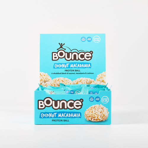
The packaging is a retail display box made of smooth, single-layer paperboard. It features a bright blue background with white and yellow accents. The box is designed to hold individual protein ball packages, with a cut-out top for easy access. The edges are clean and precise, indicating a well-constructed fold. The front displays the product name 'Coconut Macadamia Protein Ball' prominently, along with nutritional information and branding elements.

The packaging is a small, flexible wrapper designed to encase a protein ball. It features a bright yellow background with a playful design. The front displays the brand name 'Bounce' prominently in a stylized font, accompanied by an illustration of a person in motion. The product name 'Peanut' is also highlighted in a contrasting orange band. The edges of the wrapper are crimped, indicating a sealed closure. The overall appearance is vibrant and appealing, aimed at attracting health-conscious consumers.

The packaging features a bright turquoise color with a glossy finish. The front displays the product name 'Coconut Macadamia' prominently in white and dark brown fonts. The design includes a playful graphic of a person in motion, suggesting energy and activity. The edges are crimped, indicating a sealed pouch structure. The back of the packaging likely contains nutritional information and product details, although not visible in the image.

The packaging is a retail display box designed to hold multiple protein balls. It features a smooth, flat construction made from single-layer paperboard, with a bright turquoise exterior. The box has a rectangular shape with a lid that folds down to create an open display area at the top. The front displays vibrant images of the protein balls, along with product information and branding. The edges are clean and precise, indicating a well-constructed folding carton.
About the Brand
Bounce Foods is an Australian producer of protein balls and low-carb bars, focusing on nutritious ingredients and health-oriented snack options. Their packaging strategy leverages bright visuals, bold branding, and functional formats to appeal to health-conscious consumers and facilitate product differentiation at point-of-sale.
Operating with a direct-to-consumer model, Bounce Foods has established a recognizable presence in the Australian snack market. Their packaging choices reflect a commitment to convenience, shelf appeal, and consistent brand messaging. The use of single-layer paperboard cartons and flexible wrappers supports both retail display and individual portion control, optimizing logistics and consumer usability.
Key Differentiator: Bounce Foods' unique strength lies in its cohesive visual identity and use of vibrant, playful packaging that enhances product recognition and supports its health-focused positioning.
Design System
Visual Style
Bounce Foods utilizes bold, sans-serif typography alongside a high-contrast, playful color palette dominated by bright blues, yellows, and turquoise shades. The overall aesthetic emphasizes energy, health, and approachability.
Brand Identity
Logo is consistently prominent on all packaging, with recurring iconography of active figures and health cues. Visual consistency is maintained through uniform use of brand colors, type, and layout structure across all SKUs.
Packaging Design
Material choices focus on lightweight, single-layer paperboard for cartons and flexible laminates for wrappers. Structural design aims for retail efficiency, easy access, and portion control, with flat or crimp-sealed closures ensuring practicality and hygiene.
User Experience
Packaging is designed for straightforward unboxing and immediate product visibility, supporting the customer journey from shelf selection to consumption. The energetic visual language reinforces the brand promise of vitality and healthy living at each touchpoint.
Company Metrics
Business insights for Bounce Foods based on available data
Market Positioning
Brand Values & Focus
Key Competitors
Target Market: Health-conscious Australian consumers seeking convenient, nutritious snack options, including fitness enthusiasts and individuals with dietary restrictions such as gluten intolerance.
Packaging Assessment
Overall Grade
Visual appeal and presentation quality
Packaging durability and protection
Eco-friendliness and recyclable materials
Cost efficiency and value for money
Packaging assessment for Bounce Foods based on industry standards and best practices
Frequently Asked Questions
What types of packaging does Bounce Foods use for its snacks?
Bounce Foods utilizes retail display carton boxes made from single-layer paperboard and flexible, crimp-sealed wrappers for individual protein balls and bars, balancing protection, visibility, and branding.
How does Bounce Foods' packaging support brand recognition?
The packaging features consistent use of signature colors, prominent logo placement, and playful graphics, all contributing to strong shelf presence and immediate brand identification.
Is Bounce Foods' packaging environmentally friendly?
While the company uses recyclable materials such as paperboard for cartons, the flexible plastic wrappers present some challenges for recyclability, resulting in a moderate sustainability profile overall.
Discover other Food & Drink companies
Explore more companies in the food & drink industry and their packaging strategies
Thés de la Pagode
Food & Drink
Thés de la Pagode is a French company specializing in organic teas and infusions, focusing on health and well-being. Established in 1987, they prioritize sustainable practices and high-quality ingredients sourced through fair trade.
ruf lebensmittelwerk kg
Food & Drink
RUF Lebensmittelwerk KG is a German food production company specializing in a variety of baking mixes and drink products. Founded in 1920, the company is known for its high-quality ingredients and innovative food solutions.
PrepMyMeal
Food & Drink
PrepMyMeal is a food production company specializing in high-protein meal delivery services. They offer a variety of natural, nutritious meals designed for fitness enthusiasts and those seeking convenience in meal preparation.