Bloom Robbins packaging
Bloom Robbins specializes in beauty and wellness products with a strong emphasis on hair care and skincare, utilizing visually distinctive packaging to reinforce their brand identity. Their approach centers on transparent jars and vibrant cartons, balancing visual appeal with product protection for direct-to-consumer delivery.
Packaging Portfolio
Bloom Robbins’ packaging portfolio comprises primarily clear PET and glass jars with gold metallic lids, retail paperboard cartons, and occasional flexible pouches. The packaging structures are designed for both shelf impact and ease of use, with transparent containers highlighting product quality and vibrant, branded labels enhancing differentiation. Carton boxes utilize smooth, single-layer paperboard with precise folds and bold graphics, prioritizing retail display and unboxing appeal. While the material selection supports product security and brand consistency, sustainability integration is moderate, with recyclable plastics and paper but limited use of recycled materials or eco-design practices.

The packaging is a clear plastic bottle with a gold screw-on lid. The bottle contains gummy supplements, which are visible through the transparent material. The label wraps around the bottle, featuring a colorful design with playful graphics and text. The overall shape is cylindrical, typical for supplement bottles.

The packaging consists of two components: a cylindrical jar and a flat pouch. The jar is made of rigid material with a smooth surface and a glossy finish, featuring a gold lid. The pouch is a flat, flexible package with a matte finish and a resealable top. Both items are predominantly pink with colorful graphics and text.
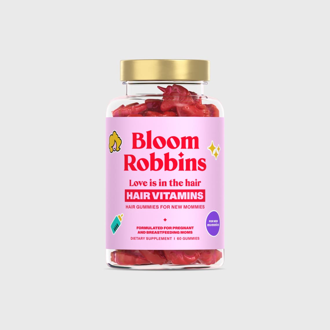
The packaging is a clear plastic jar with a gold-colored screw-on lid. The jar is cylindrical in shape and contains gummy vitamins. The label is predominantly pink with white and yellow accents, featuring playful graphics and text.

The packaging is a clear glass jar with a gold metal lid. The jar is cylindrical in shape and contains gummy supplements. The label wraps around the jar, featuring vibrant colors and graphics. The front label prominently displays the brand name 'Bloom Robbins' in bold, pink lettering, along with the product name 'Unfiltered APPLE CIDER VINEGAR' in a contrasting color. The label includes additional text regarding the product's benefits and nutritional information.
The packaging consists of multiple retail cartons for hair care products. Each carton features a smooth, flat construction without fluted layers, indicative of single-layer paperboard. The colors are predominantly pink with gold accents, providing a vibrant and appealing aesthetic. The edges are clean and precise, with well-defined folds. The cartons display branding elements prominently, including product names and descriptions in bold fonts. The overall design is cohesive and visually attractive, aimed at retail display.
About the Brand
Bloom Robbins is a Slovakian beauty and wellness company focused on hair care, skincare, and vitamin supplements, operating primarily through a direct-to-consumer e-commerce model. Their packaging strategy leverages clear jars, bottles, and retail cartons with consistent branding to enhance shelf presence and consumer recognition.
The company’s packaging consistently features transparent plastic and glass containers with gold lids, complemented by paperboard retail cartons in vibrant pink and gold color schemes. Labels and graphics are designed to be playful yet informative, supporting product differentiation and reinforcing the youthful, health-focused brand image. Packaging choices are optimized for consumer engagement, logistics efficiency, and retail display, but sustainability considerations appear secondary to visual and protective priorities.
Key Differentiator: The brand’s unique approach is characterized by cohesive, playful packaging design that prioritizes brand recognition and consumer appeal through material transparency and color consistency.
Design System
Visual Style
The visual design is anchored in bold, sans-serif typography and a color palette dominated by pinks, golds, and white, projecting a playful yet premium aesthetic. Graphics are youthful and illustrative, supporting a vibrant brand presence.
Brand Identity
Branding elements include prominent logo placement, consistent use of the 'Bloom Robbins' name, and playful iconography such as hearts and stars. All packaging maintains strong visual consistency through repeated color schemes and typographic hierarchy.
Packaging Design
Material selection favors clear PET and glass for visual transparency, gold metal or plastic for lids, and single-layer paperboard for outer cartons. Structural design emphasizes cylindrical jars and rectangular cartons, ensuring both product protection and attractive presentation.
User Experience
The design system supports the user journey by delivering a visually appealing and cohesive unboxing experience, leveraging transparency to build trust and detailed labeling to inform purchase decisions. The packaging encourages trial through mini versions and reinforces brand recall at every touchpoint.
Company Metrics
Business insights for Bloom Robbins based on available data
Market Positioning
Brand Values & Focus
Key Competitors
Target Market: Primarily health- and beauty-conscious consumers in Slovakia and neighboring European markets, with a focus on women seeking hair growth and skincare solutions via e-commerce.
Packaging Assessment
Overall Grade
Visual appeal and presentation quality
Packaging durability and protection
Eco-friendliness and recyclable materials
Cost efficiency and value for money
Packaging assessment for Bloom Robbins based on industry standards and best practices
Frequently Asked Questions
What packaging materials does Bloom Robbins primarily use?
Bloom Robbins predominantly uses clear plastic (PET) and glass jars with gold-colored screw-on lids for supplements, along with single-layer paperboard cartons for retail products. Flexible pouches and matte-finished packets are also used for certain product lines.
How does Bloom Robbins’ packaging support product protection during shipping?
The rigid structure of jars and bottles, combined with sturdy paperboard cartons, provides moderate protection against transit damage. However, the use of clear plastic may be less robust than thicker materials for long-distance shipping.
Does Bloom Robbins use eco-friendly or recyclable packaging?
While some packaging components, such as PET jars and paperboard cartons, are technically recyclable, there is no explicit evidence of a sustainability-led packaging strategy or the use of recycled content in their materials.
Discover other Beauty & Fitness companies
Explore more companies in the beauty & fitness industry and their packaging strategies
Big Moustache
Beauty & Fitness
Big Moustache specializes in shaving and grooming products tailored for men, providing a hassle-free subscription service for razor blades and skincare essentials.
Institut Karité Paris
Beauty & Fitness
Institut Karité Paris specializes in luxury beauty products made with natural Shea Butter, offering a wide range of skincare and body care solutions. The brand combines Parisian heritage with a commitment to quality and creativity in its offerings.
Pure Altitude
Beauty & Fitness
Pure Altitude specializes in high-quality beauty and skincare products that leverage the expertise of spa treatments to enhance daily routines. The brand offers a diverse range of products tailored for both facial and body care.