BlackBeard packaging
BlackBeard operates as a multi-service venue in Wrocław, Poland, offering barbering, cocktail experiences, and premium alcohol retail targeted at men. The brand employs a cohesive, branded packaging strategy spanning coffee, retail, and gifting segments, emphasizing both aesthetic impact and product protection.
Packaging Portfolio
BlackBeard's packaging portfolio includes kraft paper stand-up pouches with vivid branding for coffee, rigid wooden gift boxes for premium sets, and custom-printed carton boxes for retail items. There is a clear emphasis on structure and material selection to balance product protection, shelf appeal, and user experience. Design integration is evident in the consistent use of matte finishes, bold logotypes, and thematic color accents, while the variance in materials addresses differing logistics and presentation requirements across product categories.
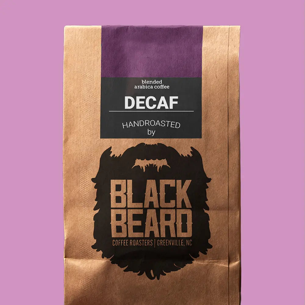
The packaging is a flat, stand-up pouch made from a combination of kraft paper and a plastic inner lining. The exterior features a brown kraft paper finish with a glossy purple band at the top. The front displays a large, bold logo of a bearded figure, prominently featuring the brand name 'BLACK BEARD' in capital letters. The text 'DECAF' and 'HANDROASTED by' is printed in a clean, modern font. The overall design is simple yet striking, with a focus on the brand identity.
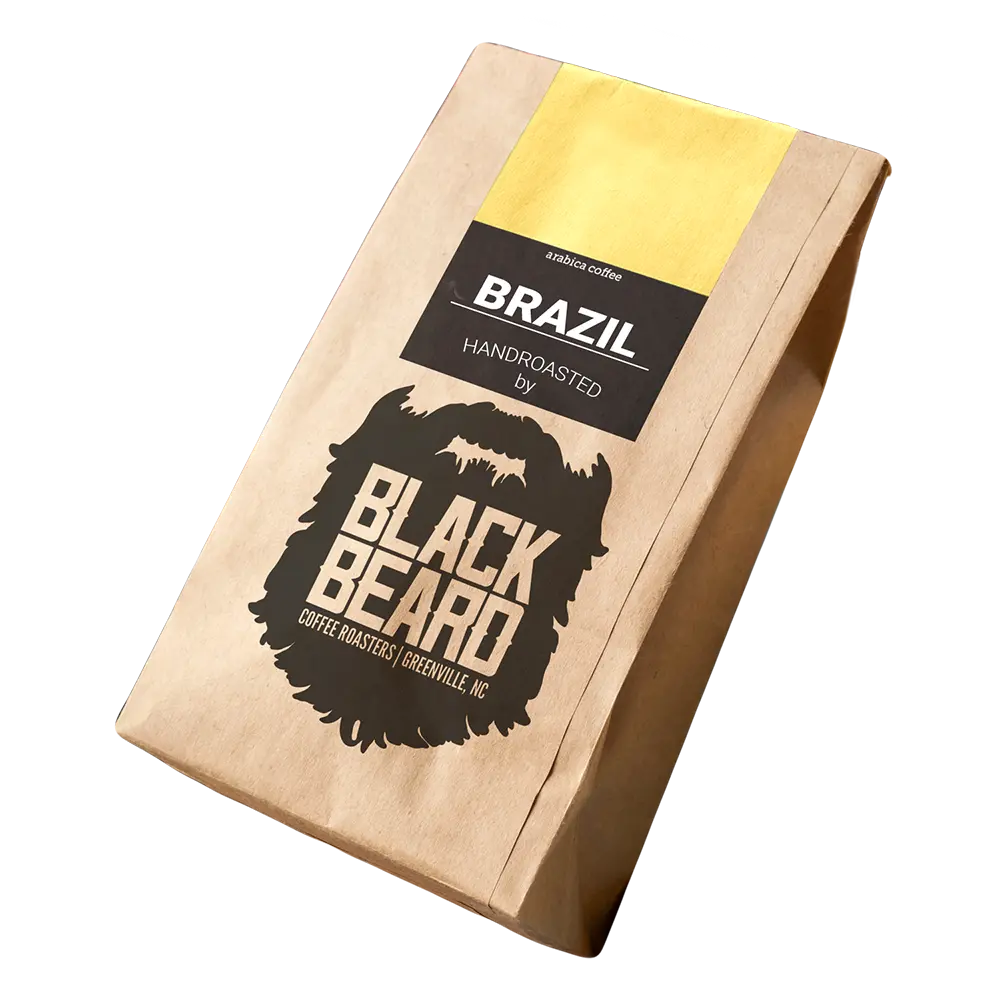
The packaging is a flat, stand-up pouch made from a single layer of kraft paper. It features a smooth surface with a matte finish. The top of the pouch is folded down, and there is a yellow strip at the top for branding. The front prominently displays the brand name 'BLACK BEARD' in bold, black lettering, accompanied by a graphic of a beard. Below the brand name, there is product information stating 'BRAZIL HANDROASTED' in a smaller font. The overall design is clean and straightforward, with a rustic aesthetic.
The packaging is a rectangular folding carton with a smooth, flat construction. It features a predominantly black exterior with a glossy finish. The front displays a large red logo and product name, while the sides have additional branding elements. The edges are clean and precise, indicating a well-constructed box. The interior is simple, with no additional inserts or compartments.
The packaging is a flat, rectangular box made of single-layer paperboard. It features smooth, clean edges and a matte finish. The box is predominantly black with a vibrant red graphic on the front, showcasing product features and branding. The text is printed in white and yellow, with a combination of bold and standard fonts. The overall design is sleek and modern, aimed at attracting attention on retail shelves.
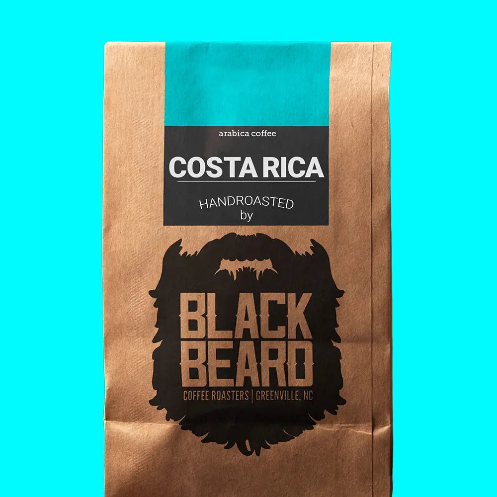
The packaging is a flat, stand-up coffee bag made from kraft paper with a glossy teal band at the top. The bag features a prominent black beard logo at the bottom, with the product name 'COSTA RICA' and additional text in white and black. The overall design is clean and modern, with a focus on the brand identity.
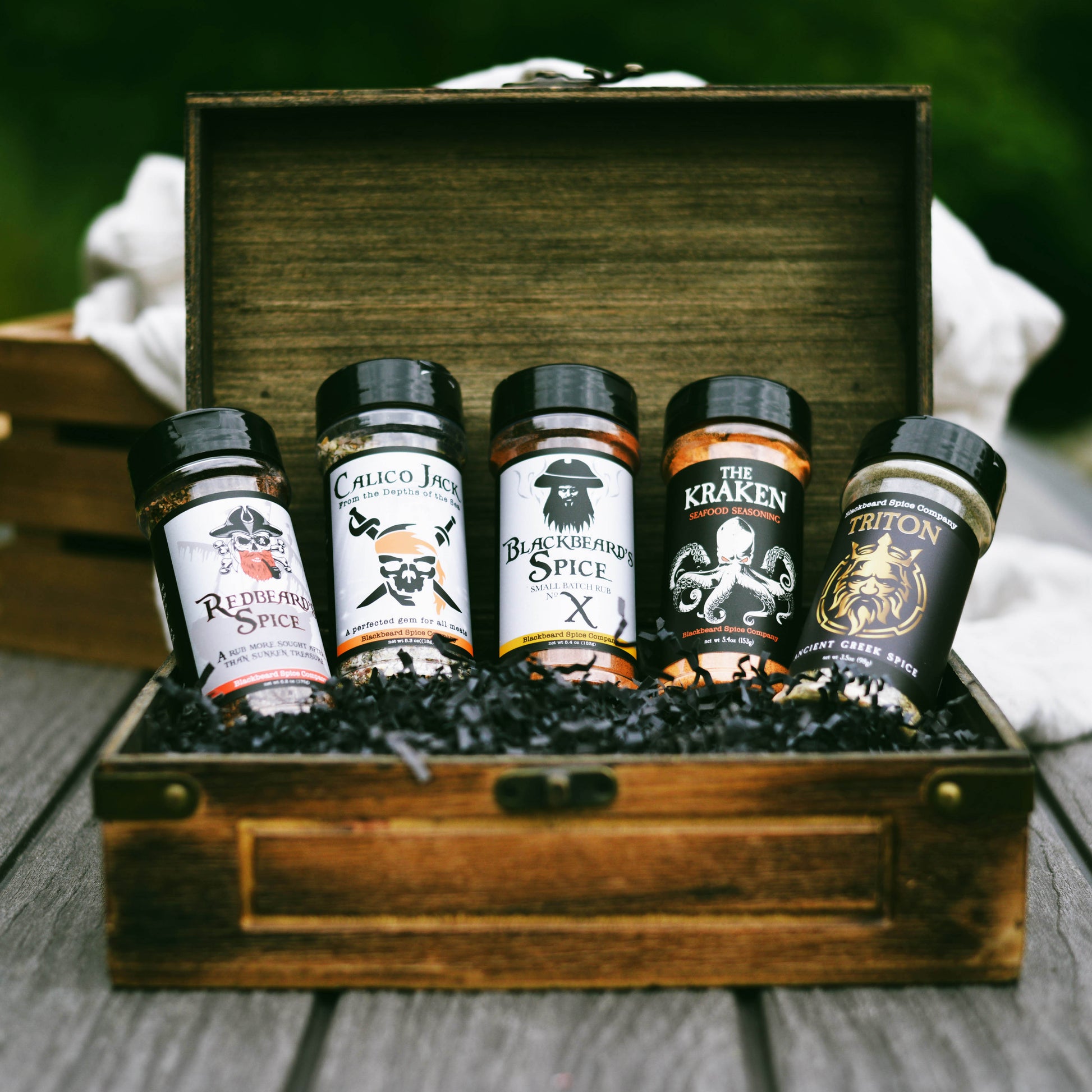
The packaging consists of a sturdy wooden box that houses five spice jars. The box has a premium appearance with a smooth finish and is likely made of thick wood or chipboard. The interior is filled with black crinkle paper, providing cushioning for the jars. The jars themselves are cylindrical with black lids and feature colorful labels with pirate-themed graphics and names. The overall design is cohesive and visually appealing, suggesting a gift or premium product.
About the Brand
BlackBeard delivers a curated experience for men's grooming and leisure, integrating a barber shop, cocktail bar, and a premium retail shop for spirits. Their packaging solutions reflect a focus on brand identity, retail shelf appeal, and customer experience. The use of diverse packaging formats supports their multi-faceted business model.
Packaging at BlackBeard is tailored to enhance product differentiation across categories, with strong visual branding for coffee, alcohol, and gift items. Materials range from kraft paper pouches for artisanal coffee to rigid boxes for premium gifting, each selected for balance between visual impact and functional protection. The packaging approach demonstrates alignment with brand values of sophistication, masculinity, and quality.
Key Differentiator: BlackBeard differentiates through a unified brand experience across service and retail, using packaging as a critical touchpoint to reinforce its premium, masculine aesthetic.
Design System
Visual Style
Typography is bold and masculine, with sans-serif fonts dominating. The color palette features blacks, browns, golds, and accent colors such as yellow and red, supporting a premium, rustic, and modern aesthetic.
Brand Identity
Logo usage is prominent and consistently applied across packaging, often paired with iconography such as beards or pirate themes. Branding maintains high visibility and clarity, reinforcing immediate recognition.
Packaging Design
Material choices prioritize kraft paper, rigid wood, and durable carton board. The structural design philosophy emphasizes both protection and presentation, with flat pouches, sturdy boxes, and compartmentalized gift sets optimizing for both logistics and consumer engagement.
User Experience
Packaging is designed to deliver a memorable unboxing experience, reinforcing the brand's premium positioning. Clear labeling, tactile finishes, and visually striking graphics guide the customer journey from purchase to consumption, supporting both retail and gifting contexts.
Company Metrics
Business insights for BlackBeard based on available data
Market Positioning
Brand Values & Focus
Key Competitors
Target Market: Affluent male consumers in Wrocław seeking integrated grooming, premium beverages, and gifting experiences.
Packaging Assessment
Overall Grade
Visual appeal and presentation quality
Packaging durability and protection
Eco-friendliness and recyclable materials
Cost efficiency and value for money
Packaging assessment for BlackBeard based on industry standards and best practices
Frequently Asked Questions
What types of packaging does BlackBeard use across its product lines?
BlackBeard utilizes kraft paper stand-up pouches for coffee, rigid wooden boxes for premium gift sets, and custom-printed carton boxes for retail products. These formats are chosen to align with the brand's rustic yet sophisticated positioning and ensure product protection.
How does BlackBeard's packaging support its brand identity?
BlackBeard's packaging consistently integrates bold logo placement, masculine color schemes, and thematic graphics, ensuring strong shelf presence and immediate brand recognition across all categories.
Is BlackBeard's packaging environmentally sustainable?
The use of kraft paper and recyclable board materials in some packaging formats supports moderate sustainability, though the presence of composite materials and rigid boxes indicates there is room for further eco-optimization.
Discover other Beauty & Fitness companies
Explore more companies in the beauty & fitness industry and their packaging strategies
Pure Altitude
Beauty & Fitness
Pure Altitude specializes in high-quality beauty and skincare products that leverage the expertise of spa treatments to enhance daily routines. The brand offers a diverse range of products tailored for both facial and body care.
Big Moustache
Beauty & Fitness
Big Moustache specializes in shaving and grooming products tailored for men, providing a hassle-free subscription service for razor blades and skincare essentials.
Cultiv Cosmetique
Beauty & Fitness
Cultiv Cosmetique is a French skincare brand that provides organic and eco-friendly beauty products inspired by nature. They focus on effective skincare solutions for various skin concerns.