Azafran - Premium Gewürze packaging
Azafran specializes in premium gourmet spices and organic teas, leveraging high-quality, visually striking packaging formats to ensure product freshness and shelf appeal. Their packaging strategy emphasizes transparency, premium materials, and brand visibility to reinforce product quality and consumer trust.
Packaging Portfolio
Azafran’s packaging portfolio consists of rigid transparent boxes, single-layer carton packaging, glass jars with cork lids, and retail display cartons. The use of transparent materials—particularly for high-value spices such as saffron—enables direct product inspection while preserving visual appeal. Packaging structures are optimized for both retail display and shipping, with clean folding, precise edges, and protective inner elements. The material mix incorporates recyclable glass and paperboard, though certain formats utilize plastics and glossy finishes for enhanced shelf presence and product integrity.

The packaging is a clear, rigid box with a transparent plastic top and a solid base. The box has a rectangular shape, showcasing the saffron inside. The base is white with a smooth finish, while the transparent top allows visibility of the contents. The box has a clean, modern design with a minimalistic aesthetic.

The packaging is a flat, rectangular box made of single-layer paperboard. It features a smooth, glossy finish with a predominantly dark red background. The front displays a clear window that showcases the saffron inside. The edges are clean and precise, indicating a well-constructed folding carton. The back includes product information and branding elements in white text against the dark background.
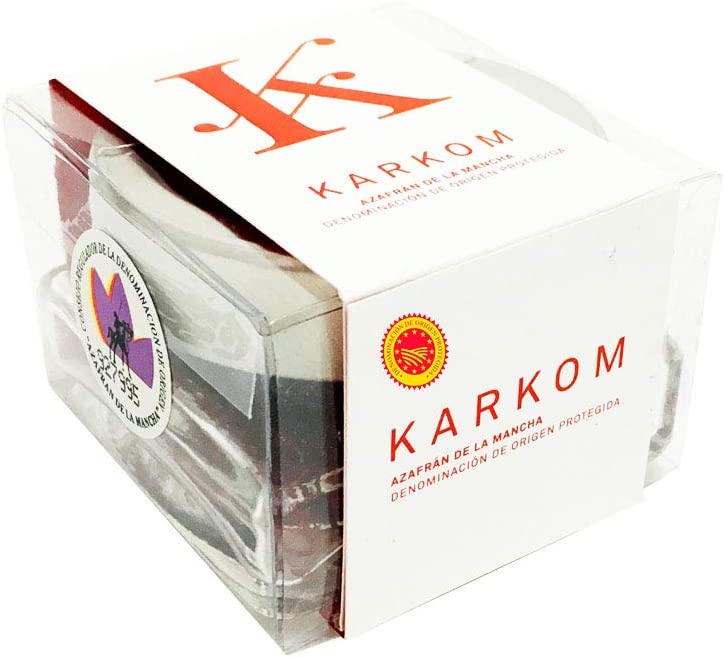
The packaging is a clear, rigid box with a square shape, showcasing the product inside. The box features a white paperboard base with a glossy finish. The front displays the product name 'KARKOM' in bold, red lettering, along with a logo and a circular emblem indicating the product's origin. The sides of the box are transparent, allowing visibility of the contents. The edges are clean and precise, indicative of high-quality construction.

The packaging consists of a clear glass jar with a cylindrical shape, featuring a cork lid. The jar is filled with bright red saffron threads, which are visible through the transparent glass. A white label wraps around the jar, displaying the product name 'KARKOM' in bold black letters. The label has a clean design with minimalistic elements, enhancing the product's premium appearance. The cork lid adds a rustic touch to the overall design.
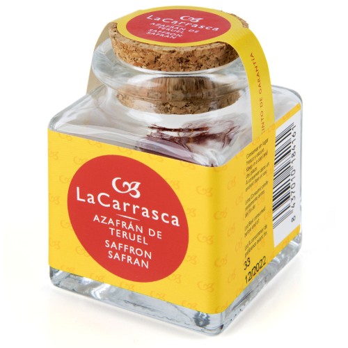
The packaging consists of a clear glass jar with a square shape and a cork lid. The jar is filled with saffron and features a yellow label wrapped around its neck. The label includes a logo and product information, while the glass itself is smooth and transparent, showcasing the contents inside.
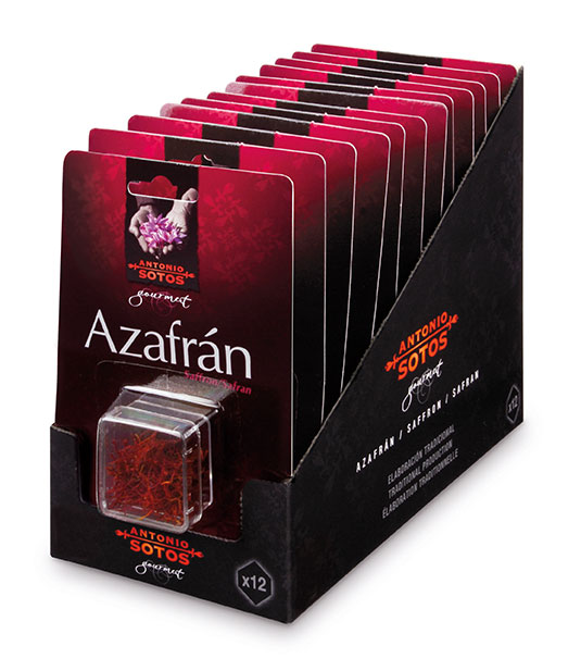
The packaging is a retail display box designed to hold multiple small containers of saffron. It features a smooth, flat construction without any visible fluted layers, indicating it is made from single-layer paperboard. The box is predominantly black with a glossy finish, accented by vibrant red and white graphics. The front displays the brand name 'Azafrán' prominently, along with images of saffron threads. The box has clean, precise edges and folds, typical of carton boxes used for retail. It is designed for countertop display, allowing easy access to the product inside.
About the Brand
Azafran operates in the food and drink sector, focusing on gourmet spices and organic teas distributed directly to consumers through online and marketplace channels. The company utilizes packaging as a core element in preserving the sensory quality of its products, relying on a mix of rigid boxes, carton packaging, and glass containers to support its premium positioning.
Their packaging approach is characterized by the use of transparent rigid boxes, retail cartons, and glass jars with cork lids, selected for both product visibility and preservation of aroma and freshness. The visual consistency across packaging formats, including clear branding and quality indicators, supports Azafran’s high-end market stance. This multi-format strategy also enables the brand to cater to both single-unit retail and bulk purchasing preferences.
Key Differentiator: Azafran’s unique differentiator lies in its consistent use of premium, visually transparent packaging materials that simultaneously communicate authenticity, origin, and freshness—reinforcing its positioning as a trusted supplier of high-quality gourmet ingredients.
Design System
Visual Style
Azafran’s packaging employs elegant, serif and sans-serif typography, a rich color palette dominated by deep reds, whites, and blacks, and a minimalist yet premium aesthetic. The design leverages high contrast and clean lines to emphasize product quality.
Brand Identity
Logos and emblems of origin are prominently displayed, with consistent use of product naming conventions and brand marks. Visual consistency is maintained across all formats, ensuring strong shelf recognition and brand recall.
Packaging Design
Primary materials include rigid clear plastics for boxes, single-layer paperboard for cartons, and glass for jars. The design philosophy prioritizes transparency, product protection, and visual authenticity, with structural choices balancing retail impact and product preservation.
User Experience
The packaging facilitates a premium unboxing experience with easy access, strong tactile cues (e.g., cork lids), and immediate product visibility. Branding elements guide the consumer journey from online purchase to in-home use, reinforcing perceptions of quality and trust.
Company Metrics
Business insights for Azafran - Premium Gewürze based on available data
Market Positioning
Brand Values & Focus
Key Competitors
Target Market: Health-conscious consumers, culinary enthusiasts, and premium food shoppers seeking organic and specialty spices across the DACH region and broader European market.
Packaging Assessment
Overall Grade
Visual appeal and presentation quality
Packaging durability and protection
Eco-friendliness and recyclable materials
Cost efficiency and value for money
Packaging assessment for Azafran - Premium Gewürze based on industry standards and best practices
Frequently Asked Questions
What packaging formats does Azafran primarily use?
Azafran primarily employs rigid clear boxes, single-layer carton boxes, retail display cartons, and glass jars with cork lids, all designed to maximize product visibility and protect aromatic integrity.
How does Azafran ensure product freshness through packaging?
The brand’s selection of airtight glass containers, rigid boxes, and inner seals minimizes exposure to light and air, preserving volatile compounds and extending shelf life for its premium spices.
Is Azafran’s packaging sustainable?
Azafran incorporates recyclable glass and paperboard in its packaging mix, although the use of plastic and glossy finishes may limit overall sustainability compared to fully compostable alternatives.
What role does branding play in Azafran’s packaging?
Branding is tightly integrated, with prominent logos, origin emblems, and consistent color schemes featured across all formats to reinforce authenticity and premium positioning.
Discover other Food & Drink companies
Explore more companies in the food & drink industry and their packaging strategies
Thés de la Pagode
Food & Drink
Thés de la Pagode is a French company specializing in organic teas and infusions, focusing on health and well-being. Established in 1987, they prioritize sustainable practices and high-quality ingredients sourced through fair trade.
kerex - terre exotique
Food & Drink
Kerex - Terre Exotique specializes in the international trade of gourmet food and drink products, offering a unique selection of spices and culinary ingredients.
Terres de Café
Food & Drink
Terres de Café is a specialty coffee retailer based in Paris, France, known for its commitment to sustainability and high-quality coffee sourcing.