A l'Olivier packaging
A l'Olivier, a historic producer of gourmet oils and vinegars, leverages premium, brand-focused packaging to reinforce product quality and heritage. Their packaging strategy integrates luxury materials and custom structures to enhance consumer perception and support product integrity.
Packaging Portfolio
A l'Olivier's packaging portfolio features a diverse mix of rigid gift boxes, wooden crates, folding cartons with window cutouts, and cylindrical tin cans. These formats are engineered for both gift and retail shelf appeal, utilizing thick chipboard, natural wood, and metallic substrates for optimal product protection and brand differentiation. The packaging often includes matte finishes, clear windows for product visibility, and precision foiling or embossing, signaling premium positioning. The combination of structural integrity and visual branding supports both logistics efficiency and a high-impact unboxing experience.
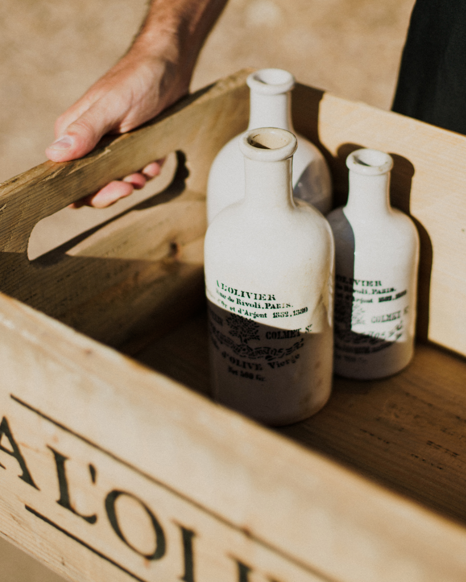
The packaging consists of a wooden crate with an open top, designed to hold three ceramic bottles. The crate has a rustic appearance with visible wood grain and a natural finish. It features cut-out handles on each side for easy carrying. The front of the crate is marked with the brand name 'AL OLIVIER' in bold, dark lettering, indicating its contents or brand association. The bottles inside are white with black text, suggesting they contain a liquid product, likely olive oil or a related item.
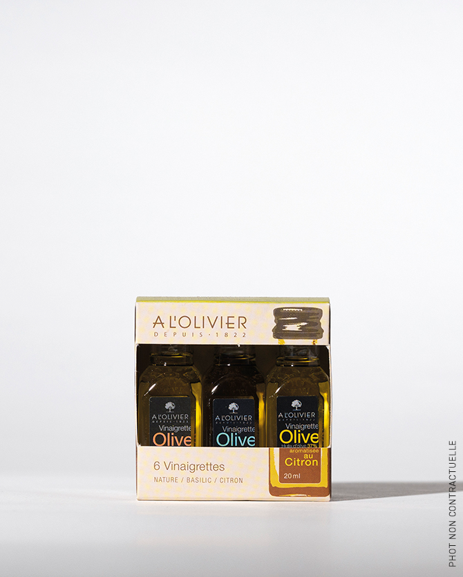
The packaging is a small, rectangular folding carton that houses three glass bottles of vinaigrettes. The carton features a smooth, flat construction with clean edges and folds, indicative of single-layer paperboard. The exterior is predominantly white with colorful accents, showcasing a glossy finish that enhances visual appeal. The front displays a clear window cut-out, allowing visibility of the bottles inside, and the top flap is designed to tuck securely. The overall shape is compact and designed for retail display.
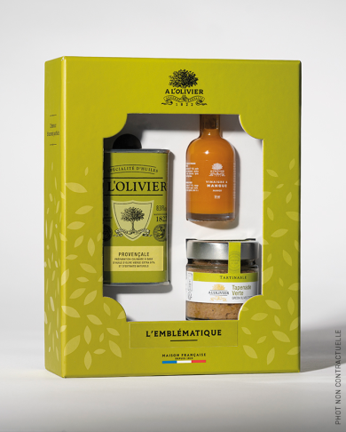
The packaging is a rigid box featuring a window cutout that displays three products inside. The box has a sturdy construction with thick walls, providing a premium feel. The exterior is predominantly green with a matte finish, adorned with a pattern of olive leaves. The front features a large window that allows visibility of the contents, which include a cylindrical can, a bottle, and a jar. The box is designed with clean, precise edges and folds, enhancing its luxury appearance.
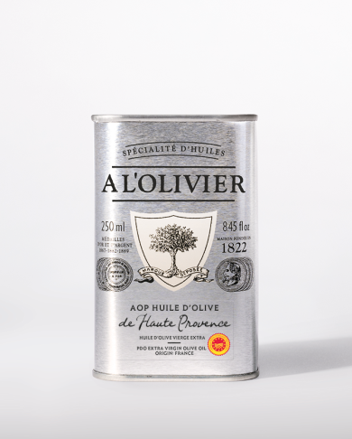
The packaging is a cylindrical tin can with a shiny metallic surface. The can features a prominent label with a central logo depicting an olive tree, surrounded by decorative elements. The top of the can is flat, while the bottom has a slight indentation. The label includes text in both French and English, indicating the product type and volume. The overall design is elegant and reflects a premium quality.
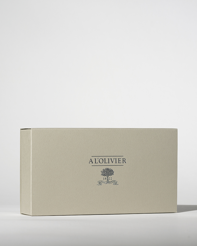
The packaging is a rectangular rigid box with a smooth, flat surface and clean edges. It features a light beige color with a matte finish, giving it a premium appearance. The box is likely made of thick chipboard, providing durability and a high-quality feel. The front displays the brand name 'A L'OLIVIER' in a sophisticated serif font, along with the year '1822' in a smaller size beneath it, centered on the box. The overall design is elegant and minimalistic, emphasizing the brand's heritage.
About the Brand
A l'Olivier is a France-based gourmet food company specializing in high-quality oils, vinegars, and condiments. The brand’s approach to packaging emphasizes durability, premium aesthetics, and a consistent visual identity that echoes its heritage and product authenticity.
Established in 1822, A l'Olivier has built a packaging system centered on rigid boxes, wooden crates, and tin cans, all tailored to protect delicate products and communicate luxury. The use of matte finishes, window cutouts, and branded elements on packaging enhances shelf presence and consumer trust while supporting the logistics requirements of fragile food goods. Their focus on both retail and gifting formats demonstrates versatility across B2C channels.
Key Differentiator: A l'Olivier distinguishes itself through its integration of heritage-inspired design, premium materials, and a strong alignment between packaging aesthetics and product positioning in the gourmet segment.
Design System
Visual Style
The visual design leverages serif typography, an earthy and refined color palette (beige, olive green, white), and matte finishes. The aesthetic is minimalist yet sophisticated, aligning with luxury food segment expectations.
Brand Identity
Consistent logo placement, use of the founding year, and restrained iconography reinforce heritage. Visual consistency is maintained across formats, with the brand name and logo prominently displayed on all packaging types.
Packaging Design
Material selection prioritizes chipboard, natural wood, and recyclable tin, balancing durability with premium feel. Structural designs are rigid and protective, often featuring window cutouts to enhance product display and consumer engagement.
User Experience
Design choices support a seamless customer journey, from shelf impact to unboxing. Windowed cartons and elegant gift boxes enhance perceived value, while ergonomic features (e.g., crate handles) facilitate handling and reuse. The packaging reinforces the brand narrative at every touchpoint.
Company Metrics
Business insights for A l'Olivier based on available data
Market Positioning
Brand Values & Focus
Key Competitors
Target Market: Culinary enthusiasts, home cooks, and professional chefs seeking premium oils, vinegars, and gourmet condiments in France and across Europe.
Packaging Assessment
Overall Grade
Visual appeal and presentation quality
Packaging durability and protection
Eco-friendliness and recyclable materials
Cost efficiency and value for money
Packaging assessment for A l'Olivier based on industry standards and best practices
Frequently Asked Questions
What types of packaging formats does A l'Olivier use?
A l'Olivier employs rigid boxes, luxury gift packaging, wooden crates, folding cartons, and cylindrical tin cans to suit various product types and retail requirements.
How sustainable is A l'Olivier’s packaging?
A l'Olivier’s packaging incorporates recyclable materials and durable formats, though the use of rigid and multi-material structures may limit full recyclability. There is an emphasis on reusability and local sourcing, consistent with industry sustainability trends.
What is the focus of A l'Olivier's packaging design?
The packaging design is focused on premiumization, brand storytelling, and product protection, utilizing minimalist branding, elegant color schemes, and durable materials.
Discover other Food & Drink companies
Explore more companies in the food & drink industry and their packaging strategies
kerex - terre exotique
Food & Drink
Kerex - Terre Exotique specializes in the international trade of gourmet food and drink products, offering a unique selection of spices and culinary ingredients.
PrepMyMeal
Food & Drink
PrepMyMeal is a food production company specializing in high-protein meal delivery services. They offer a variety of natural, nutritious meals designed for fitness enthusiasts and those seeking convenience in meal preparation.
ruf lebensmittelwerk kg
Food & Drink
RUF Lebensmittelwerk KG is a German food production company specializing in a variety of baking mixes and drink products. Founded in 1920, the company is known for its high-quality ingredients and innovative food solutions.