Zooki packaging
Zooki develops high-absorption health supplements with a direct-to-consumer approach, focusing on innovative formulations and user-centric product formats. Their packaging strategy centers on vivid branding, functional formats, and optimized presentation for both retail and e-commerce channels.
Packaging Portfolio
Zooki employs high-quality folding carton boxes composed of single-layer paperboard for their core product ranges, including liquid sachets and supplement bundles. These cartons feature precise construction, clean edges, glossy finishes, and vibrant color schemes tailored to each product variant. Flexible pouches are also utilized, particularly for specialty items and rewards, offering resealable functionality and printed recycling instructions. The packaging system emphasizes retail shelf presence, user convenience, and product integrity, while balancing visual branding with moderate sustainability efforts.

The packaging is a flexible pouch made from a thin, smooth material. It features a resealable top with a tear notch for easy opening. The front has a vibrant green and white color scheme with clear instructions and a QR code. The back has additional information and recycling instructions. The overall shape is rectangular with a flat bottom for standing.
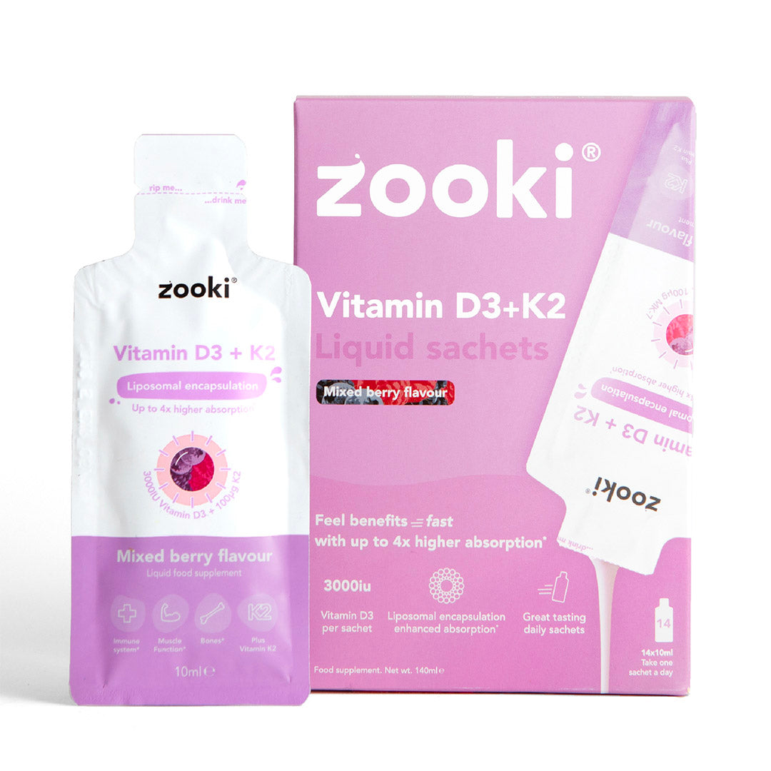
The packaging consists of a folding carton box that houses individual liquid sachets. The outer box is primarily pink with white accents, featuring a clean, smooth surface. The edges are well-defined, and the folds are precise, indicating a high-quality construction. The front displays the product name 'Vitamin D3 + K2' prominently, along with a graphic of the sachets. The back includes additional product information and instructions, printed in a clear, readable font.

The packaging consists of colorful folding cartons with a smooth, flat construction. Each carton features clean edges and precise folds, indicative of single-layer paperboard. The boxes are primarily white with vibrant colors and graphics, showcasing product information and branding elements prominently on the front. The overall design is visually appealing and geared towards retail display.

The packaging consists of a colorful retail carton that houses liquid sachets. The carton is primarily rectangular with a smooth, flat construction. The exterior features a vibrant design with a watermelon theme, incorporating both red and green colors. The front displays the product name 'Vitamin C' prominently, along with the brand name 'zooki' in a bold font. The back of the carton likely contains product information and usage instructions, although not visible in the image. The sachets are individually packaged, with a similar design to the carton, featuring a spout for easy dispensing.

The packaging consists of a folding carton box that houses liquid sachets. The box is predominantly orange with white text and graphics. The front features the brand name 'zooki' prominently at the top, along with the product name 'Turmeric' and 'Liquid sachets' in bold lettering. The sachets are visible through a cut-out window on the side of the box. The box has clean edges and folds, indicating a well-constructed design. The surface has a glossy finish, enhancing the vibrant colors.

The packaging consists of several folding cartons with a smooth, flat construction. Each box features clean, precise edges and folds, indicative of single-layer paperboard. The boxes are brightly colored, with a combination of orange and yellow hues, and display vibrant graphics and text. The cartons have a glossy finish, enhancing their visual appeal and making them suitable for retail display.
About the Brand
Zooki specializes in scientifically-formulated nutritional supplements designed for enhanced absorption and palatability. The brand’s packaging reflects a data-driven commitment to product integrity, shelf impact, and consumer usability.
By leveraging advanced delivery systems and a focus on user experience, Zooki addresses key market challenges such as supplement absorption and taste. Their packaging portfolio includes both retail cartons and flexible pouches, emphasizing convenience and clear communication of product benefits. The visual language and material selection are tailored to reinforce product quality and support the brand’s clinical credibility.
Key Differentiator: Zooki differentiates itself through evidence-backed product claims, high bioavailability, and a consistent, consumer-friendly packaging system that visually communicates efficacy and enjoyment.
Design System
Visual Style
Modern sans-serif typography, high-contrast color palettes (orange, pink, yellow, green, white), and bold graphical elements create a vibrant, approachable aesthetic. The design leverages flat backgrounds and clean layouts for clear information hierarchy.
Brand Identity
Consistent use of the zooki logo, prominent placement of product names, and standardized iconography across all packaging formats ensure strong visual recognition. Color coding by product type aids navigation and reinforces brand structure.
Packaging Design
Material selection favors single-layer paperboard for cartons and flexible, resealable pouches for select SKUs. Structural choices prioritize stackability, product protection, and ease of dispensing (e.g., sachets with spouts). Design philosophy centers on retail impact and user-friendly functionality.
User Experience
Design choices facilitate intuitive use, from easy-open cartons to clear product information and recycling instructions. The unboxing process is streamlined for positive emotional impact, aligning with the brand's emphasis on enjoyable, hassle-free health routines.
Company Metrics
Business insights for Zooki based on available data
Market Positioning
Brand Values & Focus
Key Competitors
Target Market: Health-conscious consumers seeking effective, enjoyable nutritional supplements with clinical backing, primarily in the UK and other Tier I e-commerce markets.
Packaging Assessment
Overall Grade
Visual appeal and presentation quality
Packaging durability and protection
Eco-friendliness and recyclable materials
Cost efficiency and value for money
Packaging assessment for Zooki based on industry standards and best practices
Frequently Asked Questions
What types of packaging does Zooki use for its supplements?
Zooki primarily utilizes folding carton boxes for liquid sachets and flexible pouches, optimized for product protection, retail display, and user convenience.
How does Zooki’s packaging contribute to product safety during shipping?
The sturdy construction of single-layer paperboard cartons and resealable flexible pouches provides robust protection against physical damage and contamination during transit.
Does Zooki prioritize sustainability in its packaging?
While Zooki’s packaging includes recyclable paperboard and provides recycling instructions on flexible pouches, the overall environmental impact is moderate, reflecting a balance between visual appeal and eco-friendliness.
How does packaging design enhance the Zooki customer experience?
Distinctive colors, prominent branding, and easy-to-use formats contribute to a positive unboxing experience and reinforce brand trust.
Discover other Health companies
Explore more companies in the health industry and their packaging strategies
Doctor Seaweed
Health
Doctor Seaweed specializes in natural, plant-based nutritional supplements derived from seaweed, aimed at promoting overall wellness.
EVO Nutrition
Health
EVO Nutrition specializes in premium health supplements, providing a wide range of vitamins and nutritional products to support well-being.
Comvita
Health
Comvita is a New Zealand-based company specializing in high-quality Mānuka honey and natural health products. Established in 1974, it aims to connect people with the healing power of nature.