Y-Brush packaging
Y-Brush specializes in advanced oral care solutions, delivering innovative toothbrushes and dental hygiene products to a broad consumer base. Their packaging strategy leverages high-impact visual branding and a mix of protective carton, rigid, and flexible formats to enhance user perception and product security.
Packaging Portfolio
Y-Brush's packaging portfolio encompasses folding carton boxes for primary retail display, rigid protective cases for premium product presentation, flexible stand-up pouches for consumables, and clear plastic blister packs for accessory items. The use of high-quality paperboard and molded rigid materials, combined with precise die-cutting and color printing, demonstrates an emphasis on visual appeal and shelf presence. Packaging formats are selected to balance product protection, brand visibility, and cost efficiency, with a clear focus on consumer experience and logistical requirements.

The packaging is a clear plastic blister pack that contains a whale-shaped toothpaste dispenser. The pack is designed with a backing card that features colorful graphics and product information. The front is transparent, allowing visibility of the product inside. The edges are sealed tightly, and there is a hanging hole at the top for retail display.
The packaging is a folding carton made of smooth, single-layer paperboard. It features a rectangular shape with a flat top and bottom, and clean, precise edges. The front displays a light blue color with a graphic illustration of the product, while the back contains product information and instructions. The carton is designed to stand upright, showcasing the contents clearly.
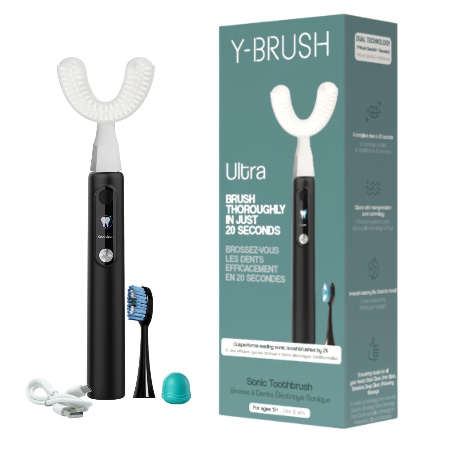
The packaging is a folding carton made of single-layer paperboard, featuring a smooth, flat construction without any visible fluted layers. The box is predominantly white with vibrant colors used for branding and product information. The edges are clean and precise, indicative of high-quality manufacturing. The front displays a large image of the toothbrush, along with text highlighting its features. The back includes instructions and additional product details. The overall design is sleek and modern, appealing to consumers looking for innovative dental care solutions.

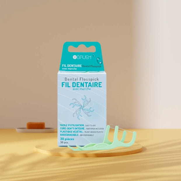
The packaging is a stand-up pouch made of a flexible material that allows it to maintain an upright position. It features a clear front window showcasing the product inside, with a resealable top for convenience. The design includes vibrant colors, primarily a mint green background with white accents. The front displays the brand name 'Y BRUSH' prominently, along with product details in both French and English. The overall appearance is modern and appealing, targeting a health-conscious audience.

The packaging is a small, flat pouch with a smooth, single-layer construction. It features a transparent front that showcases the product inside, while the back is printed with product information. The edges are clean and precise, indicating a well-constructed folding carton. The overall design is lightweight and designed for retail display.

The packaging is a square, rigid case with a smooth, hard exterior. The case features a bright turquoise color with a white circular logo prominently displayed on the top. The zipper closure runs along the edge, allowing the case to open fully. The interior appears to be designed to hold a specific product securely, likely with custom inserts to prevent movement. The overall construction is sturdy, indicating a premium feel.
About the Brand
Y-Brush is a health-focused company offering novel dental hygiene products, most notably a sonic toothbrush designed for efficiency and ease of use. Their packaging employs a variety of structures, including folding cartons, blister packs, and rigid cases, all tailored to reinforce brand identity and protect the integrity of oral care products.
The company’s approach to packaging is data-driven and aligns closely with its brand values of innovation, family-friendliness, and high product performance. Y-Brush integrates both visual consistency and product protection across its packaging portfolio, ensuring each format—from carton boxes to flexible stand-up pouches—meets functional and marketing objectives. The inclusion of clear branding, vibrant graphics, and multi-lingual product information reflects their international outlook and customer-centric strategy.
Key Differentiator: Y-Brush distinguishes itself through a holistic packaging strategy that merges brand reinforcement, retail shelf impact, and robust product protection, all within the context of the health and wellness sector.
Design System
Visual Style
Modern sans-serif typography, a vibrant palette led by turquoise, white, and accent colors for segmentation, and an overall clean, contemporary aesthetic that signals innovation and health.
Brand Identity
Consistent use of the Y-Brush logo in prominent positions, bold product imagery, iconography supporting product features, and cohesive color schemes across all SKUs.
Packaging Design
Preference for recyclable folding cartons and rigid cases, use of transparent elements for product visibility, and structural designs that prioritize both protection and retail display functionality.
User Experience
Packaging is engineered to streamline the unboxing process, provide clear, visually organized product information, and reinforce the brand’s innovative positioning, supporting a positive and memorable customer journey.
Company Metrics
Business insights for Y-Brush based on available data
Market Positioning
Brand Values & Focus
Key Competitors
Target Market: Health-conscious consumers and families seeking innovative, user-friendly oral care products, primarily within Europe but with global e-commerce reach.
Packaging Assessment
Overall Grade
Visual appeal and presentation quality
Packaging durability and protection
Eco-friendliness and recyclable materials
Cost efficiency and value for money
Packaging assessment for Y-Brush based on industry standards and best practices
Frequently Asked Questions
What types of packaging does Y-Brush use for its products?
Y-Brush utilizes folding carton boxes, rigid protective storage cases, clear plastic blister packs, and flexible stand-up pouches, each selected based on product requirements for protection, retail display, and branding.
How does Y-Brush's packaging support its brand identity?
Their packaging consistently features the Y-Brush logo, vibrant color schemes, and clear typography, fostering strong brand recognition and aligning with their innovative product positioning.
What sustainability considerations are present in Y-Brush's packaging?
While the use of recyclable paperboard cartons and lightweight flexible packaging suggests an intention toward eco-friendly practices, the inclusion of plastic blister packs indicates an area for further sustainability improvement.
How does Y-Brush address logistics safety in packaging?
Packaging formats such as rigid cases and tightly sealed cartons ensure product stability and minimize risk during transportation, supporting a high standard for product safety.
Discover other Health companies
Explore more companies in the health industry and their packaging strategies
Comvita
Health
Comvita is a New Zealand-based company specializing in high-quality Mānuka honey and natural health products. Established in 1974, it aims to connect people with the healing power of nature.
EVO Nutrition
Health
EVO Nutrition specializes in premium health supplements, providing a wide range of vitamins and nutritional products to support well-being.
Smart Protein
Health
Smart Protein is dedicated to transforming nutrition by providing a range of health and wellness products focused on protein supplements and vitamins.