Wurzener Nahrungsmittel GmbH packaging
Wurzener Nahrungsmittel GmbH is a German food producer specializing in snacks, cereals, rice, and convenience items, with a legacy dating back to 1847. Their packaging strategy emphasizes brand consistency and modern visual design, utilizing both flexible and carton-based solutions tailored to product needs.
Packaging Portfolio
Wurzener’s packaging portfolio demonstrates a structured approach to food industry requirements, utilizing flexible plastic pouches for snacks and single-layer paperboard cartons for cereals and rice. The flexible packaging offers product visibility and shelf stability, while carton boxes provide protection and ease of stacking for dry goods. Branding consistency is achieved through the use of signature green hues, prominent logo placement, and high-contrast typography. The selection of lightweight materials supports efficient logistics, while the mixed-material approach reflects a balance between cost, product protection, and current sustainability trends.

The packaging is a flat, rectangular box made of single-layer paperboard, featuring a smooth surface without any fluted layers. The box is predominantly green with a white background for the rice image, and it has a glossy finish. The edges are clean and precise, with well-defined folds. The front displays a large image of rice in a wooden spoon, accompanied by the product name 'LANGKORN Reis' in bold, red font. The back likely contains nutritional information and preparation instructions, although not visible in this view.

The packaging is a flexible plastic bag designed for snack food. It features a vibrant green background with images of peanuts and sunflowers, indicating the product's flavor and ingredients. The bag is sealed at the top and has a flat bottom to allow it to stand upright. The overall shape is rectangular, with a slightly crinkled texture due to the flexible material.
The packaging is a flat, smooth, single-layer paperboard carton with a vibrant, glossy finish. The front features a large, colorful graphic of the product, with a bright green background and images of the product itself (snack pieces). The edges are clean and precise, with a well-defined fold structure. The top and bottom flaps are folded down neatly, and there are no visible corrugated layers, indicating a lightweight construction typical of retail cartons.

The image displays various snack packages, including a green bag of pretzels and a transparent bag containing smaller pretzel pieces. The pretzel bag features a vibrant green color with a glossy finish, showcasing the product prominently. The transparent bag allows visibility of the contents, which are also green-themed. The bags are sealed at the top and feature a clean, modern design with minimal text and graphics.

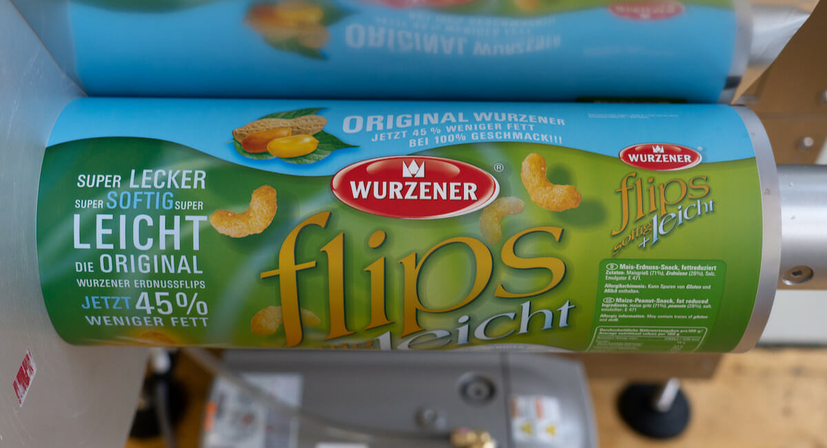
The packaging is a stand-up pouch made of flexible plastic material, featuring a clear window that showcases the product inside. The bag has a vibrant design with a predominantly green background and bright yellow accents. The front displays the product name 'Erdnuss Flips' in bold, colorful typography, along with a sunflower graphic, indicating the use of sunflower oil. The back of the bag includes nutritional information and product details in a clean layout.
About the Brand
Wurzener Nahrungsmittel GmbH operates in the competitive German food and drink sector, delivering a broad portfolio of snacks, rice products, cereals, and organic foods. The company has modernized its packaging approach to support evolving consumer preferences, integrating e-commerce readiness and shelf appeal into its packaging solutions.
Leveraging over 175 years of industry experience, Wurzener’s packaging is characterized by the use of flexible pouches for snacks and single-layer paperboard cartons for cereals and rice, enabling efficient logistics and clear product segmentation. The company’s brand identity is expressed through consistent logo placement, a vibrant green color palette, and a focus on material efficiency. Wurzener's packaging evolution reflects an emphasis on retail competitiveness, user experience, and sustainability trends within the food sector.
Key Differentiator: Wurzener’s key differentiator lies in its blend of historic brand equity with a contemporary packaging design philosophy, delivering both strong shelf presence and operational efficiency across diverse product lines.
Design System
Visual Style
Wurzener employs bold, sans-serif typography paired with a vibrant green color palette, accented by yellow and white highlights. The overall aesthetic is modern yet approachable, focusing on clarity and strong shelf visibility.
Brand Identity
Logo usage is consistent across all packaging formats, typically placed prominently at the top of the package. Iconography is limited but functional, supporting product identification and ingredient highlights. Visual consistency is maintained through standardized color use and layout structure.
Packaging Design
Packaging materials are selected for product compatibility—flexible plastics for snacks ensure freshness and portability, while paperboard cartons offer rigidity for cereals and rice. Structural design emphasizes stackability, tamper evidence, and efficient use of material.
User Experience
Design choices facilitate quick product recognition and reinforce brand trust. Clear labeling, transparent panels on some pouches, and easy-open features enhance the customer journey from shelf to consumption, supporting both impulse and planned purchases.
Company Metrics
Business insights for Wurzener Nahrungsmittel GmbH based on available data
Market Positioning
Brand Values & Focus
Key Competitors
Target Market: Wurzener targets the German consumer food market, focusing on health-conscious individuals, families, and convenience-driven shoppers seeking snacks, cereals, and organic products through both retail and online channels.
Packaging Assessment
Overall Grade
Visual appeal and presentation quality
Packaging durability and protection
Eco-friendliness and recyclable materials
Cost efficiency and value for money
Packaging assessment for Wurzener Nahrungsmittel GmbH based on industry standards and best practices
Frequently Asked Questions
What types of packaging does Wurzener Nahrungsmittel GmbH utilize for its product range?
Wurzener employs a mix of flexible plastic pouches for snacks and lightweight paperboard cartons for products such as rice and cereals, optimizing for both shelf appeal and logistics efficiency.
How does Wurzener’s packaging approach support its online and retail channels?
Packaging formats are designed for durability during transport and strong visual branding, supporting both e-commerce fulfillment and in-store display needs.
What are the main sustainability considerations in Wurzener’s packaging?
The company primarily uses recyclable paperboard cartons for dry goods, but flexible plastic materials for snacks may present challenges in recyclability, indicating a partial alignment with sustainability objectives.
Discover other Food & Drink companies
Explore more companies in the food & drink industry and their packaging strategies
kerex - terre exotique
Food & Drink
Kerex - Terre Exotique specializes in the international trade of gourmet food and drink products, offering a unique selection of spices and culinary ingredients.
ruf lebensmittelwerk kg
Food & Drink
RUF Lebensmittelwerk KG is a German food production company specializing in a variety of baking mixes and drink products. Founded in 1920, the company is known for its high-quality ingredients and innovative food solutions.
Teegschwendner GmbH
Food & Drink
Teegschwendner GmbH is a specialty tea company based in Germany, offering a wide selection of high-quality teas and tea-related accessories. They focus on providing unique tea experiences through carefully sourced and curated products.