Wunder Zahnstocher packaging
Wunder Zahnstocher is a consumer goods company specializing in flavored, vegan, and gluten-free toothpicks. Their packaging strategy integrates custom-designed tins, cartons, and stand-up pouches with a focus on sustainability, functional design, and strong brand presence.
Packaging Portfolio
Wunder Zahnstocher implements a diversified packaging portfolio, utilizing recyclable folding cartons, rigid metal tins, and resealable stand-up pouches. Paperboard cartons provide a lightweight, eco-friendly solution for retail and bundle presentations, while metal tins enhance product protection and reusability, especially for on-the-go use. Stand-up pouches with resealable closures offer convenience and maintain product freshness. Each packaging type is tailored to specific product formats, optimizing both logistics and consumer interaction while reflecting a strong commitment to sustainable materials and brand distinction.

The packaging consists of several small rectangular tin containers with rounded edges, each containing 100 toothpicks. The containers feature a smooth metallic surface with a glossy finish. Each tin has a distinct color scheme corresponding to its flavor: blueberry, apple, icebonbon, and pineapple. The lids are flat and fit snugly onto the base, with a slight lip around the edge for easy opening. The overall design is sleek and modern, appealing to a contemporary audience.

The packaging consists of three small, rectangular tin boxes with rounded edges. Each box features a smooth, metallic surface with a glossy finish. The boxes are adorned with colorful graphics and branding elements, including the word 'WUNDER' prominently displayed on the front. The lids are flat and fit snugly onto the base, indicating a rigid construction. Each box is designed to hold 100 toothpicks, as indicated by the text on the packaging.

The packaging consists of a stand-up pouch that is primarily transparent with a colorful printed front. The pouch has a resealable top and features a vibrant design with images of grapes and mint leaves. The back of the pouch is likely opaque, providing space for nutritional information and product details.
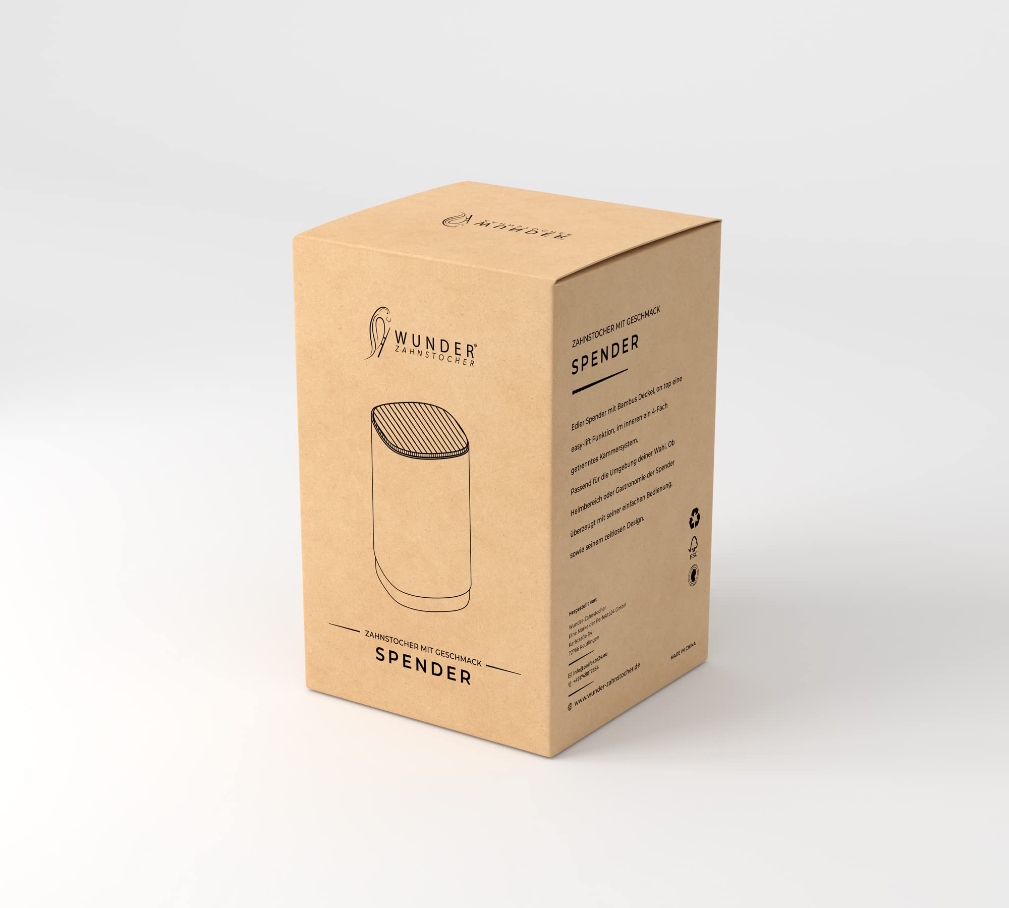
The packaging is a rectangular folding carton made from a single layer of paperboard. It features a smooth, flat construction with clean edges and folds. The exterior is a kraft brown color, giving it a natural appearance. The front of the box displays product information in a clear, modern font, with the brand name prominently featured at the top. The design is minimalistic, with no additional graphics or images, focusing on text-based information. The box has a tuck-top closure, ensuring secure closure while maintaining an easy opening mechanism.

The packaging consists of a flat pouch with a glossy finish, featuring a vibrant blue color with white accents. The front displays a polar bear graphic and the product name 'ICEBONBON' prominently. The edges are smooth and the construction appears to be a single-layer paperboard, typical for retail items. The pouch is designed to stand upright, with a resealable top.

The packaging consists of a stand-up pouch with a vibrant orange background featuring a glossy finish. The front displays the product name 'PEACH-ICE' in bold black font, accompanied by images of peaches and ice, enhancing visual appeal. The top of the pouch has a resealable zipper, providing convenience for storage. The overall shape is rectangular with a slight curve at the bottom, allowing it to stand upright. The back of the pouch likely contains nutritional information and other product details, although not visible in the image.
About the Brand
Wunder Zahnstocher operates in the niche segment of eco-friendly food accessories, primarily offering flavored toothpicks targeted at health-conscious consumers. The brand leverages a direct-to-consumer business model and employs a distinctive packaging approach combining aesthetic presentation with sustainable materials.
Founded in 2018 and based in Reutlingen, Germany, Wunder Zahnstocher utilizes recyclable cartons, metal tins, and resealable stand-up pouches across its product line. Packaging design is minimalist yet modern, with clear branding and color-coded elements for product differentiation. Environmental responsibility is emphasized through material selection and tree-planting initiatives, aligning with consumer demand for sustainable packaging solutions.
Key Differentiator: The brand sets itself apart through the integration of recyclable and reusable packaging formats, visually impactful design, and a documented commitment to sustainability initiatives such as tree planting.
Design System
Visual Style
Typography is clean, modern, and sans-serif, supporting high legibility. The color palette employs vibrant hues (blue, orange, green) for flavor differentiation, set against neutral backgrounds such as kraft brown and metallic silver. Overall aesthetic is minimalist with high-contrast elements.
Brand Identity
Consistent use of the 'WUNDER' logo and clear product naming on all packaging. Iconography is minimal, relying on bold text and color blocks for differentiation. Brand presence is reinforced through uniform logo placement and typographic hierarchy.
Packaging Design
Material choices prioritize recyclable paperboard, reusable metal tins, and high-barrier stand-up pouches. Structural designs are straightforward—rectangular cartons, compact tins, and stand-up pouches—emphasizing durability, consumer convenience, and sustainability.
User Experience
Design prioritizes easy opening, resealability, and portability, creating a positive unboxing and consumption experience. Visual cues and color coding guide product selection, and packaging ergonomics support repeat use and brand recall.
Company Metrics
Business insights for Wunder Zahnstocher based on available data
Market Positioning
Brand Values & Focus
Key Competitors
Target Market: Health-conscious and environmentally-aware consumers in Germany and neighboring European markets, seeking premium flavored food accessories with sustainable packaging.
Packaging Assessment
Overall Grade
Visual appeal and presentation quality
Packaging durability and protection
Eco-friendliness and recyclable materials
Cost efficiency and value for money
Packaging assessment for Wunder Zahnstocher based on industry standards and best practices
Frequently Asked Questions
How does Wunder Zahnstocher address packaging sustainability?
The company incorporates recyclable paperboard, reusable metal tins, and resealable pouches, minimizing plastic use and supporting environmental initiatives. Their partnership with organizations for tree planting further reinforces their sustainability strategy.
What packaging formats are used for Wunder Zahnstocher products?
Core formats include rectangular folding cartons, rigid metal tins, and stand-up pouches with resealable closures. Each format is selected based on product requirements and customer convenience.
How does packaging contribute to the overall brand experience?
Packaging design leverages modern typography, vibrant color schemes, and clear logo placement to create a memorable unboxing experience and reinforce the brand's identity and sustainability focus.
Discover other Food & Drink companies
Explore more companies in the food & drink industry and their packaging strategies
Thés de la Pagode
Food & Drink
Thés de la Pagode is a French company specializing in organic teas and infusions, focusing on health and well-being. Established in 1987, they prioritize sustainable practices and high-quality ingredients sourced through fair trade.
ruf lebensmittelwerk kg
Food & Drink
RUF Lebensmittelwerk KG is a German food production company specializing in a variety of baking mixes and drink products. Founded in 1920, the company is known for its high-quality ingredients and innovative food solutions.
Teegschwendner GmbH
Food & Drink
Teegschwendner GmbH is a specialty tea company based in Germany, offering a wide selection of high-quality teas and tea-related accessories. They focus on providing unique tea experiences through carefully sourced and curated products.