Whole Family Products packaging
Whole Family Products delivers natural health solutions through a direct-to-consumer model, focusing on supplements and hormone creams. Their packaging utilizes standardized plastic bottles and jars with tamper-evident features and branded labeling to support product integrity and retail presentation.
Packaging Portfolio
Whole Family Products utilizes a standardized packaging suite typical for nutraceuticals, including cylindrical HDPE and PET plastic bottles, jars, and rigid boxes with tamper-evident features. Labels are digitally printed with high color saturation, providing comprehensive product information, supplement facts, and clear branding. The use of glossy finishes, clear typography, and color coding aids both shelf visibility and compliance. While packaging is optimized for logistical safety and regulatory needs, it shows moderate advancement in sustainability, with limited use of recycled or biodegradable content.
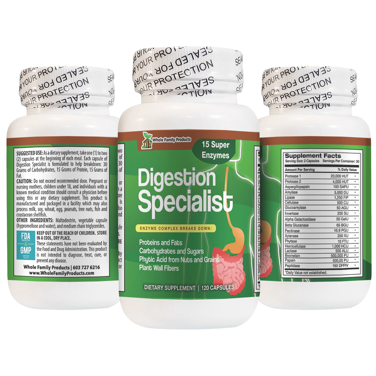
The packaging consists of a plastic bottle with a white screw-on cap. The bottle is cylindrical and has a smooth surface with a glossy finish. The front label features a vibrant green background with images of digestive enzymes and a pink illustration of a digestive system. The text is printed in various colors, with the product name 'Digestion Specialist' prominently displayed in bold letters. The back label includes detailed supplement facts, usage instructions, and company information.

The packaging consists of three cylindrical bottles, each with a white plastic body and a screw-on lid. The labels are colorful and feature various graphics and text related to dietary supplements. The bottles are designed for retail display, showcasing the product names prominently. Each bottle has a tamper-evident seal around the lid, ensuring product safety.

Two plastic bottles with screw-on lids, each containing dietary supplements. The bottles are cylindrical with a smooth surface and a glossy finish. The labels are colorful, featuring vibrant graphics and text. The first bottle is labeled '15 Day Cleanse' with illustrations of herbs and a green color scheme, while the second bottle is labeled 'Moringa Complex' with a similar design aesthetic. Both labels include dosage information and dietary supplement details.

The packaging is a cylindrical plastic container with a black plastic lid. The container features a smooth surface with a light blue base color and a prominent image of a dog on the front. The label includes various text elements in white and black, with a clear indication of the product type and its benefits. The container has a straightforward design with no visible flaps or tabs, indicating a screw-on lid closure.

The packaging consists of a cylindrical plastic bottle with a screw-on lid. The bottle is opaque with a white finish, featuring a label that wraps around its body. The label has a glossy finish, displaying vibrant colors and graphics. The front of the label prominently features the product name 'HORNY GOAT WEED' in bold lettering, along with a graphic of a goat. The back of the label includes detailed supplement facts and usage instructions. The bottle has a tamper-evident seal around the cap, ensuring product safety.
About the Brand
Whole Family Products specializes in natural supplements and hormone creams, targeting a broad consumer base with an emphasis on family health and inclusivity. Their approach to packaging is functional, prioritizing product safety and regulatory compliance through tamper-evident seals and clear labeling. The brand consistently leverages visual identity elements to reinforce recognition and trust.
Operating primarily online, Whole Family Products utilizes packaging solutions that meet industry standards for dietary supplements, focusing on safety, clarity, and brand alignment. The packaging portfolio relies on cylindrical plastic bottles and jars with colorful, information-rich labels designed for both retail and e-commerce distribution channels. While current solutions emphasize product safety and shelf appeal, there is limited evidence of advanced sustainability initiatives or premium unboxing experiences.
Key Differentiator: A family-owned, value-driven business with a consistent, regulatory-compliant packaging approach tailored to health-conscious families seeking trust and transparency.
Design System
Visual Style
The visual design leverages clean sans-serif typography, a palette of white bases with vibrant accent colors (greens, blues, pinks), and bold, high-contrast graphics. Label layouts prioritize clarity and legibility for supplement facts and dosage information.
Brand Identity
Consistent use of the Whole Family Products logo, company name, and signature color schemes reinforces brand trust. Iconography is practical, with product-specific illustrations supporting category differentiation. Visual consistency is maintained across products for easy recognition.
Packaging Design
Material choices favor HDPE/PET plastics for safety and durability. Structural designs focus on standard cylindrical bottles and jars with tamper-evident and child-resistant closures. The philosophy emphasizes cost-effective compliance and ease of distribution.
User Experience
Design choices support a straightforward user journey, from online purchase to product receipt. Clear labeling, safety seals, and intuitive packaging formats streamline the customer experience, though emotional engagement through unboxing is limited.
Company Metrics
Business insights for Whole Family Products based on available data
Market Positioning
Brand Values & Focus
Key Competitors
Target Market: Health-conscious families and individuals seeking natural supplements and hormone creams, with a focus on direct-to-consumer online shoppers in the US and select international markets.
Packaging Assessment
Overall Grade
Visual appeal and presentation quality
Packaging durability and protection
Eco-friendliness and recyclable materials
Cost efficiency and value for money
Packaging assessment for Whole Family Products based on industry standards and best practices
Frequently Asked Questions
What types of packaging does Whole Family Products use for their supplements?
The company primarily uses cylindrical plastic bottles and jars with tamper-evident screw-on lids, adorned with full-color branded labels that provide product and supplement information.
How does Whole Family Products ensure product safety during shipping?
Packaging features such as tamper-evident seals and robust plastic containers are used to protect contents and maintain product quality throughout the logistics process.
Does Whole Family Products use sustainable packaging materials?
Packaging is primarily composed of standard plastics with limited evidence of recycled or biodegradable materials in use. Sustainability practices appear to be moderate and could be strengthened to align with industry trends.
Is the packaging designed to enhance the customer unboxing experience?
While the packaging is visually consistent and informative, it focuses more on functionality and safety than on creating a premium or emotive unboxing experience.
Discover other Health companies
Explore more companies in the health industry and their packaging strategies
Smart Protein
Health
Smart Protein is dedicated to transforming nutrition by providing a range of health and wellness products focused on protein supplements and vitamins.
Lily & Loaf
Health
Lily & Loaf specializes in high-quality health and nutrition products, offering a range of supplements and vitamins aimed at supporting an active lifestyle. The company focuses on providing natural solutions for health and beauty.
EVO Nutrition
Health
EVO Nutrition specializes in premium health supplements, providing a wide range of vitamins and nutritional products to support well-being.